Spatial
Warren and Mahoney Architects 96 W+M Wellington Studio
-
Ngā Kaimahi / Team Members
Rodney Sampson, Jono Coates, Katherine Skipper, Julia McPherson, Cliff Leong, Jono Coates, Charlotte Hughes-Hallett, Shannon Surwald, Grant Wilson -
Kaitautoko / Contributor
LT McGuinness Ltd -
Client
Warren and Mahoney
Description:
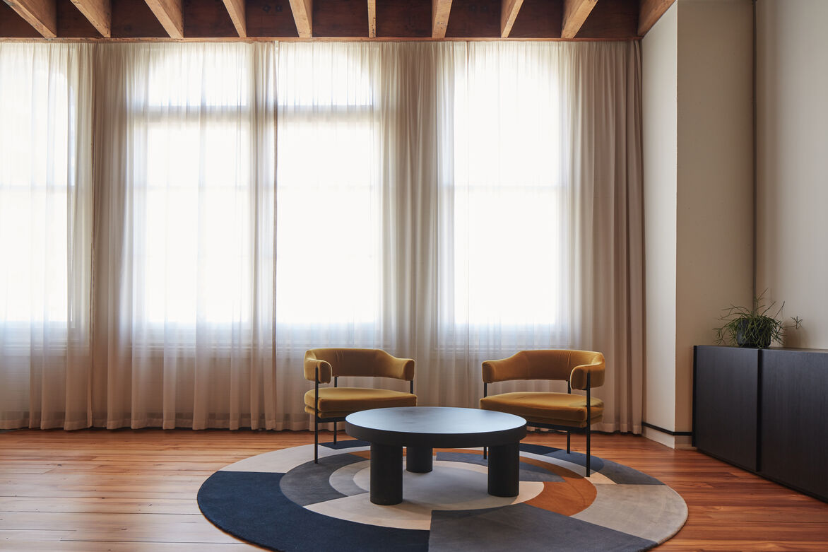
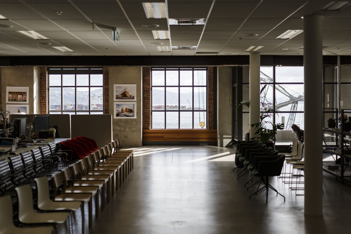
Located on Wellington’s waterfront, our new studio location on Cable Street was chosen due to its proximity and connection to the part of Wellington that we believe will have the most change in the years ahead.
Our brief was to deliver on the strategy for the studio, primarily based around connecting with our clients, being ‘an instigator’ – a hub for the thinkers and makers in Wellington, and creating a space where our people can develop to their greatest potential.
The concept was first completed in January 2020 and then revisited after COVID-19 hit, to a greatly reduced CAPEX budget. This forced us to reassess what was most important. When revisiting the design, we held true to the elements that delivered on the essence of the brief and approached the design through the lens of dematerialisation.
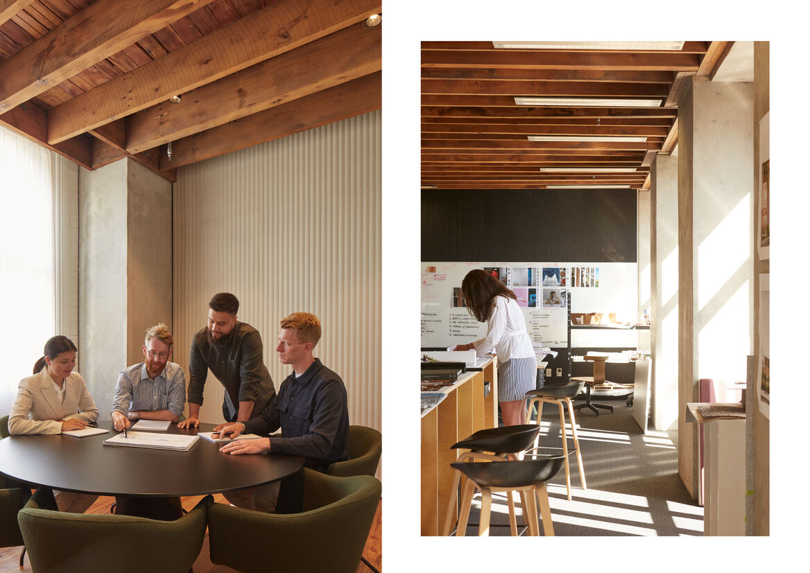
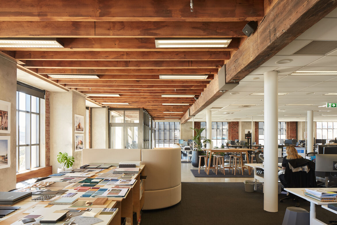
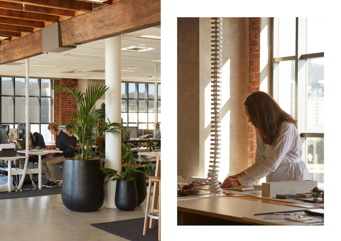
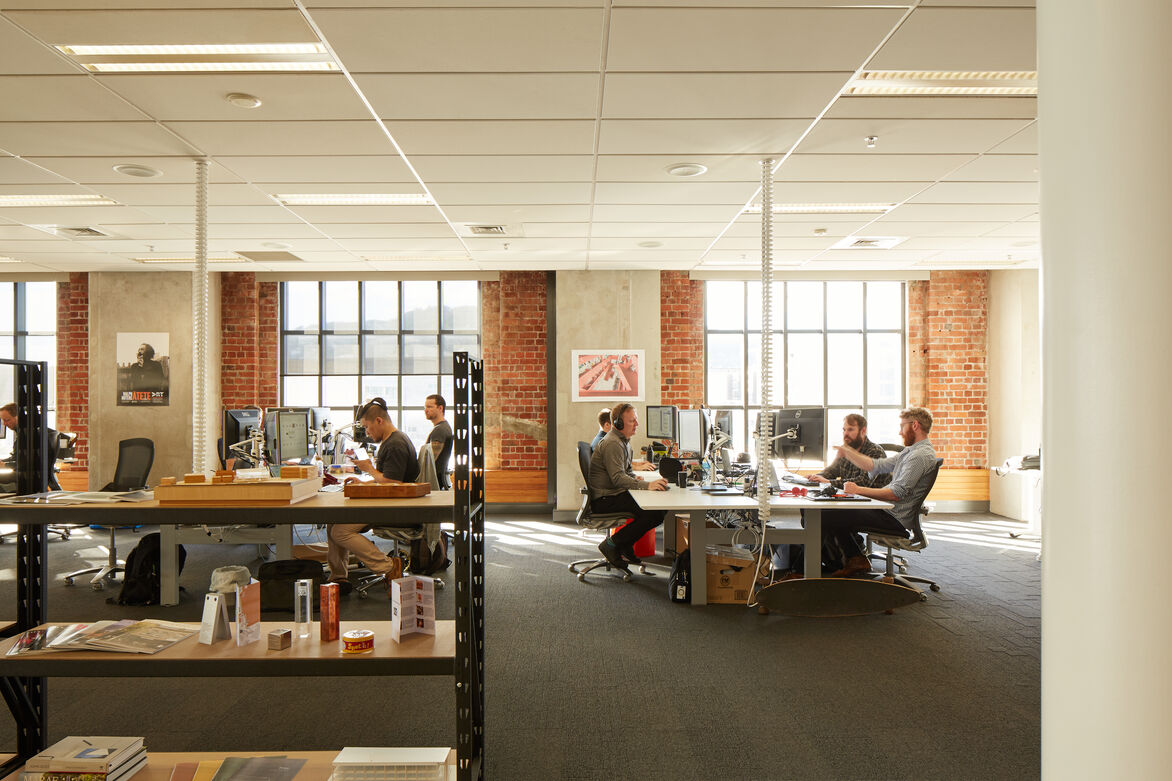
With our people being our most valuable resource, it was without compromise that we wanted to allow everyone to have the best seat in the house. The workspace was planned around providing for multiple workstyles all in proximity to panoramic views of the Wellington Harbour.
Aspiring to be the instigator, providing a space that enables us to be authentic hosts was imperative. We made the conscious decision to allocate a large portion of the budget to the arrival and hosting experience. The first and last impression of the new studio.
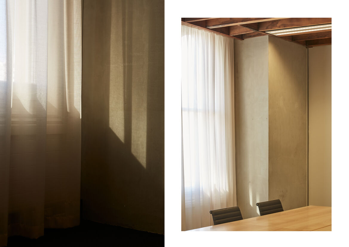
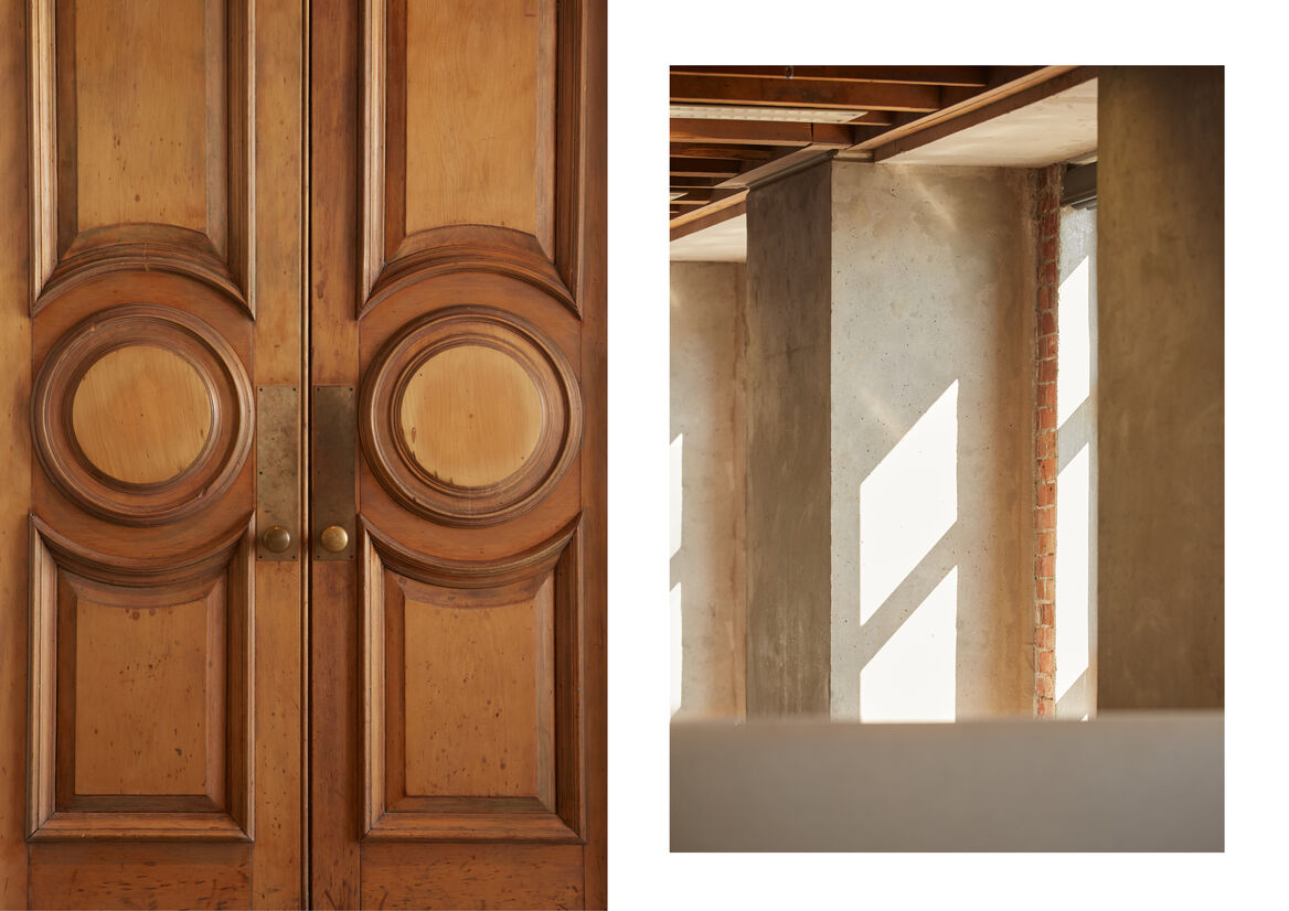
In the entry, existing floorings were removed to reveal timber floorboards. Meeting rooms were refreshed with excess finishes removed, returning to a natural and neutral palette. The lift core is re-finished in vertical black glass with a fine concave stripe, multiplying our space and reflecting activity. A black paint finish continues through the entry doors and into back of house spaces – a clear counterpoint to the exterior walls with their large windows and exposed brick.
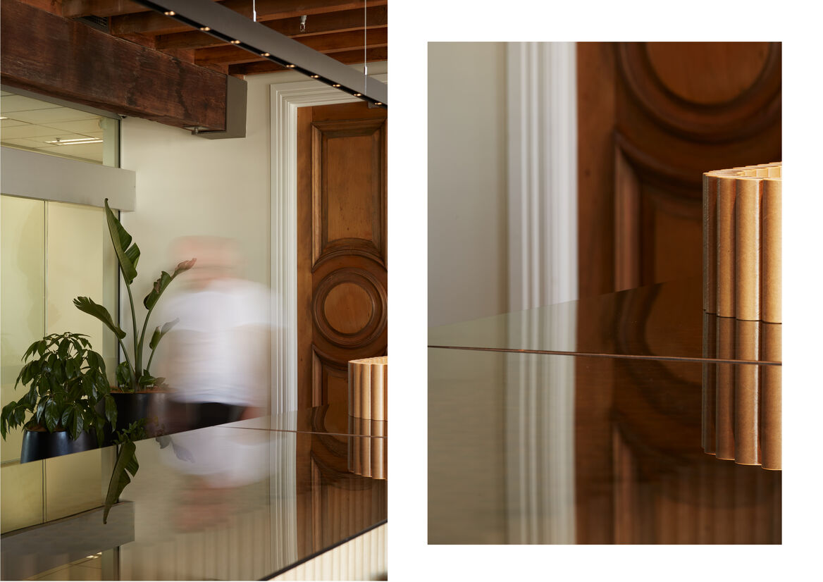
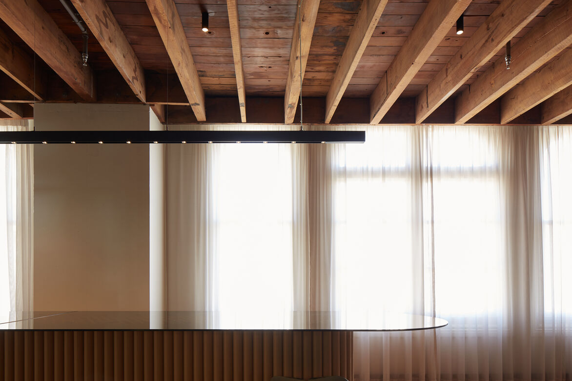
The reception counter was the major element of new joinery and was custom-made for the space, designed to reuse cardboard tubes in an unexpected way. The cardboard tubes and bronze-tinted glass provides a warm invitation and pays homage to the existing built fabric. The detailing is deceptively simple, appearing as only two elements - the robust cardboard tubes and the fine edge of the cantilevered glass top, with just enough visibility through to peak curiosity. ‘How the hell did they do that?’
In the main studio, floor coverings and desks were removed from the central space, a promenade from the front door to harbour view. Concrete is exposed and polished – accepting the fine cracks and age marks you would expect for a building of this vintage. A dining table is where we gather for morning tea, to celebrate, and can be configured to long tables to host our clients for discussion and togetherness.
The use of colour is retrained to where it provides the most impact. As much material as possible is re-used, including joinery items that the previous tenant no longer required, and furniture relocated from our previous studio.