Spatial
Warren and Mahoney Architects 86 2degrees
-
Ngā Kaimahi / Team Members
Andrew Tu'inukuafe, Asha Page, Daniel Kempka, Kelsey Muir, Scott Compton -
Kaitautoko / Contributors
BIG Ideas, Outside In, NDY WELL -
Client
2degrees
Description:
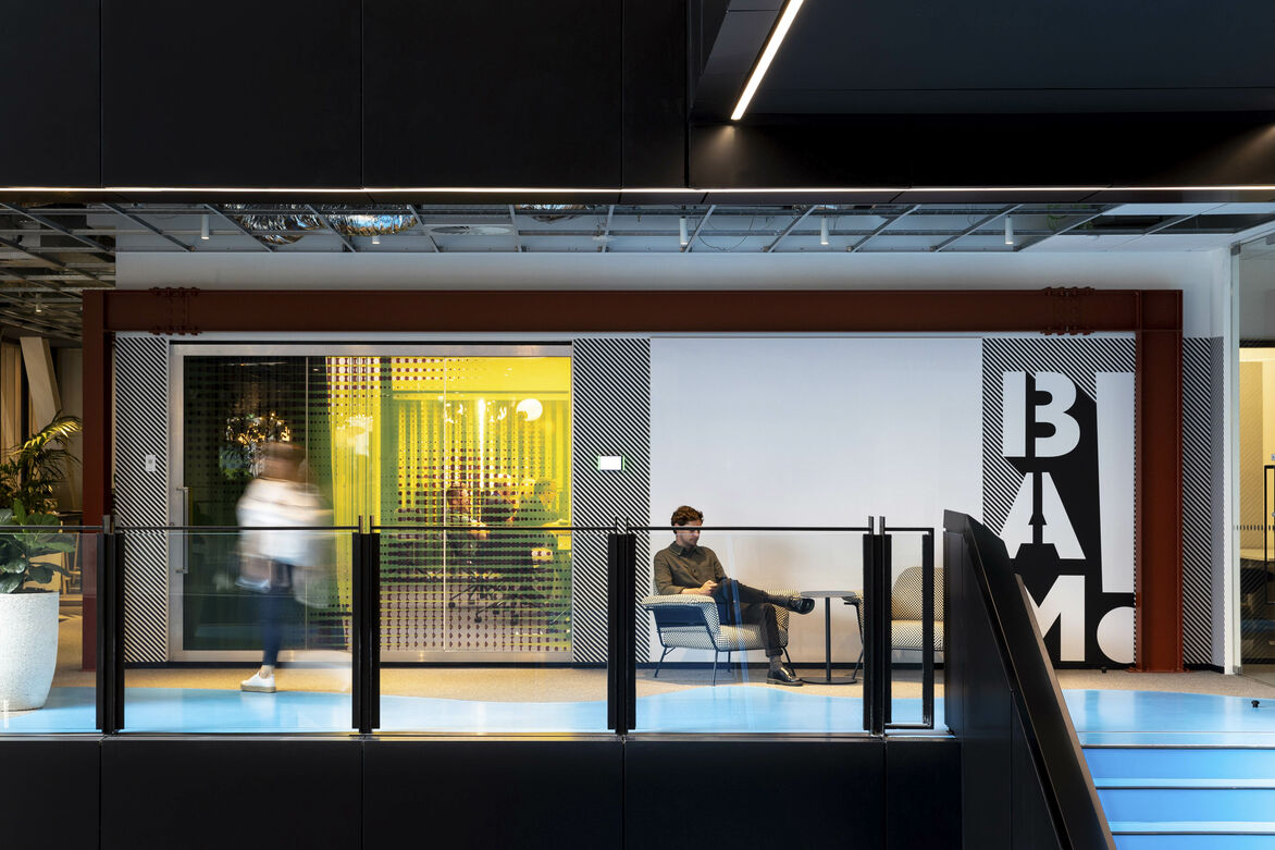
2degrees needed a workplace to challenge the status quo; bold in nature and characterised by its purpose and diversity of people and with a focus on empowerment and wellbeing. Through the middle of the first pandemic, the chance was taken to re-brief; to explore and experiment with braver design decisions and strategies in response to offering greater functionality and a more desirable workplace. Pragmatic yet unashamed, the workplace sought to provide the organisation with its first ever opportunity to truly flex its ambitions, to offer its people safety and freedom and to reflect the colourful personality - a hero’s ‘superpower’.
Bringing a community of 700 staff into their own ‘Mission Control’ required the confidence to showcase the organisation’s adventurous start-up attitude with the irreverent essence of the brand. Reflecting the heroic persona of its people, three key design pivots are presented to inform the esoteric landscape of the workplace - Protagonist, Heroic and Audacious. The Protagonist mirrors the brand; continuing to challenge the industry with its courage and optimism. The Audacity of over saturated spaces with pop colours reinforces the sense of Heroism, with contrasting scales of form and dynamic graphical artwork. It is a workshop that responds in real time to staff, clients and the community.
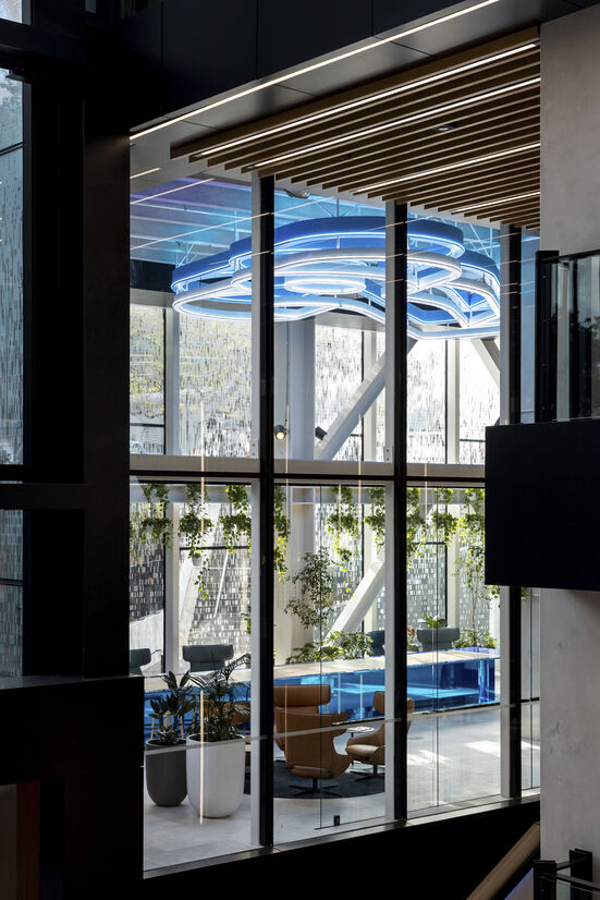
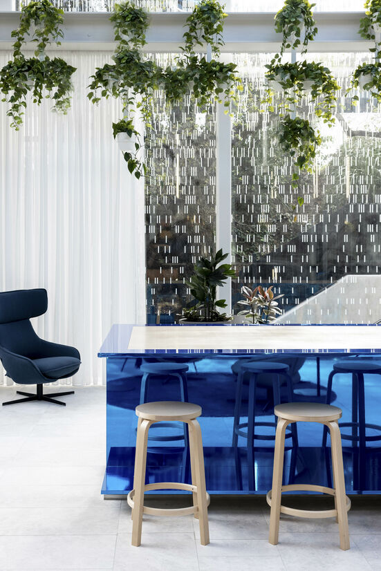
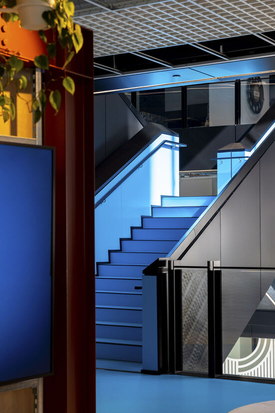
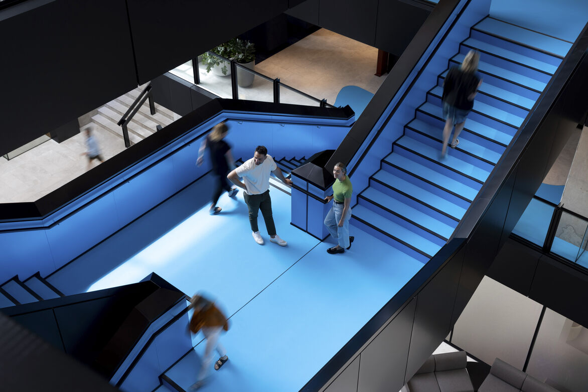
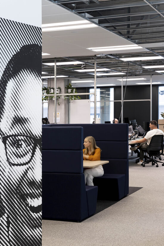
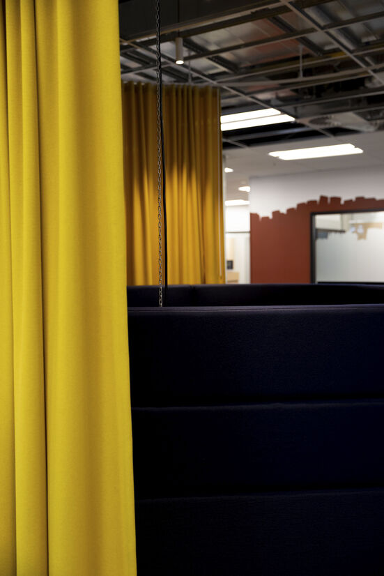
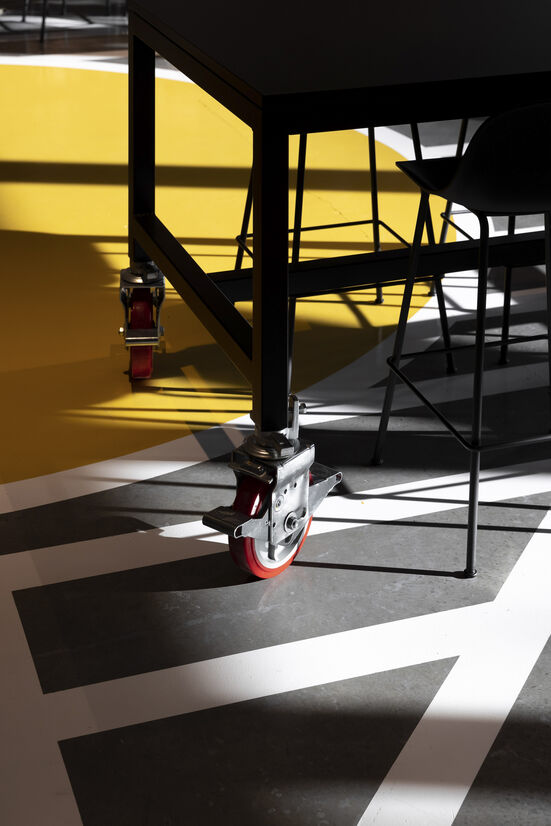
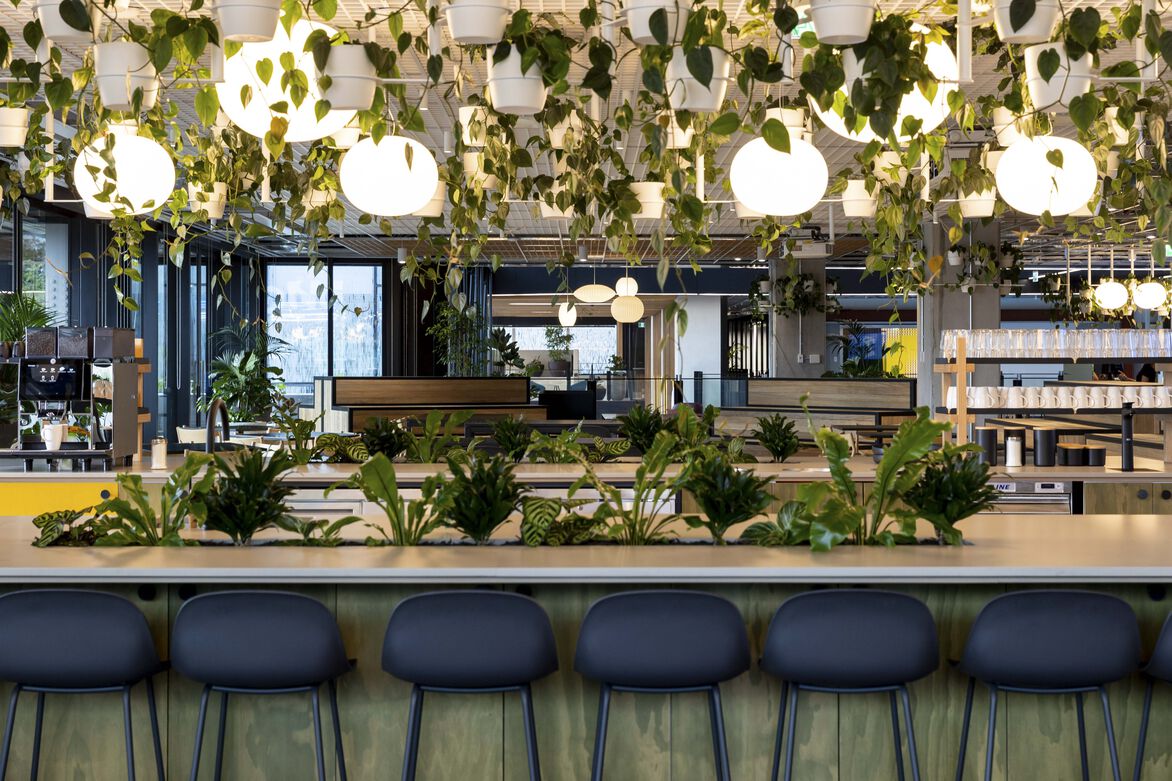
Materials are layered to create a bold simplicity, juxtaposed by a warm softness and raw grit. The saturation of the ‘interchange’ stair in resin resembles the ink connecting the activities of each floorplate while the striped back utilitarian expression of exposed structure, open ceilings and raw finishing gives the workspaces its workshop appeal. Primary colours and overstated detailing and graphics provides the comic narrative to project their personality and messages of wellbeing. The abundance of light overlaid with generous arrangements of planting supports the sense of community. Moments of relief find their inspiration in darker softer corners and behind the heavy drape textures.
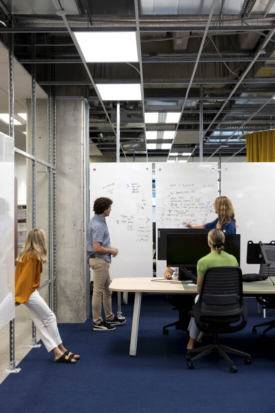
New Zealand’s first platinum WELL certification prioritises staff to be their best and therefore the best for their colleagues and customers. Authorship of space ensures the freedom of mobility and autonomy to craft and adapt the workspace to match the activities in each team’s neighbourhood. The adoption of scaffold-like framing and demountable whiteboards create workshops for agile collaboration allowing staff greater control and influence on their space. Showcasing activities that engage with the community are positioned front and centre to welcome guests with interactive screen technologies and oversized architecture like the balancing blue chrome metal ‘I’ beam and illuminated logo reminiscent of the bat-signal.
Judge's comments:
This dynamic workplace creates an environment for staff that boldly embodies the brand - the superhero 'fighting for fair' - out to innovate and take it to the world. With audacious colour, comic graphics and space to adapt, demount and modify fit for a creative team with personality.
The space boldly embodies the brand values of it's innovative tech client. Colour and finish has been integrated in striking applications where each space communicates the culture clearly through a sense of adaptability and clever utility.
In an era where some are struggling to get people back to the office, it is clear that high quality buildings and interiors are going to be something employees will look for. This striking design expresses the brand and the values of the company.