Spatial
Unispace 39 Unispace Auckland Studio
-
Pou Auaha / Creative Director
Antonia Walmsley
-
Ringatoi Matua / Design Director
Antonia Walmsley
-
Ngā Kaimahi / Team Members
Harry Rowntree, Chris Kim, Rose Williams, Luke Rogers, George Piek -
Kaitautoko / Contributor
Niel Shaw -
Client
Unispace
Description:
Client Brief
Achieve the five strategic objectives / business drivers:
Create envy – so everyone wants one for themselves
Clients come back for more – a place where they want to come, and stay to work
Bring the digital and physical worlds together
Support our entrepreneurial mindset
Sustain the family feel
Response to brief
“Create a workplace that acts as a showroom for our clients.”
The workplace supports the multi-functional needs of a highly-diverse set of disciplines - without compromising aspirational design aesthetics. As a design company it is imperative that the office becomes a working showroom for workplace design and a physical example of our thought leadership & the evolution of the office.
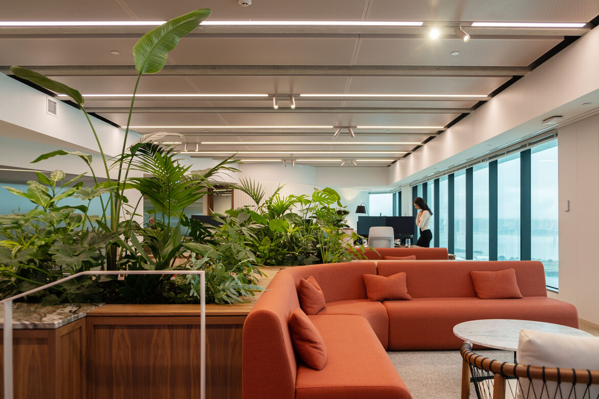
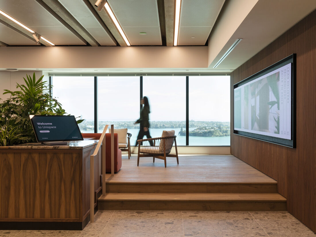
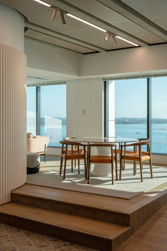
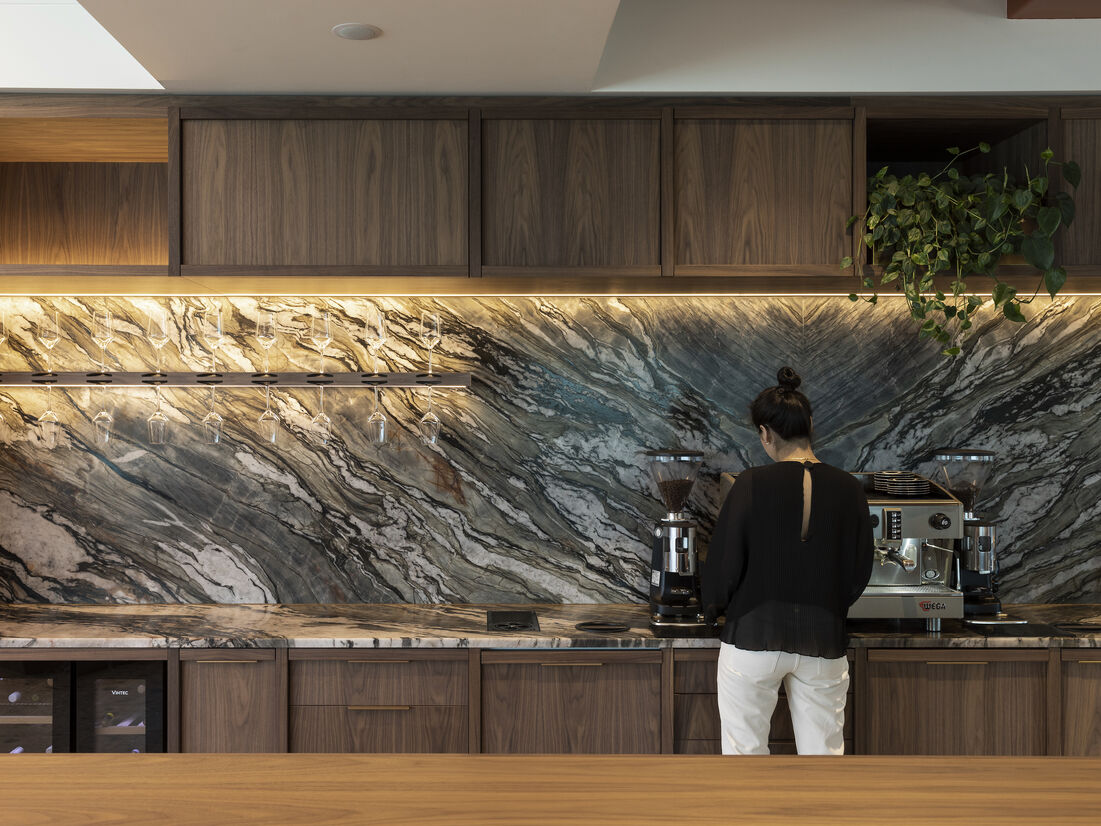
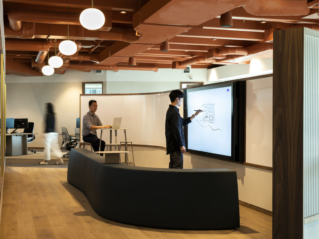
A ‘fully-hosted experience from arrival’ – digital welcome screens, an open co-working deck for employees and clients, a full open kitchen/social space, a multi-functional mix of +52 ergonomic work points, and 8-open & enclosed meeting-rooms, for up to 100 employees.
Material Palette & Detailing
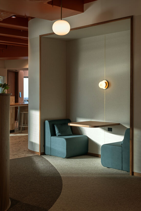
Being on the 24th floor in a building on the waterfront the view out tends to focus on the distant horizon. The intent for the colour palette for the office was to link with the closer view on the edge of the harbour, where the city meets the port.
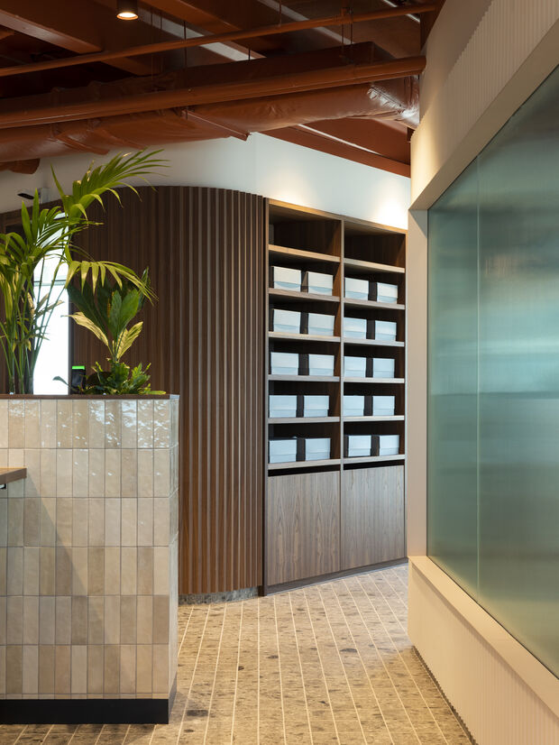
With a series of thresholds in a challenging floorplate, the workplace has 3 distinct zones, yet feels like 1 space. Material intersections achieve the zone connection, through considered interaction between floor, skirting, walls & joinery:
- The distinct deep red colour of the ceilings references the copper oxide colour of the hulls of the ships and containers of the port and pavers & bricks of waterfront buildings and pathways.
- Custom workstations, incorporate planting to enhance the feeling of wellness and the integration of the greenery into the new waterfront landscaping.
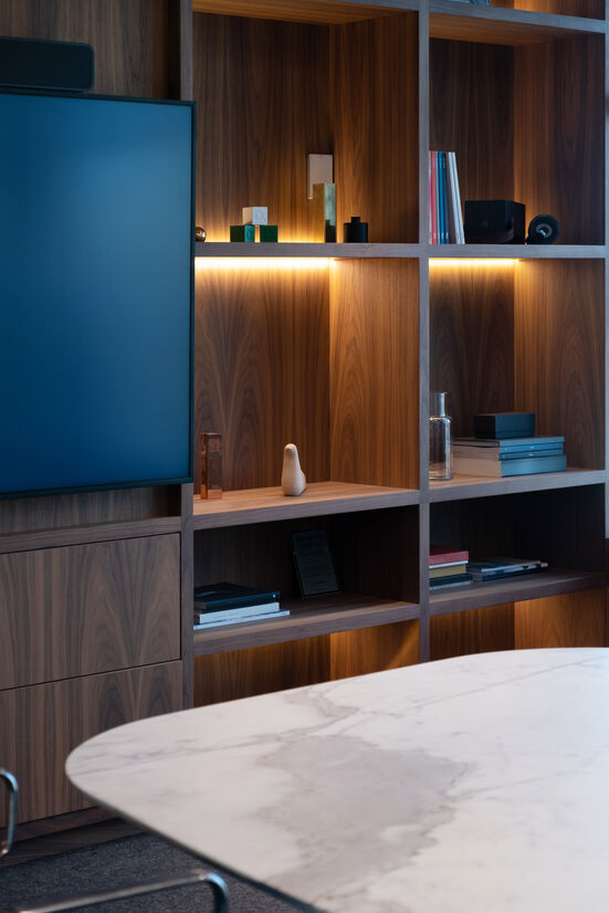
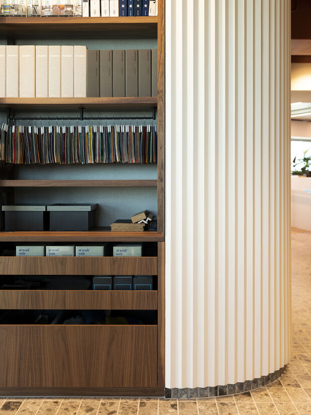
- Curved walnut and custom plaster profiled feature-panelling play off each other and create texture and movement
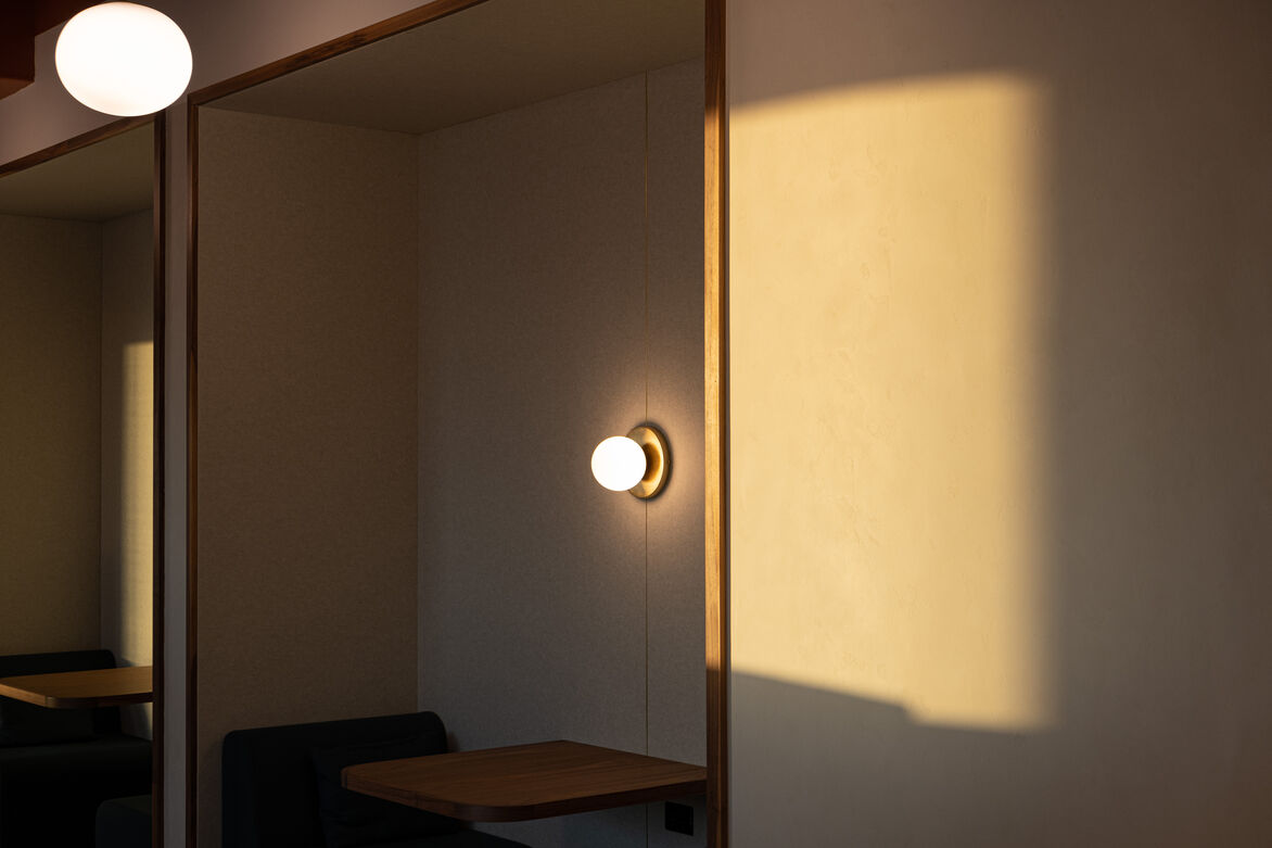
- Aged-brass knotched into timber & create thresholds between materials formalising boundaries between acoustics, writing & technology
- Statement granite splashback creates a spectacular natural artwork in the centre of the fitout
- Custom steel perforated acoustic ceiling lifts the ceiling height above the deck reflecting light from the view beyond as well as providing all the acoustic absorption needed to facilitate a great work and event environment.
- Curved rendered walls change the shape of the sharp and distinctive core and add compression & relief throughout the journey through the space
- All meeting rooms obscured reeded glass windows mirror adjacent wall panelling and get away from typical commercial glazed suites. The moire effect when the light comes through show movement and views within the rooms without giving away secrets.
This is a highly adaptable yet bespoke workplace. Every element, (besides purchased furniture), was custom-designed to achieve the high degree of multifunctionality required.
Judge's comments:
Carefully crafted and considered spaces that utilised views beyond. It was clear there was careful consideration to each space with an elegant and enriching outcome.