Spatial
The Wonder Group 19 Alex Wang HQ
-
Pou Auaha / Creative Director
Buster Caldwell
-
Ngā Kaimahi / Team Member
Annuska Menoita -
Client
Alex Wang
Description:
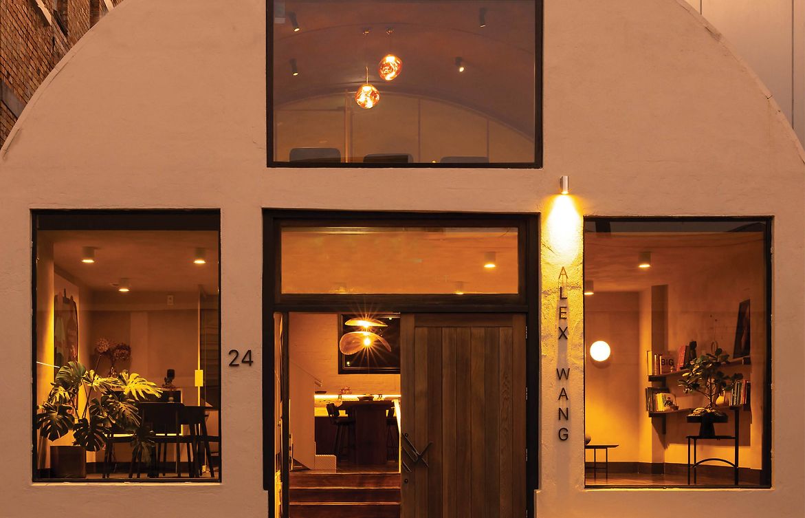
Tucked into a back street of Freeman’s Bay sits possibly the last half-round shed in central Auckland, a 1950’s relic of the industrial use that once defined the neighbourhood.
Our client set the brief to develop a workspace for his financial brokerage firm, with the strict intention to buck the ‘work-from-home’ trend & double-down on the benefits to be derived from working within a unique, elegant & peaceful workspace.
With the stress & uncertainty that comes with lending money, our job was to establish an environment that allows guests to informally unwind & talk in a space equal parts comforting and confident.
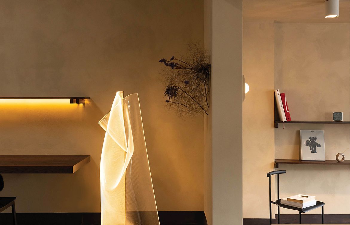
The team exude personality & energy, therefore the design didn’t need to compensate. You may notice that the detailing & finishes draw from both wabi-sabi and Nordic influences, deliberately to pair the interior back and allow the staff to remain the shining stars.
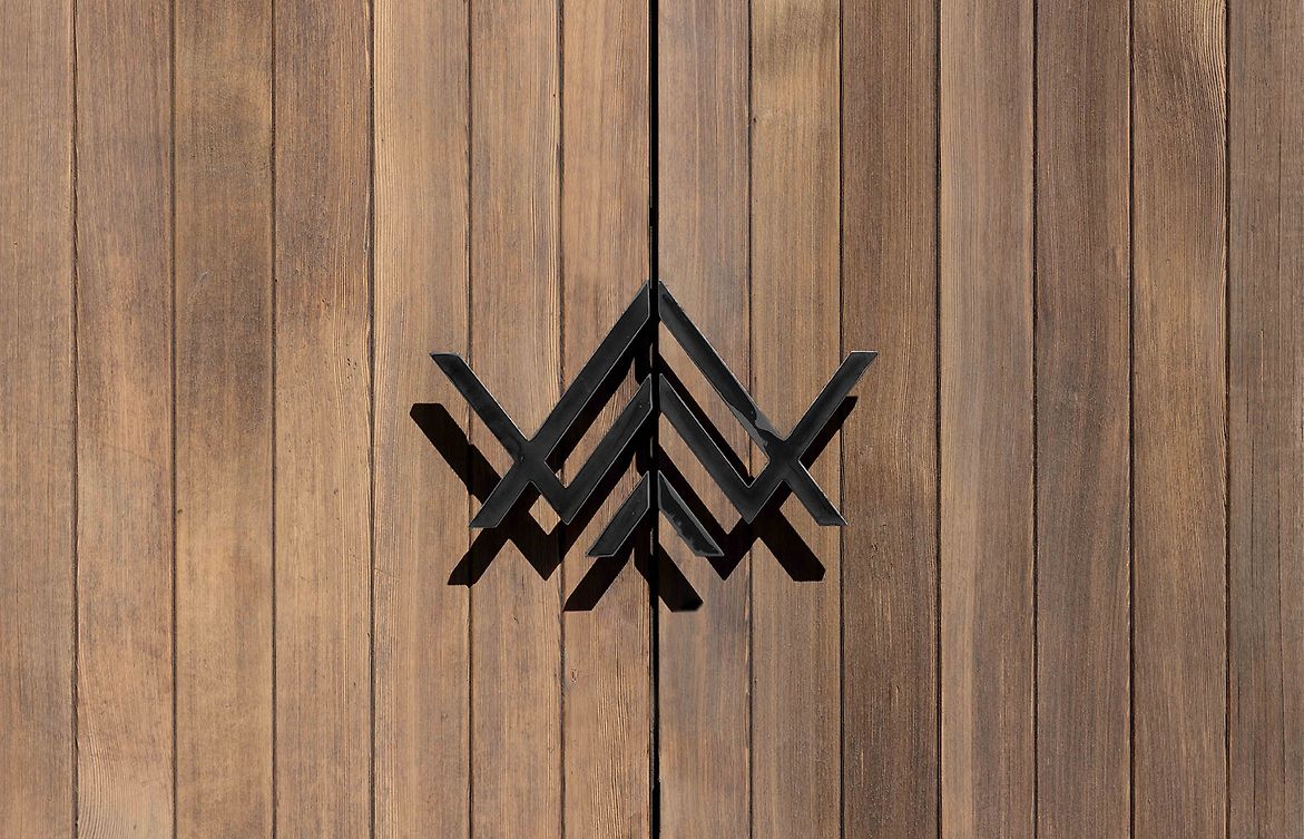
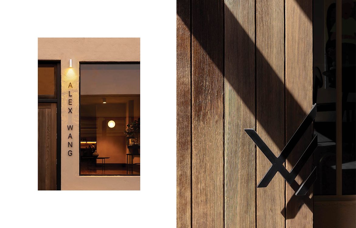
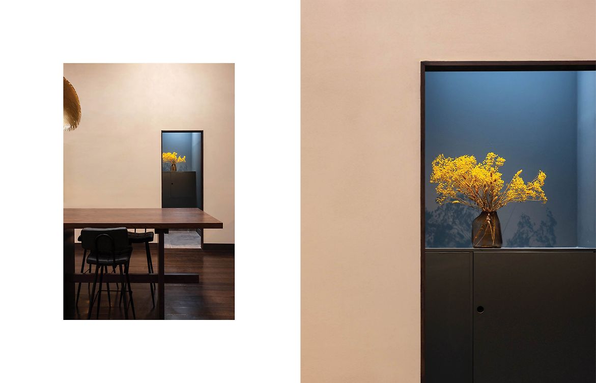
The handles cut from cold-rolled blackened steel form a firm handshake at arrival, inviting both guests & staff within an office reminiscent of a subdued & sultry lounge more so than a financial advisory firm.
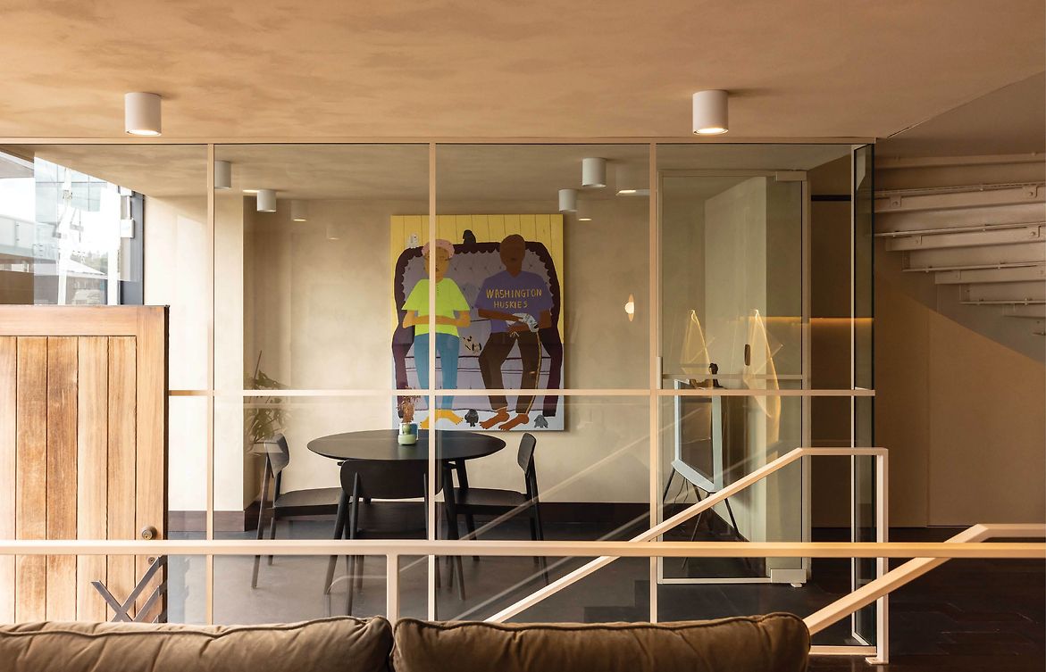
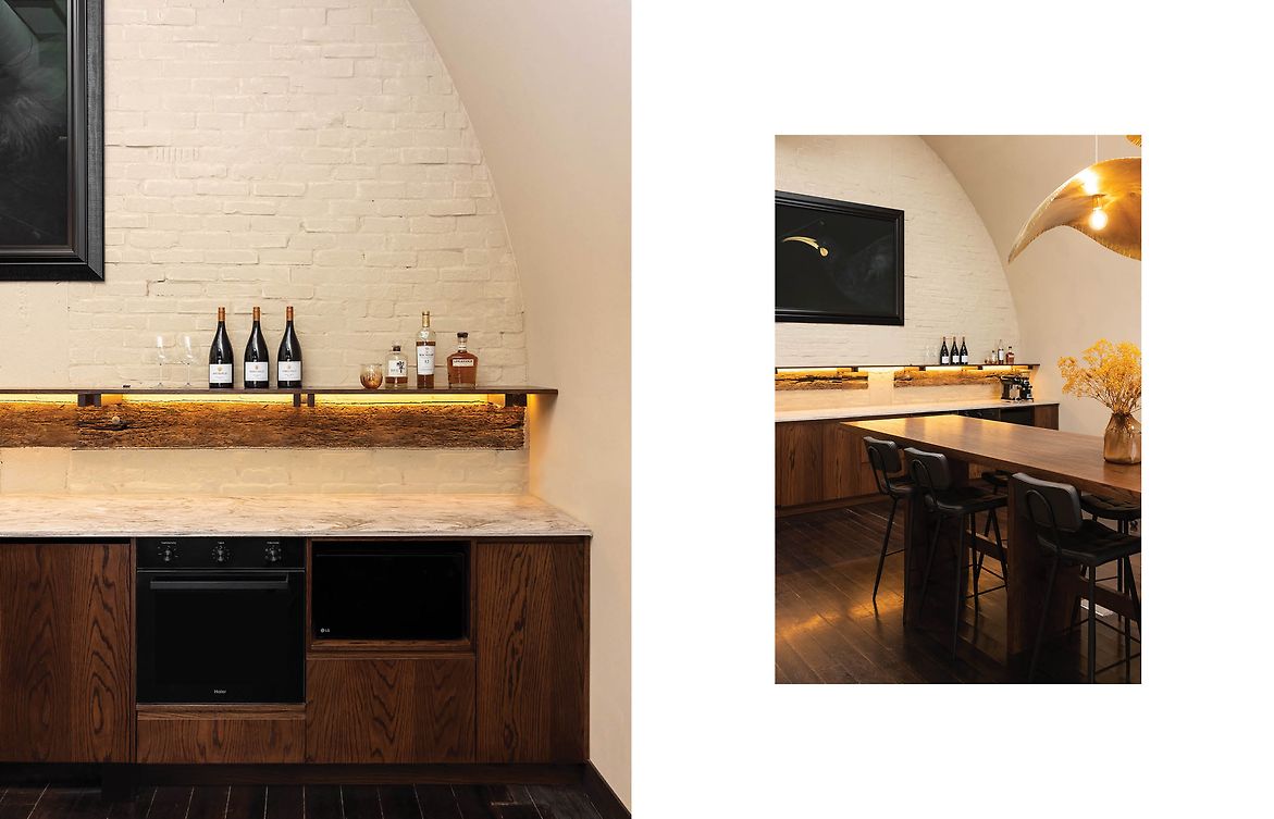
Once inside, the chaos falls away and things relax. The reductive use of volume implies a thoughtful intent in establishing a homely environment, further enhanced by the lack of typical workspace fixtures. Effort was used to reconfigure the internal services & skeleton to dramatise the half-round nature of the building, with the arched brick wall forming the backdrop for the most social of the spaces - the kitchen.
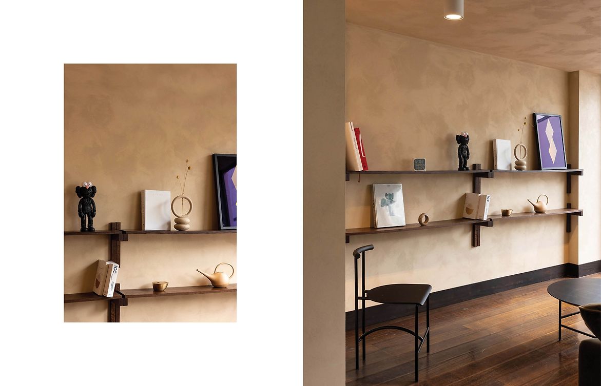
Our cabinetry detailing borrows form-language from Japanese sashimono techniques as seen on the cabinetry, shelving, tables & desks throughout. Atypical of the usual workspace, everything has been inbuilt & placed with intent - a solid delivery that reflects the ambition for the business to remain boutique.
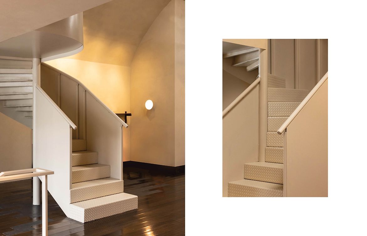
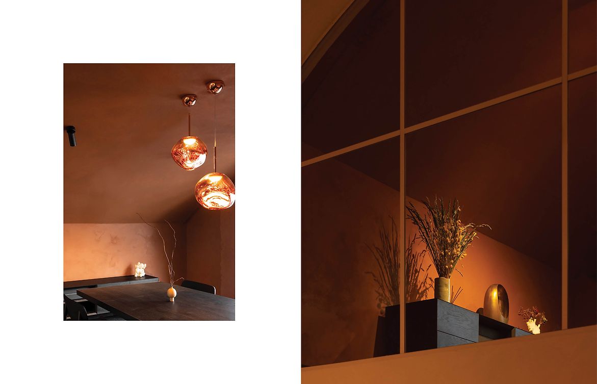
The office spans two levels, with a heroic spiral introduced to connect the lower & upper levels. The upper room informs a change in pace, shifting softly from the light-filled studio into an intimate cocoon deeper in tone - a rich carmine red. This change offers a sense of safety from which complicated & confidential discussions may become a little easier.
Art was used to introduce both credibility as well as attitude, with pieces by local artists Gorden Walters, Claudia Kogachi & Fiona Pardington purchased specifically for site. The ‘Canterbury Musem Huia’ perches high amidst the half-round arch, overlooking the space & guests within. A punchy touch.
The original brick was bagged with dolomite plaster to ensure longevity, the clay was beginning to crumble after over 80 years of use. Introduced tiles were removed to expose existing conditions on entry. Our intention was to retain as much of the character as possible & design to restore rather than reinvent. Native flooring was retained where possible, and where floorboards were damaged tinted concrete was reinstated to highlight rather than replicate.
The result is an office that feels distinctly of the client’s character, one that allows their business to live their values through both practice and perception.
Judge's comments:
Simple and timeless, this design seamlessly weaves historical character, subtle elegance, and functional purpose into a distinctive financial brokerage workspace, embodying a comforting and confident haven that prioritizes both staff and guest experiences.