Spatial
Davenport Campbell Wingates 22 HSBC NZ Headquarters
-
Ringatoi Matua / Design Director
Ben Voorderhake
-
Ngā Kaimahi / Team Members
Polly Schofield, Ronald Sutjjiadi -
Kaitautoko / Contributors
Michael Leng, Blair Keenan -
Client
HSBC New Zealand

Description:
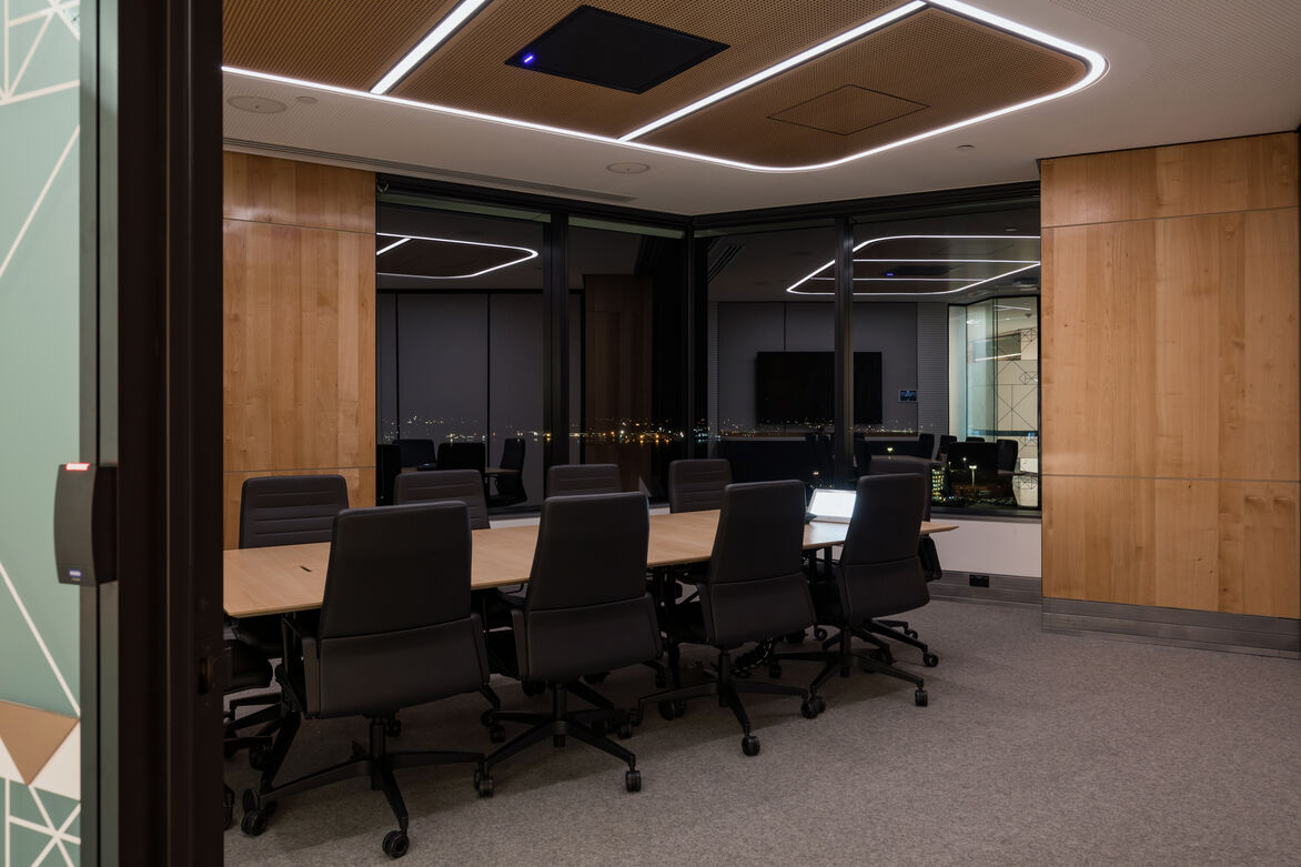
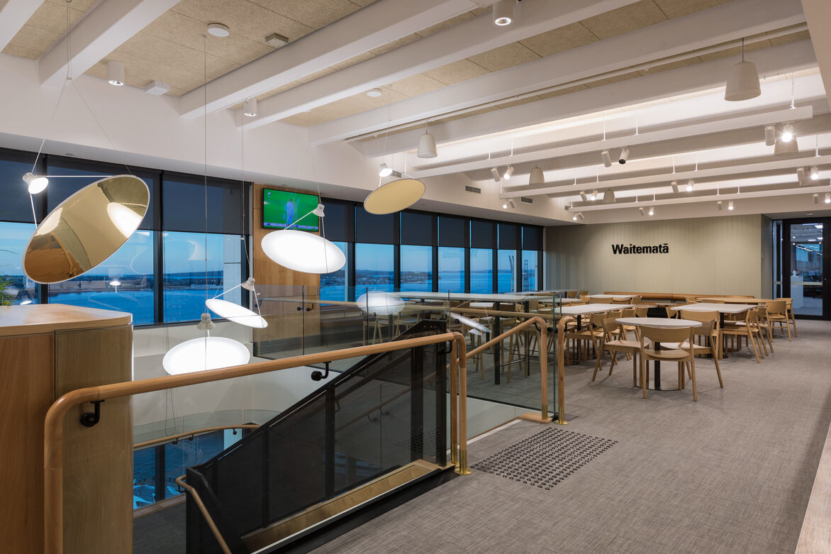
The move of a global bank to the new headquarters at 188 Quay Street, designed by Davenport Campbell, presented an opportunity to implement new ways of working, aligning with the companies Global Workplace Strategy, whilst also responding to the local context. The location positioned the business within the revitalised Commercial Bay precinct, with spectacular views over the harbour.
Being a global company with a strong brand and well-defined design portfolio. The challenge was to integrate that legacy with the local context and culture of Auckland and New Zealand.
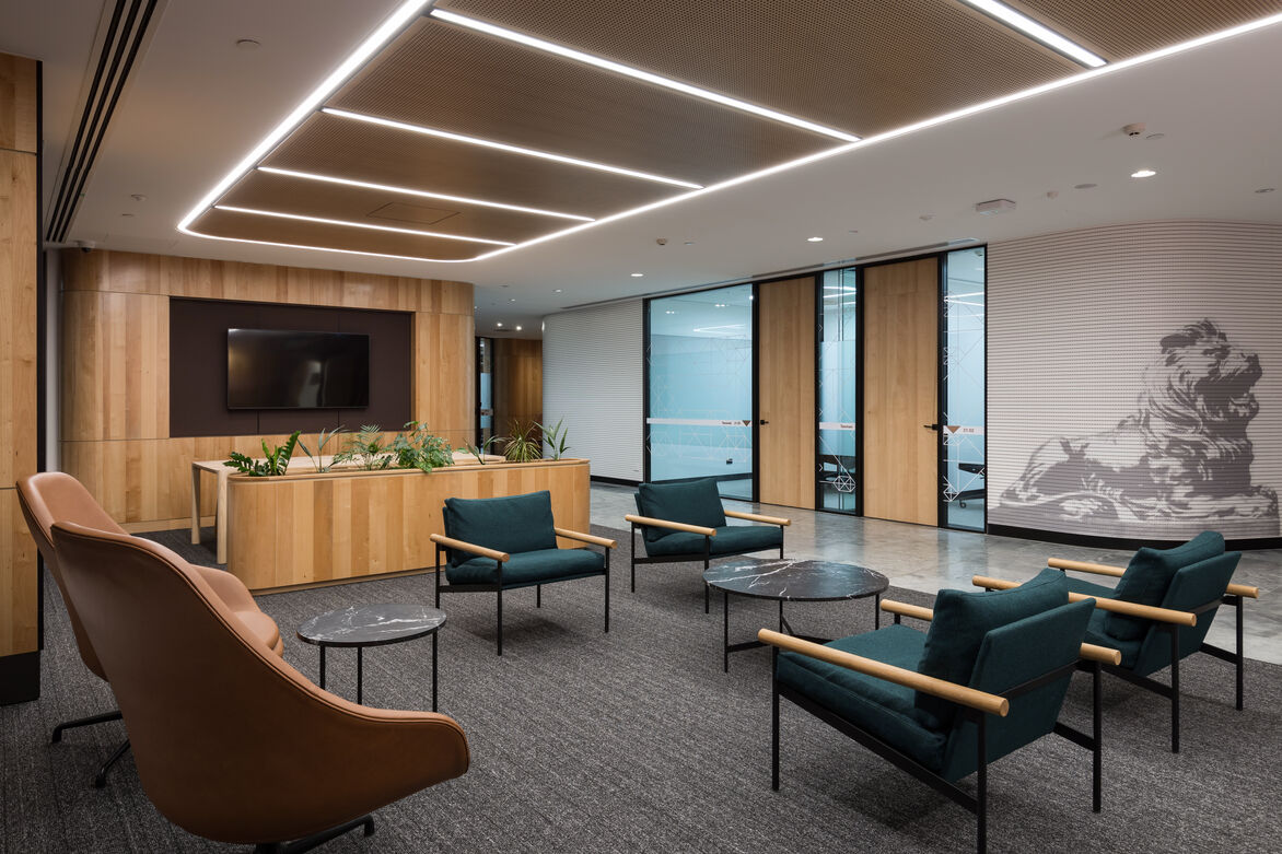
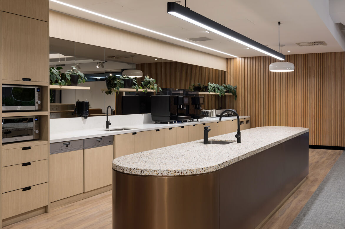
Within the interior architecture there is a sense of dialogue between the refined materiality and connection to the local area embodying the concept of the significance of place. Leather and marble combine with Indigenous reclaimed timbers, lava stone and a colour palette that talks to a combination of the companies global ethos as well as acknowledgment of the local culture. The prevailing mood of the space is simultaneously light and warm.
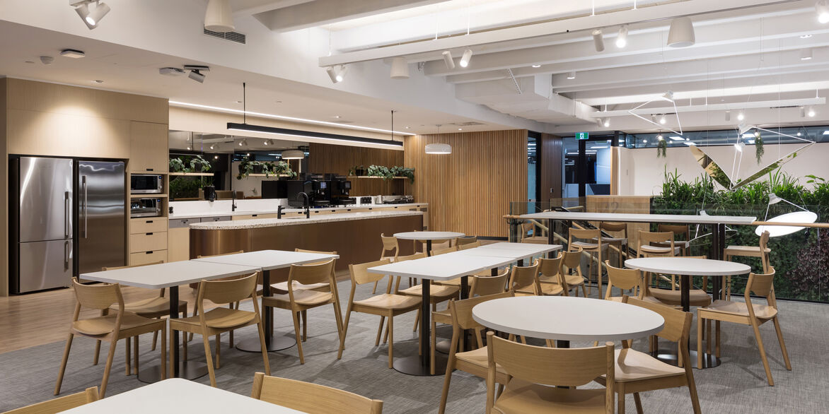
The furniture selection was also an area that allowed for local expression. Locally designed and constructed furniture was sought out and specified by the architects, accompanied by classic pieces and global directed work zones.
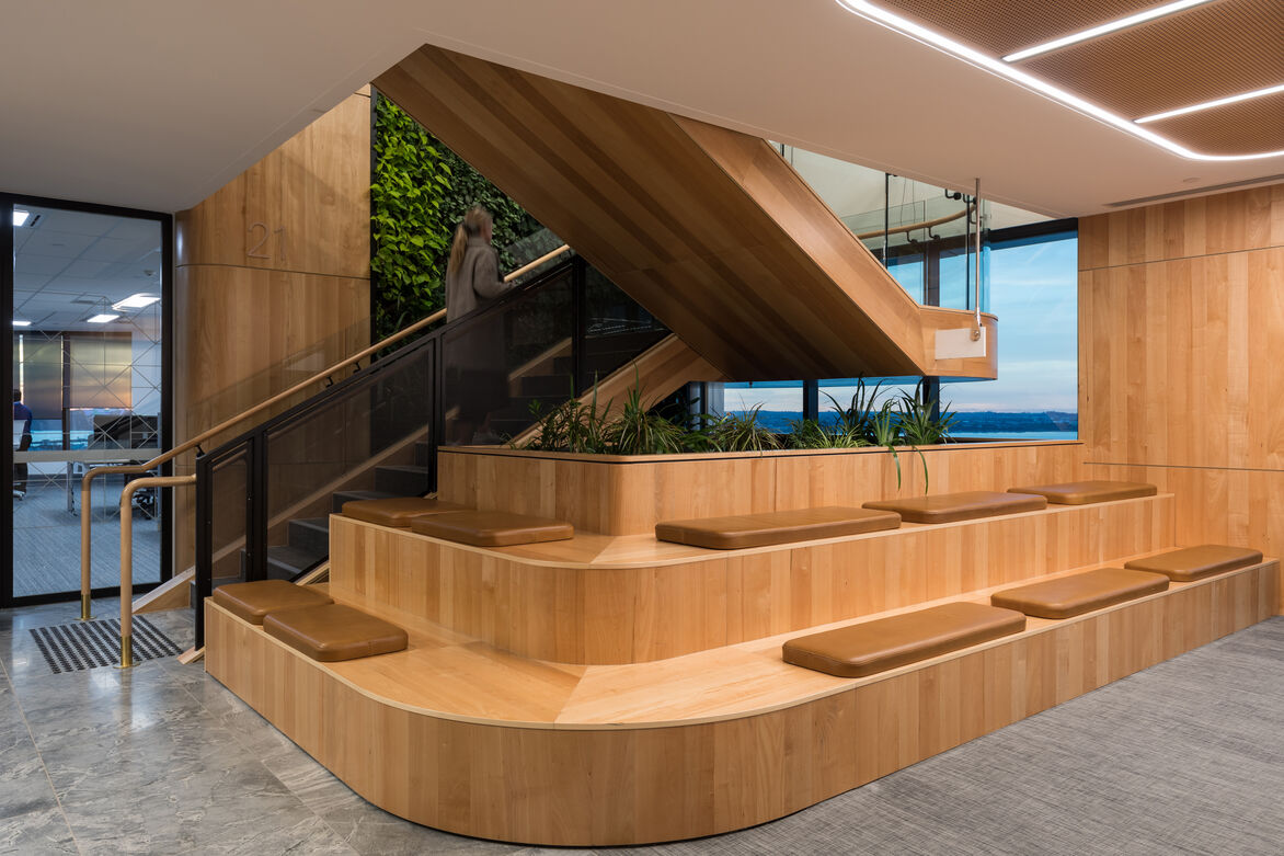
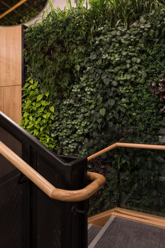
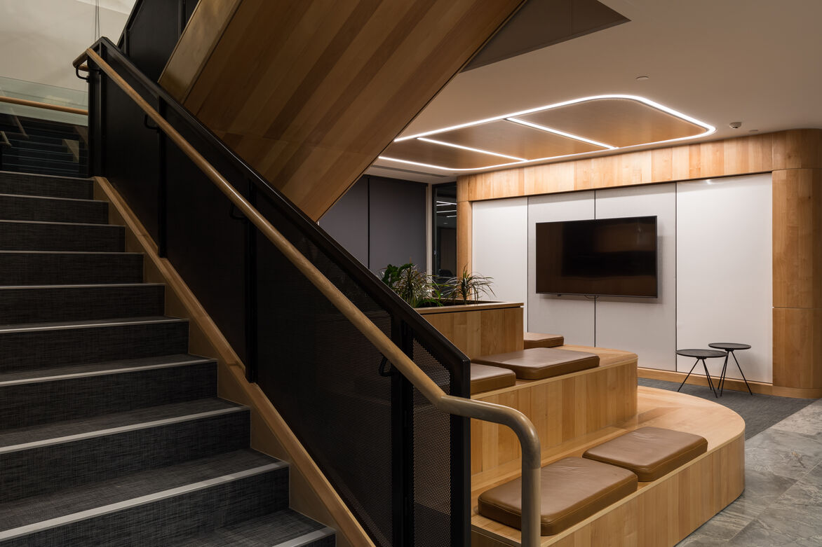
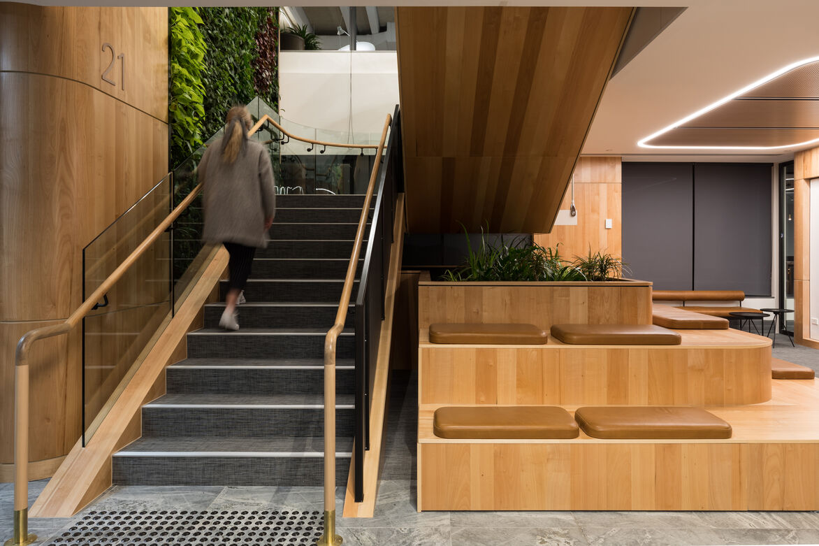
Views can be enjoyed throughout the space, but the hero view is of the harbour to the north. It was decided early on to design to celebrate this view, for not only the front of house visitors, but also the staff hub space on the upper floor. An open access stair and green wall links the two spaces with a generous void opening up views and enhancing the visual connection.
Collaboration spaces are clustered around the stair to activate the connection between floors and encourage bump meetings and cross team pollination.
Clever devices in the reception area are utilised to minimise the obstructions of views. A side-on reception desk and solid opaque elements kept perpendicular to the view and glazing connecting to façade. The entry experience makes the most of the location.
A client zone, with views out to the islands, features a dedicated prep kitchen and a furniture store, allowing for flexible meeting zones to open up for functions. Client drop in zones and discrete waiting areas give a premium experience.
As with the floor below, the breakout hub is designed to maximise natural light and views with the staff area getting the best location of the fitout. Work areas and common spaces also have built zones kept away from the façade wherever possible to maximise light and views.
In addition to the office, a retail branch was integrated with customer access direct from the lift lobby. Careful consideration ensured the retail space was read cohesively with the fitout, whilst at the same time having distinct zones for security and clear boundaries between the spaces for commercial and retail clients.
Davenport Campbells design has given this global business a premium head office for New Zealand that is recognisable within the global portfolio, while at the same time is unquestionably at home in its Auckland context.