Spatial
Leith Macfarlane 3 UP
-
School
University of Auckland
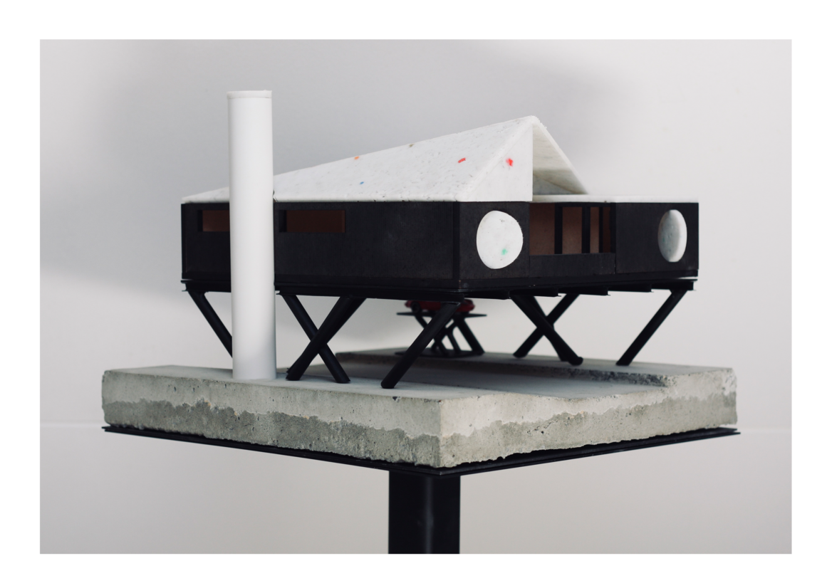
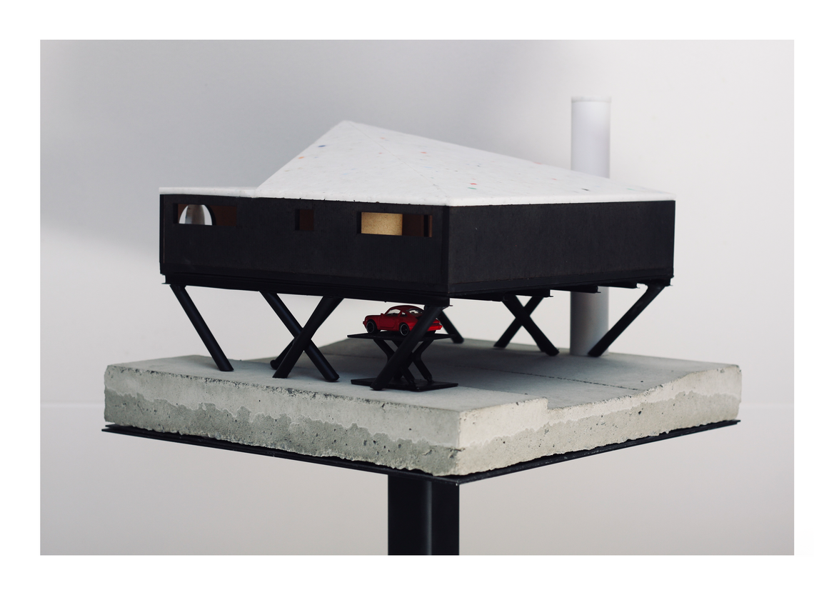
Description:
UP is a beautiful and helpful home designed for Sam, a wheelchair user who leads an independent life and has a deep love of wheelchair basketball.
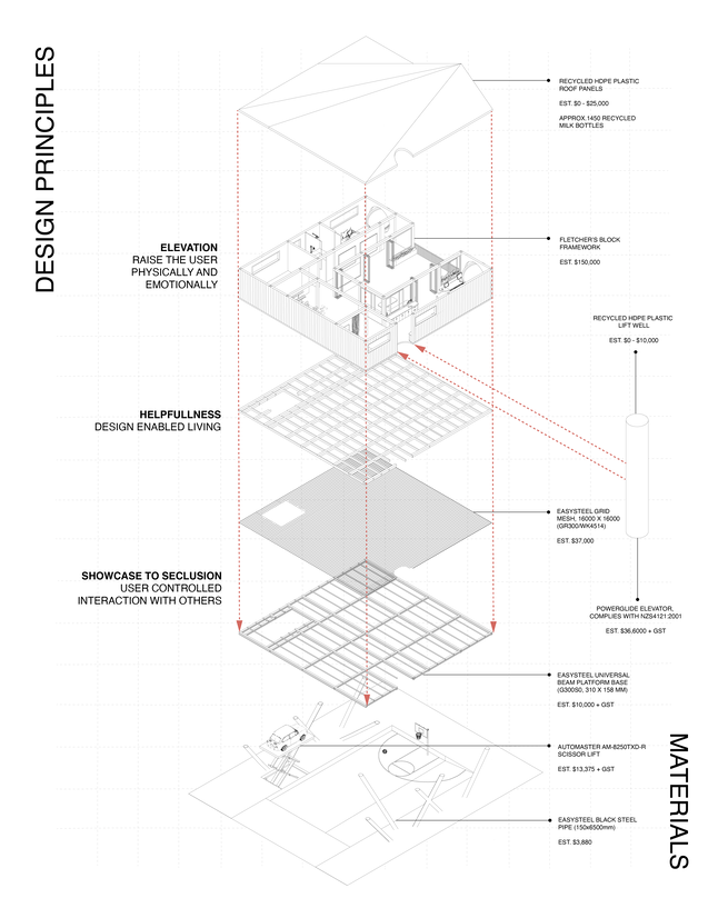
Design principles underpinning UP include ELEVATION, HELPFULNESS and SHOWCASE TO SECLUSION.
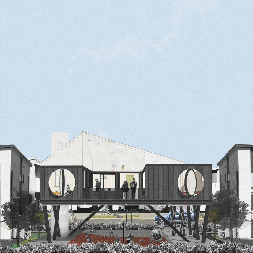
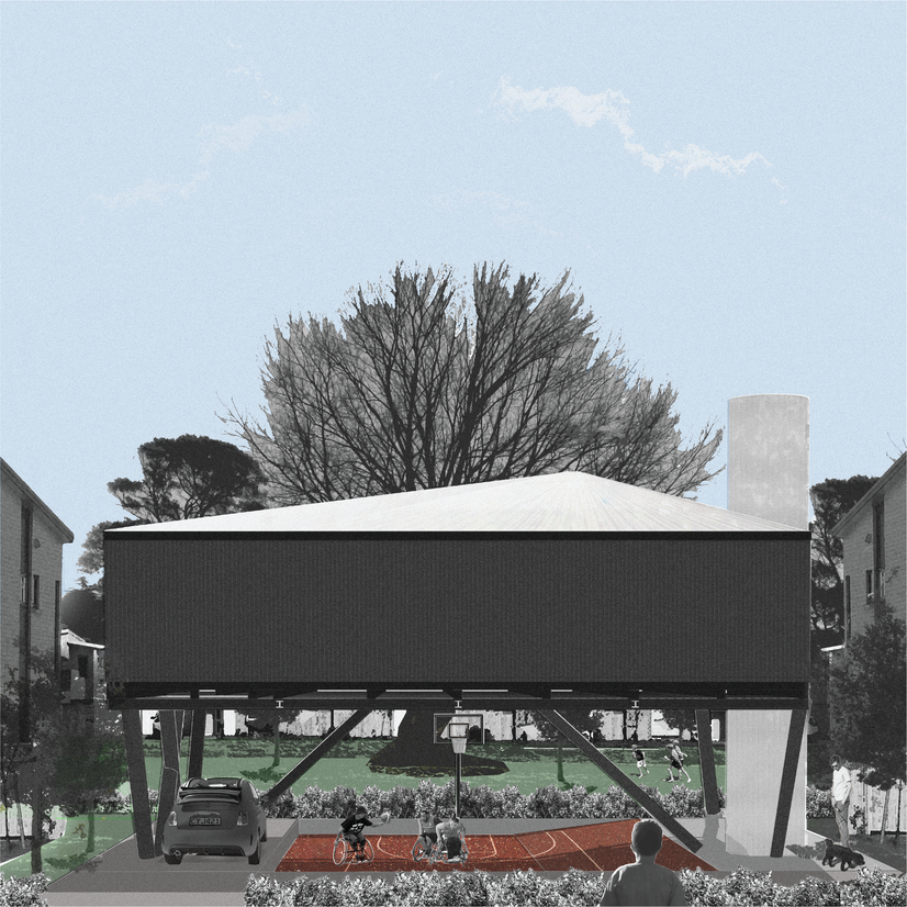
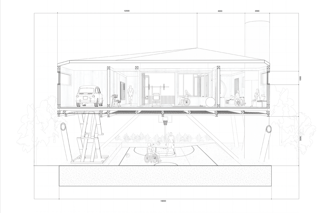
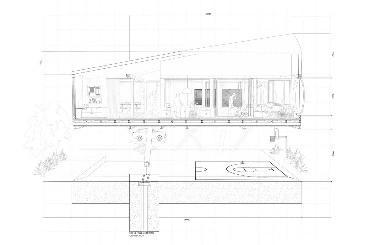
ELEVATION - Imagine life in a wheelchair where you view the world four feet off the ground. It was key to elevate Sam both physically and emotionally and create a challenge free safe haven without looking like the home was designed for a wheelchair user. I wanted to elevate Sam so he felt 20 feet tall – lifted above the world. Lifting the house off the ground gave me an opportunity to place a basketball court underneath, giving Sam the opportunity to interact with his local community on his own terms - showcasing what wheelchair users can do, educating others by shooting hoops with his neighbours and creating a positive and accessible image around those with less able bodies.
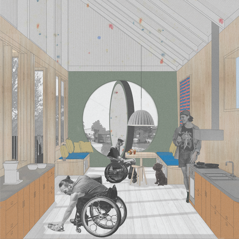
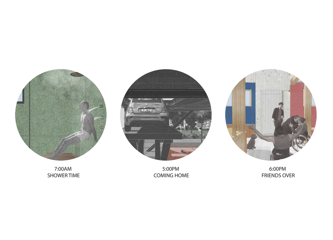
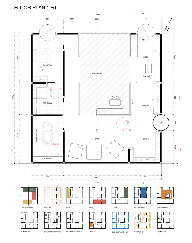
HELPFULNESS - My design created a challenge free safe haven for Sam; the only space in the world that catered entirely to his needs. The repurposed hydraulic lift allows Sam to drive directly into the house, making access a breeze. The layout has a heavy focus on circulation with wide corridors; windows and surfaces are at a lower level allowing Sam to see throughout the house and outside; and almost all furniture is built in, ensuring transferring from a wheelchair is easy and safe.
SHOWCASE TO SECLUSION - I was conscious that being in a wheelchair often draws unwanted attention and I wanted Sam to have control over how he interacted with his neighbourhood and have privacy when he wanted it. The basketball court underneath the house gives Sam an additional space to do what he loves without any challenges, but more importantly, it’s a way for him to interact with the local community. The rest of the house remains private from the road and Sam has the ability to block out the outside world.
To gain a deep understanding of how wheelchair users experience the built environment, I researched extensively and interviewed a wheelchair user. I found that wheelchair users constantly have to adapt to the outside world as opposed to the built environment making their life easier; that their expectations of the built environment were so low they weren’t aware or concerned with constantly having to adapt; that inaccessible buildings added unnecessary time and anxiety to outings; and that aesthetics were often overlooked when designing something accessible.
The roof is made of recycled milk bottle tiles I produced after much experimentation with steel molds, pressure and heating methods. The framework of the house adopts a modular system designed with a group of peers as the other part of our design paper. This modular system was intended to generate a new interpretation of suburban development and create a diverse and eclectic group of houses, both accessible and desirable to a wide variety of people.
Judge's comments:
This delightful project shows both design and technical skills but above all else understanding and empathy for the client. The brief and design drivers are original and well conceived and result in a playful, unique and considered architectural response for Sam. A highly commendable project for a year 2 student.
A delightful and technically resolved project considers design principles for a wheelchair user. The result elevates the occupant ‘Sam’ above the world both physically and emotionally in his everyday life creating joy, privacy and the connection with community.