Spatial
Jasmax 85 Alt Group 159 Stolen Girlfriends Club Wellington Flagship Store
-
Pou Auaha / Creative Directors
Jun Tsujimoto, Anna Hill, Dean Murray, Dean Poole, Emma Jepson
-
Client
Stolen Girlfriends Club
Description:
With an art-meets-rock and roll design, Stolen Girlfriends Club’s (SGC) Wellington flagship store delivers a one-of-a-kind retail experience in Aotearoa.
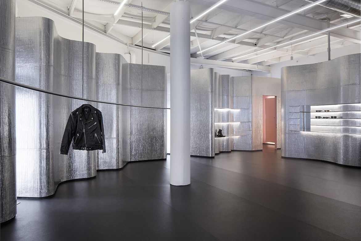
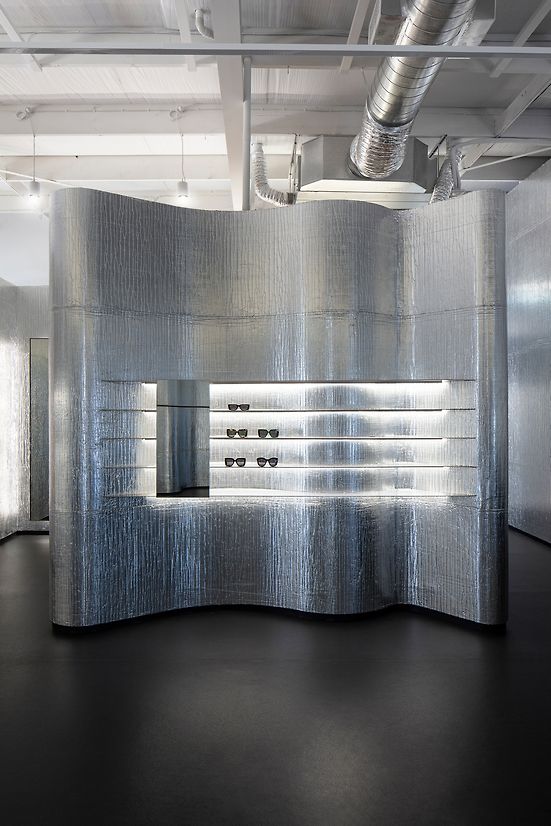
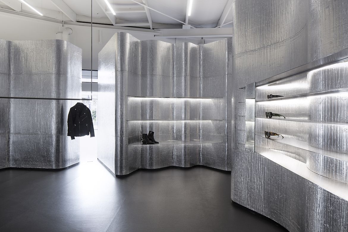
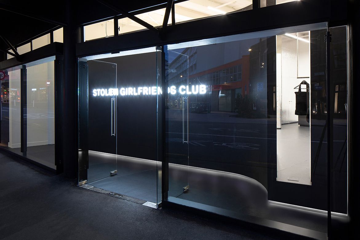
The brief was to develop a concept that captured the fashion label’s independent spirit and energy in built form. The resulting space challenges the conventions of retail design with an ‘anti-retail’ stance and redefines the concept of luxury with a design inspired by contemporary art. The store appears as though an inverted disco ball, pumping with light in the centre to draw in customers while resembling a blacked-out club from the exterior.
The design took inspiration from SGC’s performative collection release parties, which offer an element of surprise and a tactical build-up of anticipation. The considered floor layout, unique details and moments of surprise amplify visitor anticipation while slowing down the acts of shopping, viewing and fitting to provide a visceral and social experience.
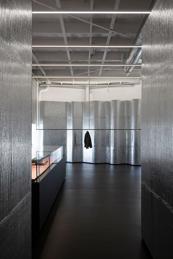
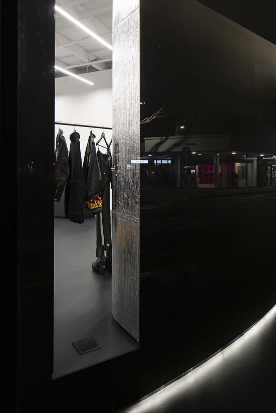
SGC’s provocative ‘anti-retail’ concept runs counter to what is typically expected regarding relying on prominent product displays to deliver retail attraction. Situated on the well-known fashion corner of Victoria and Bond Streets in central Wellington, the SGC store is hiding in plain sight, maintaining a sense of mystique. The prominent site and existing architecture provide a fishbowl setting, with full-height glazing curving around the street edge. Slot apertures, cut into a 20m-long, 1m-deep, blackened wall set behind the glass, provide minimal glimpses into the store’s interior, making seasonal store renewal and replenishment a curatorial act. Access into the store is purposefully slowed as visitors traverse a 20-metre-long, dark corridor to enter the dramatic, amorphous silver-lined space, producing a static visual stage that heightens the presence of the products on display.
The design counters site challenges with creative solutions that culminate in an innovative customer experience expressing the SGC brand DNA. The narrow space between the street façade and the screen wall behind was conceived as a temporary gallery to showcase artworks, amping up the drama and generating interest for passers-by.
The existing structure was divided into two-floor levels separated by 350mm and accessed via a concrete ramp. To minimise demolition waste, the existing ramp was retained, with the lower floor level raised to create a seamless and flexible baseline for the fitout. The ramp inspired the extended corridor entry experience, further delaying the reveal of the store interior.
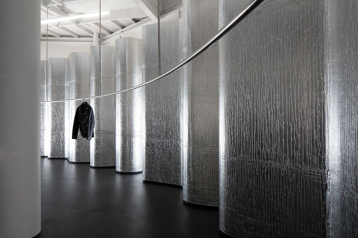
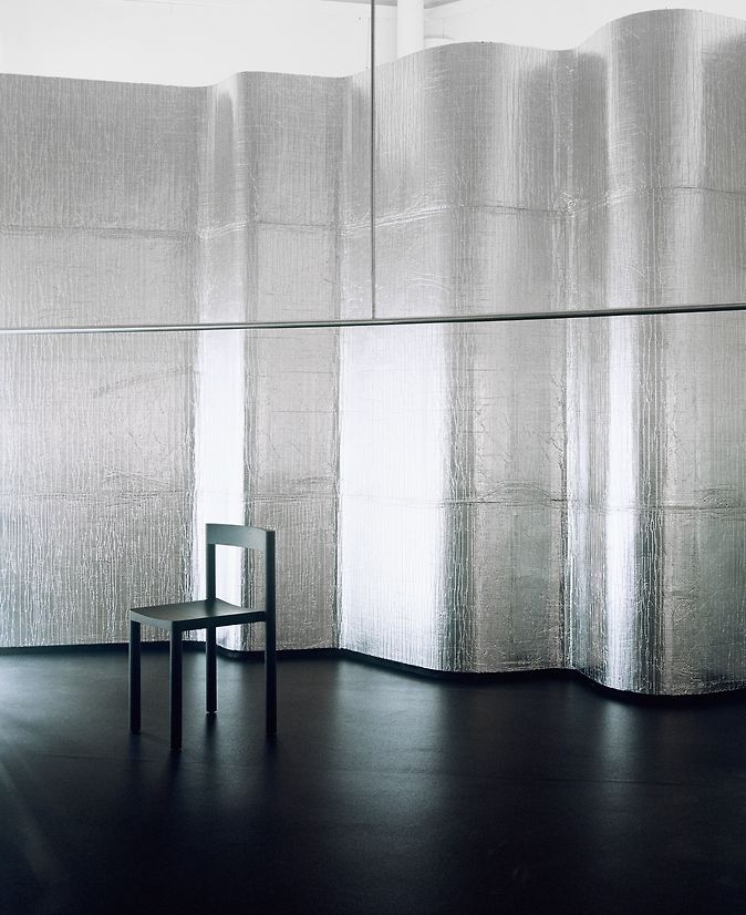
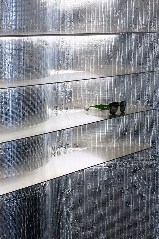
SGC’s products demonstrate innovation in material expression and performance, which needed to be reflected in the retail concept. Silverfoil-coated insulation foam was re-purposed as lining material on the rippling internal walls, creating a unique texture and subtle mirroring effect. This industrial product, rarely applied as an interior lining, captures the spirit of SGC’s rebellious and creative identity.
The foil’s pink foam backing inspired the paint shade selected for the fitting rooms, providing a visceral counterpoint to the black and silver finishes which dominate the interior. The bespoke display design features knife-like stainless-steel shelves that slice into the curving walls, while a sinuous ceiling-mounted garment rail arcs through the space, transforming garments into artworks.
Judge's comments:
This flagship store artfully challenges retail norms with an "anti-retail" concept, fusing contemporary art inspiration, unexpected elements, and clever use of recycled materials creating an immersive and visually captivating shopping experience that aligns seamlessly with the brand's rebellious identity.