Spatial
James McNab 2 Nature Baby Newmarket
-
Pou Auaha / Creative Directors
James McNab, Jacob Faull
-
Ringatoi Matua / Design Director
James McNab
-
Kaitautoko / Contributor
Myint San Aung -
Client
Nature Baby
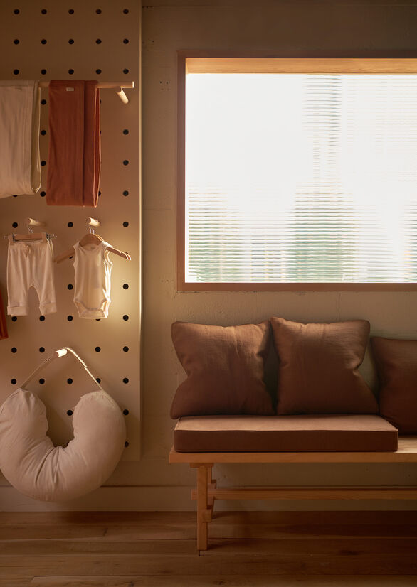
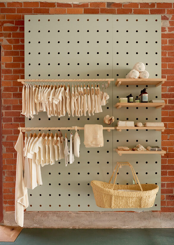
Description:
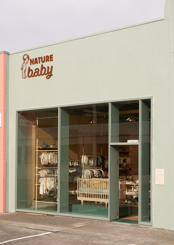
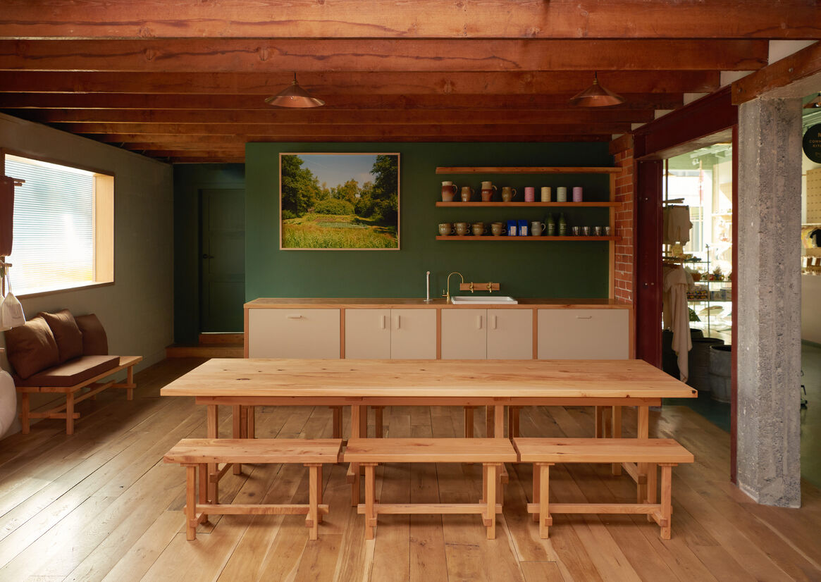
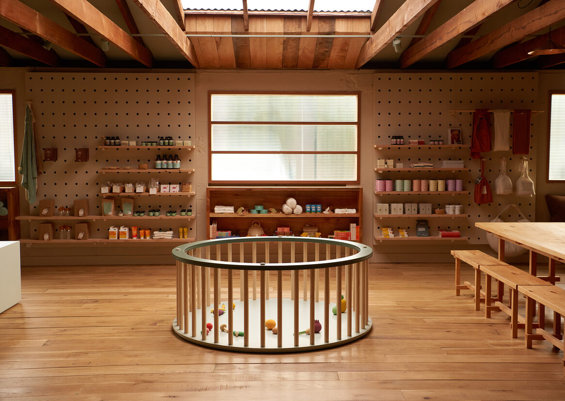
Off the beaten track in Newmarket, Tāmaki Makaurau, lies a satellite Nature Baby store dedicated to pure organic essentials with a community focus. A retail store removed from the fast-paced fashion district of the Westfield Shopping Centre and in contrast a store that gives back 1/3 of its footprint to the wider community events.
Originally a sports warehouse and retail store with cricket players and sporting figures on the walls, the project started as an initial scoping exercise to define whether the original cavernous warehouse could be tamed and turned into a warm and comforting retail store.
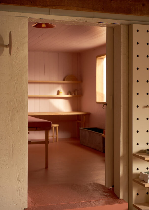
The tenancy was initially broken into two main spaces: a customer-facing retail side with high corrugated industrial ceilings and rough concrete floors, adjacent to a secluded back area for stock and restringing of tennis racquets with concrete block walls and exposed trusses. Both spaces had been outlined by the client for customer facing use.
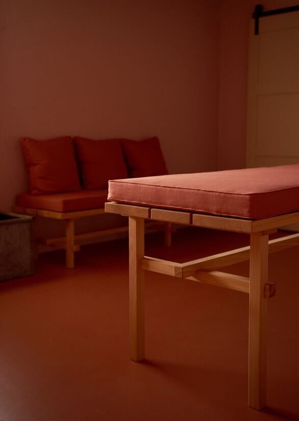
The approach to address the industrial aesthetic was to accept the imperfections of the building and use these natural scars to our advantage. This in turn saw us apply selective, block colour treatments to the mass majority of the shell, while highlighting what we deemed as the architectural features of the space. At a more intimate scale, we leaned into domestic touchpoints to imply a home within a home ideology, one we could control at a customer engagement level.
We accepted the corrugated iron ceilings and exposed trusses in an idyllic kiwi woolshed kind of way and introduced softer accents of wool into the interior. We contrasted exposed brickwork with clean, painted geometric forms to accentuate the chipped edges of the building. We pierced through block walls with solid cedar timber joinery and broad reeded glass and grew swan plants on the windows. We removed the shopfront security galvanised roller door and reinstalled solid timber joinery with the ambitions to let more natural light into the store.
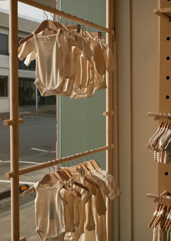
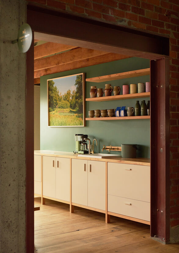
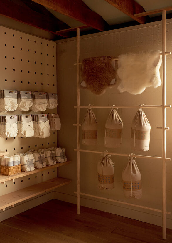
At the customer engagement level, we designed custom furniture, shelving and racking to add the softer touch, using a subdued, earthy colour palette and humble New Zealand timber selections. Pine dowel was used for all racking and could afford to be left without finish, while Macrocarpa was used in all furniture, shelving and kitchen applications finished in natural wood oils. Often combined with clean cut paint lines to add a level of sophistication and pairing with the natural grain.
Terracotta tiles were sourced from clay supplied in Warkworth. Lightshades spun from patinated copper from South Auckland. Band sawn and solid timber supplied from Silverdale.
What resulted was a place for exploration for kids, a place for mothers to meet for coffee groups and a place that has been transformed from a once industrial building.
Judge's comments:
A calming and natural retail interior that offers customers a adaptable and on brand experience
Embracing existing imperfections, this project celebrates warmth and domesticity without compromising the otherwise 'commercial' nature of the environment. Through the clever use of colour and material selections (+ what to remove and retain), the project successfully achieves a fun, youthful and intimate space.