Spatial
Z Architecture Republic Ltd 4 Kennedy's House
-
Pou Auaha / Creative Director
Daniel Zhu
-
Ringatoi Matua / Design Director
Daniel Zhu
-
Kaitautoko / Contributor
Hellaby Builders Ltd -
Client
Troy Kennedy & Amanda Kennedy
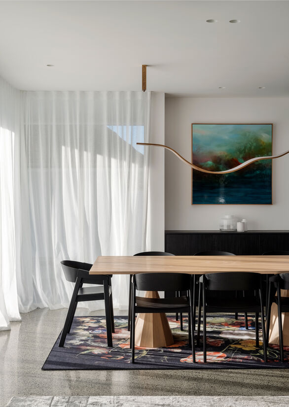
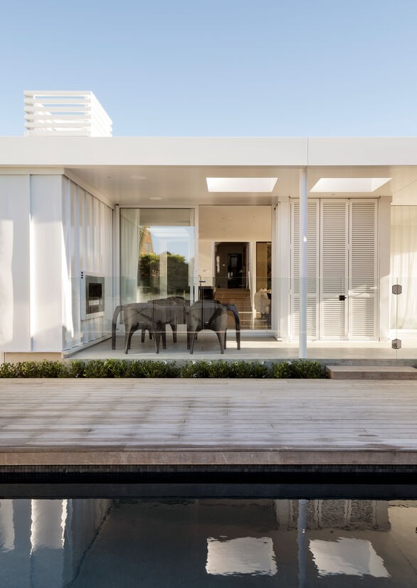
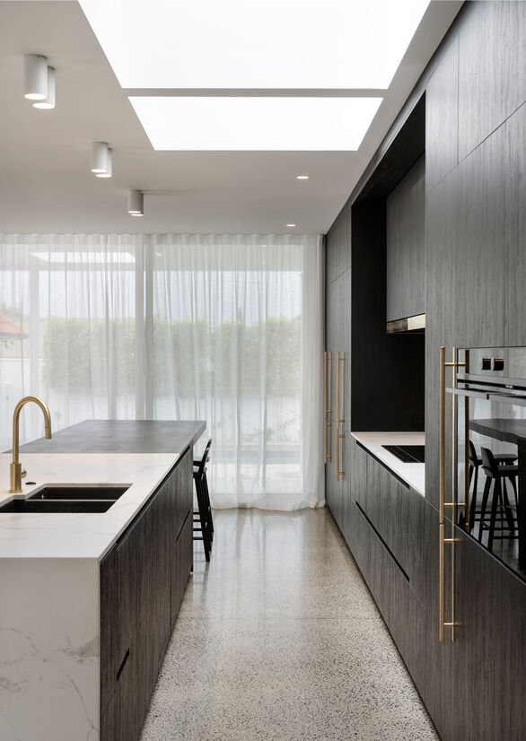
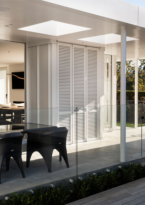
Description:
The brief for this renovation project to the existing 1945's two storey 130 sqm2 stucco house in Greenlane was very simple, extending the house to the back, creating more modern space and bringing in light. The difficulty was to do this in a way that still ensured privacy from the street and neighbours as well as keeping the inside and outside flow.
The design strategy was to alter the existing house as little as possible and use the bulk of the budget on the extension rather than costly rework. The three rooms on the existing part of the house remained, with only minor internal adjustments to create a new bathroom, a new office and an opening to the existing central hallway linking into the modern pavilion. The new additions divide the rear site from the existing house and creates a few surrounding airy green courtyards which bring light into the pavilion.
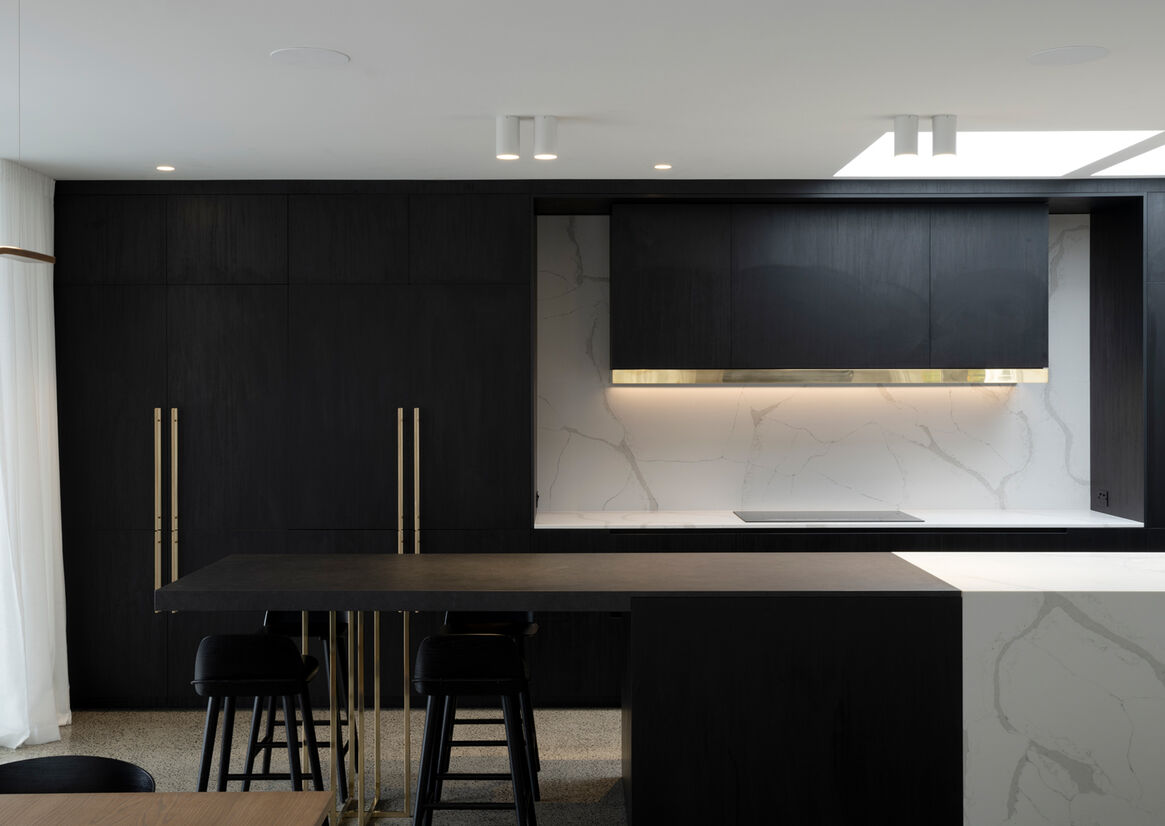
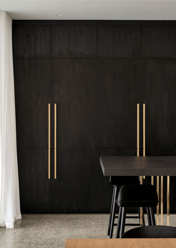
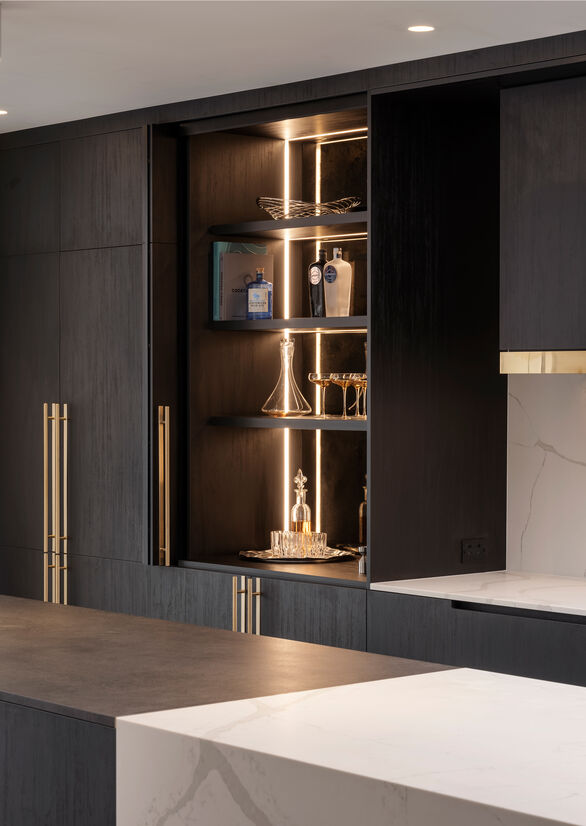
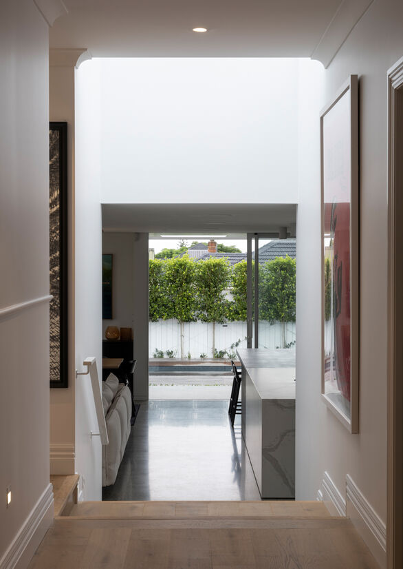
The design for the interior spaces that we were looking to create focussed on spatial contrast along the extension’s length. From the existing house’s timber floor which extended out to the new office and bedroom this then drops a few steps to an exposed concrete slab in the new living, dining and kitchen area. It gives more volume to the space, but also a more contained, intimate feel and engages more with the rear yard.
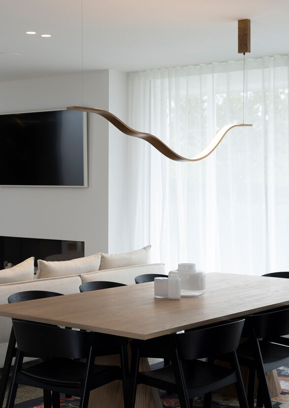
The addition was very small in size, adding only 80m2 of new space however the nature of the design allows for a feeling of greater expanse with the high-stud ceiling and use of natural light and unimpeded flow to the external spaces. The extension is modern, but it plays off the original and new materials, the variance of the building forms and the composition of the elevations, creating a sense of continuity yet contrast between the new and the old.
Judge's comments:
A beautiful synergy between the existing and extension of the home with a clear consistent design throughout