Spatial
StudioStudio Chester Avenue
-
Pou Auaha / Creative Directors
Sebastian Negri, Maria Diaz Valentin
-
Kaitautoko / Contributors
Belinda George Architects, Tim Webber Design, Saintleo, Fieldcraft, Serene Projects, Marton Lee -
Client
Fiona Wilson
Description:
Connecting nature with the places we inhabit in the urban environment is the permanent challenge we faced in this Westmere home. This connection was the driving force that ruled all the decision-making process. As a result, we found ourselves collecting our client memories through materials, furniture and objects, and combining them as an abstract mimesis exercise to bring her beloved outdoors into the interior.
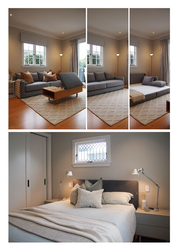
As mother nature evolves, we wanted this place to do it and grow together with its two residents. The canvas was a 1930s bungalow with its new extension: an imposing volume that would contain the kitchen, living and dining areas, and wraps into a small laundry/boot room space. We worked closely with the architect Belinda George to balance the heritage features and the contemporary living behaviours of our client and her 5-year old son.
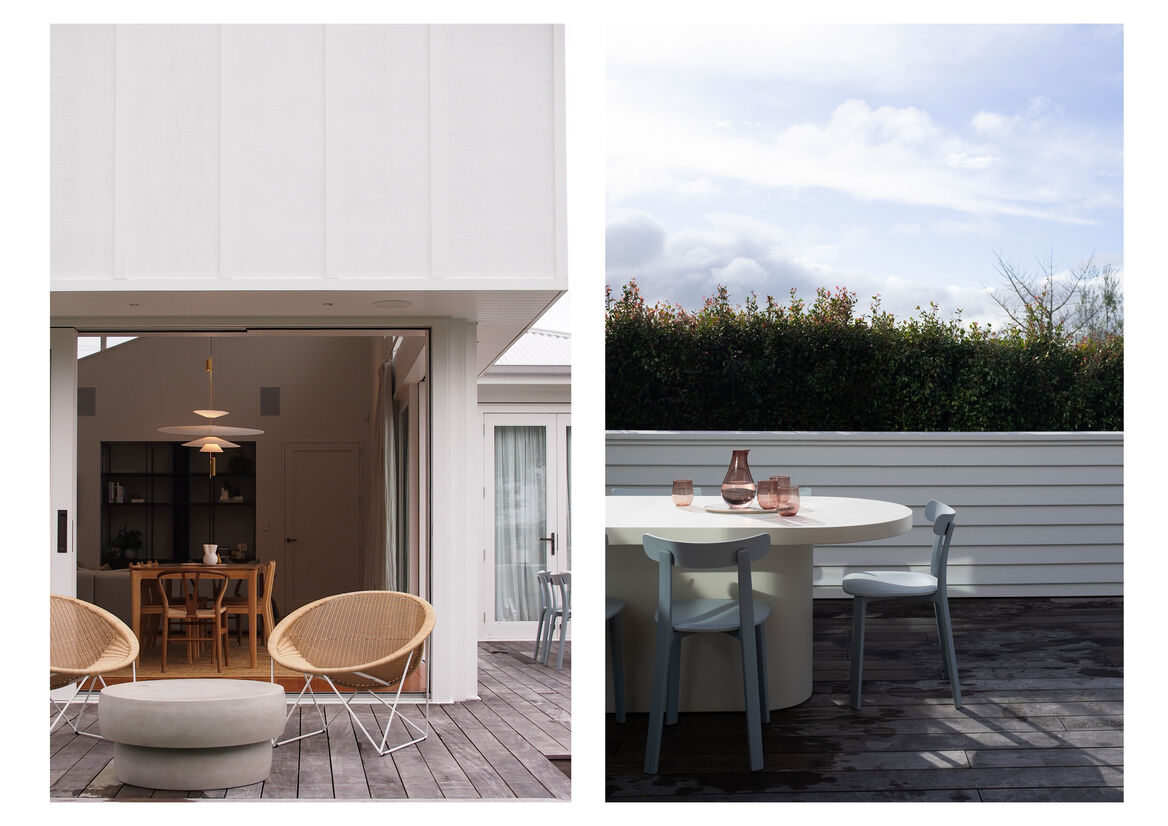
Conceptually and spiritually, we embraced a natural palette to the full extension of the word. Using the half-old and half reclaimed kauri floors as the space connector, we gathered materials and finishes that could age gracefully to attain the ‘timeless’ label, without losing any of the gentle personality of the house.
We opted to pay tribute to both eras in the walls by selecting heritage warm tones for the old side of the house and a crisp white for the sun-bathed extension. The aged brass hardware, skirtings and architraves as the details that played the role of bridging elements.
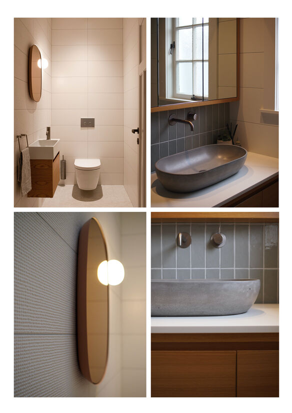
As a general principle within a whole sensorial approach, the horizontal elements are grounded, and the vertical ones are reduced to a minimal expression. These geometry rules permeate all the joinery and furniture decisions. The layering of different textures performs in an equal hierarchy to the structural elements. Heavy linen curtains, woven jute and wool rugs, boucle fabrics, and woollen throws explore the tactile dimension across the rooms. Meanwhile, glazed and wasp-nest textured tiles dressed the bathrooms.
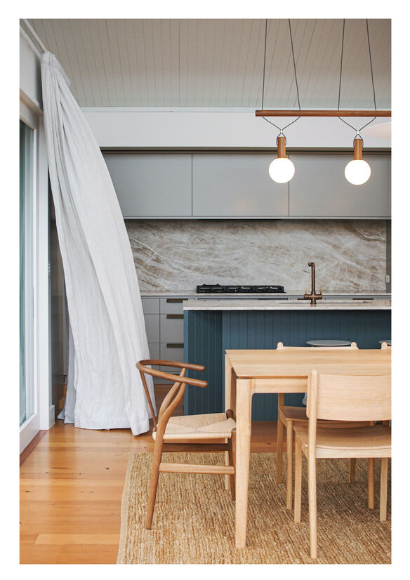
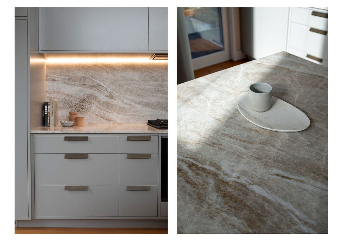
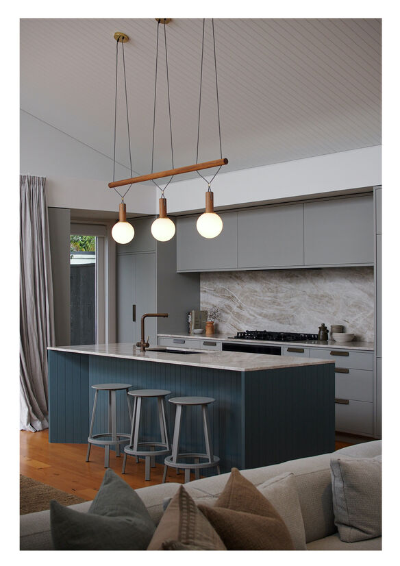
The angular kitchen acts as the backdrop of the open-plan space, anchored by the Ocean Blue kitchen island capped on natural stone, with its clay and soft green veining. We collaborated with Tim Webber to create a Triple version of his Dowel Pendant, suspended like an ethereal trapeze from the ceiling.
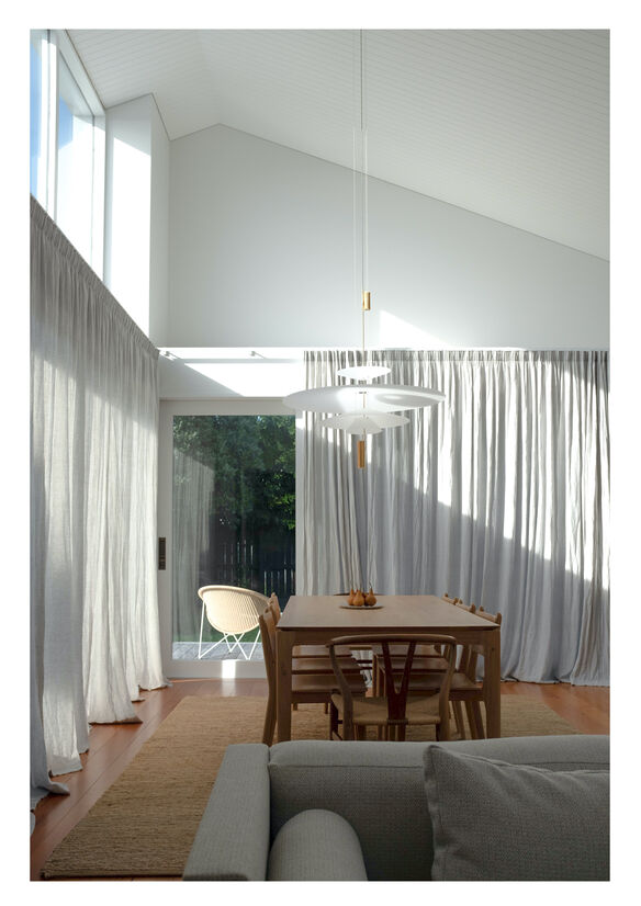
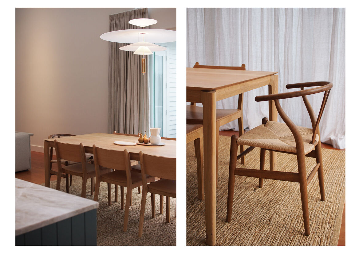
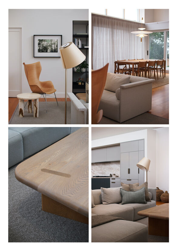
The Dining area builds on the tension growing from the ground with oiled oak table and chairs, opposed to the lenticular pendant that travels throughout the space, accentuating the double-height ceiling.
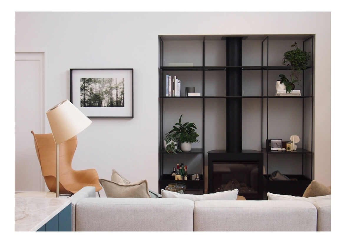
The Living room plays between the grounded contours on the sofa and the bespoke coffee table, against the sinuous roundness of the sculptural armchair. All these pieces create a dialogue with our own designed minimal shelving unit, built around the gas burner.
Even working on a relatively modest budget, we were stubborn enough to keep the privilege of working with several local makers like Saintleo and Fieldcraft. By simplicity in the forms and championing craftsmanship, all have come together to provide a timeless place for a better everyday living.