Spatial
Seear-Budd Ross 8 MB Residence
-
Ringatoi Matua / Design Directors
Thomas Seear-Budd, James Ross
-
Client
Megan and Ben Teusse
Description:
Home to a large, busy family, the interior of this character house was selectively renovated to provide an anchor for family life. With the intention to create a calm and functional yet striking intervention, the renovation brings together a restrained approach and an expression of craft and character that speaks to the original features of the home.
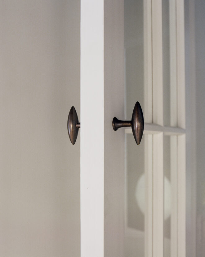
The focus of the renovation was on the kitchen and dining spaces, with adjacent scullery and laundry zones. Links and threshold are important throughout the project, with the insertion of new doors with solid bronze handles between arrival and living zones.
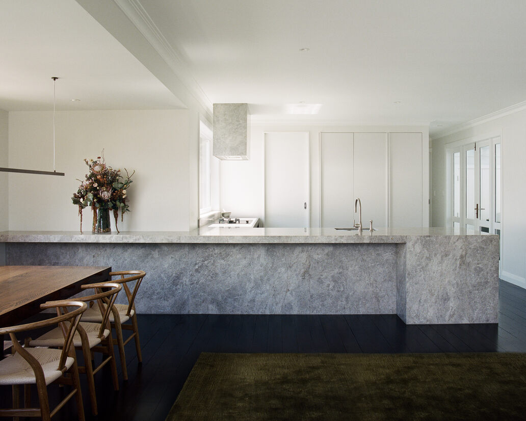
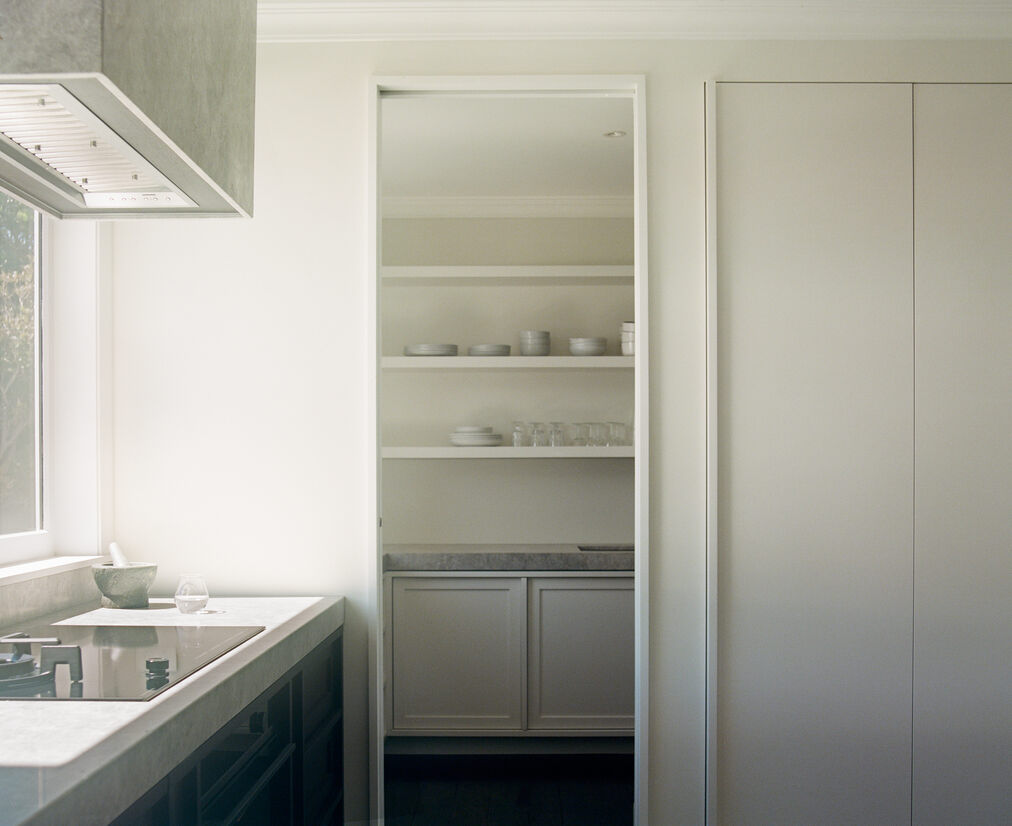
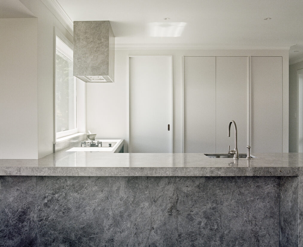
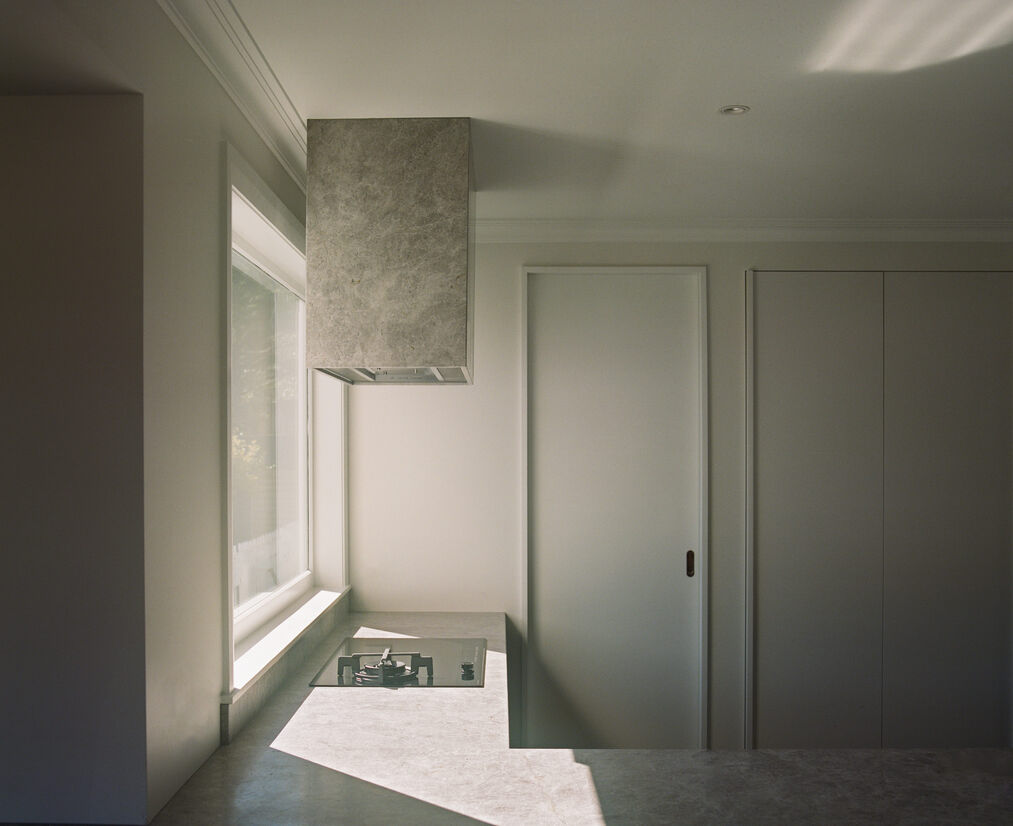
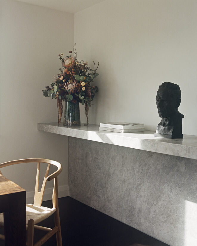
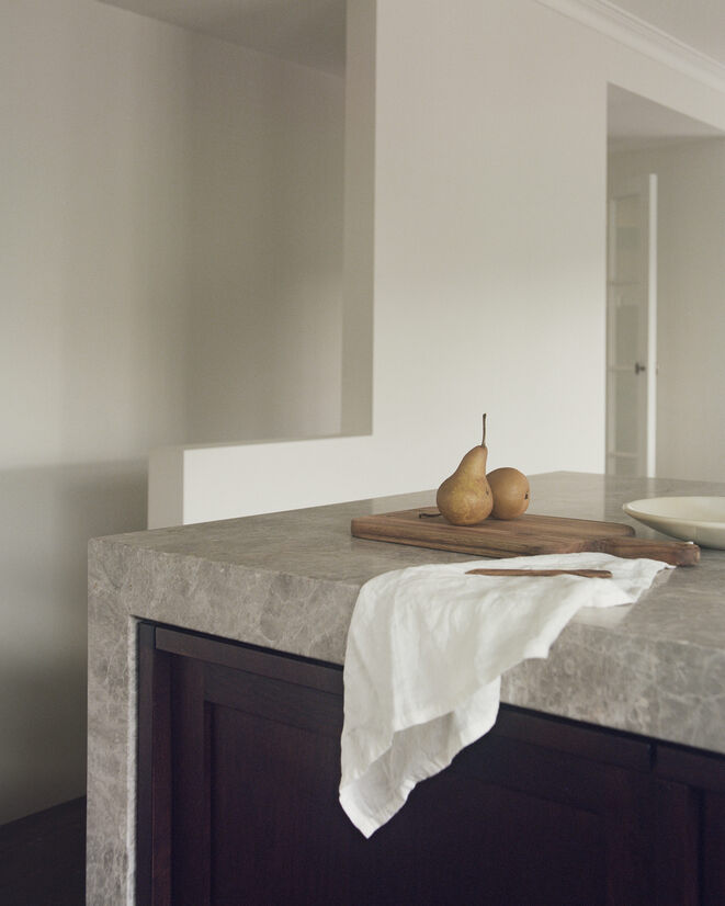
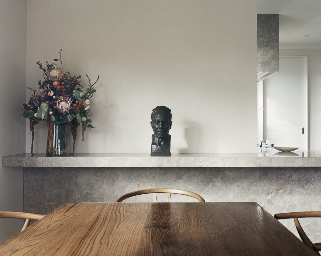
Within the soft white open-plan space of the kitchen and dining area, two solid stone masses are set in a simple arrangement: one rising from the ground and the other hovering from the ceiling. The monolithic stone bench anchors the open plan space, with the long linear mass both drawing the dining space and kitchen together, and setting different tones for the two zones. Counterbalancing the bench, the hovering stone-clad extract transforms a typically utilitarian part of the kitchen into a sculptural object, set in front of a new window through which morning light illuminates the space. Both bench and extract are clad in soft-toned Como Charcoal limestone.
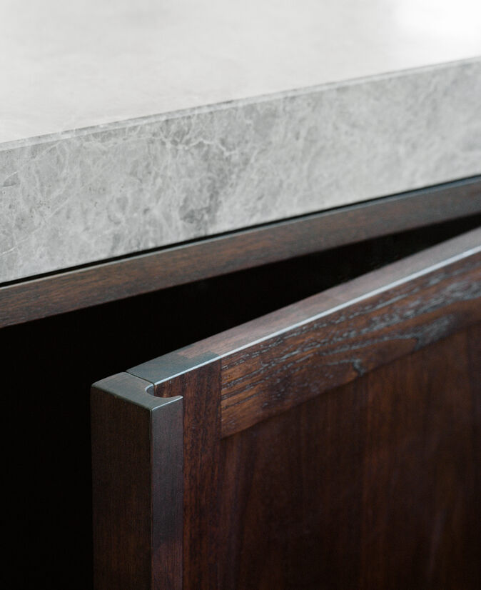
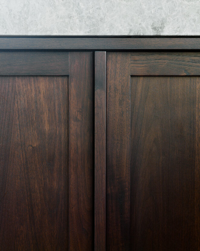
Once in the kitchen, warm walnut cabinetry is revealed. Crafted from walnut veneer set into solid walnut frames and finished with sculpted walnut handles, the cabinetry brings layers of craft, tonal depth and the timelessness of natural wood into the family space. Appliances are integrated to maintain the purity and softness of the visible palette. Tucked behind the kitchen, the simple white-clad scullery space recesses into the walls, becoming nearly invisible. Designed to be a background, the scullery doors are only articulated by subtle white detailing to match the form of the sculptural walnut fronts opposites.
Balancing function and modern living with craft, tradition and beauty, the new kitchen, dining and adjacent spaces provide a place for the family to come together. This project is evidence of the value of considered and precise interventions in existing homes, which can both transform the present and speak to the past.
Judge's comments:
An elegant and unapologetically simple stone element paired with finer cabinetry detailing shifts the home's interior into a contemporary mood.
Monolithic, striking, yet simple, this intervention uplifts and transforms the existing space through use of carefully selected materials, craft and attention to detail.