Spatial
Pac Studio 3 Steven Lloyd Architecture Limited Crinkle Cut House
-
Pou Auaha / Creative Directors
Steven Lloyd, Aaron Paterson
-
Ngā Kaimahi / Team Members
Sarosh Mulla, Liz Tjahjana, Rory Kofoed, Mat Reid, Eric Abba, Fritha Hobbs, Bhavina Patel, Jess Sodo -
Client
Lesley & Philip Lindesay
Description:
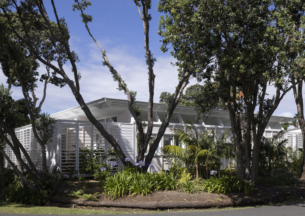
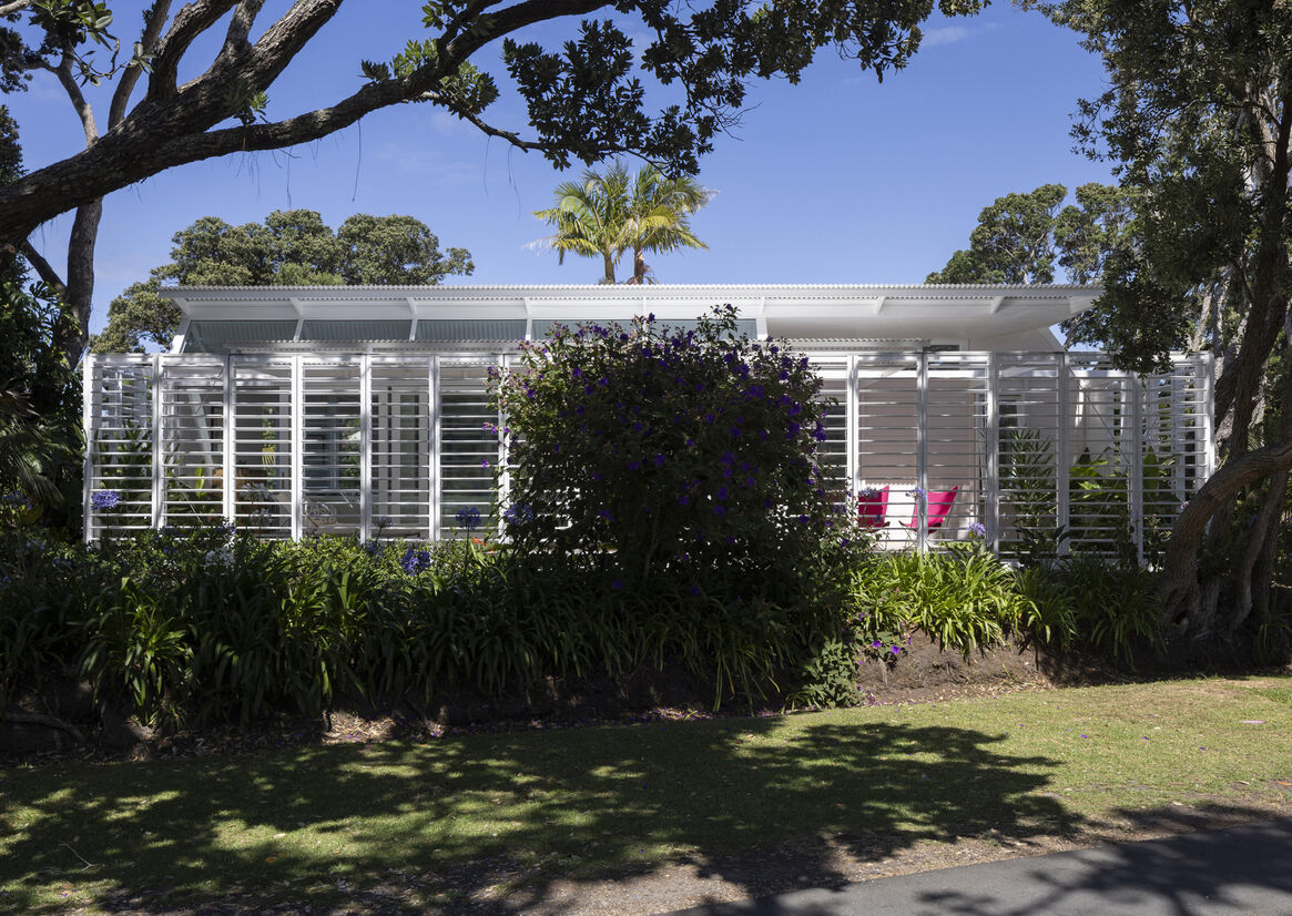
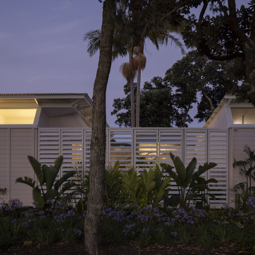
The house is bounded by a row of significant pōhutukawa and palms, and looks out to the tidal estuary of the seaside town. In front of the house is a spot with a jetty; it’s a congregation point for swimmers and locals going for a stroll.
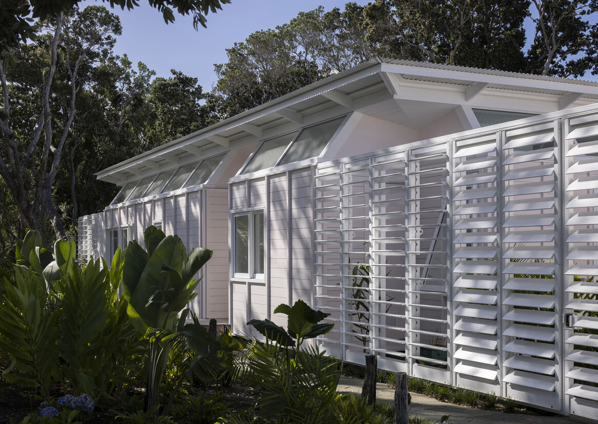
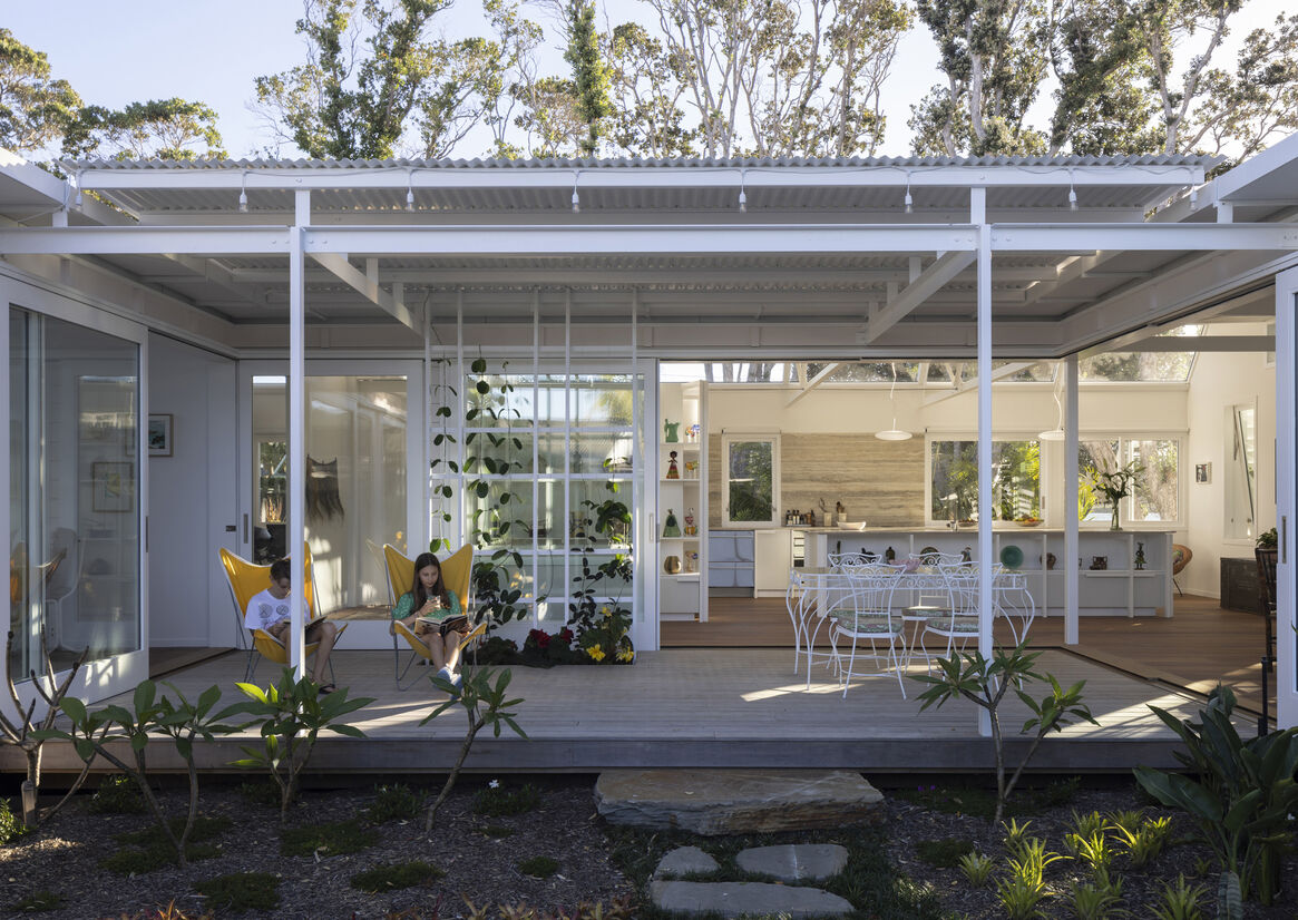
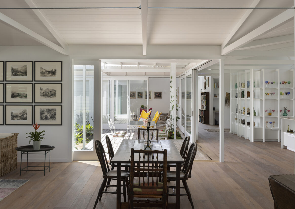
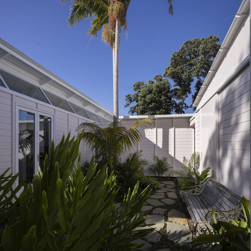
The house embraces its seaside setting with multiple points where the house can open to the promenade. Built to an 'S' plan, the predominant living spaces wrap around a central courtyard, with verandas and breezeways with louvred edges contributing both a garden lightness and the experience of being inside and out, simultaneously.
This house was built around the spectacle of light and shadow. The brief was for a light and sunny home connected to the water and community while allowing privacy – plus, it was to be painted pink.
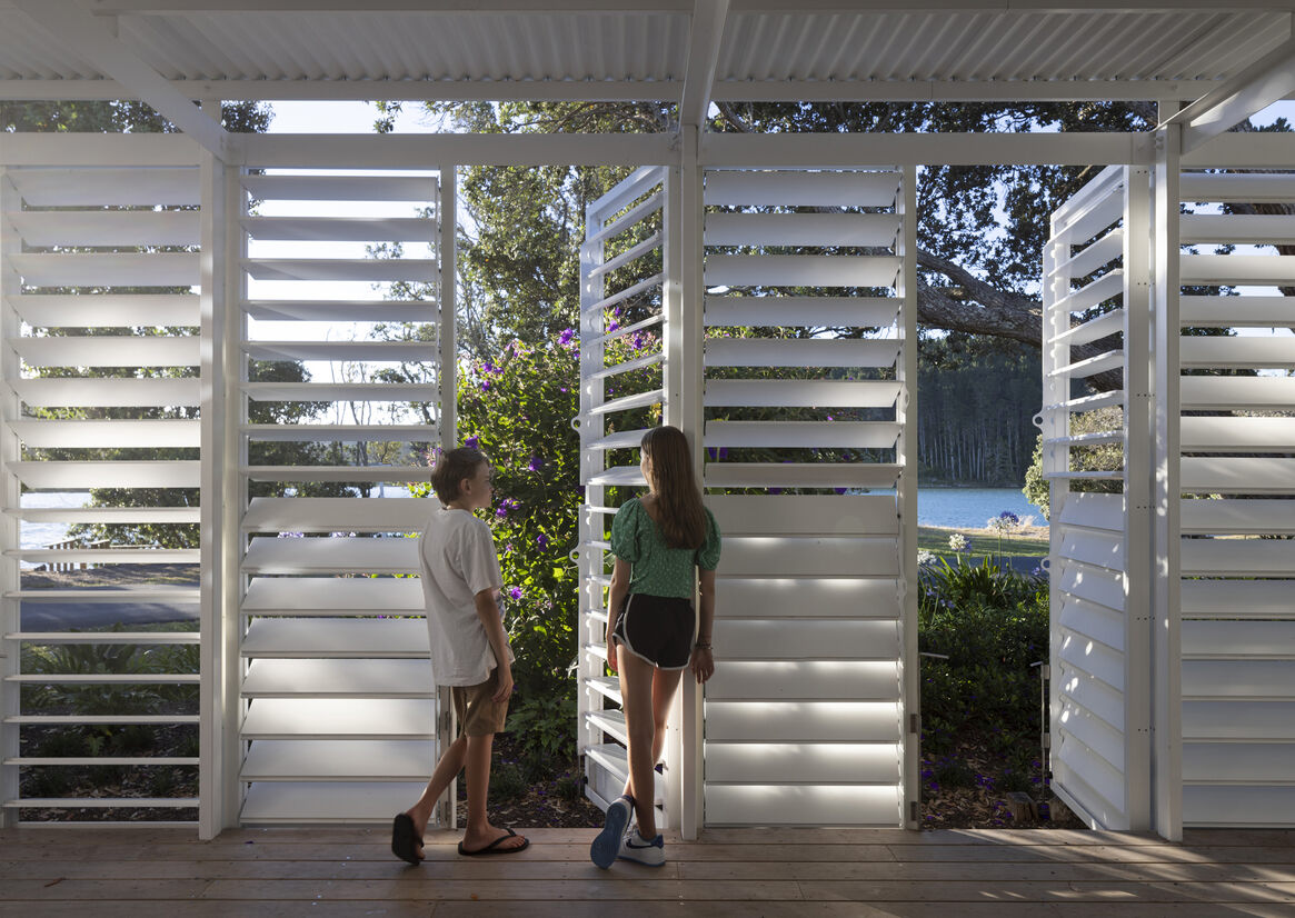
The response was a house designed around courtyards and verandas behind a dynamic facade of louvred doors. You can shut off the street while the interior is open and light. And endlessly modify the rhythm and porosity of the home for privacy and shelter.
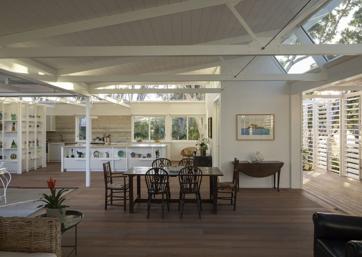
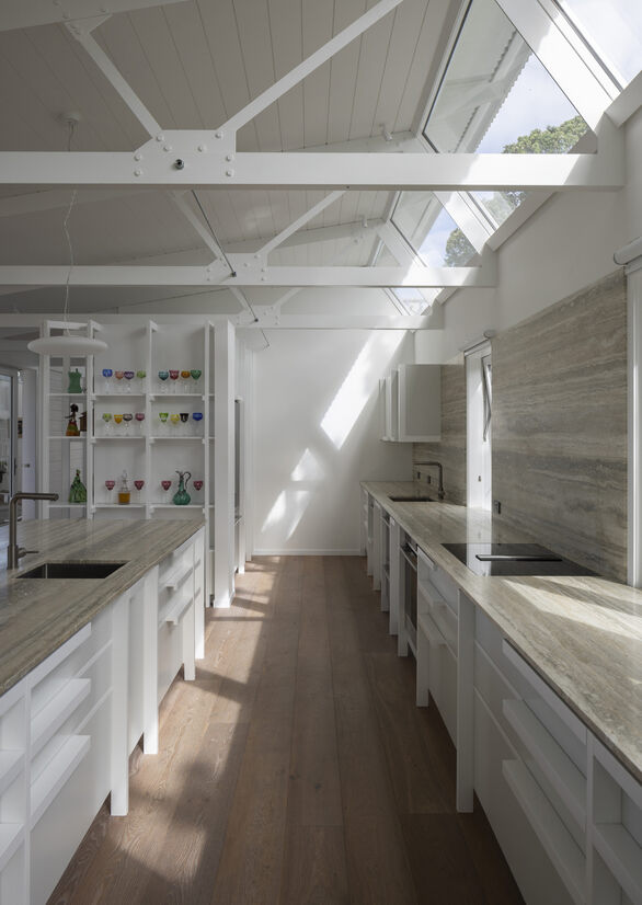
The raked clerestory windows supply a constantly changing atmosphere of light, shadow, and view of the pōhutukawa that surround the corner site. These windows also confer a temporal element – our clients can follow the movement of the sun (and moon, if so desired) throughout the home’s spaces, and enjoy the way light and shadow plays across the interior's carefully crafted structural elements.
The clients are keen on gardening and insisted on building the house around a significant palm that is now the centrepiece of the service courtyard. As many trees as possible were retained in the design of the house. Rather than having manicured lawns, the house essentially ‘bends’ around the gardens. The client has reported back to us that they love the lightness of the house and that it adds to their sense of wellbeing.
The house exemplifies the benefits of a passive design principle, the orientation of sun shading and high-performance thermal materials – how airflow and ventilation can be fine-tuned for a comfortable and sustainable connection with the elements.
Veranda architecture is suited to warmer climates for its passive cooling performance and shutter as a climate modifier. The external wall becomes a kinetic skin with louvre slots and/or shutter openings. Light, heat, ventilation is all in a state of manual adjustment to suit climate, view, and atmosphere. Large covered outdoor rooms also make the house comfortable in the peak of summer.
The timber frame house has a suspended timber floor and exposed steel trusses set out in a rigorous grid. The façade is composed of horizontal weatherboards with a battened grid that sets the windows of the building in elevations that are constantly in the feathered shadow of trees – which is emblematic of our intention to design a house to harness the interplay of light and shadow.