Spatial
Elmore Booth 7 Lightly Weighted
-
Pou Auaha / Creative Directors
Oli Booth, Libby Elmore
-
Client
Oli Booth / Libby Elmore
Description:
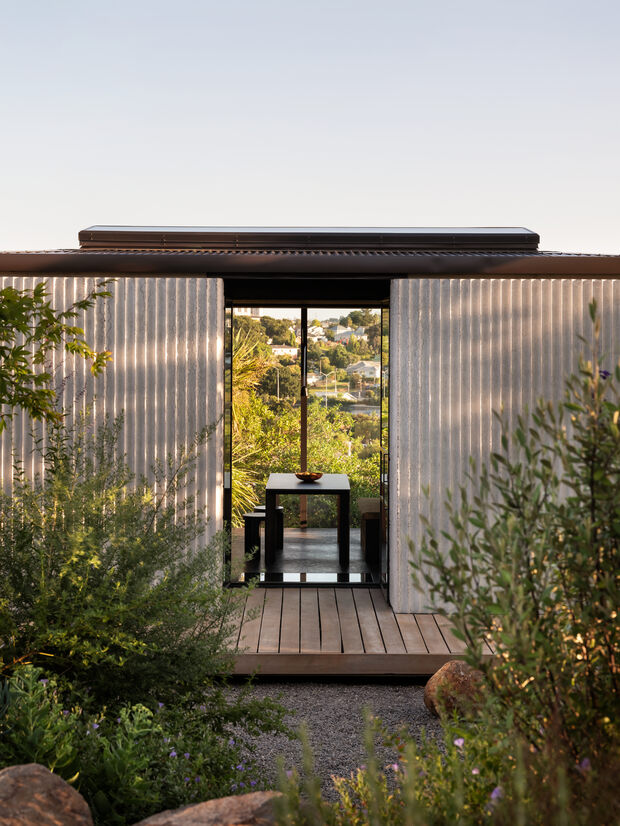
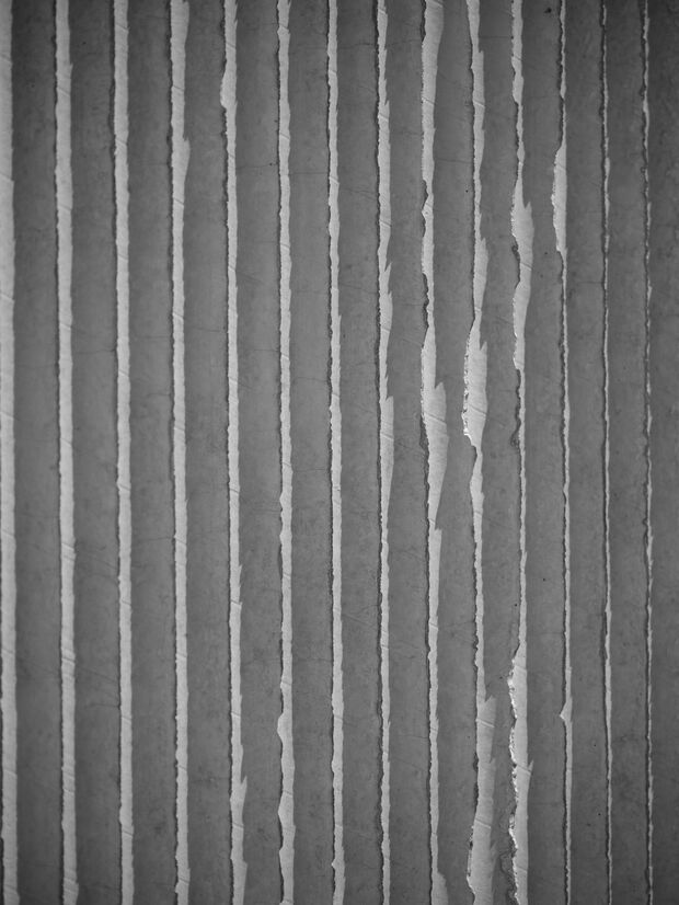
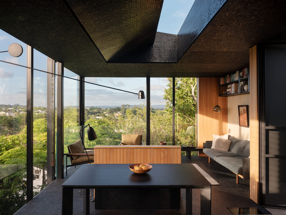
As an interplay between light and shadow, a textural rippling façade creates a robust and protective veil for the slight interior and efficiently planned Lightly Weighted. Ideas of retreat and seclusion, sculpt a highly detailed and concealed refuge. The modest 2 bedroom home feels removed and transportive, despite being embedded amongst residences in an inner Auckland suburb. By creating a protective shell of sorts, the home feels both removed and private, where outward views connect to nature. Lightly Weighted reconsiders an inner-urban home, demonstrating the idea that living amongst others need not compromise on feeling reclusive and calm
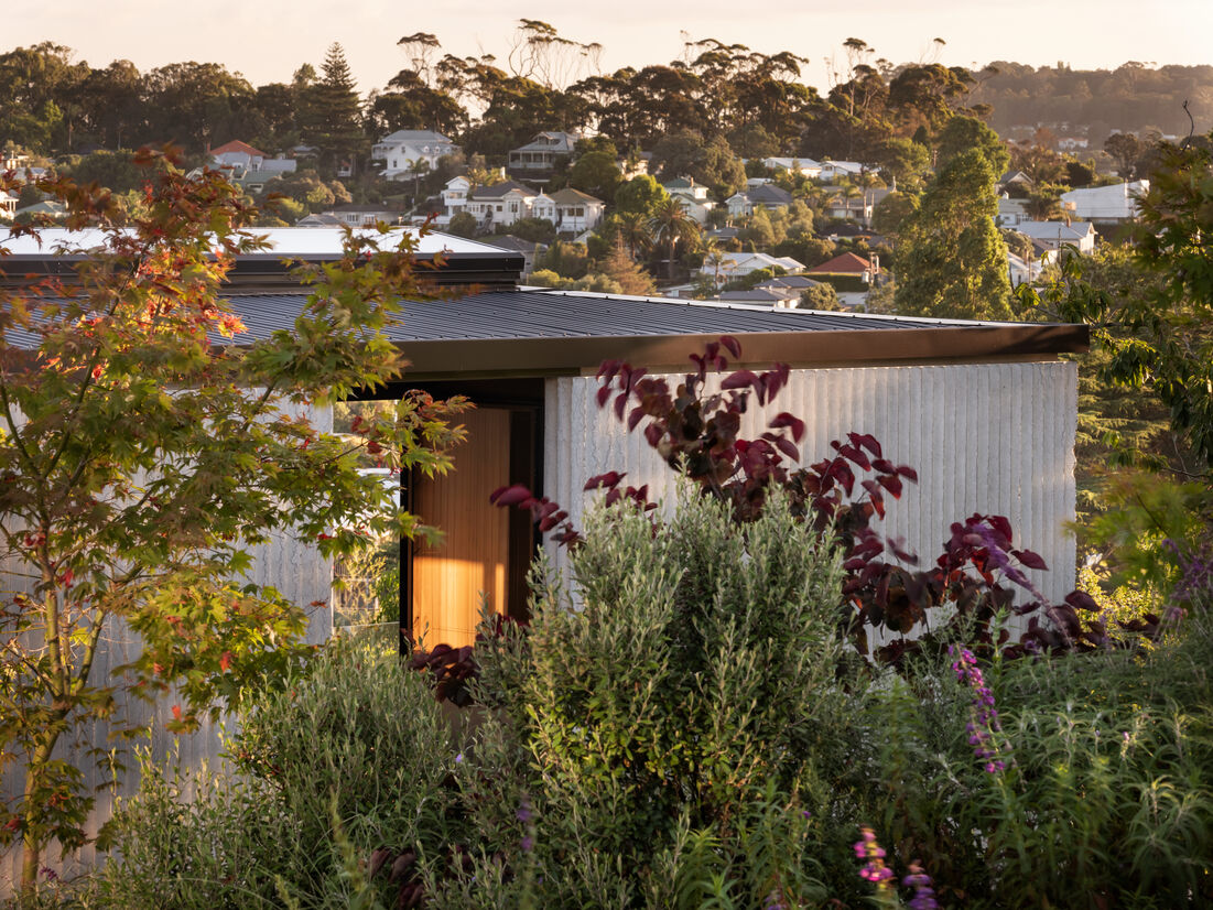
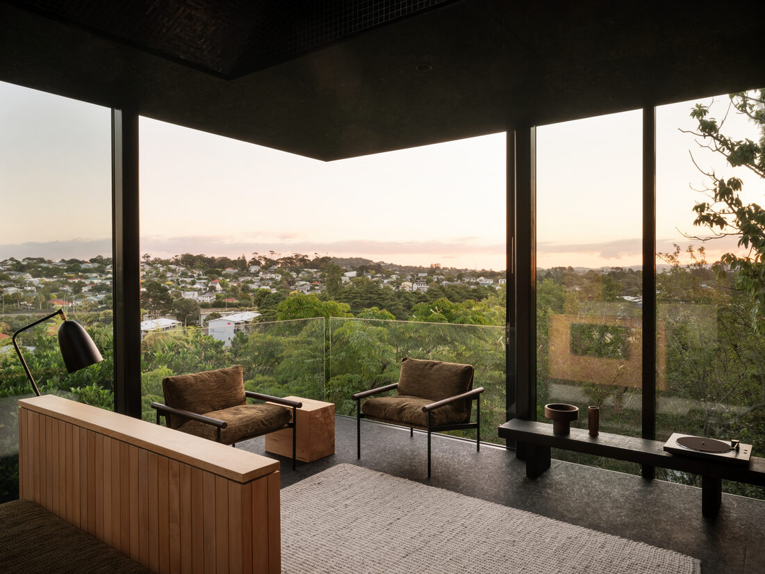
Perched looking out from its elevated position, the modest two bedroom home feels removed and transportive, despite being embedded amongst residences in the Auckland suburb of Grey Lynn. While inner-city living has its multitude of benefits, there exists an undeniably compromising closeness between residences, where feeling separated is not always a given. By creating a protective shell of sorts, Lightly Weighted feels both removed and private, where outward views connect to nature as a priority.
The small 85-square-metre home sits on an equally modest site of 280 square metres. The clever manipulation of the building form to engage with natural light throughout the day, while maintaining privacy, creates interesting moments that feel sculptural. The decision was made early on to keep the footprint small and the quality high to try to emphasise how smaller spaces can feel equally as generous as their larger selves.
Anchoring the home to its site sees the use of fluted concrete formwork to create a sense of permanence. The structure sits pushed up toward the boundary, creating a courtyard garden.
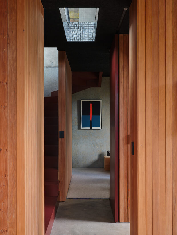
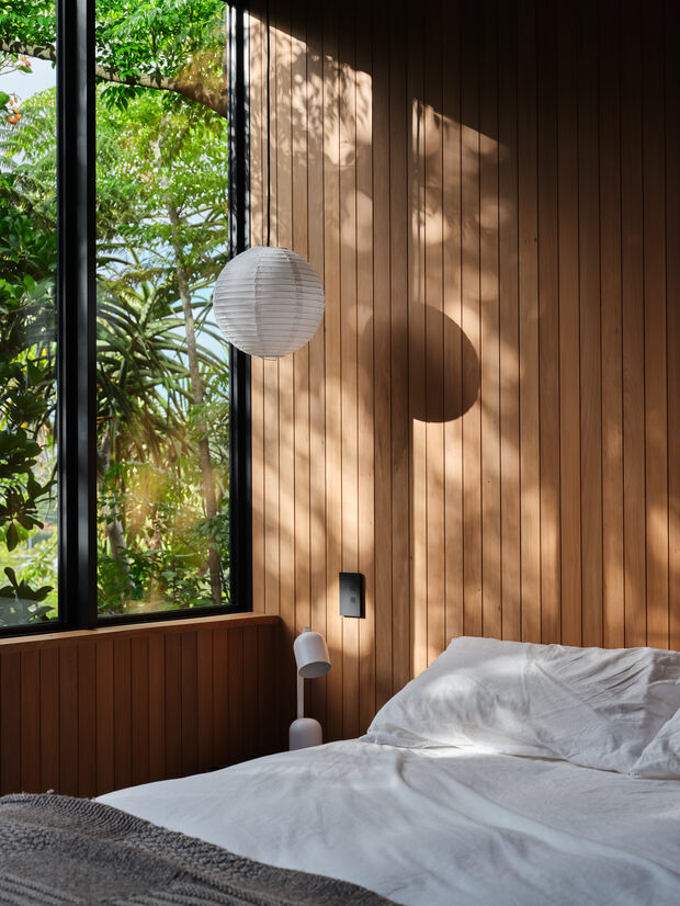
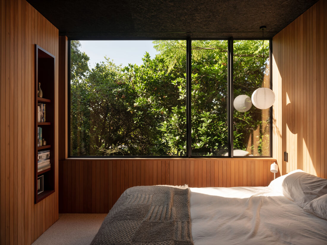
The intuitive floor plan is formed from a place of restraint and efficiency. Although spread over two levels, the burrowing of the lower level into the sloping site allows a reduced presence from approach. It provides a considered engagement with the site, whereby the bedrooms are restful, set within the native vegetation below and feel completely removed from its urban environment. Framing the upper level, the fluted concrete walls sit to the north and east, recalibrating an inward directed focus.
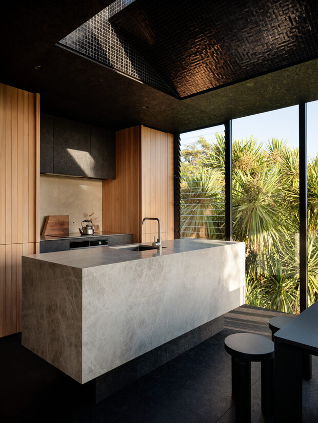
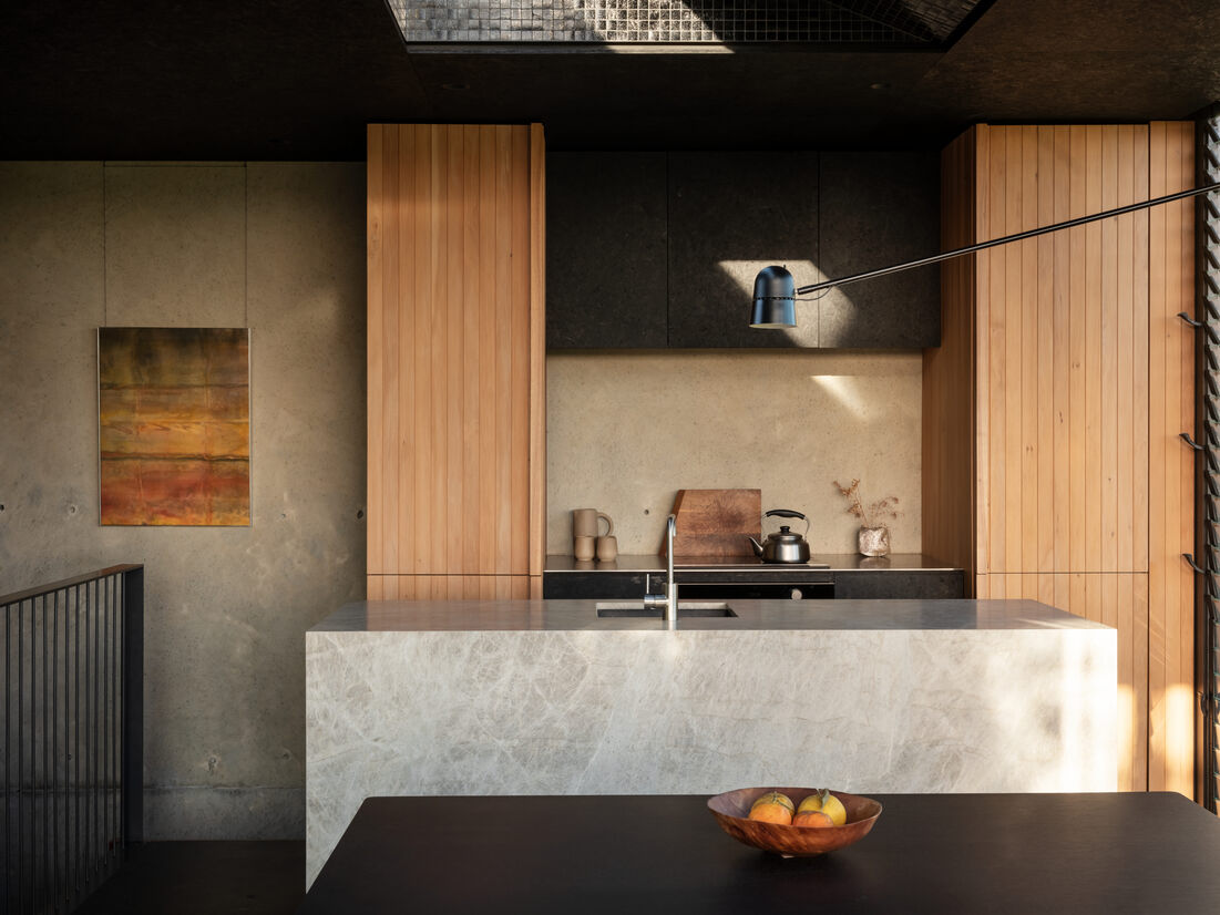
Light, shadow and materials have a symbiotic relationship here. The robust external form opens up from within, with glazing providing a connection to the wider streetscape and surrounding natural elements. Light and shadow inform an ever-changing palette. Exposed concrete forms a thermal moderator, black floors and ceilings compress and absorb light, Totara timber wall linings provide warmth and a consistency for the vertical elements in the room, the stone bench is raised on a plinth – designed as a piece of furniture.
With the primary focus of the house being away from the sun, it provided a special opportunity to consider how best to let it back in. Exploring how light can be amplified, a 4.2-metre long 'slot' was inserted at the apex of the roof. Together with the ceiling space flaring out, this encouraged the sunlight to be directed deeper into the living spaces.
Judge's comments:
Beautifully efficient the project is elegantly considered in every detail. It offers a north star for small architecture to be more than enough.
Creative use of materials and textures to manipulate the environment and create play between light and shadow. Smartly planned into a small but efficient floorplate, this dwelling does not compromise on quality in any way.