Spatial
Crosson Architects 12 Jewellery Box
-
Pou Auaha / Creative Director
Ken Crosson -
Pou Rautaki / Strategic Lead
Jerome Buckwell
-
Ringatoi Matua / Design Director
Jerome Buckwell
-
Ngā Kaimahi / Team Members
Corbett Madden, Vanessa Coxhead -
Kaitautoko / Contributors
Wraight and Associates, Tomik Architectural Builders -
Client
Alice & Johnny Mew
Description:
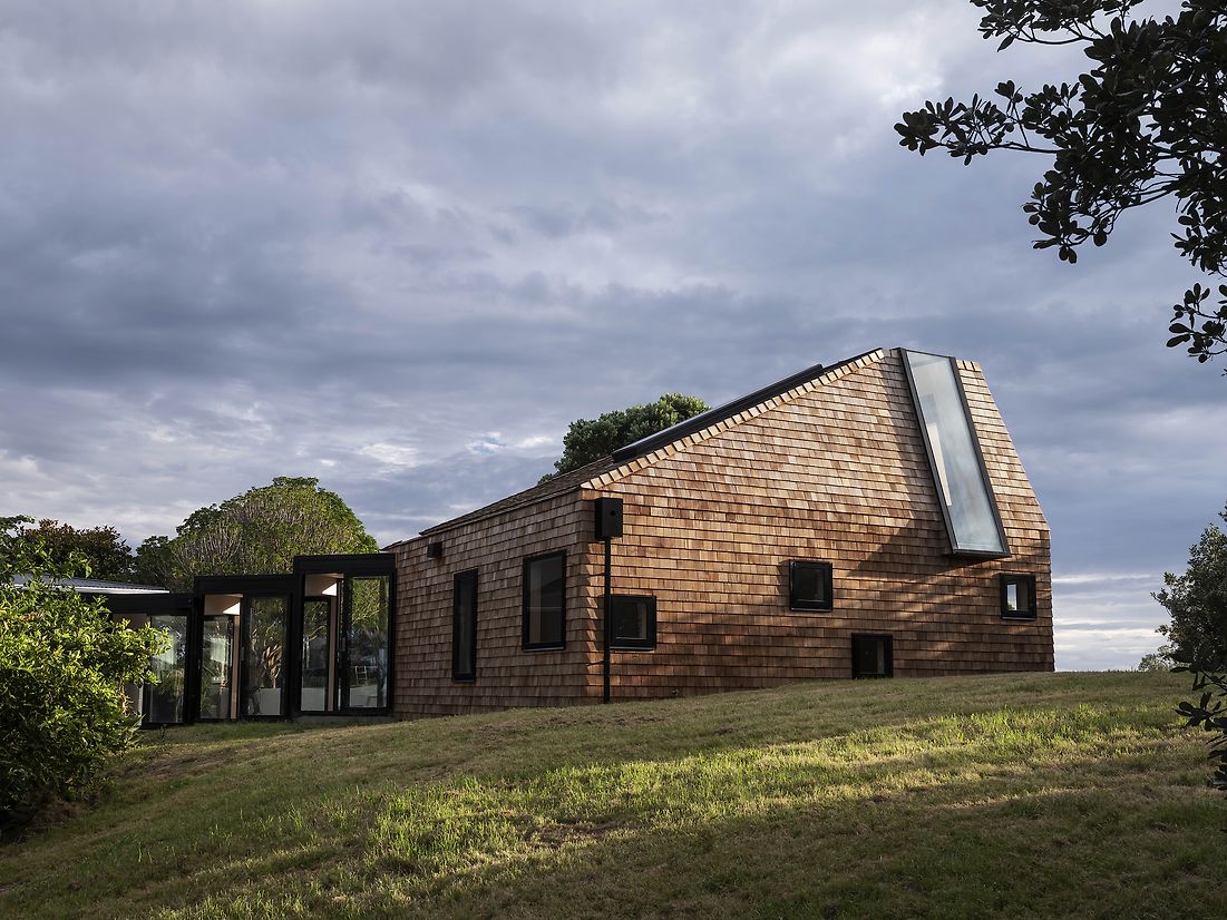
On a large section, comprised mostly of protected bush, the clients sought to extend their existing modest two-bedroom home to accommodate their growing family. Instead of wholesale demolition, which would be both costly and less sustainable, they embarked on an extension of their existing home.
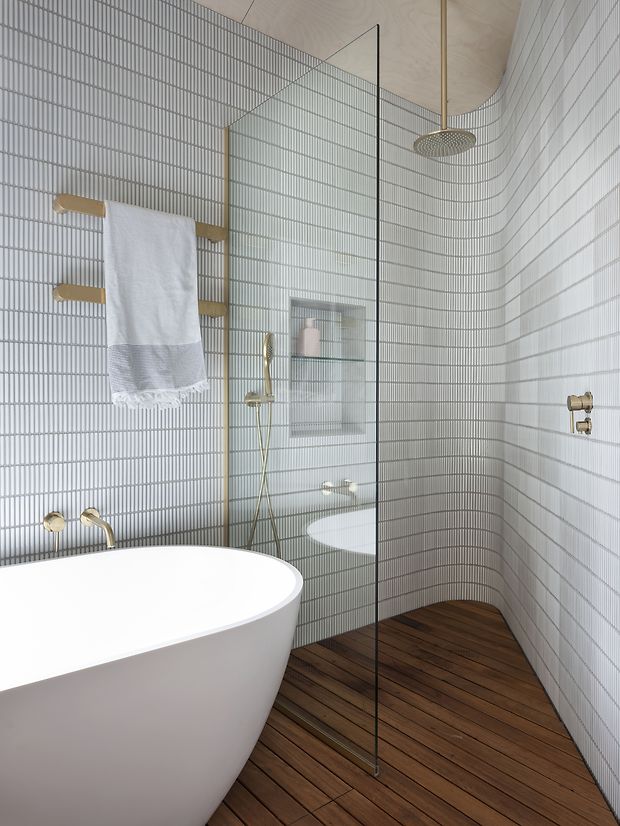
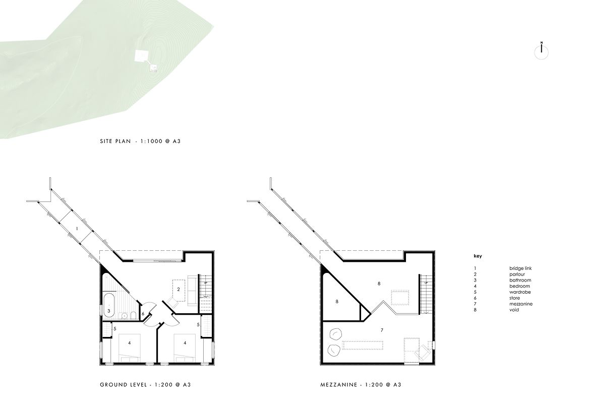
The brief was for two bedrooms, bathroom, living, and office spaces. The extension provided an opportunity to capture the spirit of the family in a new architectural gesture, take advantage of previously uncaptured views, and create a north-facing outdoor living area/courtyard that links the new and the existing.
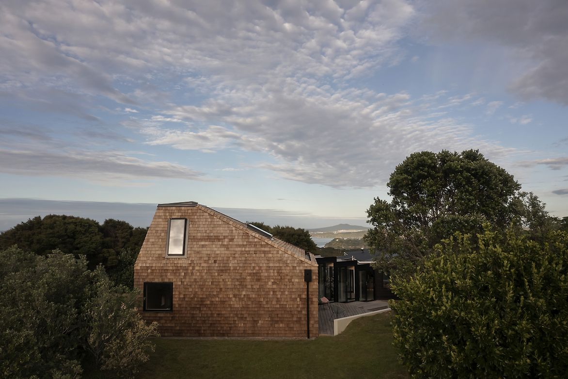
The site is large and bushy, and the design is a site-based response. The existing house had captured stunning views north, towards Pūtiki Bay, the city, and Rangitoto, but did not take advantage of the incredible views to the south toward Te Whau Bay and east towards Ōmiha Bay. Building the extension towards the highest part of the site unlocked these spectacular views, and windows were carefully positioned to frame these as you navigate through the space.
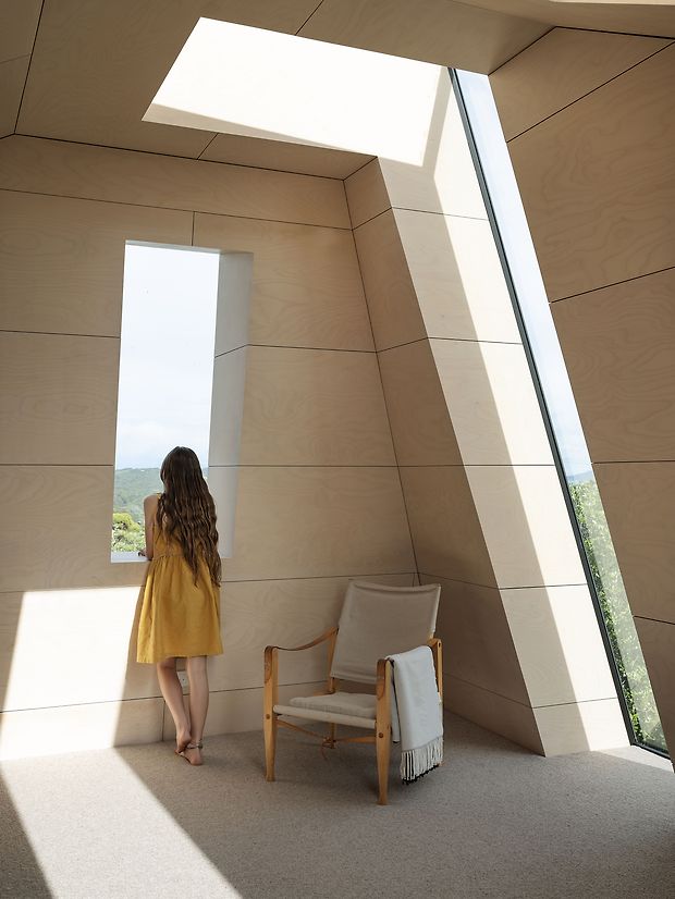
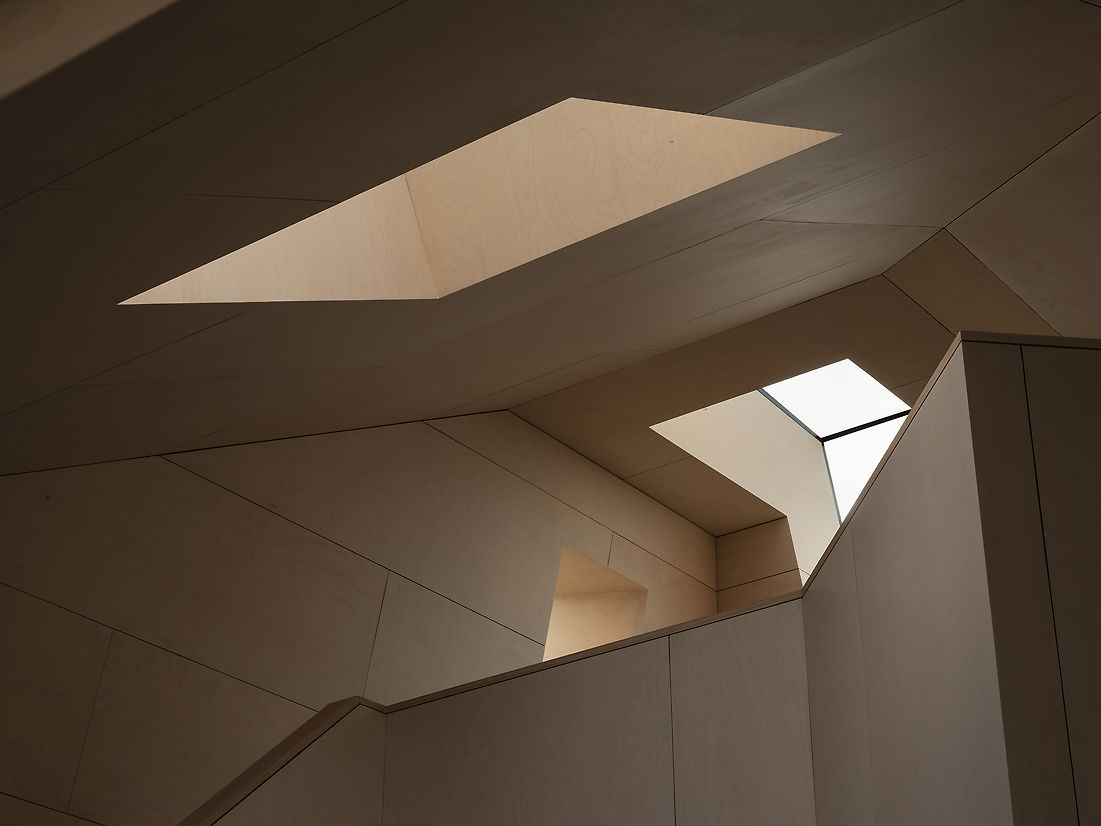
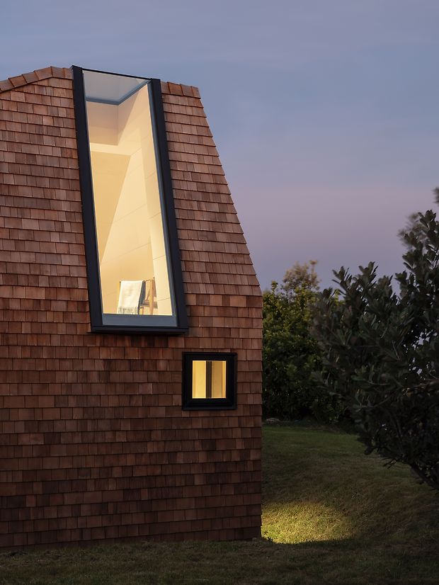
As you ascend the stair to the mezzanine, you see the sky through the overhead skylight that wraps over the roof and continues to the floor. As you approach the top of the stair, your eye is guided from the view of the sky, down to the land and sea to the south (Te Whau Bay). At that point, another window is presented to your left which opens a view to the east (Ōmiha Bay). Once on the mezzanine, you are elevated and on top of the ridge, experiencing incredible 360-degree panoramic views.
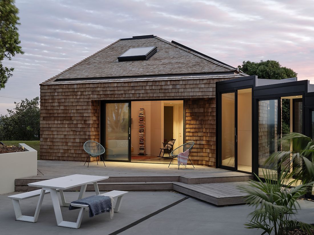
The footprint of the existing house is a perfect square, and we followed that lead with the addition, another perfect square. A new link bridge (on the diagonal) connects the new and existing and creates the backbone to a new north-facing courtyard.
The geology seen at Ōmiha Bay is unique on Waiheke with significant mineral banding/stratification in the rock formation. This banding was a key driver in the both the exterior and interior material selection. The cedar shingles creating a sense of ‘banding’ traveling up the building in a series of contours – like the lines running through the Ōmiha Bay rocks.
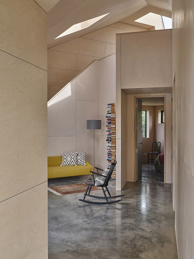
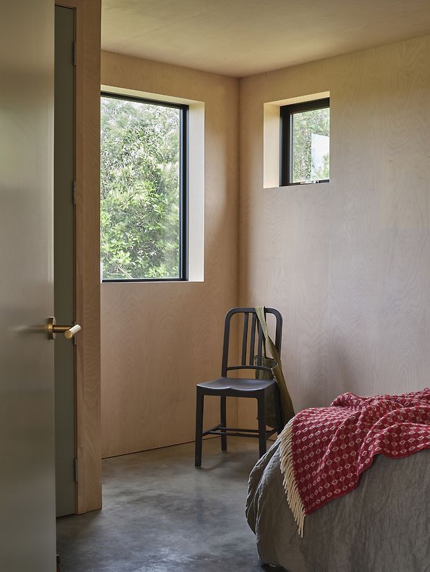
The interior geometry is somewhat complex, and the horizontal banding of plywood forms ‘contours’ around the room, which again talks to the idea of ‘stratification’. As the bands move up the walls, the scale changes, getting longer or wider in each row. A natural wood oil finish to the plywood distinguishes the ‘envelope’ with everything else inside the ‘envelope’ being finished with a natural wood oil with a slight white tint. It creates a subtle colour shift defining the exterior ‘envelope’ and the interior walls within it.
Sustainability was a key focus of the project. The size of the extension is modest, only catering for the space required by the functional brief. Orientation and passive heating and cooling has been carefully considered and natural materials are used throughout.