Spatial
Three Sixty Architecture 12 The M.E.D Building
-
Pou Auaha / Creative Director
Dean Cowell
-
Ringatoi Matua / Design Director
Tom Norman
-
Ngā Kaimahi / Team Member
Caleb van der Pyl -
Kaitautoko / Contributors
Christina Christensen (Lumin fitout), Kyla K (Exterior Colour scheme) -
Client
Box 112
Description:
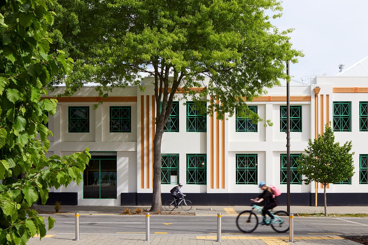
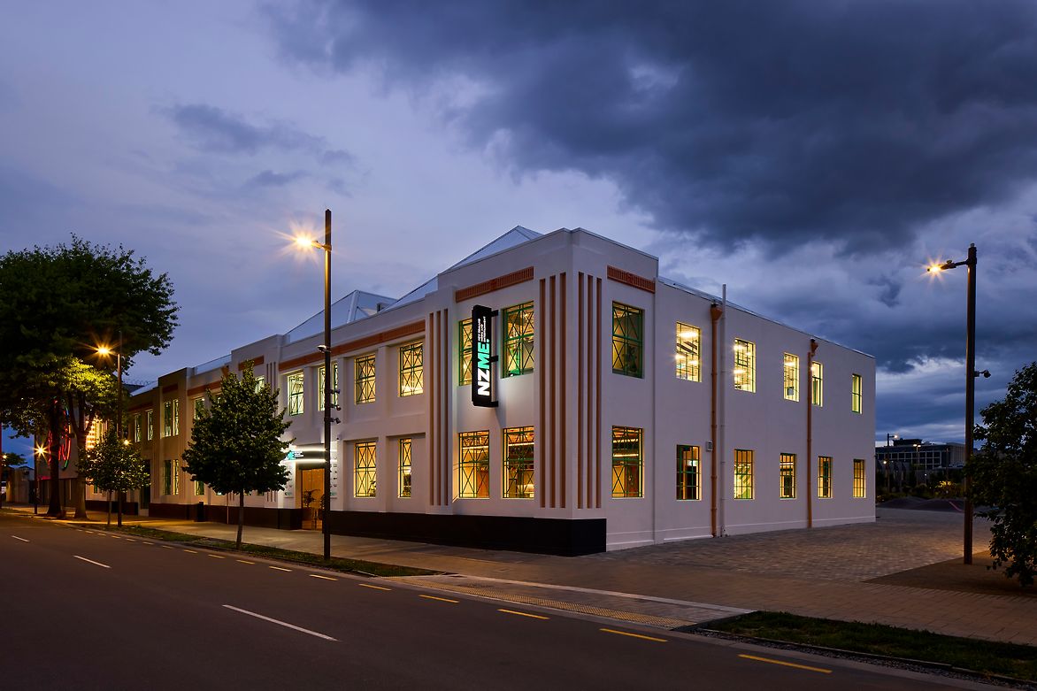
‘The M.E.D Building’ is three buildings, built through the early 1900’s, in an Art Moderne style. Christchurch’s original substation was first built on the site in 1914 and rebuilt after the Napier Earthquakes. By 1939 it took the form that is here now. Additional to the substation were loading bays, workshops, and offices for the Municipal Electricity Department - the occupants until the Christchurch Earthquakes.
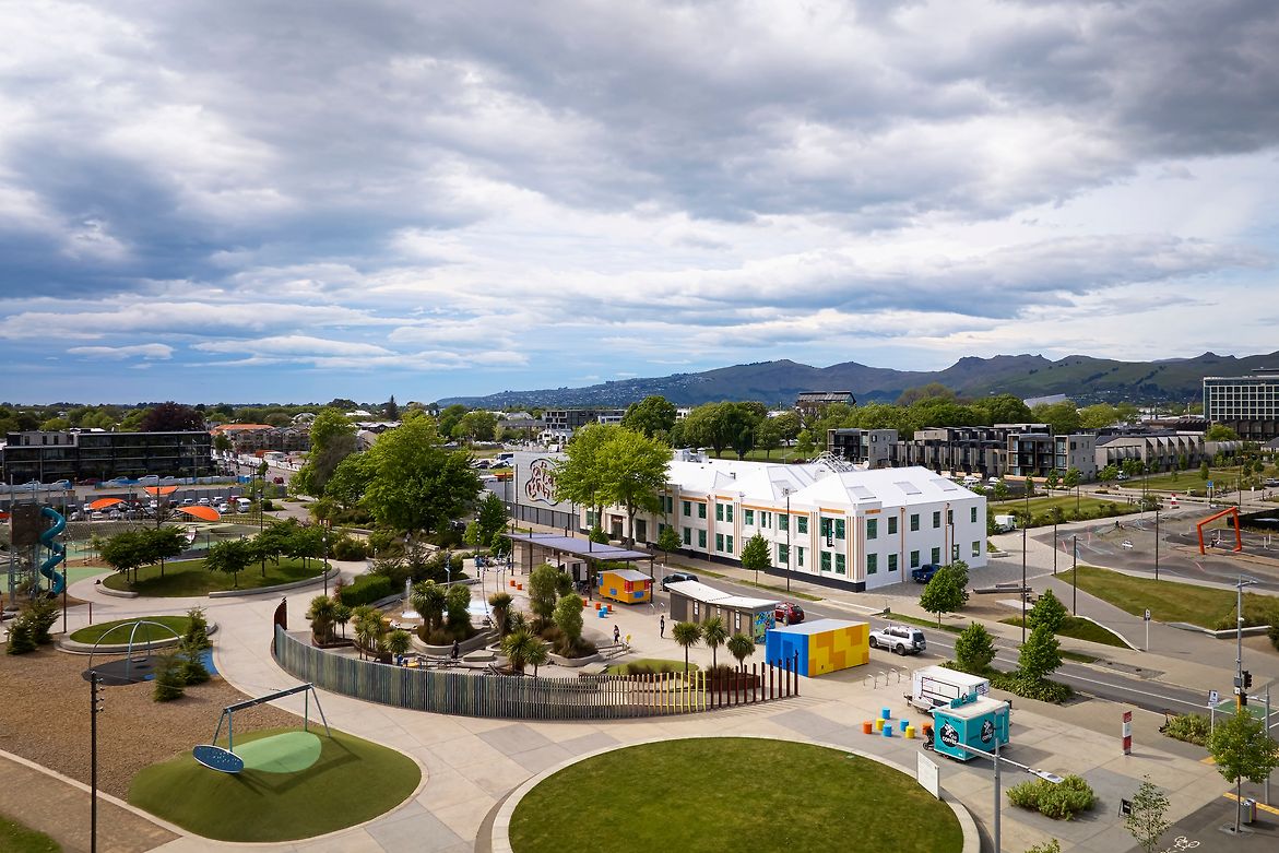
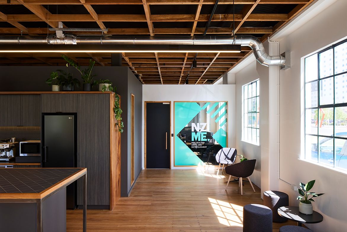
Fortunately, the 1930’s rebuild saved the building. The original character of the building survived – steel windows, unique roof trusses, and large, voluminous spaces. The Crown acquired the building in the ‘East Frame’ post-earthquake development. It sits on the edge of Rauora Park, with busy Margaret Mahy Playground opposite.
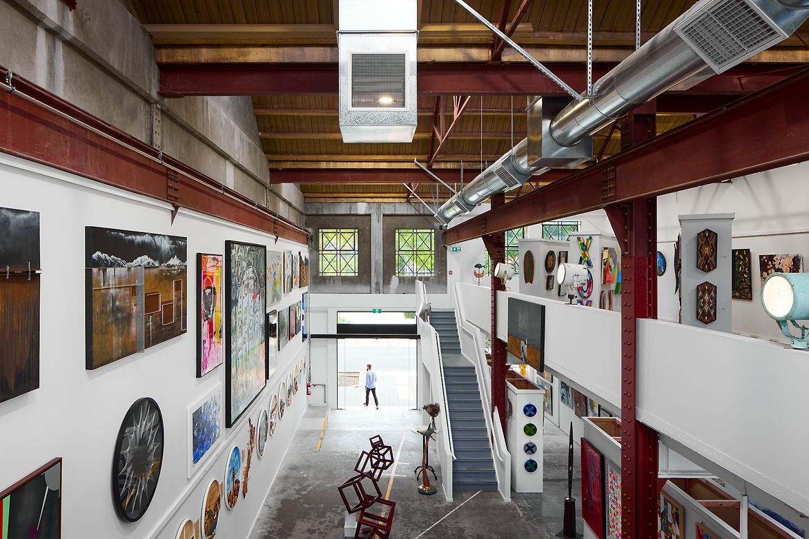
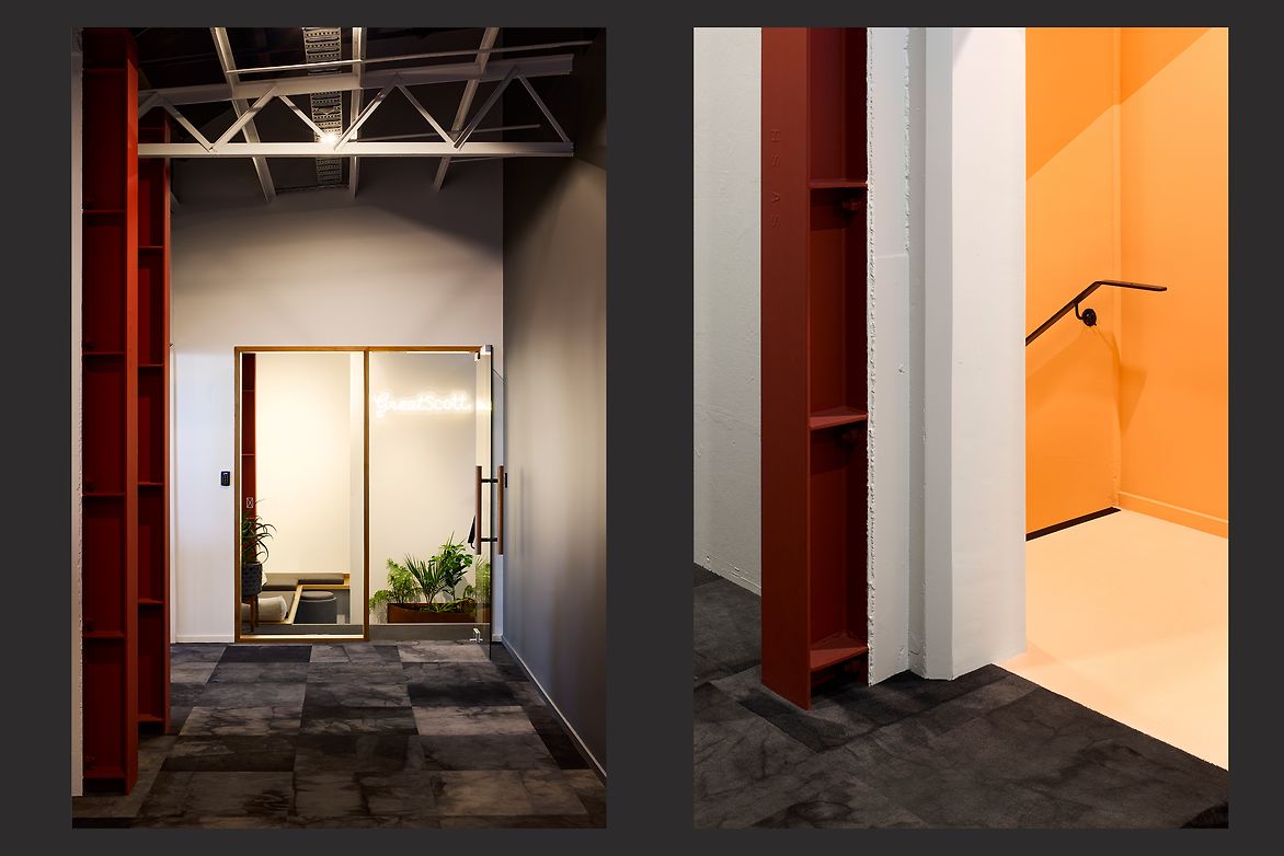
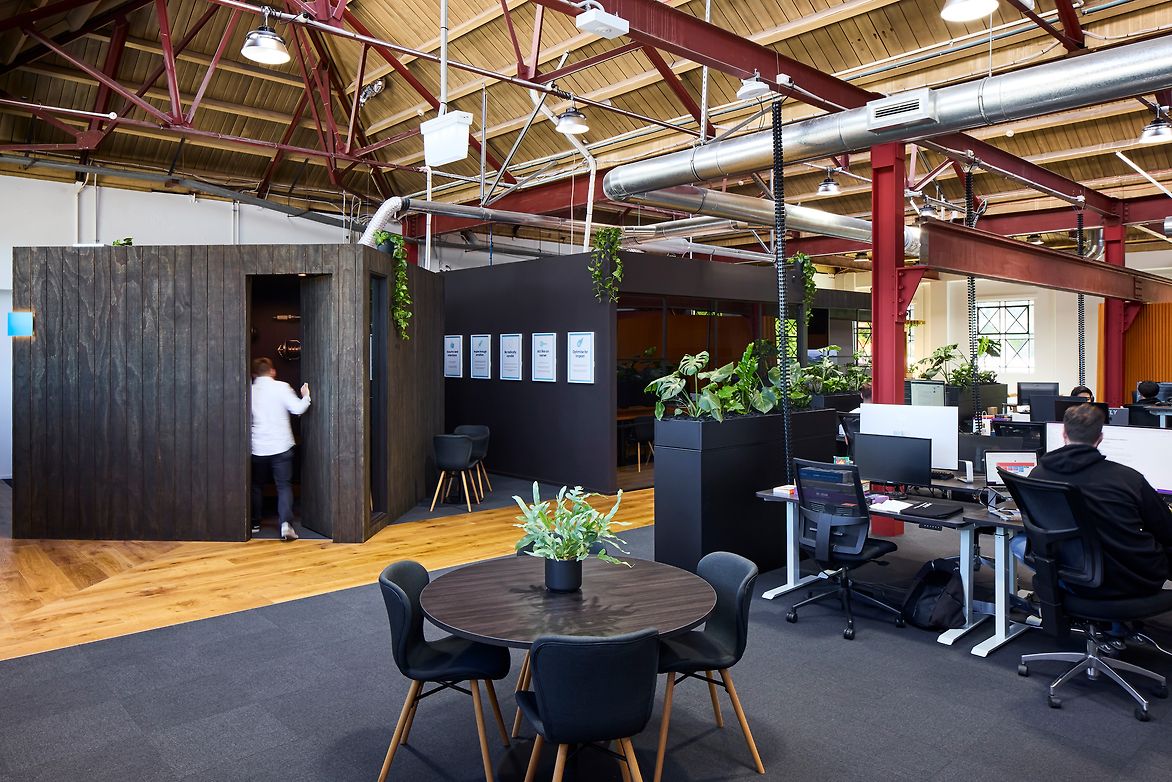
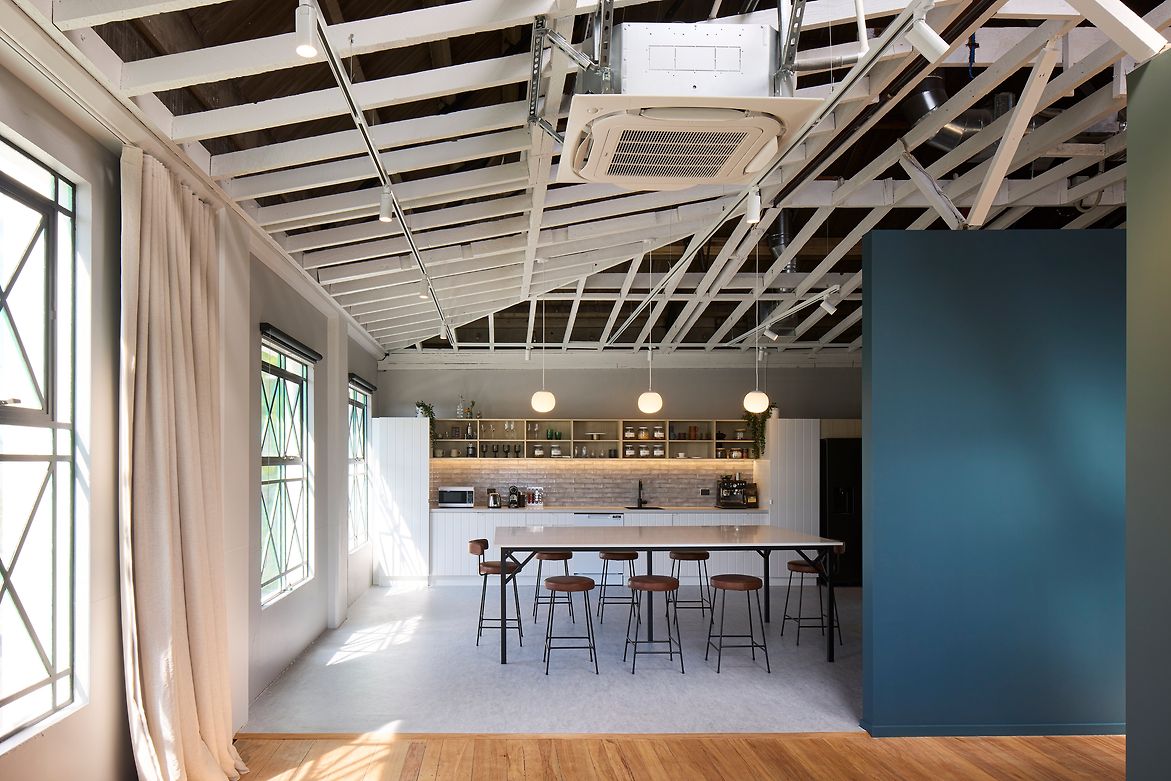
A common approach in the 30’s was to beautify the exterior of utility buildings, leaving the interior raw. While this was no longer a utility building, we took a similar approach - retaining original concrete and brick walls, exposing structural steel, and removing ceilings to reveal some amazing trusses and ceilings. Original rimu flooring was carefully relocated to different areas of the building. A local artist developed the exterior colour palette, giving the building a fresh identity. This was the most explicit new addition, generally the building’s original character is the star of the show.
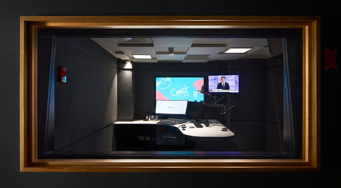
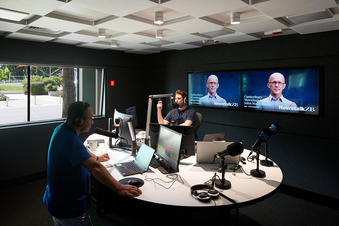
The art gallery is in a former workshop with double height space, allowing the public to get a feel for the buildings scale and volume, and the tenant to display large pieces. To ensure the rest of the building felt active, planning located all the office’s shared spaces to the North. Staff cafes and breakout spaces keep the lights on and the building alive at night. A loading bay roller door was replaced with a 4m high window, allowing the public to see into the live studios of NZME, the ground floor tenant.
The biggest challenge was dealing with three buildings and treating them as one. Punctuating structural walls and creating level, accessible floor plates with 6 different floor levels, while also retaining height and legible egress routes.
We designed anything new to lightly connect to the shell of the building, horizontally and vertically. Aesthetically it highlights the original building's unique features, while forming interesting pockets for quiet rooms and storage nooks. The resultant spaces provide tenants with modern workplace environments wrapped up in heritage character.