Spatial
Hierarchy Group 3 Strategy Creative 147 A1 Property Managers
-
Pou Auaha / Creative Director
Chris Wheeler
-
Ringatoi Matua / Design Director
Chris Wheeler
-
Ngā Kaimahi / Team Members
Bing Chen, Sonia Prince -
Kaitautoko / Contributor
Strategy Creative -
Client
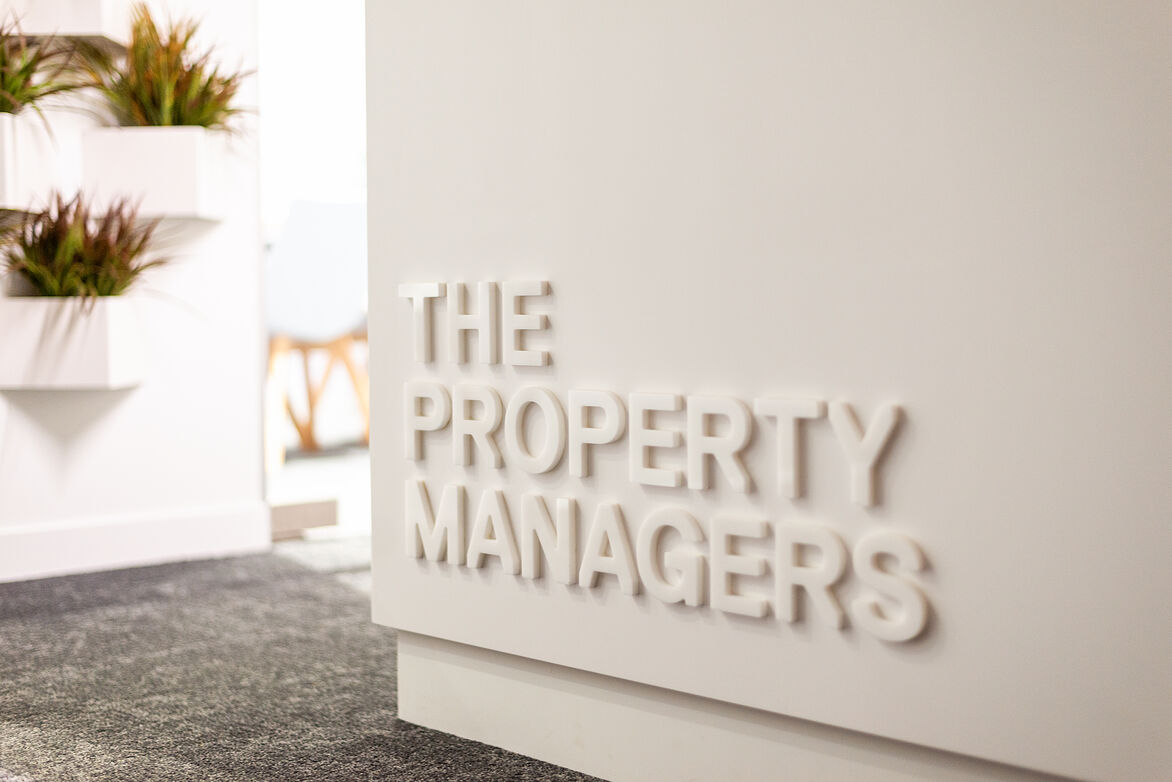
A1 Property Managers


Description:
After 25 years in their profession, a new site in a prime location provided our client the opportunity to reinvent themselves for the future. Located on the corner of a busy intersection, there was scope to create a strong graphic presence with maximum visual impact.
The client engaged a brand agency to reinvent their brand and visual identity. The key goals were to create a brand which is modern, simple and fresh and to work with the new building space to ensure it was warm, welcoming and comfortable.
The design brief was to retain the character features of the building while creating an interior that was easy to work in and live with for years to come. It needed to reflect the strength and positioning of the company as one that had withstood the test of time and were at the top of their profession.
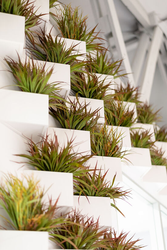
The new site, a renovated heritage building with character details, provided a blank canvas with which to create a real presence on the prime corner location. The large double wooden doors were stripped and oiled creating a welcoming entryway. The interior was light and airy due to a lack of ceilings and an abundance of floor to ceiling windows. The exposed rafters and interior blockwork gave the space a warehouse feel. The challenge was to retain the sense of openness while accommodating the public and private spaces required for the business to function effectively. With the lack of ceilings sound proofing was a key requirement. Large format acoustic panelling has been used aesthetically to line the majority of the walls both within the open plan office and the public facing meeting rooms, ensuring sound absorption and reduced sound travel.
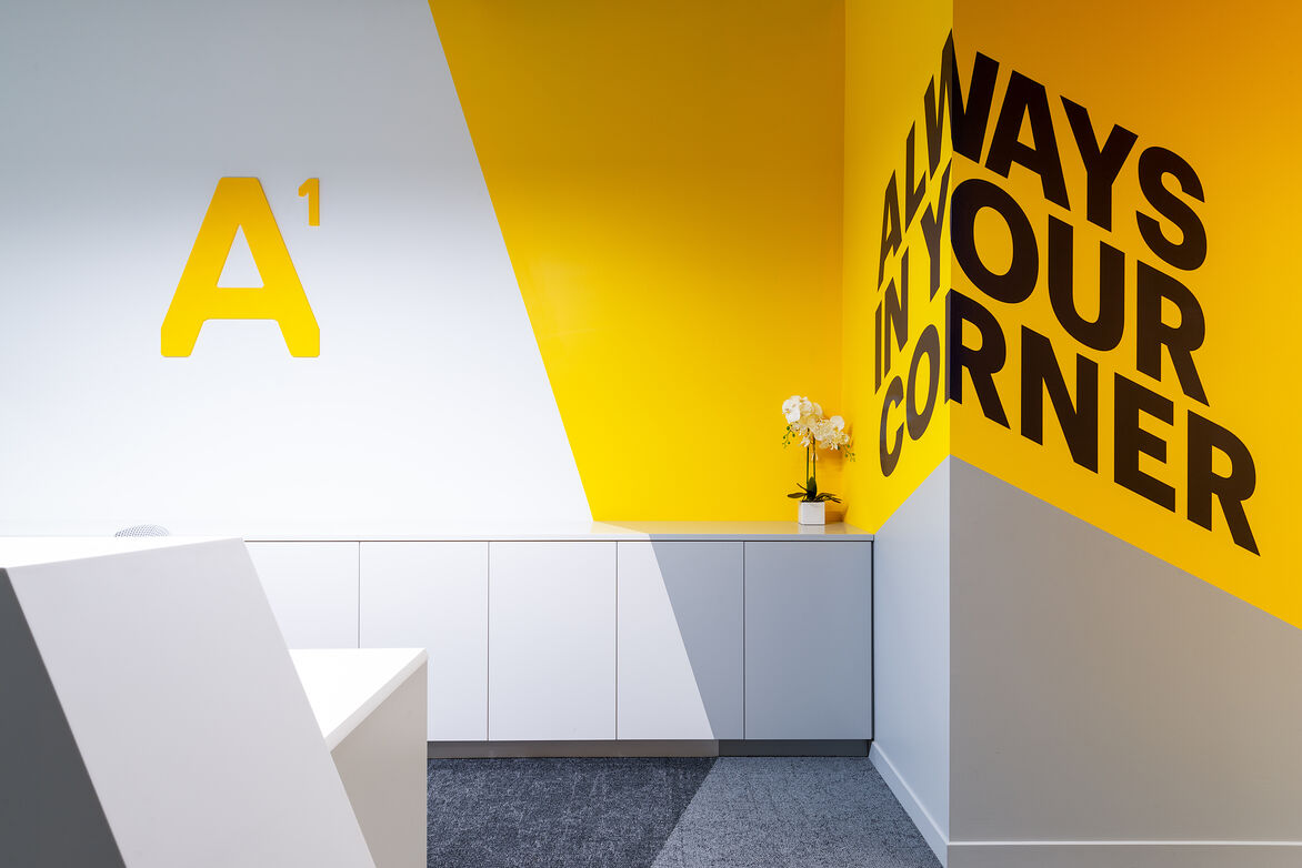
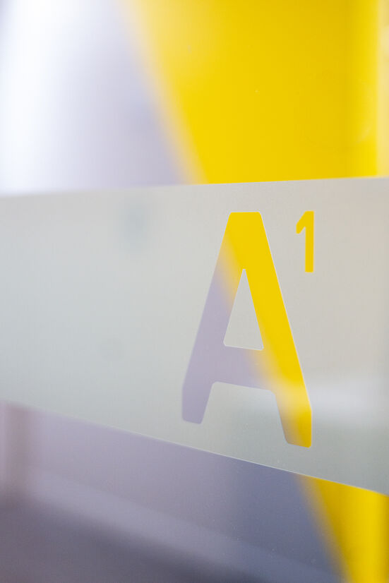
The primary branding colours - slate grey, yellow and white were chosen to give the brand and built environment a modern feel and a strong, confident identity. The interior is enhanced by graphic elements that add visual interest to the space. The angular forms from the brand are used to great effect throughout the renovated building. In reception a clever visual connection is created between the various materials, using the restricted colour palette (yellow and grey). Technically challenging yet achieving a stunning result.
Careful consideration was given to how the space would be used. As property managers, communication with clients is key. Multiple meeting rooms cater for face to face meetings, while staff can access ‘phone booths’ for private phone conversations. There is a direct visual connection between all staff members to encourage communication.
Our client wanted a fitout that would function effectively and reflect them as a company. With a combination of colour, simple architectural forms and the addition of key branding elements, the result is bold, fresh, confident. It ticks all the briefing boxes and provides the people that interact with the space with the tools they require to work effectively.
Here the visual brand enhances the space and the space compliments the brand. Together the two elements weave together to tell the story.