Spatial
IZZARD Design 25 The Shy Guy
-
Pou Auaha / Creative Director
Kate Wotherspoon
-
Ringatoi Matua / Design Director
Paul Izzard
-
Kaitautoko / Contributors
Envoy Construction, Angus Muir -
Client
Forty 4 Group
Description:
Our clients, a group of some of the best hospitality icons in Auckland, wanted to create
not just another bar or nightclub, but a members late night lounge. To create a communal living room, for guests to enjoy, socialise and network in a post Covid world, where the luxury of just talking to people is restored.
The Shy Guy is a destination venue, curated to offer respite from the more populated late night precincts. Its hideaway location in Auckland’s Victoria Park Market, is perfect and discrete, but once you enter the venue, you are welcomed with all of the amenities of a luxury space for music, dance and world class hospitality
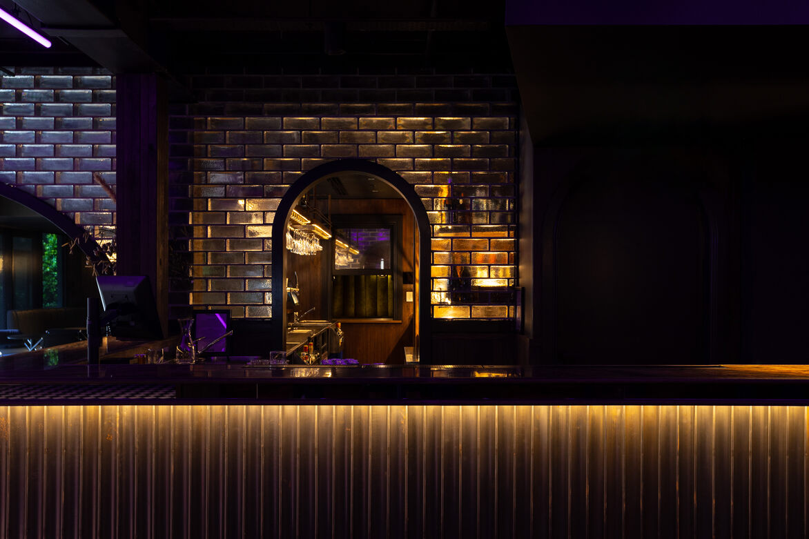
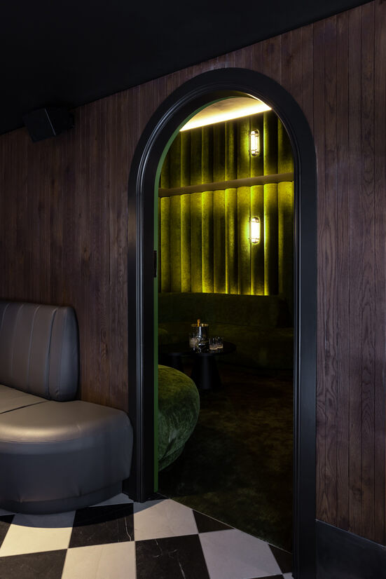
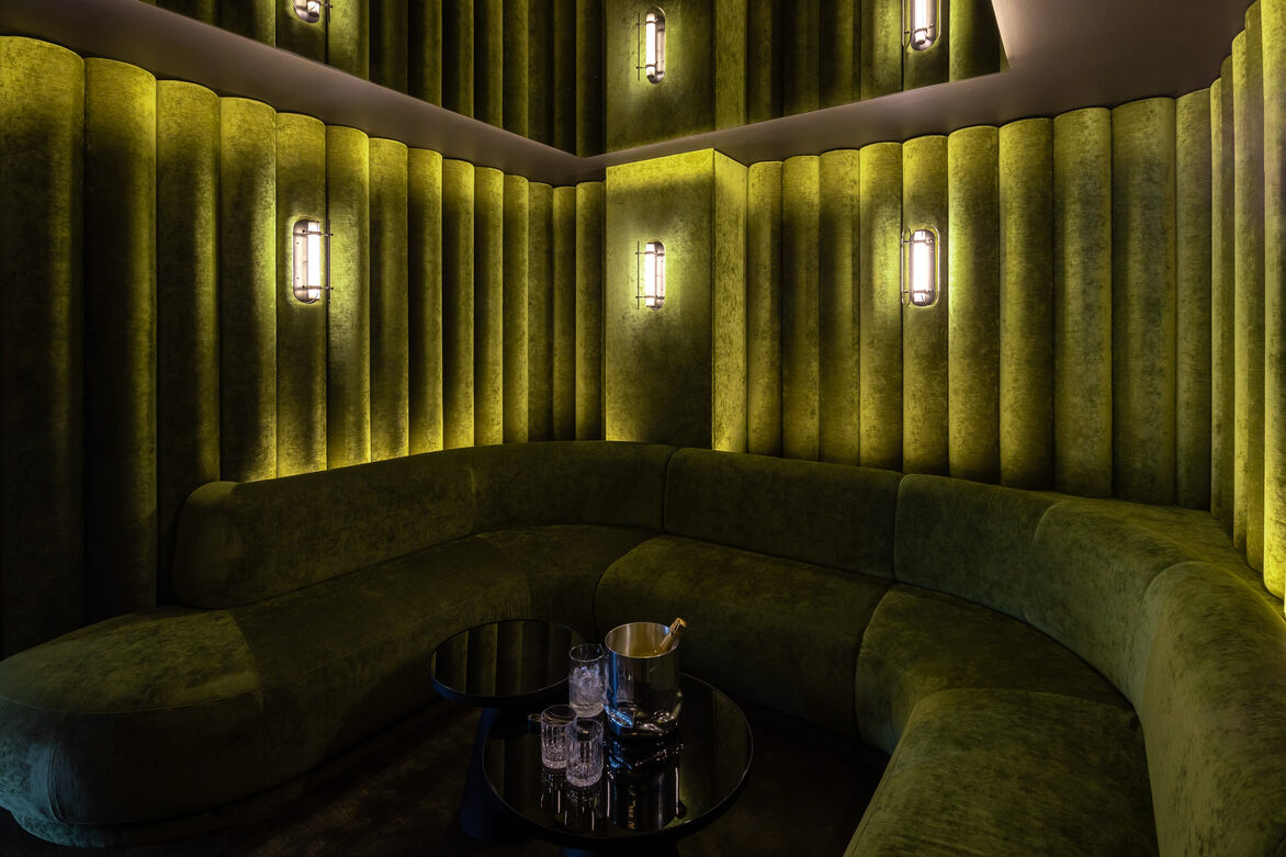
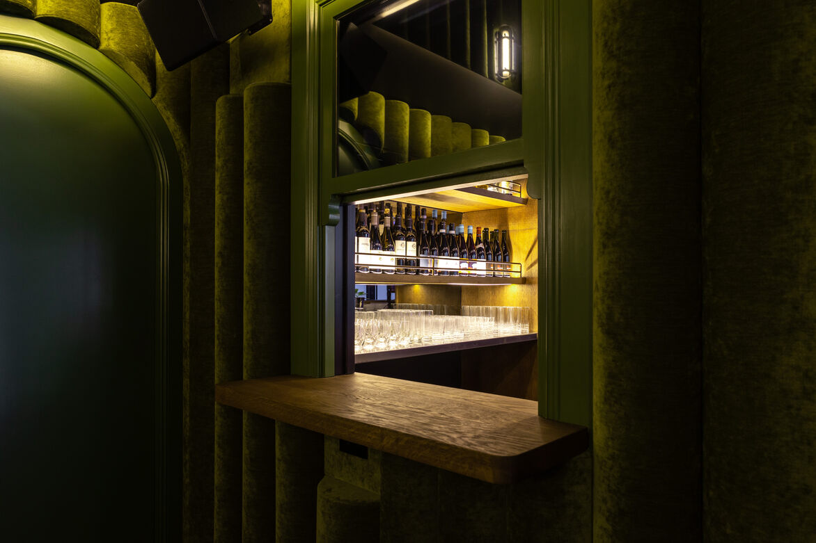
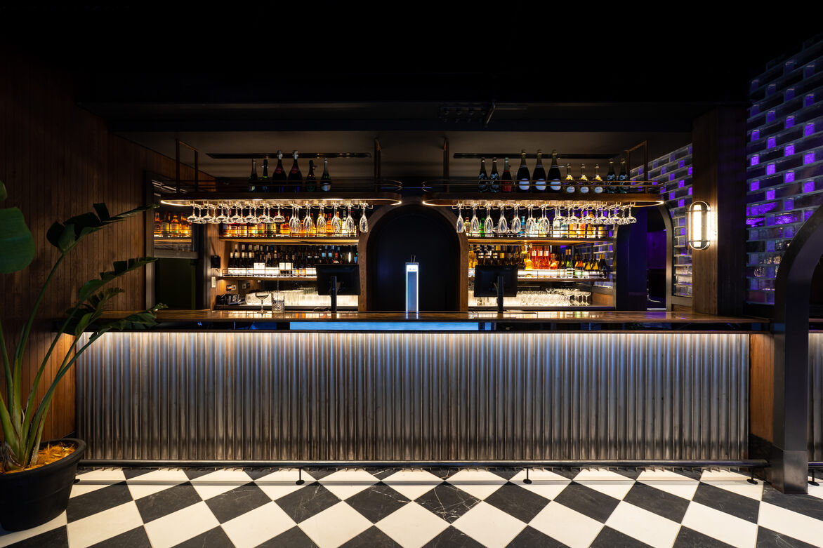
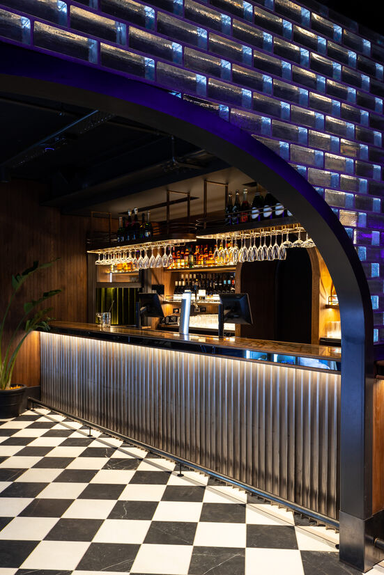
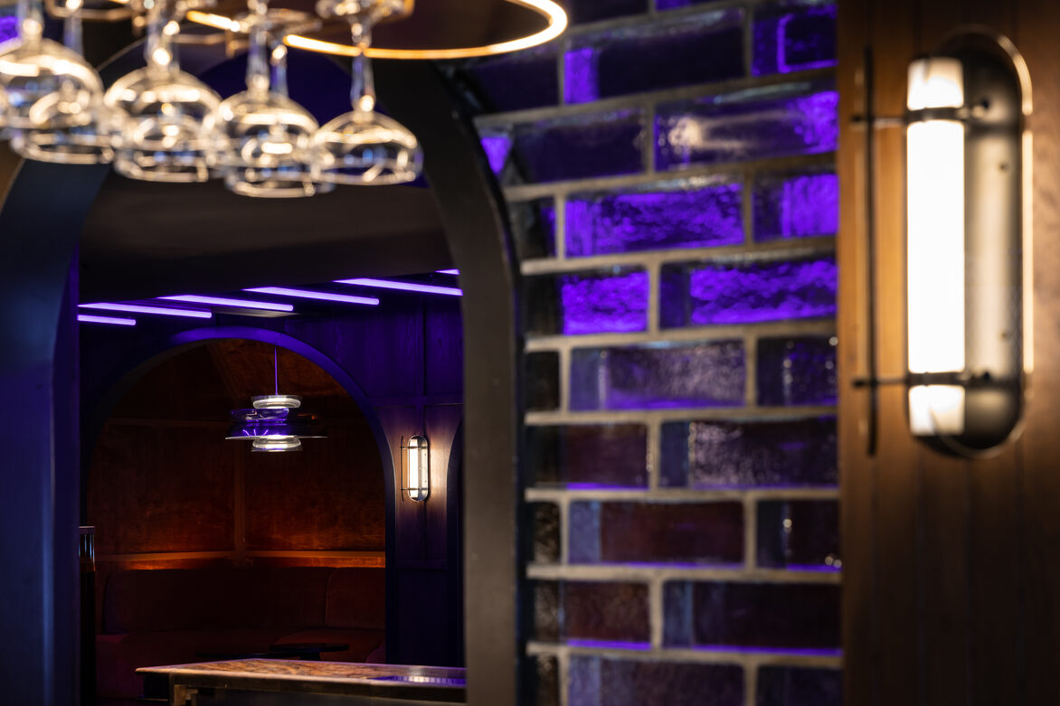
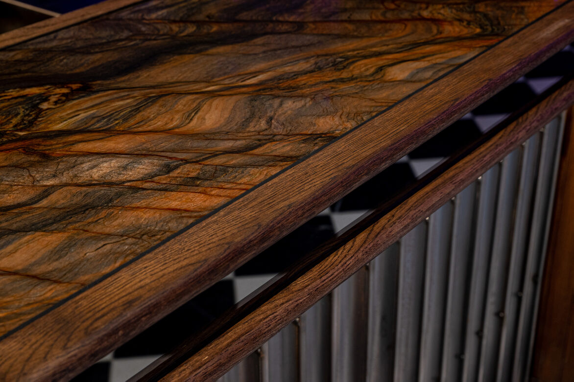
We wanted people to be comfortable in the space. There is a stigma to impressively decorated interiors, a 'do not touch' mentality. We wanted guests to feel like they could relax, touch, explore and enjoy the various materials and textures of the space. The space is to be lived in, not just looked at. Initially drawing inspiration from the historic brickwork of Victoria Park, we used Venetian glass bricks to create different zones within the space however used the transparency of the product to carry the theme through the space. To compliment the bricks, we selected a palette of opulent marbles, checkered floor tiles, antiqued metals and bamboo silk rugs to create an overall feeling of indulgence.
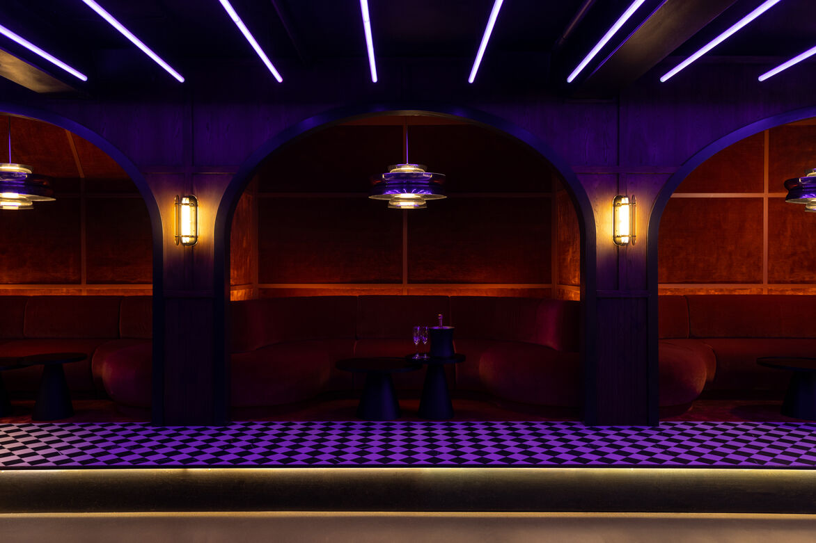
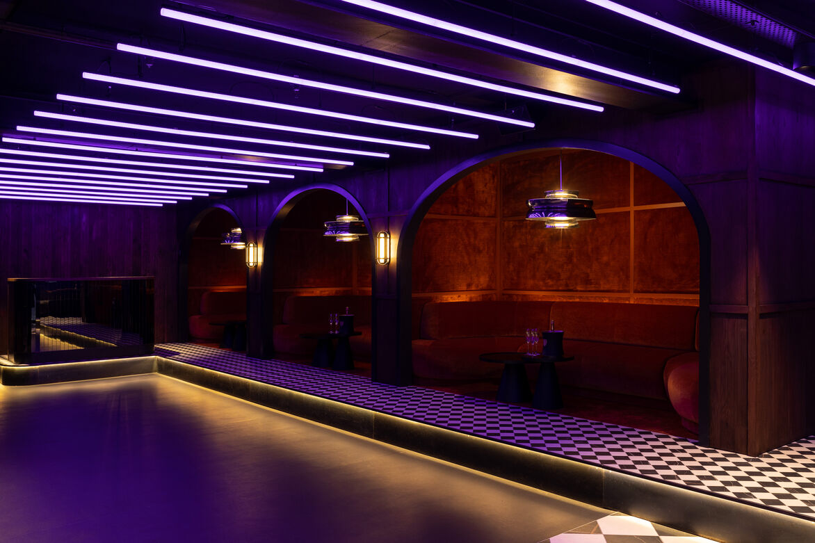
The exterior façade of The Shy Guy remains relatively untouched from its existing state, demonstrating a minimal intervention to the building fabric. Signage is small and discrete and the windows are covered with a dark tint - allowing for an element of surprise and discovery within. Inside, rich velvet banquettes sit within crafted arched nooks and a striking lighting installation reflects off every surface.
The distinctive lighting installation within The Shy Guy is colourful, loud and bold. The controls of this system allow for different themes and environments to be created within a space with very minimal natural light.
Originally taking inspiration from the vibrancy and energy of the Latin world, Columbian culture, the fire and the dance, we wanted to ensure we created a space that felt fun, inviting and full of life.
The design challenge was to balance the retention of an existing heritage building, with a bold, electric insert. The use of rich, multi-layered materials and colours, adds a feeling of excitement to an urban area where this was previously lacking.
Judge's comments:
This is a club the judges want to belong to. The luxuriant fabrics and the bold use of rich colours are reminiscent of a speakeasy - the judges could almost taste the whiskey, smell the cigar smoke and inhale the perfume. But the lighting is straight out of a future fantasy. It is a delightfully atmospheric space.