Spatial
CTRL Space 38 Siso
-
Pou Auaha / Creative Director
Chris Stevens
-
Ringatoi Matua / Design Director
Sam Griffin
-
Ngā Kaimahi / Team Members
Summer Bishop, Lauren Marshall -
Kaitautoko / Contributor
Fit out solutions -
Client
Nourish Group / Richard & Paula Sigley
Description:
Our clients bought Remuera’s Banque late last year, intending to make a few nips and tucks. Defined as an upmarket local bistro specialising in raw seafood, it was fairly well regarded by the locals in its prime. More recently, due to a lack of competition in the area and despite being a little tired, it still drew in its regulars – predominantly older men.
The brief was to grow the customer base and appeal to more females to balance the male-dominated venue, and to become relevant to younger crowds in their late 20s and upwards who are moving into the area. The owners wanted to give the local demographic an eatery that’s relevant to the current hospitality climate.
The concept was essentially derived from three key words – intimate, collected, residential.
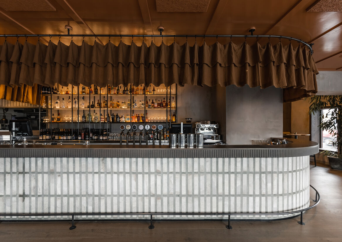
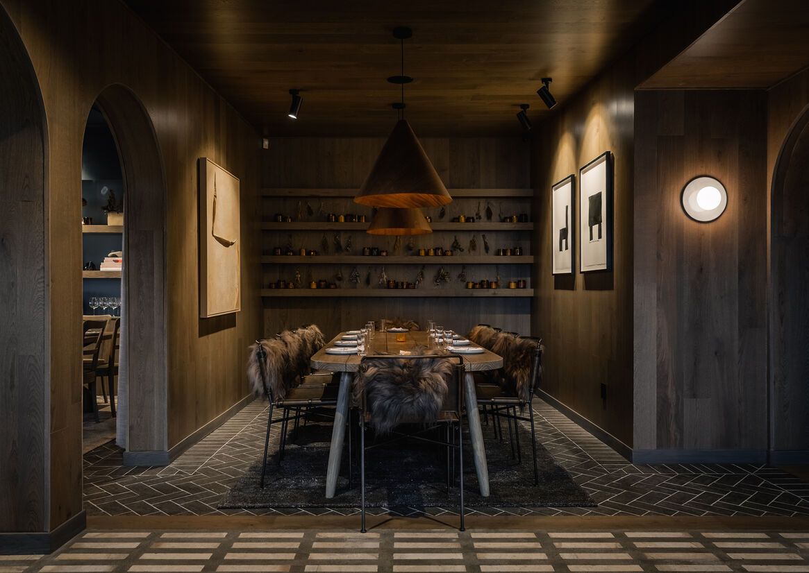
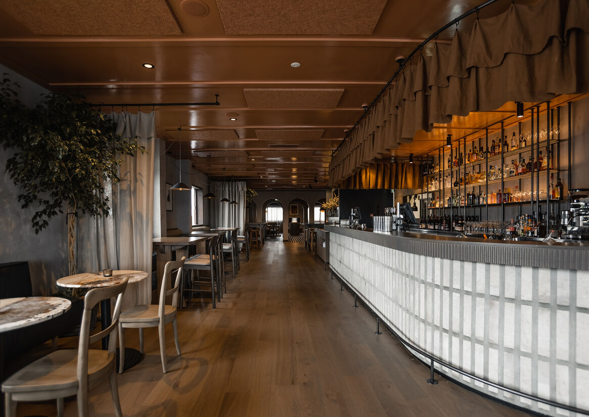
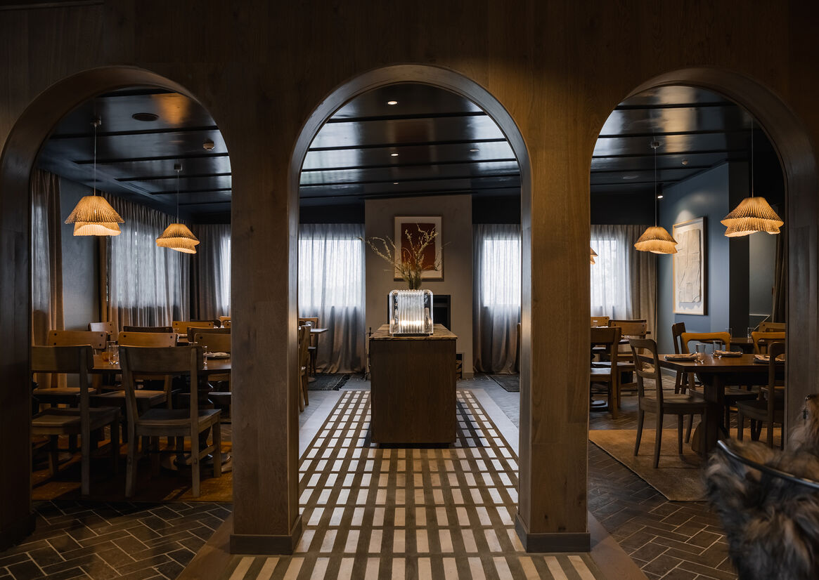
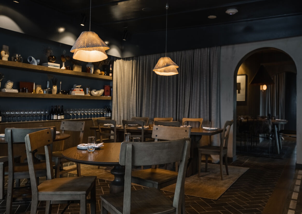
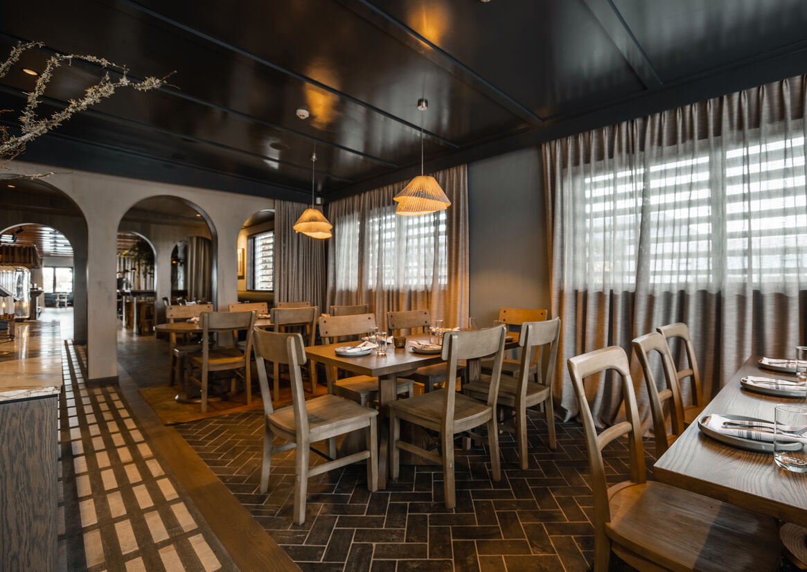
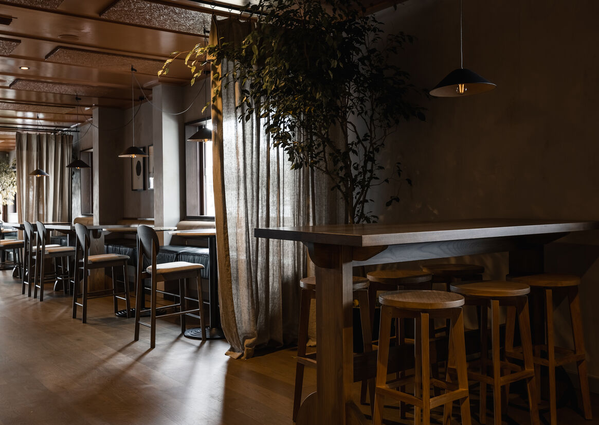
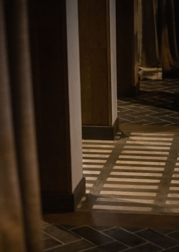
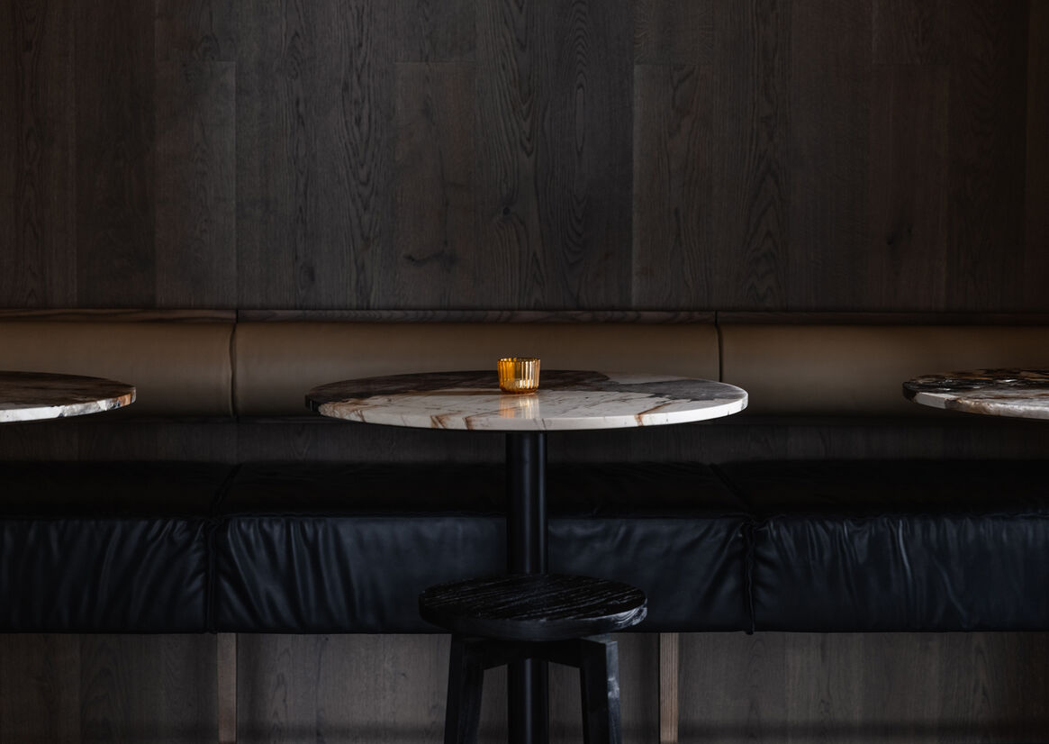
The idea was to create an intimate and cosy local bar and eatery with subtle residential cues that soften the commercial hospitality experience. Siso was designed to be a refuge from the slick nature of Remuera. Soft, natural moments with texture and character deliver a casual, humble aesthetic, while darker complementary areas offer warmth and shadow to inject a sense of mood and intimacy.
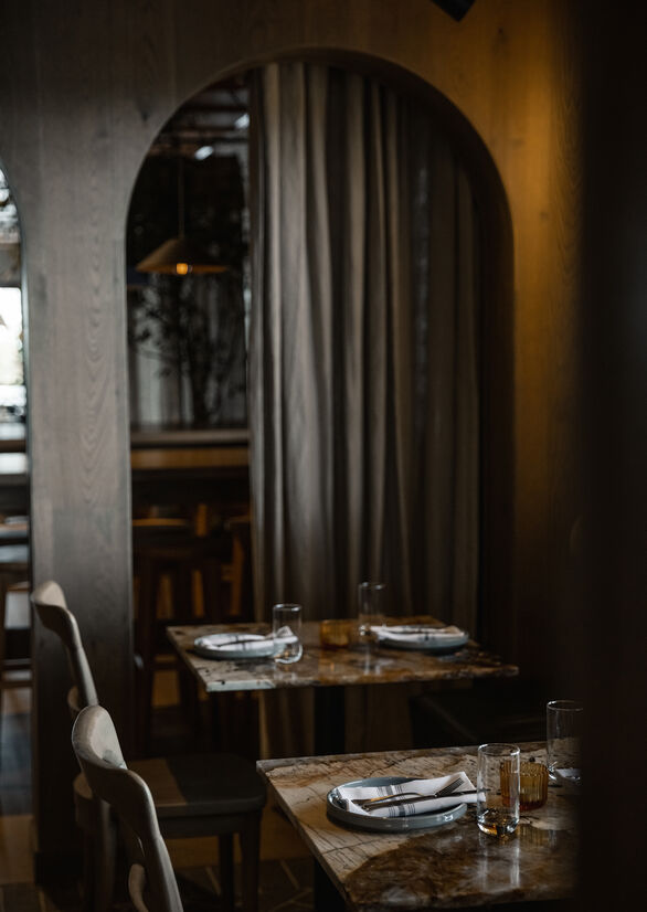
The differing table settings create a casual, friendly dining area. Drapes saturate the rear room, and feature throughout the rest of the space to add softness and help separate spaces. We also layered artefacts and objects on the shelves and hung framed artwork, reinforcing the residential look and feel. The timber-soaked private dining room is a special oasis that’s lit by flickering candles, and forms a humble and inviting spot.
We wanted Siso to have a strong colour identity. The glossy terracotta ceiling brightens the space and helps reflect the light, creating a spacious feel. This colour is reinforced through the bar curtain, table cloths, rugs and artwork.
The arches were introduced to hide some architectural challenges, disguising a change in ceiling levels, while the placement of the archways hides structural building features and eliminates two awkward existing doorways. We also managed to create an extra space by knocking out the wall to the old bank vault. Adding a rectangular window within the circular opening in the concrete at the front of the building disguises its former purpose.
Using basic, cost-effective materials in creative ways has helped us achieve an impactful space while coming in under budget.