Spatial
Unispace 39 Auckland Spine Surgery Centre
-
Pou Auaha / Creative Director
Harry Rowntree
-
Ringatoi Matua / Design Director
Alice Dalton
-
Ngā Kaimahi / Team Members
Angie Wang, Chris Kim, Vinisha Topiwala, Craig Parr, Jeremy Brown -
Client
Michael J. Barnes
Description:
Client Brief: “Transform this sh*thole warehouse into a premium specialist spinal surgeon hub.”
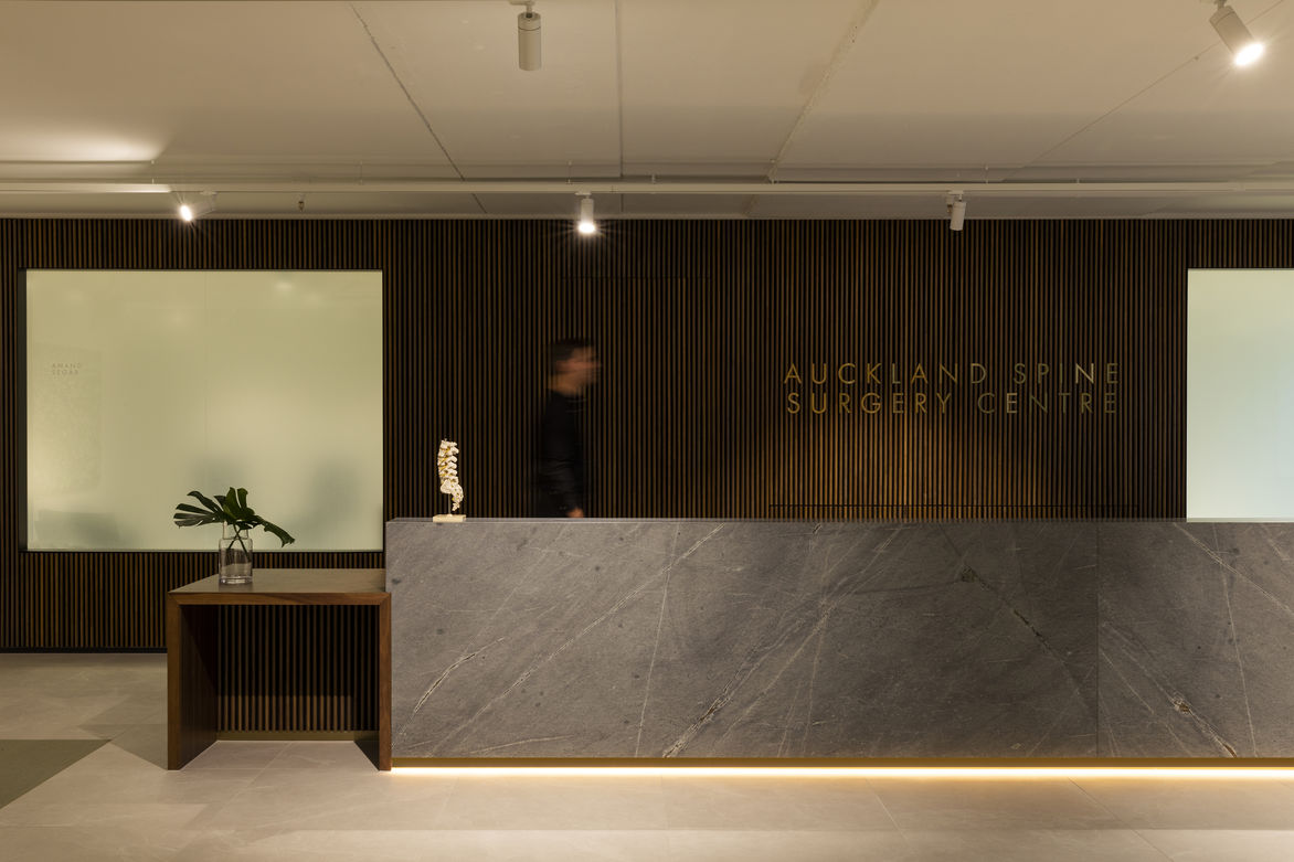
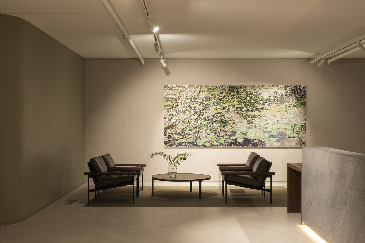
For the front of house: a welcoming, calming client-facing clinic with reception/waiting area, three consulting medical suites with examination rooms.
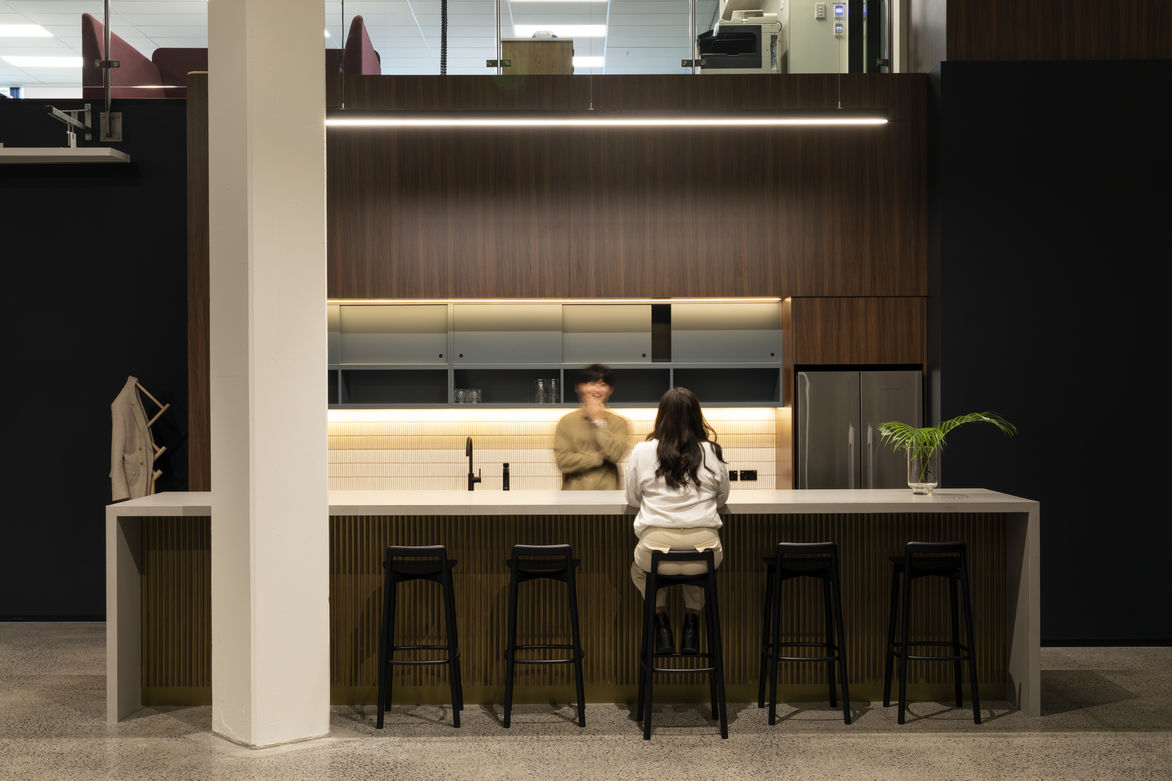
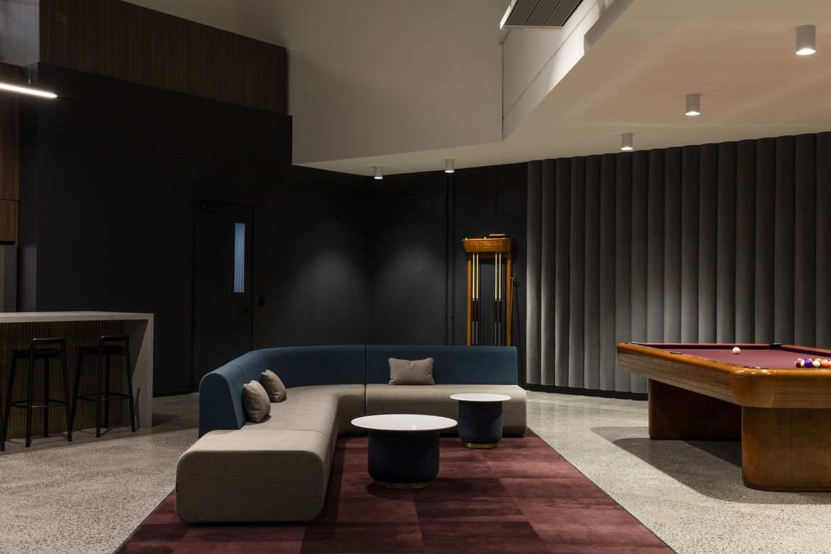
For the rear double height warehouse space: a dedicated prosthetic logistic centre; complete with entertainment, administrative office and medical set-assembly and dispatch function.
Considerable structural modifications and interventions were required to extend the mezzanine floor, bridge to a second storey carpark entry, and creating a raised floor structure to meet the existing street level while also cleverly housing power, data, hydraulics and underfloor HVAC mechanical equipment.
Egress paths and secure access lines were all redrawn and tweaked while simultaneously creating a private entrance for both entities.
Both clinics called for distinct designs and requirements, but ultimately benefit from a cohesive overarching design ethos of simplicity and quality.
For treatment clinics:
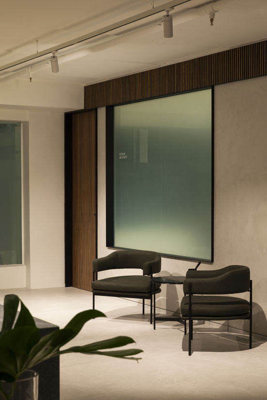
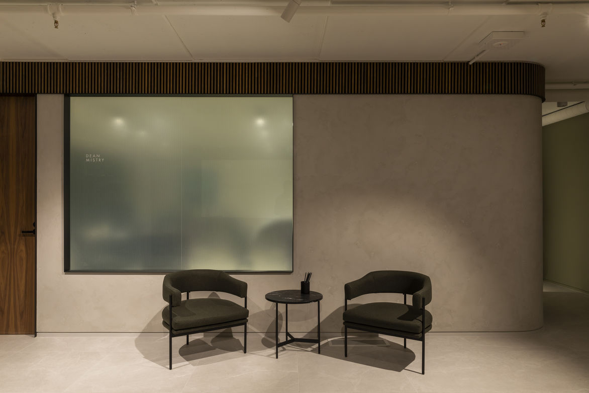
- A calming pastel hues of green palette
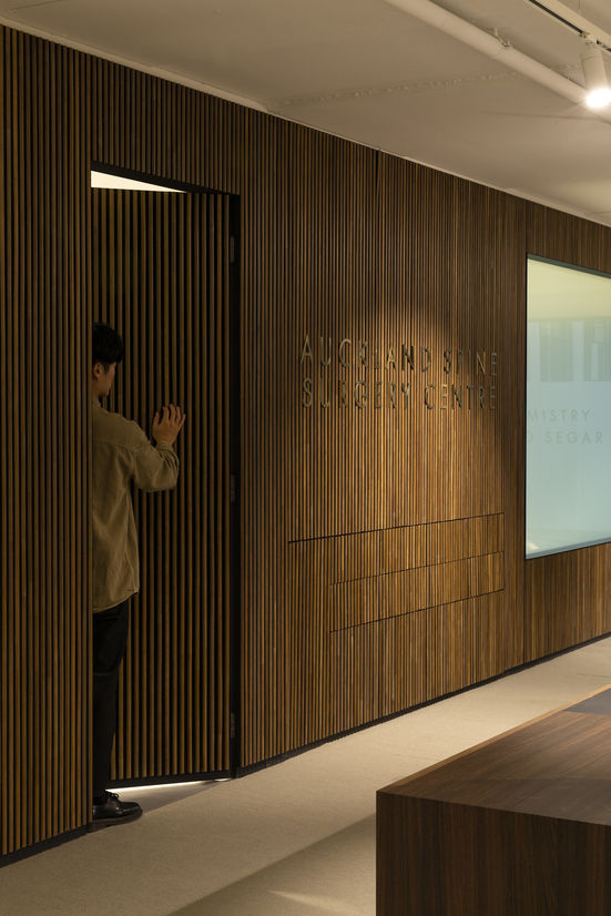
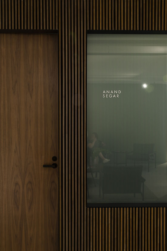
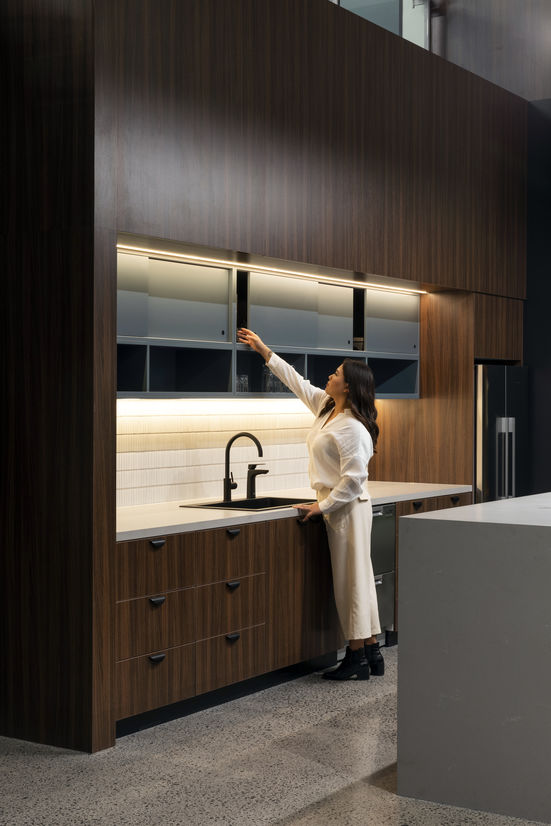
- American Black Walnut elements – wall, doors, details around reception counter + furniture
- Sequential book-matched Atlantic basalt stone slabs for reception counter
- Leathers of warm grey
- High performance Tretford goat’s wool sisal broadloom carpet
- Solid brass detailing around signage and fittings around consult rooms and kitchen
- Reeded glass – privacy for consult rooms
- Honest of materiality such as unpainted, polished plaster – complimented the existing concrete ceilings. Tying new and old together.
For prosthetic centre:
- Deep red merlot and selection of blues
- Although the timber ran between the 2 different areas the more casual colour palette in the prosthetic centre suited the function of the space & brand.
The building was redesigned and opened up with a mezzanine level to create much more natural light for the working areas.
A double height was created to create the warehouse
Major moves
The entry was initially below ground level, as such a raised floor and underground services was introduced, and ceiling removed. The bare slab and soffit were treated to regain sufficient ceiling heights throughout.
The mezzanine was extended a further 3m – enabling a private entrance to both sides of the tenancy, and gain more space within both clinics.
3D concept in uniBIM and Enscape to visualise concept and interior architecture changes to show real time visualisations and assist client vision and approvals.