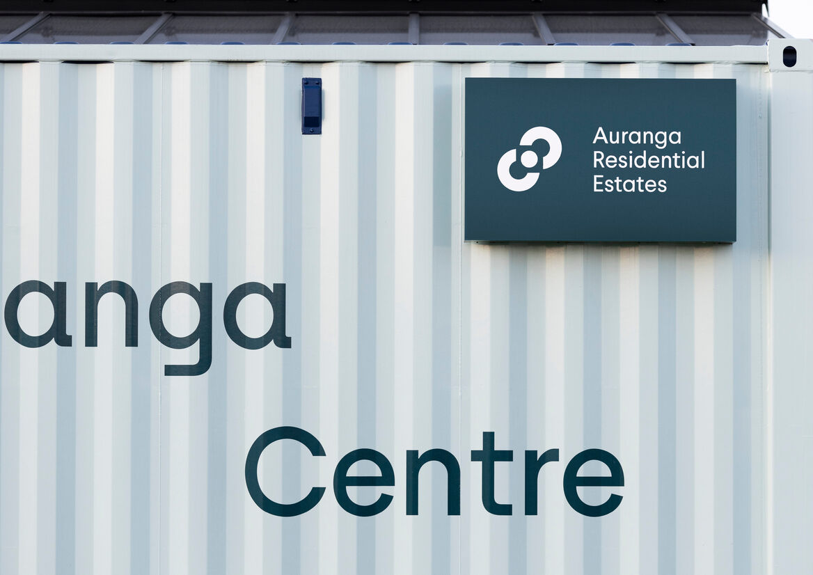
Auranga Residential Estates (ARE) is a boutique real estate agency operating exclusively for, and within, the masterplanned community of Auranga in Drury.
Auranga was founded on our client’s four ‘pillars for a better city’: Economy (the joy of generosity); Sociology (the security of belonging); Ecology (the goodness in creation); and Anthropology (the dignity in serving). These foundations allow a place to become so much more than a development or subdivision; they seed a better way of living.
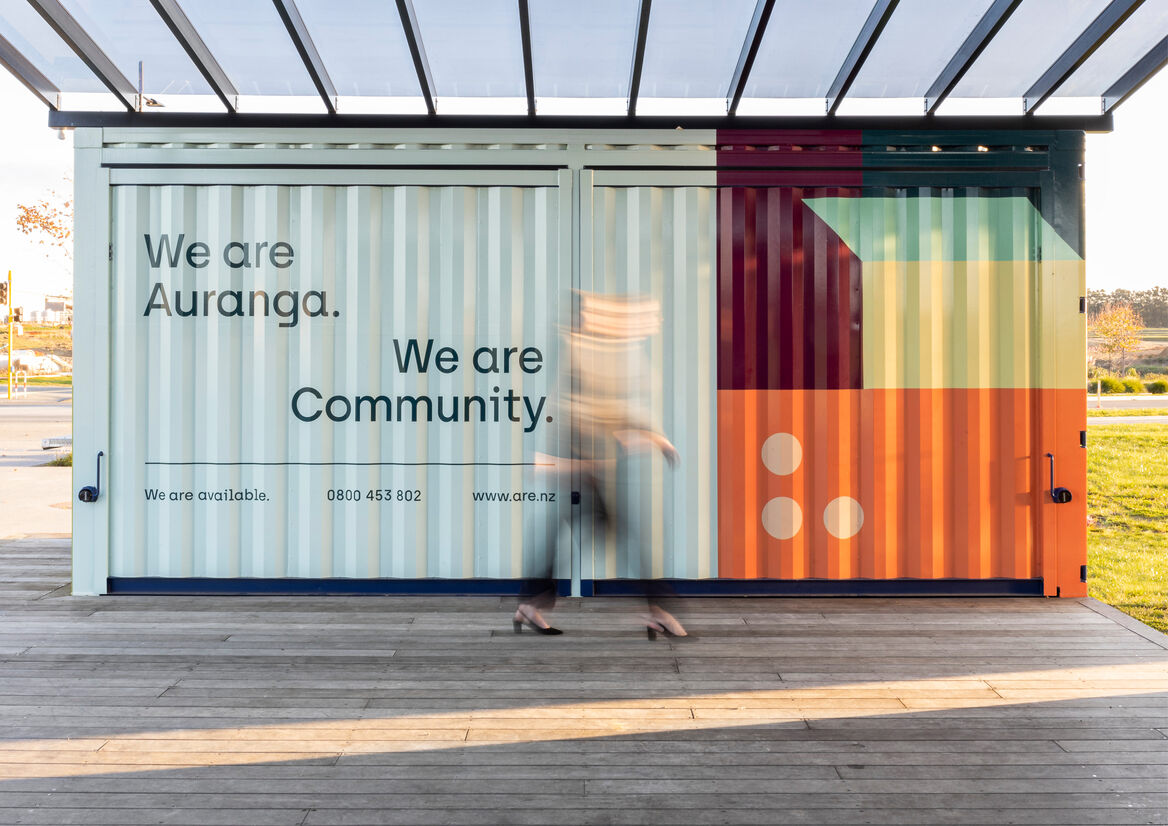
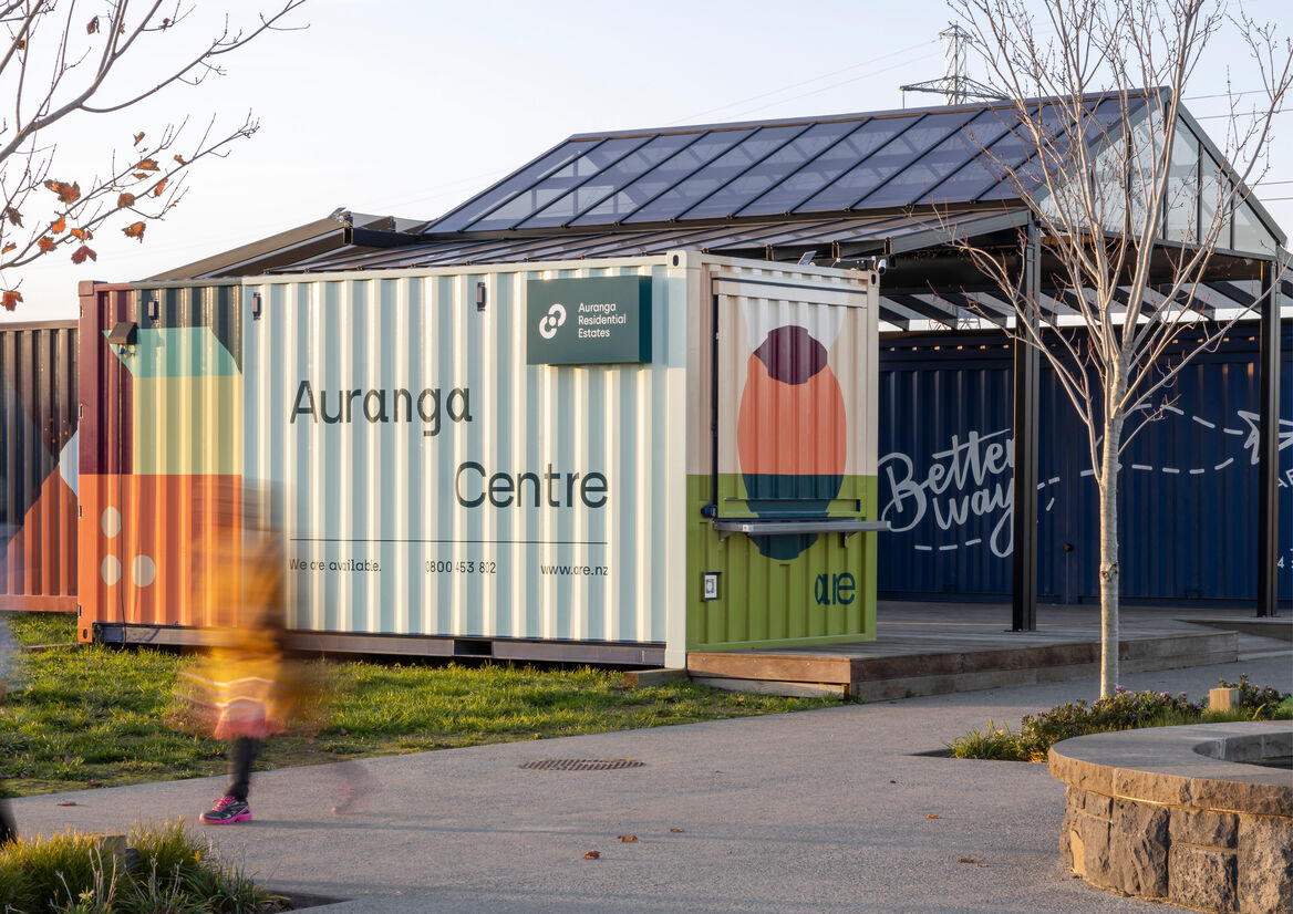
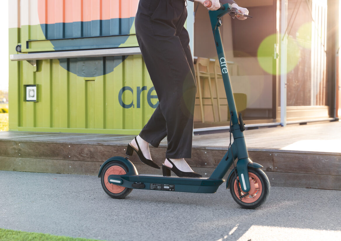
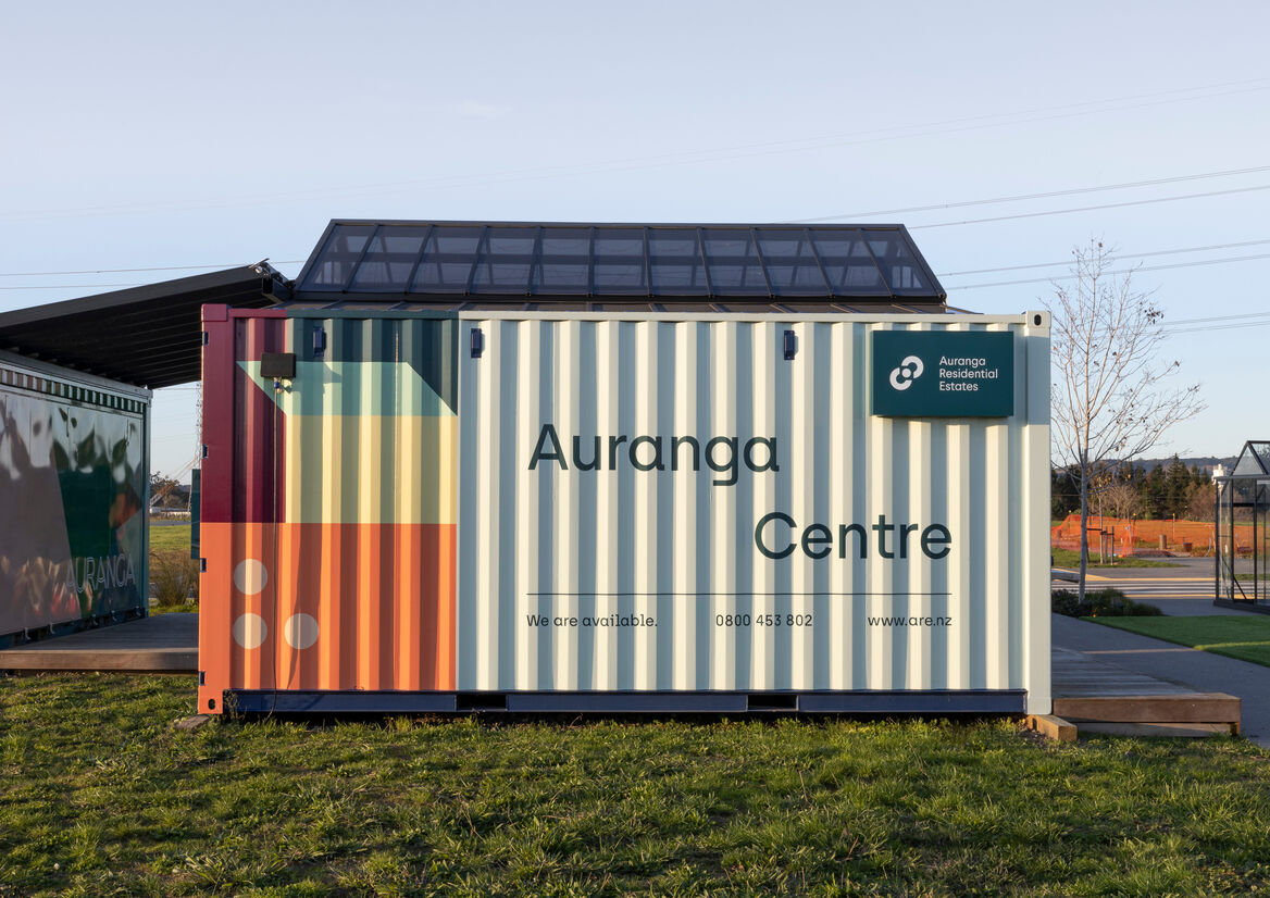
Our clients wanted ARE to reframe the typical transactional real estate experience by putting people over profit. Together, we envisioned ARE as the navigator, concierge, custodian and storyteller of this community with a shared brand DNA based on the pillars. ARE will have a “whole of life” relationship with purchasers – from their first point of contact through purchase, settlement, moving in, integrating into the community and eventually resale – so it is fitting that the local base for ARE, the Auranga Centre, is located in the heart of Village Square opposite BetterWay café. The brightly wrapped 20FT container is the perfect embodiment of the brand - friendly, eccentric, humble – with the strapline ‘We are Auranga. We are Community’.
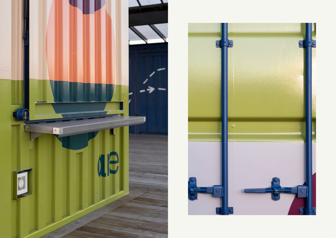
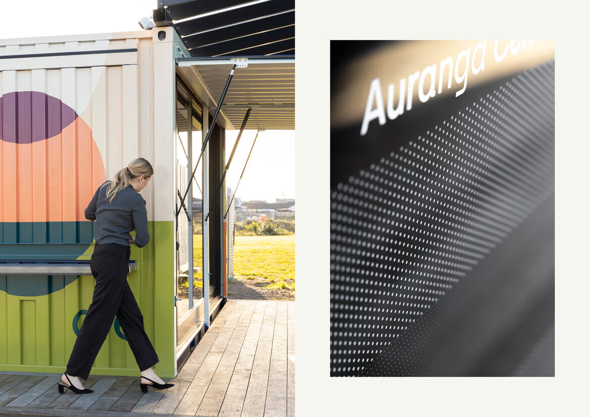
ARE's brand identity is built around a master pattern and four sub-patterns, each of which represents a pillar. The master brand pattern has been used on three sides of the exterior, while the Sociology pattern has been used on the end facing the square where it serves as a visual introduction to the pillars. The sliding joinery is revealed by lifting the side of the container; supported by gas struts, it becomes a canopy that can be closed to secure the space when not in use.
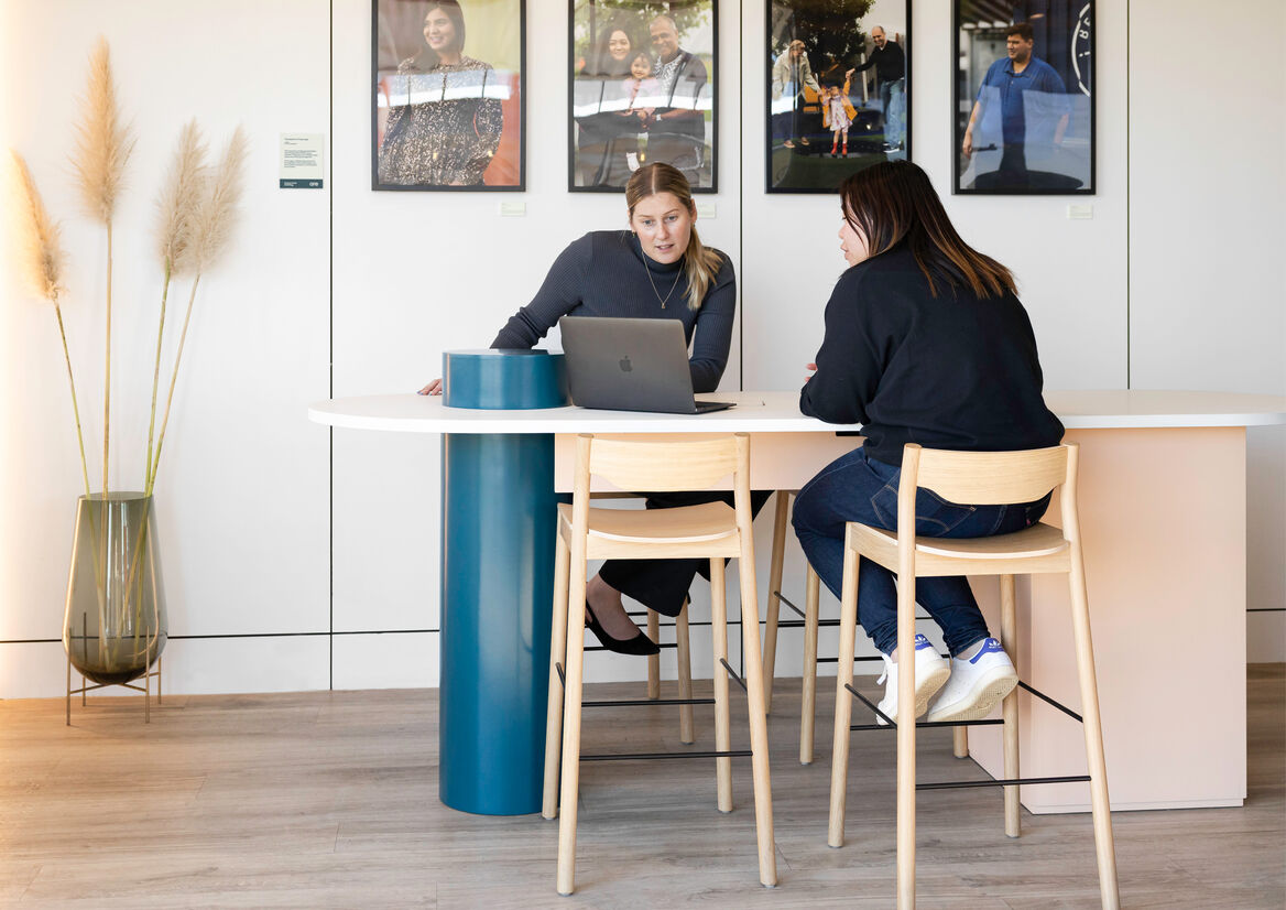
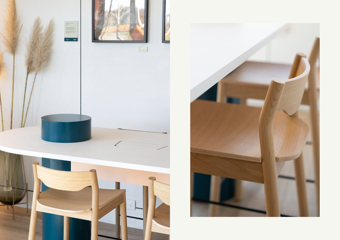
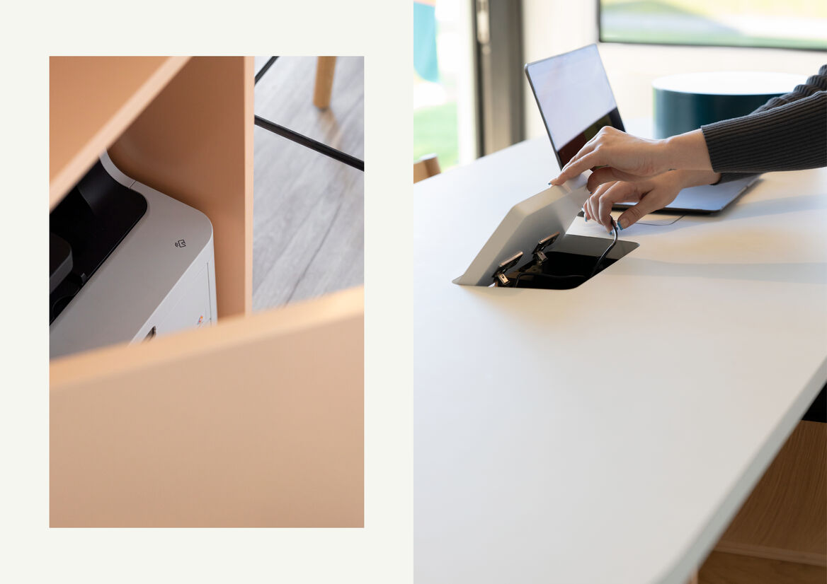
Our challenge with the interior was to create a space that was functional as a sales office, yet also imbued with meaning. Each element in this compact space has been carefully selected to represent a pillar. As the functional hub of the centre, the bespoke, pill-shaped table represents Anthropology. Its sculptural form – which neatly contains a printer and electrical ports - is a spatial interpretation of the brand patterns. The toetoe - which is refreshed regularly from the coastal planting - in a beautiful Echasse vase represents Ecology; the touchscreen – which is used for sales presentations - represents Economy; and the framed ‘Champions of Auranga’, Sociology. These champions are so passionate about the Auranga community that they have agreed to assist ARE as informal guides to new residents.
The success of the Auranga Centre is in how it gives new dimensions – both literally and figuratively – to the ARE brand. The extensive colour palette and geometric shapes come to life on the large, corrugated walls of the container. Inside, the bold exterior is juxtaposed with a curated collection of special elements in a simple gallery-style room, showing the versatility of the brand. It is a billboard, workplace, display suite and layered symbol for how ARE is intrinsically linked with this special community.
Description:
Auranga Residential Estates (ARE) is a boutique real estate agency operating exclusively for, and within, the masterplanned community of Auranga in Drury.
Auranga was founded on our client’s four ‘pillars for a better city’: Economy (the joy of generosity); Sociology (the security of belonging); Ecology (the goodness in creation); and Anthropology (the dignity in serving). These foundations allow a place to become so much more than a development or subdivision; they seed a better way of living.
Our clients wanted ARE to reframe the typical transactional real estate experience by putting people over profit. Together, we envisioned ARE as the navigator, concierge, custodian and storyteller of this community with a shared brand DNA based on the pillars. ARE will have a “whole of life” relationship with purchasers – from their first point of contact through purchase, settlement, moving in, integrating into the community and eventually resale – so it is fitting that the local base for ARE, the Auranga Centre, is located in the heart of Village Square opposite BetterWay café. The brightly wrapped 20FT container is the perfect embodiment of the brand - friendly, eccentric, humble – with the strapline ‘We are Auranga. We are Community’.
ARE's brand identity is built around a master pattern and four sub-patterns, each of which represents a pillar. The master brand pattern has been used on three sides of the exterior, while the Sociology pattern has been used on the end facing the square where it serves as a visual introduction to the pillars. The sliding joinery is revealed by lifting the side of the container; supported by gas struts, it becomes a canopy that can be closed to secure the space when not in use.
Our challenge with the interior was to create a space that was functional as a sales office, yet also imbued with meaning. Each element in this compact space has been carefully selected to represent a pillar. As the functional hub of the centre, the bespoke, pill-shaped table represents Anthropology. Its sculptural form – which neatly contains a printer and electrical ports - is a spatial interpretation of the brand patterns. The toetoe - which is refreshed regularly from the coastal planting - in a beautiful Echasse vase represents Ecology; the touchscreen – which is used for sales presentations - represents Economy; and the framed ‘Champions of Auranga’, Sociology. These champions are so passionate about the Auranga community that they have agreed to assist ARE as informal guides to new residents.
The success of the Auranga Centre is in how it gives new dimensions – both literally and figuratively – to the ARE brand. The extensive colour palette and geometric shapes come to life on the large, corrugated walls of the container. Inside, the bold exterior is juxtaposed with a curated collection of special elements in a simple gallery-style room, showing the versatility of the brand. It is a billboard, workplace, display suite and layered symbol for how ARE is intrinsically linked with this special community.