Spatial
Madeknown 15 Riverside Ōtautahi Wall
-
Pou Auaha / Creative Directors
Josh Thompson, Phillip Sunderland
-
Kaitautoko / Contributors
George Shaw, Guy Ellis, Wongi Wilson, Jacob Ryan, Nick Tam, Tim Loftus, Sam Taylor, Mike Percasky -
Client
Riverside Market
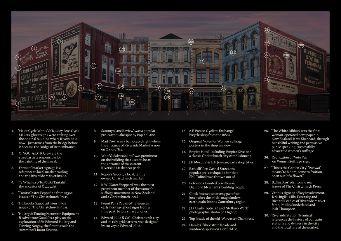
Description:
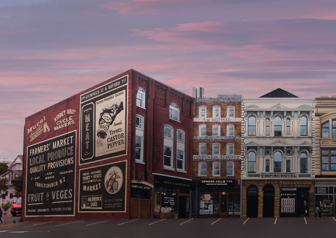
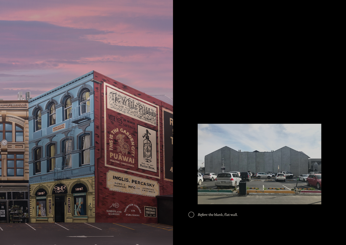
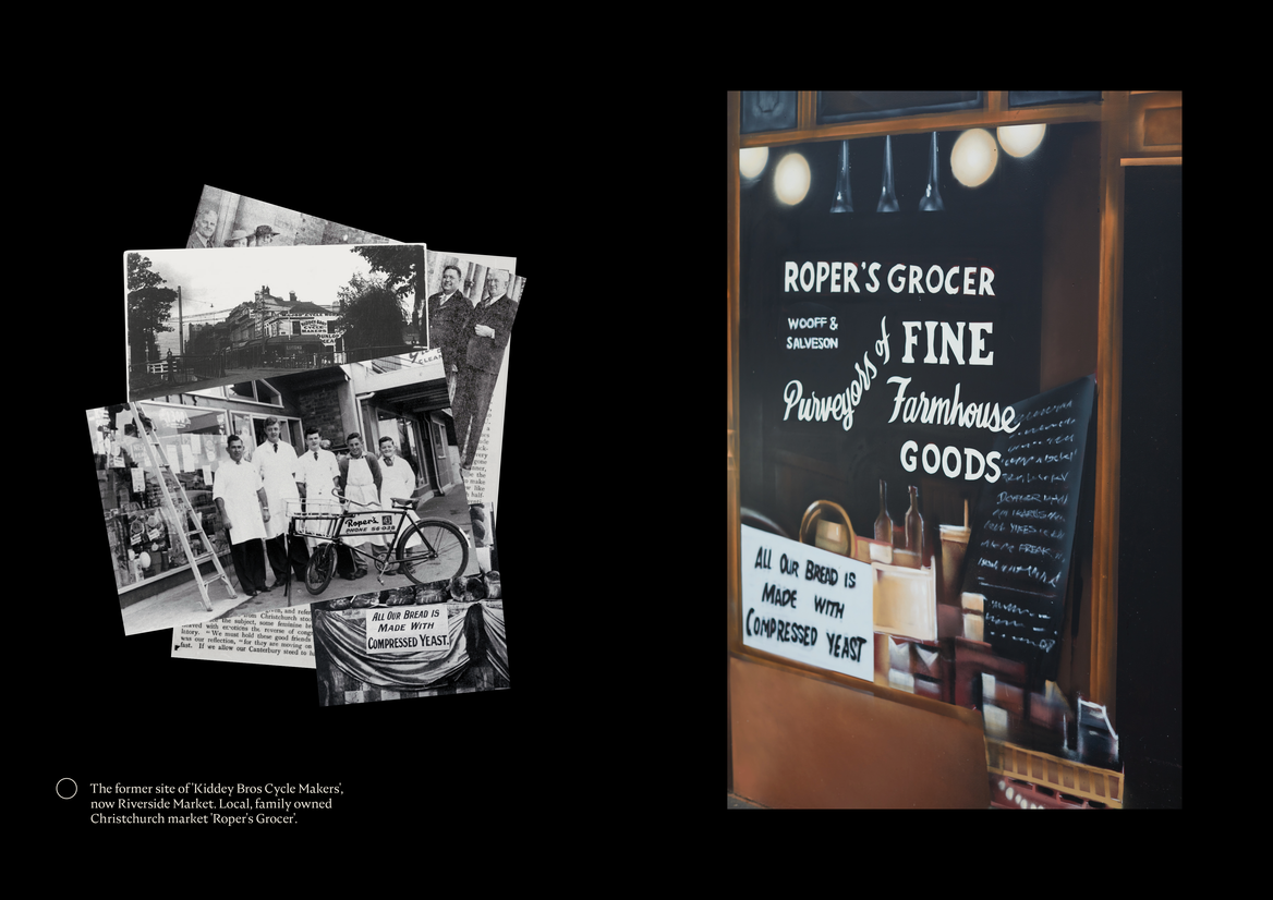
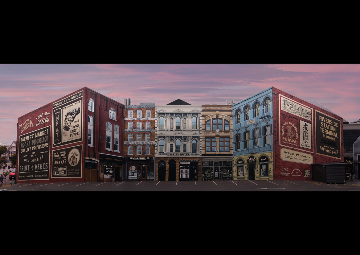
The Riverside Ōtautahi Mural is the largest and most complex ever delivered in the city. Located on the site of the former inner city marketplace (and on the back wall of our new Riverside Market), the mural pays intentional homage to many of our city's icons, as well as recalling much of what was lost in the devastating 2010 and 2011 earthquakes.
The mural is a celebration where old meets new. A reminder of what was lost, but also, of what can never be lost.
We took the approach of situation/time & physical/social context, local story telling, nostalgic captured memories and historical relevancy.
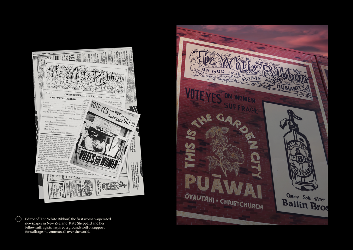
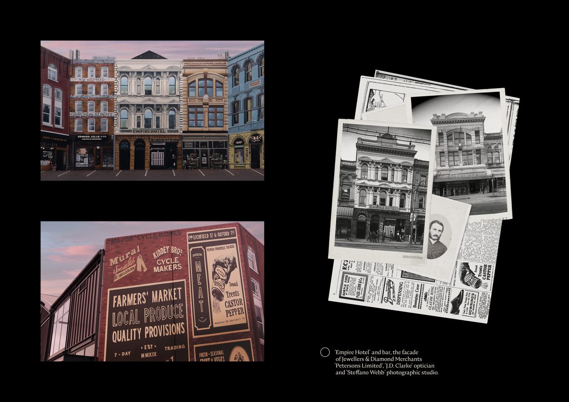
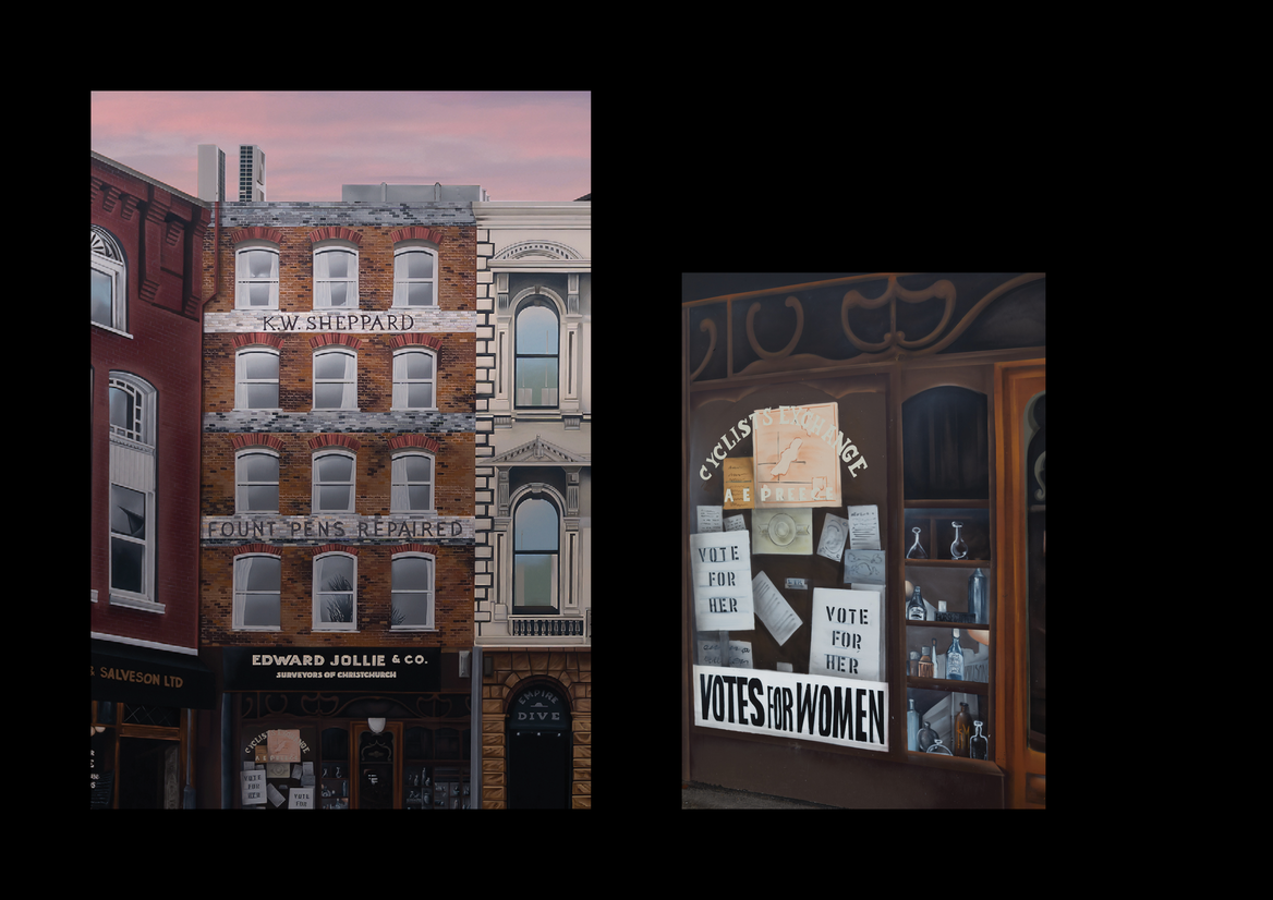
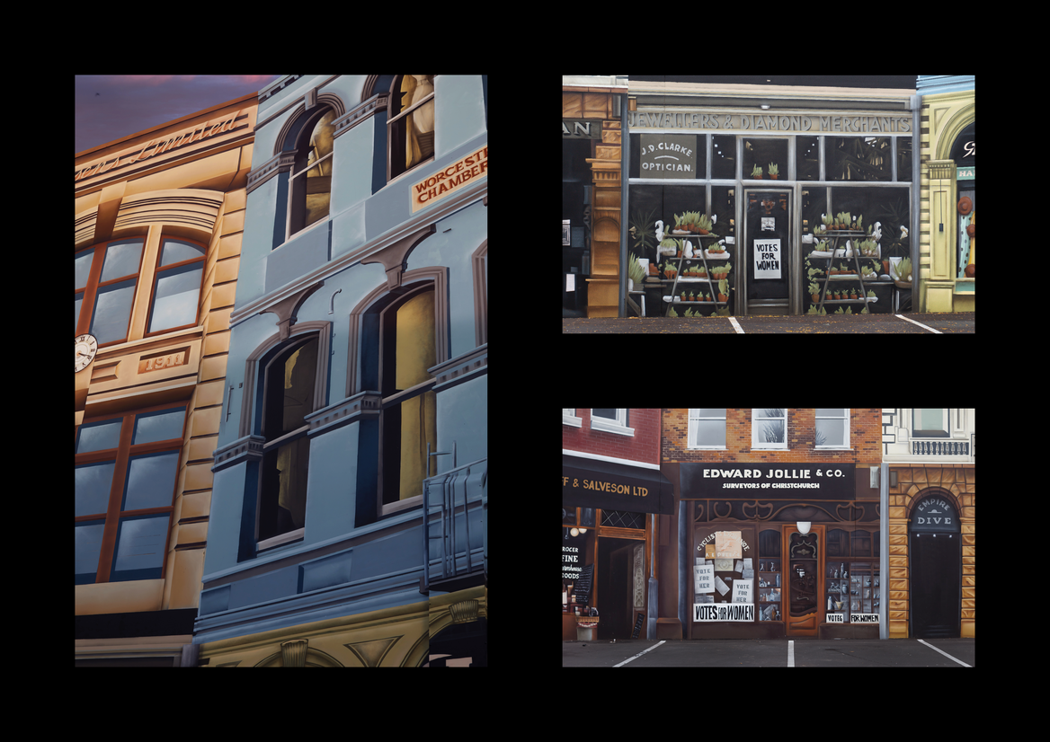
The wall was brought to life with key references to our central city heritage and architecture, remembering defining moments including Kate Sheppard and the broader women's suffrage movement (which started in Ōtautahi Christchurch). The buildings featured in the mural were once located in and around the site but were destroyed in the earthquakes. The businesses mentioned on the shop fronts and walls each take their place in the memories of residents and visitors alike.
We all know that much was lost in the earthquakes, but the mural plays its part in keeping the stories alive for future generations. Several street art tours and cultural walks now incorporate this mural in their narrative, allowing each participant the opportunity to dive deeper into the richness of the individual meanings contained within the work.
By simple design thinking, and research, we were able to bring back a collection of memories of the former Christchurch, taking from the past, while looking to the future. Using alternative mediums, at a large scale, the wall tells a story of unity and determination and sets a platform for what's to come.
Taking advantage of the two peaks of the flat facade, the perspective of the buildings in the artwork tricks the mind into believing it is three-dimensional - an illusion of depth that is stopping visitors to pause and ponder on a daily basis.
It was a lovely opportunity to take a bland, concrete tilt slab wall and transform it for the delight of all who pass by.