Spatial
Elmore Booth 7 Oli Booth
-
Pou Auaha / Creative Directors
Oli Booth, Libby Elmore
-
Client
Oli Booth / Libby Elmore

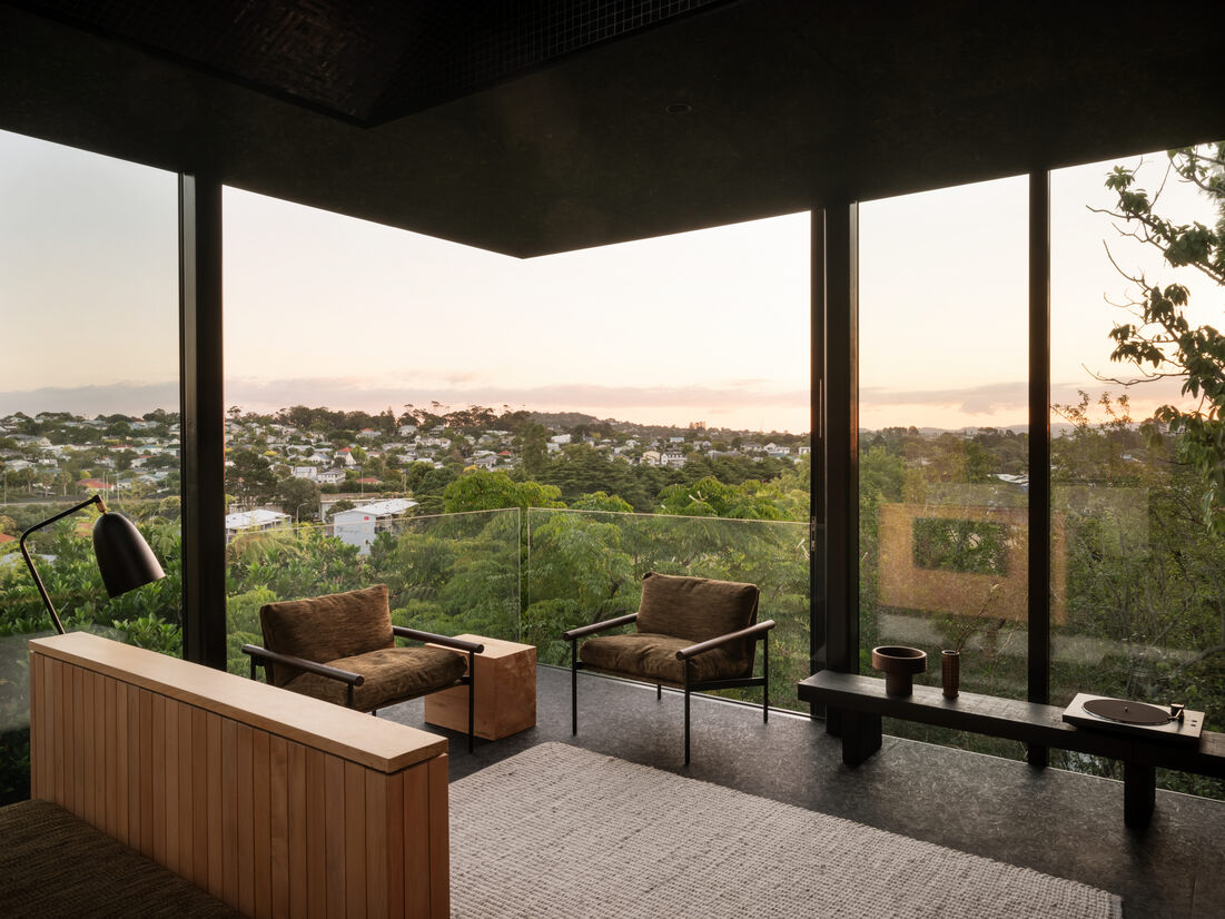
Description:
Lightly Weighted was conceived as an example of infill housing in an urban context. It sought to address how architectural quality doesn’t need to be compromised at scale typically considered ‘small’ within its wider environment.
This is a design-build project I have undertaken myself with my wife. With rising property prices and increasing unaffordability, we collaborated with a friend in purchasing a property together. Coinciding with the introduction of the Unitary Plan, it was an opportunity to see how successful infill housing could be achieved in a suburban context.
Built on a 280m2 ‘back yard’ the property was subdivided in two. The design opportunity was to establish a compact family home that prioritised quality of space and encourages a generosity not typically associated with homes at this scale.
The project was designed, documented and managed by myself, involving significant coordination of contractors and trades.
In a lot of ways, designing for yourself gives you a unique opportunity to test and trial details that may otherwise not be possible. Some aspects of the design were completely unique to this project and involved extensive research and testing.
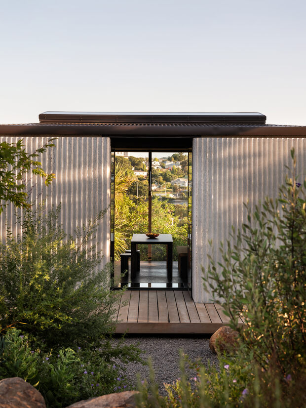
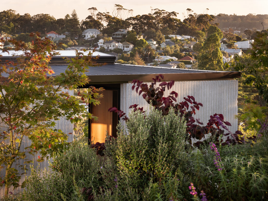
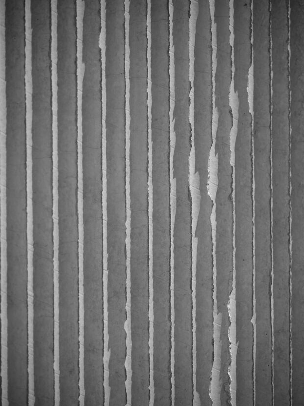
An example of this was the fluted concrete walls. The texture was created through the use of cardboard tubes often used as a functional core in upholstery fabrics. These were custom made at an efficient diameter and density in order to withstand the pressure of concrete. After being sealed by ourselves and delivered to a precast concrete manufacturer, they were cast off site and craned into place in 6 panels.
These established the protective shell that envelops the home and protects the expansive views within. The intent was to create a monolithic facade which seemed robust at a distance, but delicate and intricate on approach. The ridges created between each flute allowed for a natural erosion of the concrete. This creates an ever changing shadow play across the facade of the home throughout the seasons.
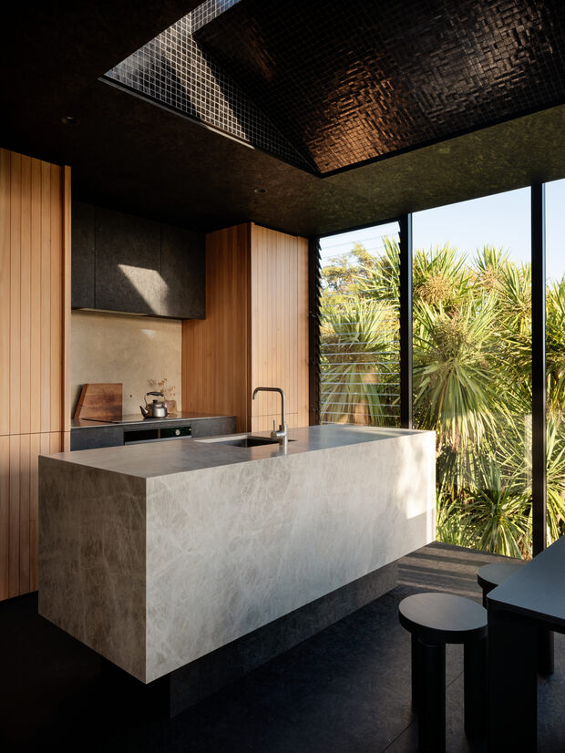
Another unique design challenge was the light scoop inserted at the apex of the roof structure.
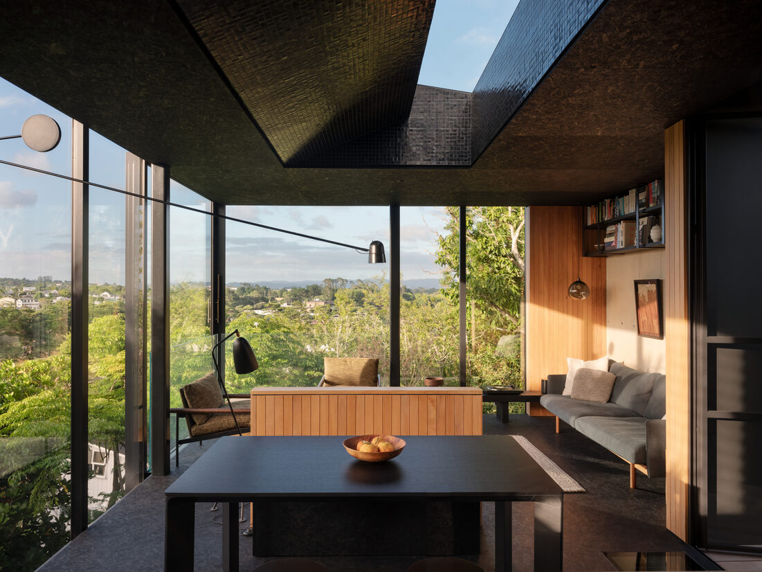
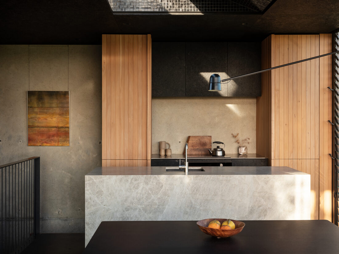
With the primary focus of the house being south, away from the sun, this provided a special opportunity to consider how best to let light back in. Exploring how light can be amplified, a 4.2-metre long 'slot' was inserted at the apex of the roof. Together with the ceiling space flaring out, this encouraged the sunlight to be directed deeper into the living spaces. Black glass mosaic tiles clad the interior of this form which generates a playful throughout the day.
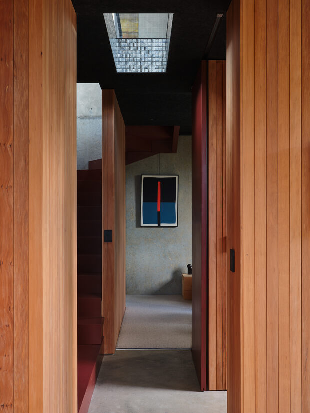
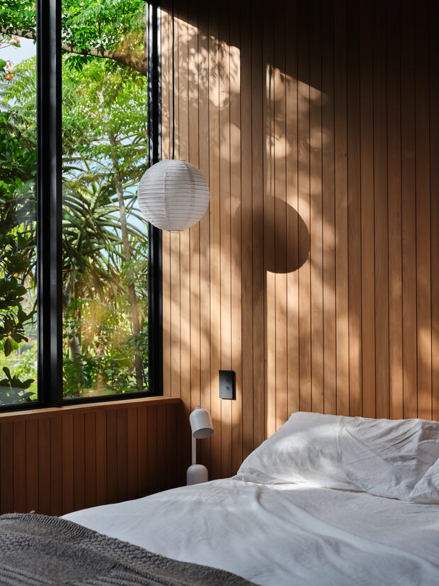
Totara Interior linings and inbuilt furniture were designed and installed by myself and my wife, Libby.
Having complete autonomy and a small scale allowed me the privilege and freedom to explore design ideas honestly and without restraint.
Judge's comments:
The judges fell in love with 'Lightly Weighted' and this was just one project in Oli's impressive portfolio. Oli's work exhibits a fine aesthetic sense, beauty and innovation in details, and attention to the quality and function of spaces. Oli has pushed boundaries embracing all aspects of the project through to research of unique construction techniques..
Oli has an impressive portfolio and demonstrates a high level of competence, finesse and talent in both being able to design beautifully, but also to execute relentlessly. Oli is unafraid to push himself to develop, research and iterate - all skills which, in time, enable innovation, beauty and craft.