The latest in high-efficiency and environmental designs are all wrapped up in a sweet nostalgic style for a fun young family.
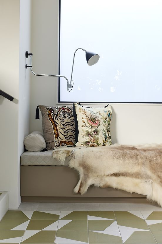
The design of architect Kate Rogan’s own home is in every way an expression of the way she and her family like to live. Going against the grain of open-plan living, Kate and her husband, who have two young children, prefer their interpretation of a broken-plan concept. This means an interior layout that has some degree of separation but still connected. With cosy nooks and enclaves, including a sunken lounge and a private snug, the home is a relaxed sanctuary.
The Grey Lynn location reflects that same ideal. Although it’s in the midst of a popular city-fringe Auckland suburb, the site is tucked away at the end of a leafy cul-de-sac near a park. Its quirky triangular shape, with a sharp slope at the back, required some creative thinking. Rogan Nash Architects turned the challenge into a positive.
A level lawn and car parking at the street front then steps down to the front door. Inside, considered design ekes out maximum functionality. A cloak room and powder room flank the entrance and, further, there is a study and a storage room. Progress through this level leads past the kitchen, dining and service areas, down to the sunken lounge where the ceiling height gives way to a lofty 3.2m.
Rogan Nash Architects are proud to have achieved Homestar 6 rating by the New Zealand Green Building Council. The house doesn’t use structural steel, and is above code in terms of insulation, even within internal walls. Hot water is via heat pump, as is the clothes dryer.
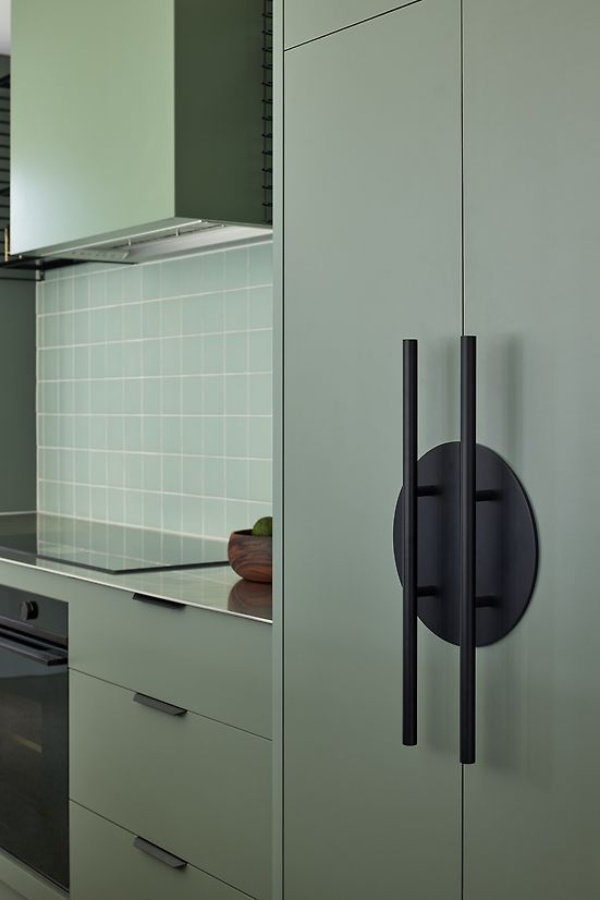
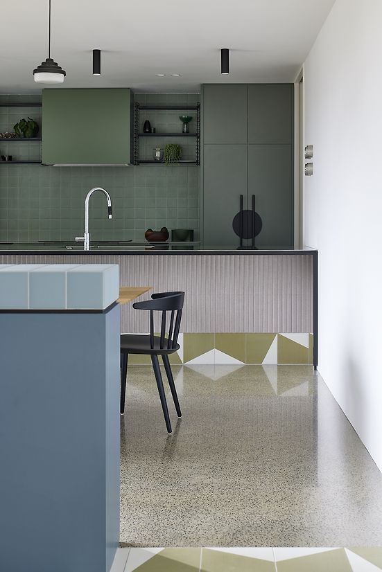
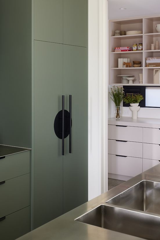
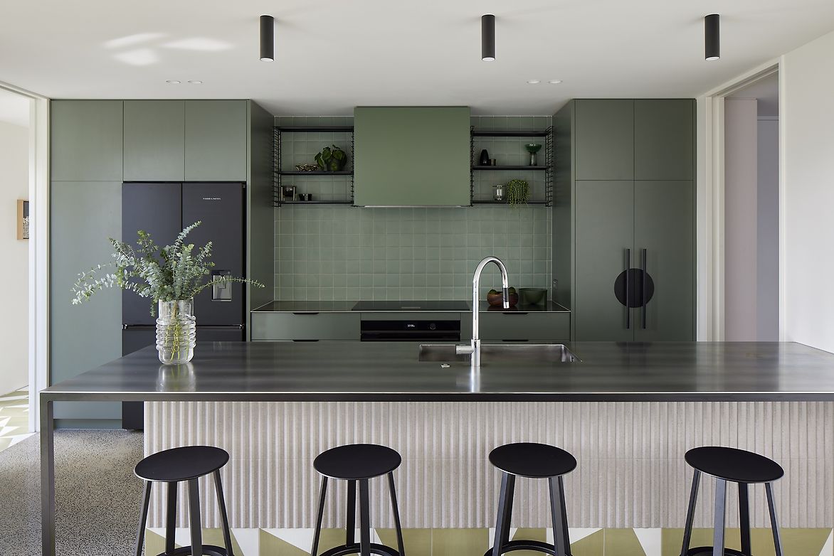
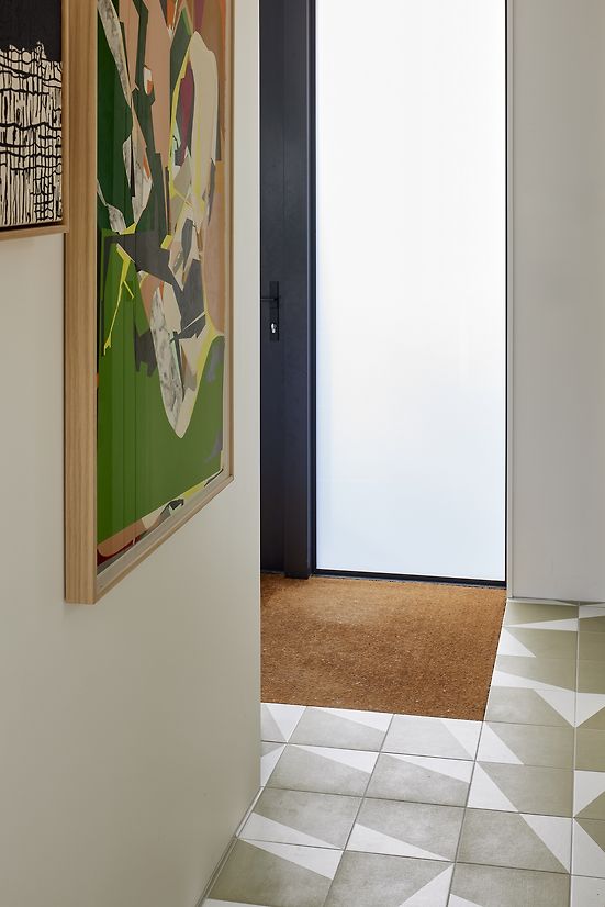
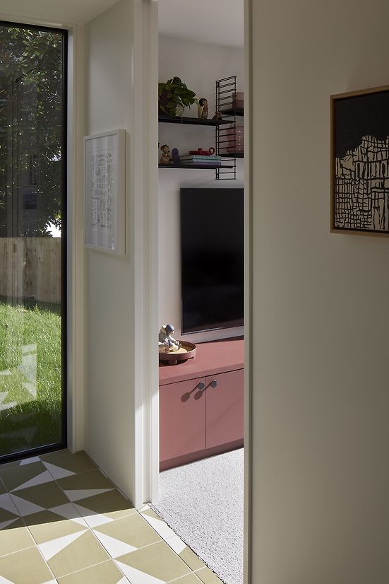
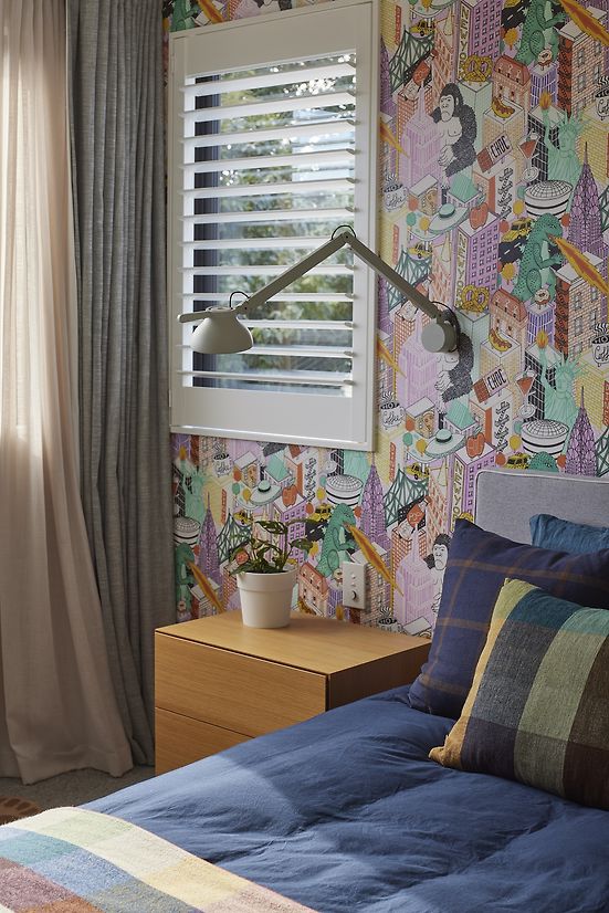
Clever use of colour-blocking further delineates internal areas of the home. Graphic olive and white Mutina tiles immediately set the tone at the entrance. The kitchen is slate green, a dusky blue sideboard anchors the dining room, the living area is sandy beige, and paler pinks denote the service areas such as laundry and scullery. Bold patterned wallpapers add vibrancy to the three upstairs bedrooms.
Well separated from the rest of the house the snug acts as an all-important media room. A large picture window captures western light, and careful planning ensures the large TV and sofa don’t dominate the space. The colour tone here is a deep maroon that draws the eye.
All the colours throughout were chosen to feel mismatched yet still pleasing. The overall tone is one of nostalgia – familiar and homely.
The use of tile reflects this sense of comfort. The Mutina tiles in the entrance are repeated in a walkway through the living area to the deck, and they are also wrapped around the base of the kitchen island evoking the feel of a milk bar.
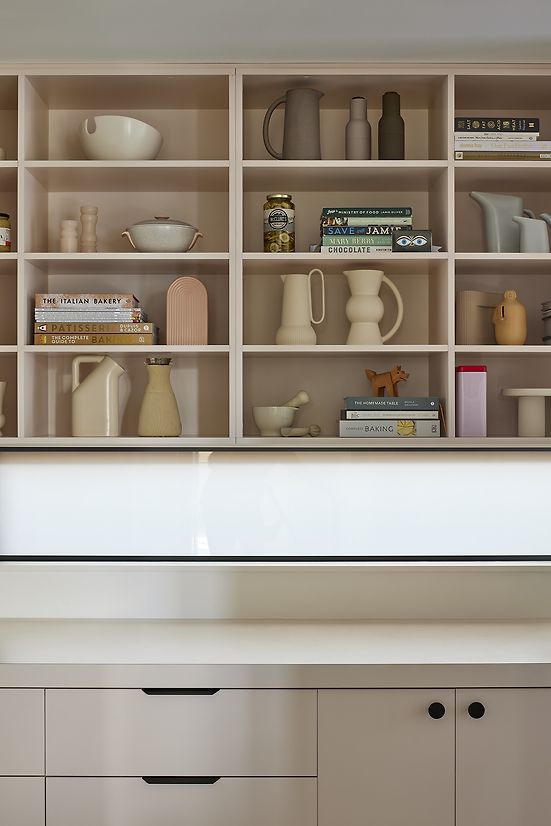
The sideboard in the dining area is finished in 70s-style square tiles. A circle motif, for example in cabinetry hardware and pendant lighting, softens the geometrics and extensive use of 1950s-era Tomado shelving cements the old-school feel.
Description:
The latest in high-efficiency and environmental designs are all wrapped up in a sweet nostalgic style for a fun young family.
The design of architect Kate Rogan’s own home is in every way an expression of the way she and her family like to live. Going against the grain of open-plan living, Kate and her husband, who have two young children, prefer their interpretation of a broken-plan concept. This means an interior layout that has some degree of separation but still connected. With cosy nooks and enclaves, including a sunken lounge and a private snug, the home is a relaxed sanctuary.
The Grey Lynn location reflects that same ideal. Although it’s in the midst of a popular city-fringe Auckland suburb, the site is tucked away at the end of a leafy cul-de-sac near a park. Its quirky triangular shape, with a sharp slope at the back, required some creative thinking. Rogan Nash Architects turned the challenge into a positive.
A level lawn and car parking at the street front then steps down to the front door. Inside, considered design ekes out maximum functionality. A cloak room and powder room flank the entrance and, further, there is a study and a storage room. Progress through this level leads past the kitchen, dining and service areas, down to the sunken lounge where the ceiling height gives way to a lofty 3.2m.
Rogan Nash Architects are proud to have achieved Homestar 6 rating by the New Zealand Green Building Council. The house doesn’t use structural steel, and is above code in terms of insulation, even within internal walls. Hot water is via heat pump, as is the clothes dryer.
Clever use of colour-blocking further delineates internal areas of the home. Graphic olive and white Mutina tiles immediately set the tone at the entrance. The kitchen is slate green, a dusky blue sideboard anchors the dining room, the living area is sandy beige, and paler pinks denote the service areas such as laundry and scullery. Bold patterned wallpapers add vibrancy to the three upstairs bedrooms.
Well separated from the rest of the house the snug acts as an all-important media room. A large picture window captures western light, and careful planning ensures the large TV and sofa don’t dominate the space. The colour tone here is a deep maroon that draws the eye.
All the colours throughout were chosen to feel mismatched yet still pleasing. The overall tone is one of nostalgia – familiar and homely.
The use of tile reflects this sense of comfort. The Mutina tiles in the entrance are repeated in a walkway through the living area to the deck, and they are also wrapped around the base of the kitchen island evoking the feel of a milk bar.
The sideboard in the dining area is finished in 70s-style square tiles. A circle motif, for example in cabinetry hardware and pendant lighting, softens the geometrics and extensive use of 1950s-era Tomado shelving cements the old-school feel.