Spatial
Ockham Residential 6 Smudge Signs Aroha
-
Pou Auaha / Creative Directors
Mark Todd, Hannah Chiaroni-Clarke -
Pou Taketake / Cultural Lead
Marutuahu Iwi
-
Ringatoi Matua / Design Directors
Anisha Vallabh, Adrienne Wong
-
Ngā Kaimahi / Team Member
Michael Stanton -
Kaitautoko / Contributor
Kylie Fleet -
Client
Ockham Residential
Description:
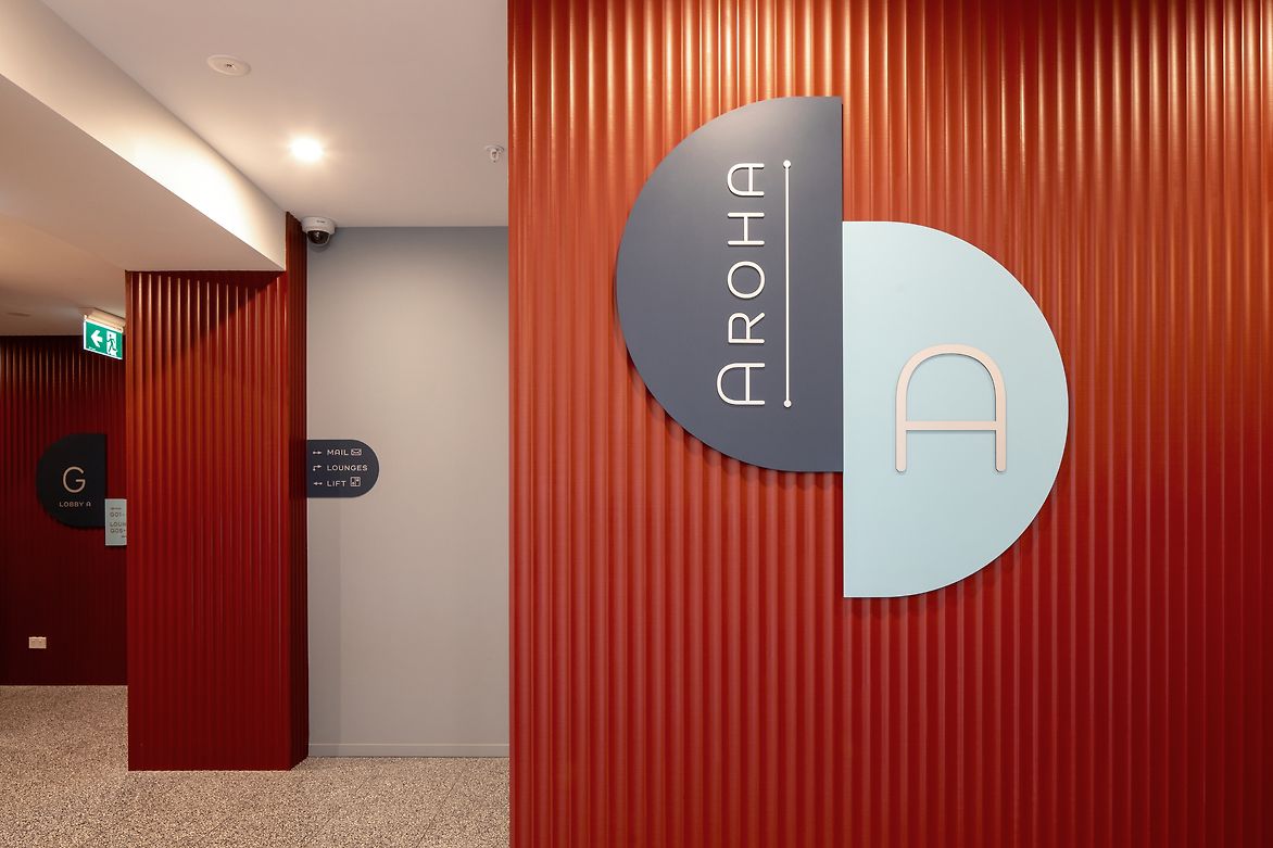
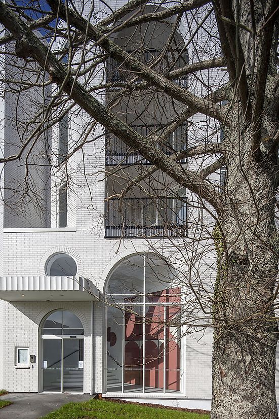
At this large residential development, with 117 apartments spanning across two buildings, with multiple resident spaces, amenities, and building infrastructure; colour was used to create an aesthetic experience by enhancing the interior and exterior architecture and be used in a functional way to address the navigation of the buildings.
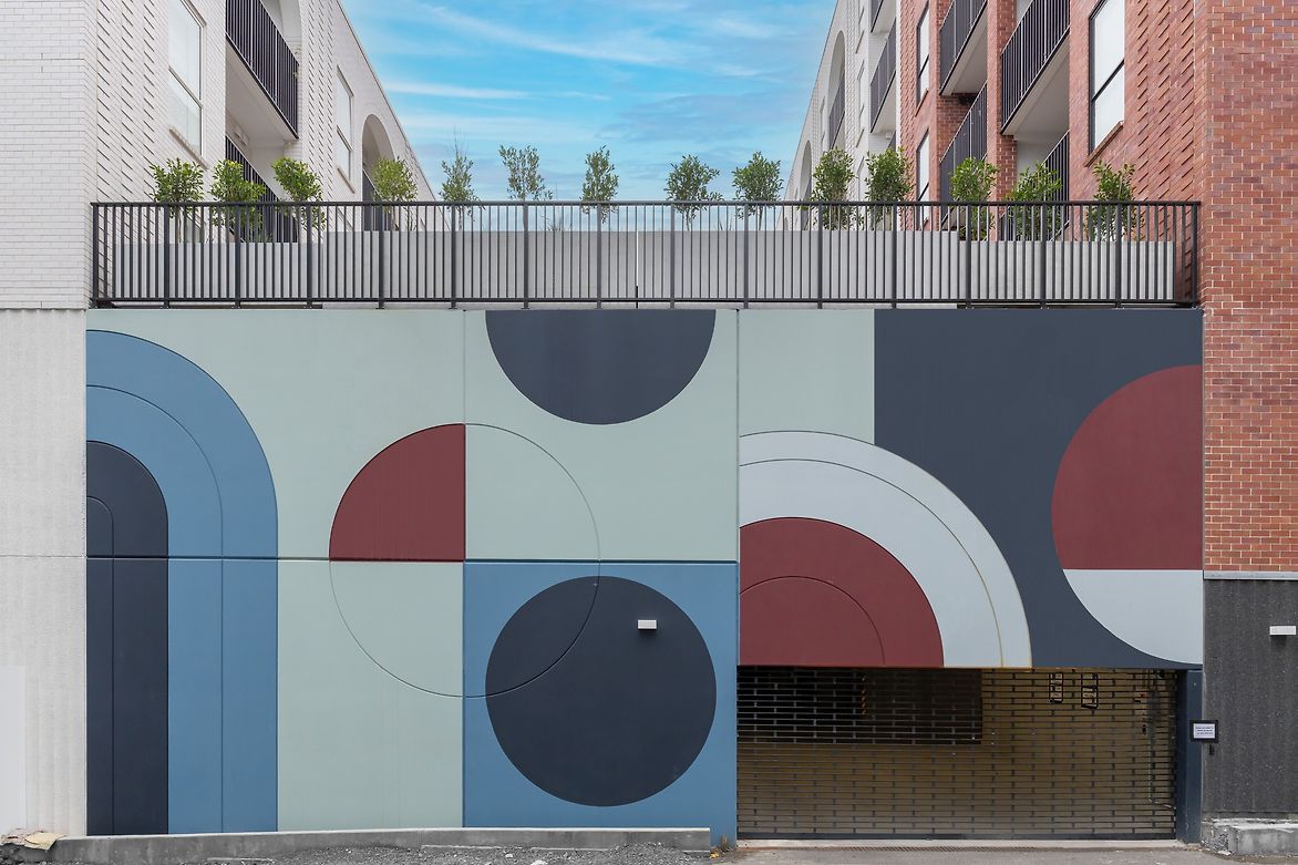
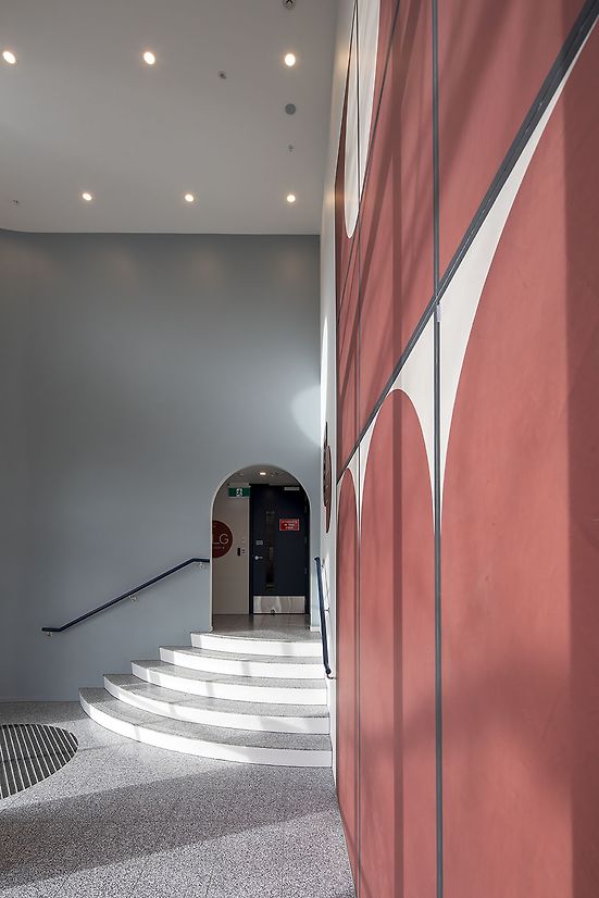
The design concept was driven by the distinctive shape of the arches in the exterior architecture and red brick with purple undertones. These architectural features inspired the bold colour ‘retro’ feel, an approach to interiors common to the 1970s-80s decades.
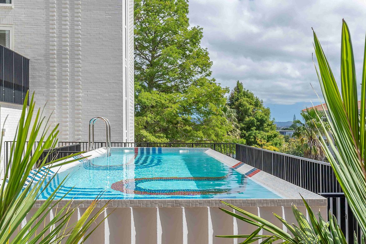
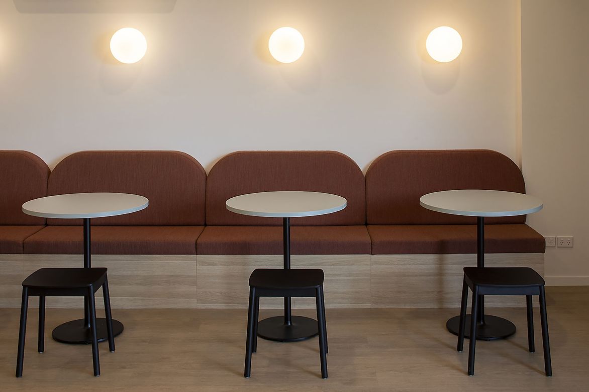
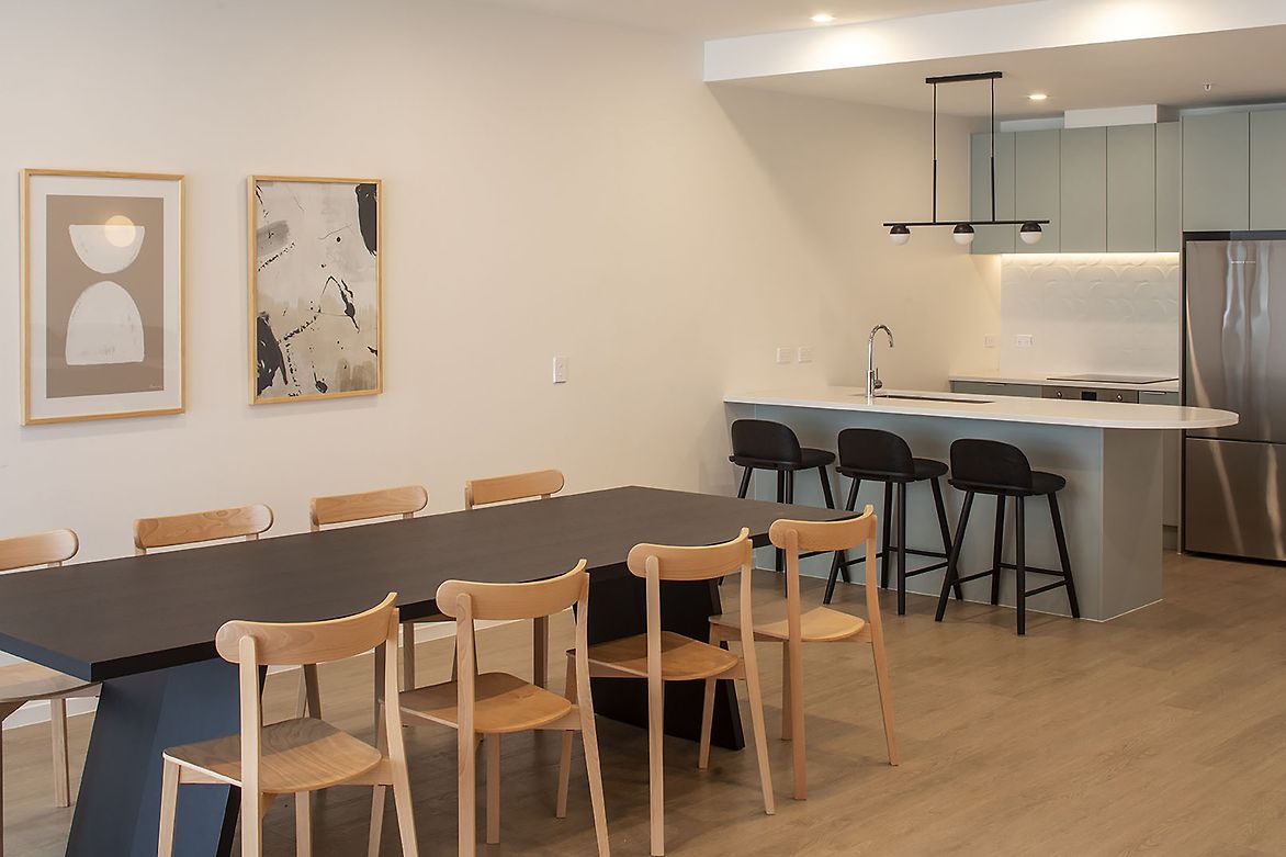
Colour was used boldly on an exterior mural, the colour palette echoed as accents in the pool mosaic design, the main lobby, the secondary lobby, in wayfinding signage, apartment signage, and door colours and wall colour choices, through to the purchased furniture in the shared spaces.
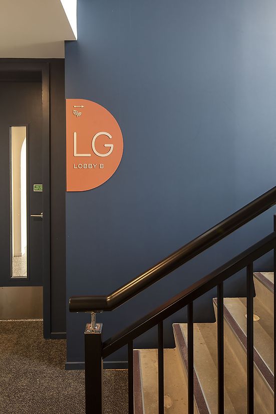
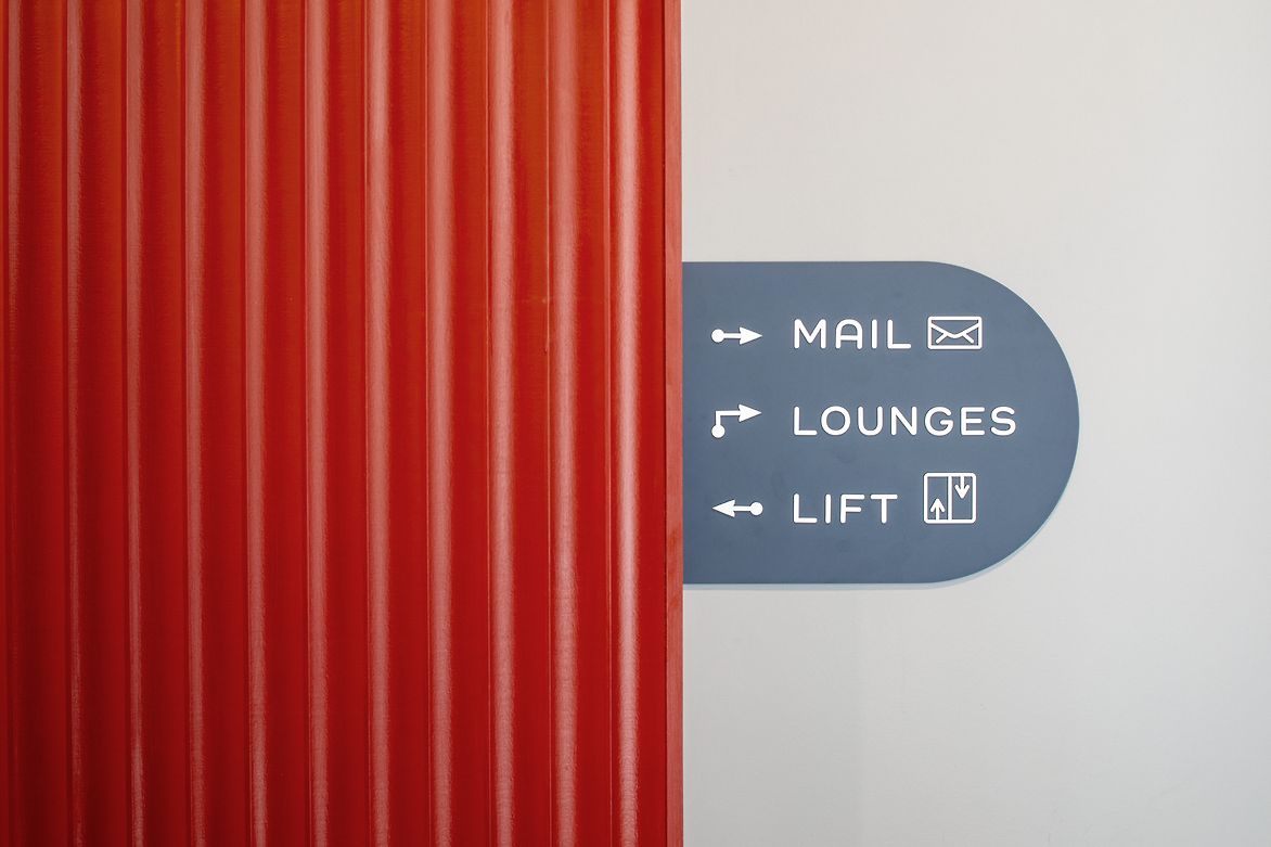
To help both residents and visitors (including tradespeople) find their way and use the spaces, colour was used as “coding” to simplify visual information by differentiating between buildings, floors and spaces.
Moving through the buildings, one experiences the colour palette in a consistent manner.
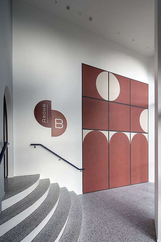
The colour palette of dark blue, light blue, deep red and light clay are used across the development to code locations and purpose to the user. Depending on the combinations, these colours create vibrancy or peaceful harmony. The deep red of the full-height fluted panels in the main lobby, paired with the visual contrast of the dark and light blues of the main lobby signage is a warm, invigorating welcome to the building.
The colour palette for the wayfinding signage is further coded, where dark and light blue alternate across floors in Building 1. The tall entry lobby at Building 2 uses the earthy colours of the deep red and light clay imaginatively in a striking double-floor-height matte-finish tile, these colours echoed in the door colours and apartment number plaques that alternate for colour-coding, over the floors in the second building.
Challenges included using colour in a cohesive way across spaces with a range of functions, materials and finishes. Achieving consistency required colour matching across varied colour applications, for example: paint, concrete pigment, interior furnishings.
Colour-coding the many spaces was challenging as there was a risk of unintentionally having an overwhelming and visually busy space. The solution was to use the wayfinding signs, not only to help further colour-code the floors and areas, but also to serve as a visual link by bringing together the colour palette used across the development.
The emotional effects of colour are well-known. This bold and consistent use of colour in tandem with architectural design choices, creates a development with personality.
The colour palette at this development creates a lively, invigorating space for residents and visitors to enjoy from the moment they approach the building.