Spatial
Museum of New Zealand Te Papa Tongarewa 15 Rita Angus: He Ringatoi Hou o Aotearoa | New Zealand Modernist
-
Pou Auaha / Creative Directors
Rosanne Kwan, Ginevera Ambrosia
-
Ringatoi Matua / Design Directors
Lizzie Bisley, Hanahiva Rose
-
Ngā Kaimahi / Team Members
Charlotte Davy, Prue Donald, Catherine Halbleib -
Client
Museum of New Zealand Te Papa Tongarewa
Description:
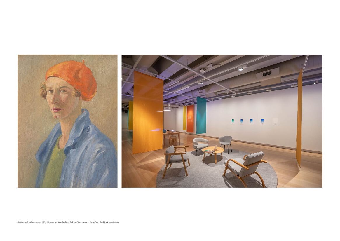
Rita Angus believed deeply in the power of colour – as an expression of energy, emotion, and the vibrancy of life. Often small scale, her works jump off the wall. They draw us in with a swathe of viridian green, lemon yellow, or cadmium red. Angus described herself as synesthetic, and her sense of colour was closely connected to her identity as a woman painter. As she wrote in 1948, ‘I paint colour as a woman sees and hears...’.
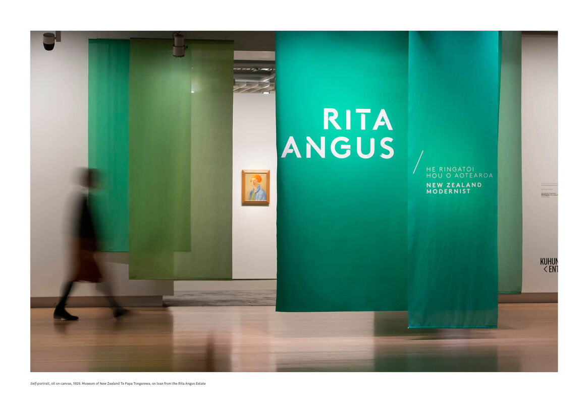
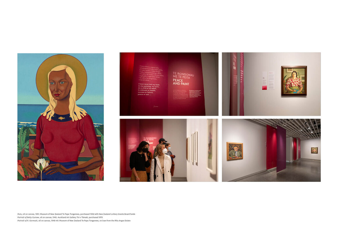
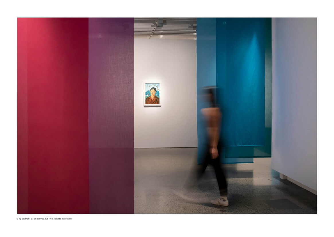
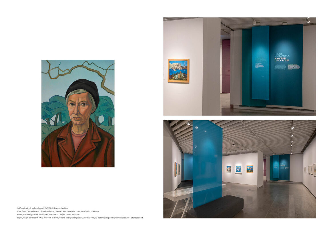
Te Papa’s summer exhibition – Rita Angus: He Ringatoi Hou o Aotearoa/New Zealand Modernist – used colour as the central spine of its design. Soft, semi-transparent textile drops hung throughout the galleries, punctuating the visitor journey and providing a clear progression through the space. Against crisp white walls, these textiles brought Angus’s palette physically to life. Swaying gently as visitors walked between them, the drops framed paintings and offered long views. They created a joyous design which celebrated both the artworks themselves, and Rita Angus’s vision of the world.
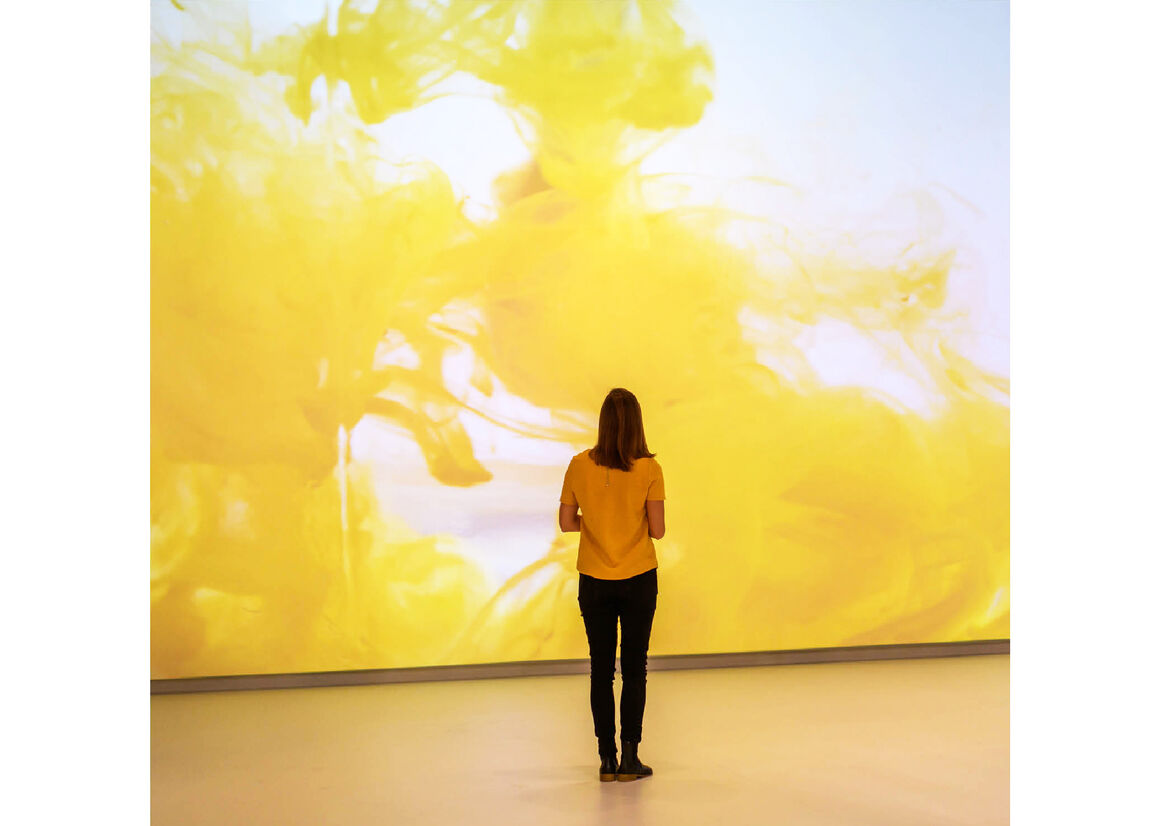
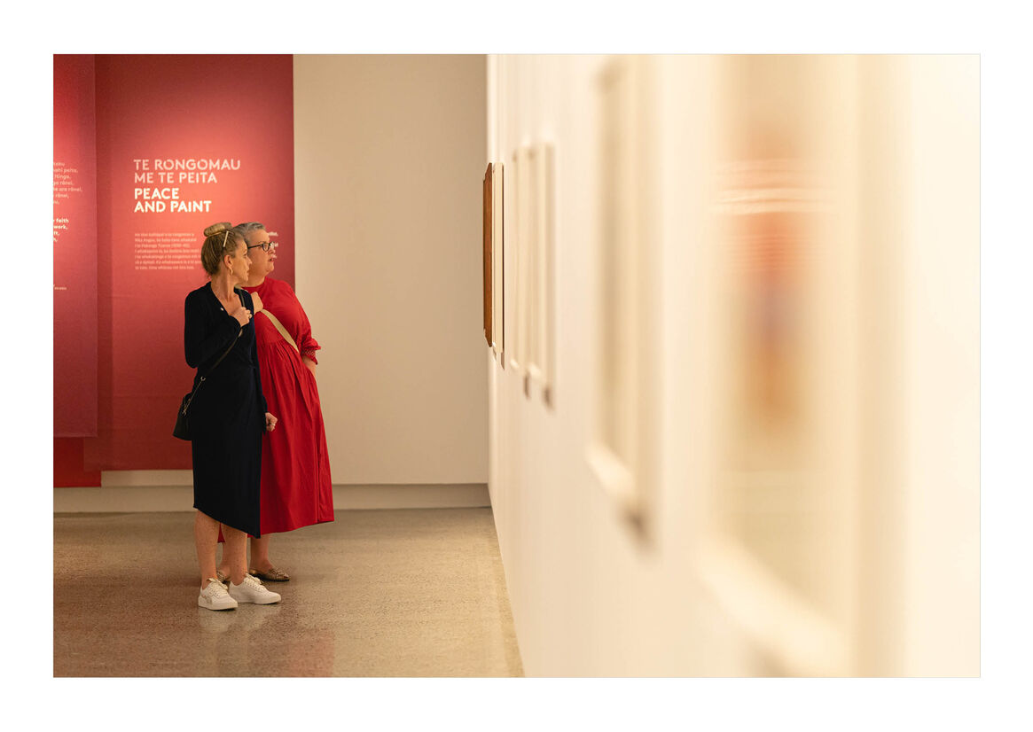
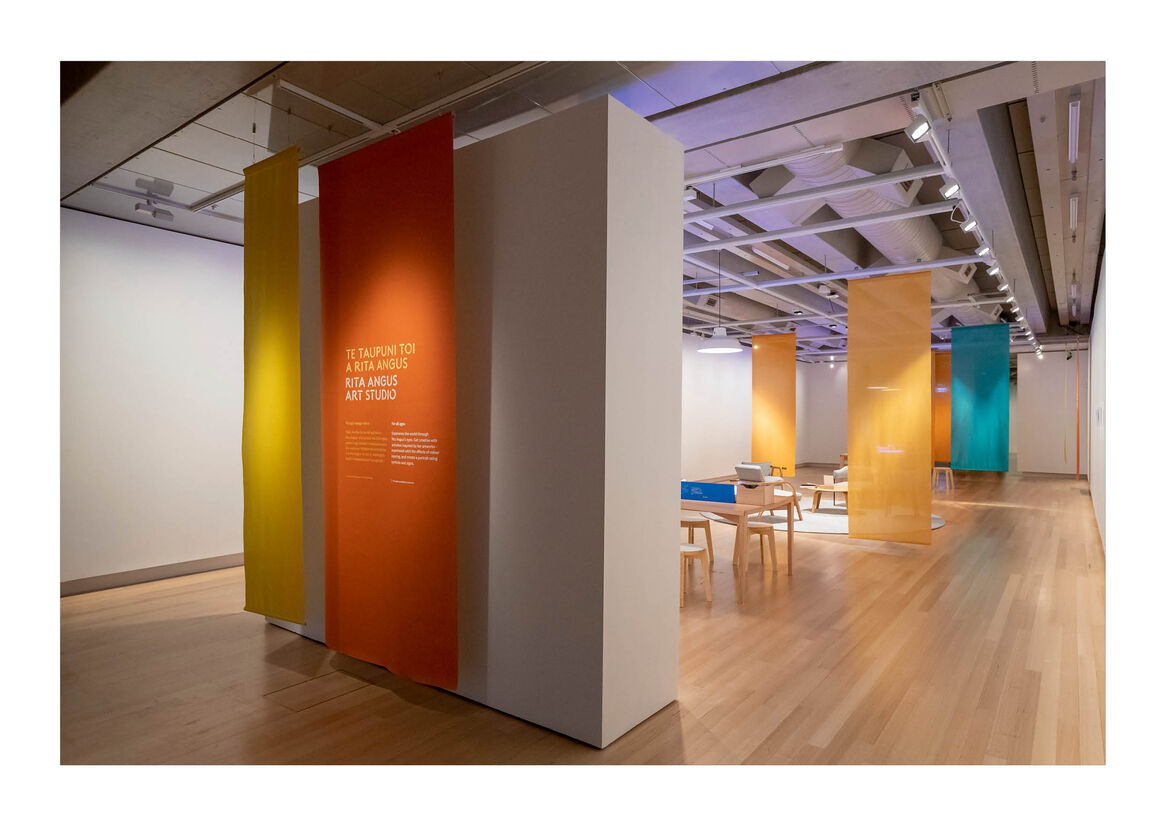
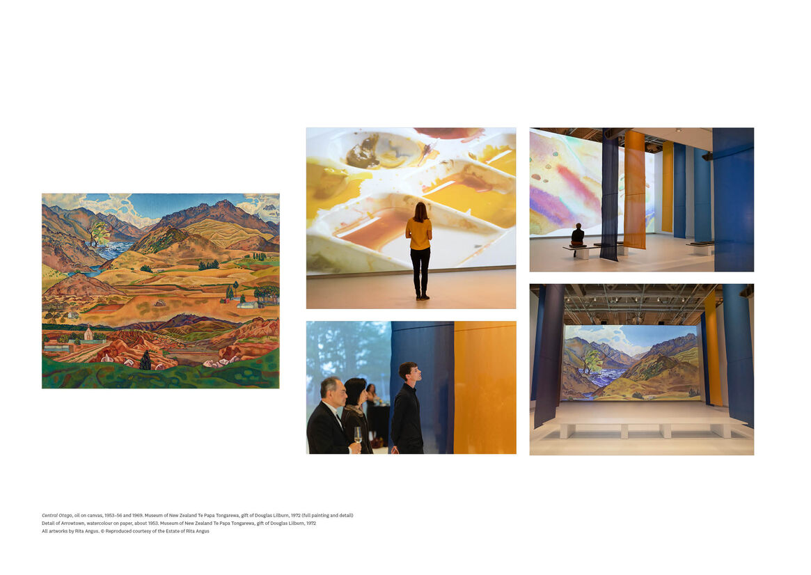
The exhibition began in a double-height gallery. A film, focussed on Angus’s painting Central Otago, was projected on two 9-metre walls. Drops of colour hung through the centre of the space, encouraging visitors to see connections between the colours in the painting, and those in the landscapes where Angus was working. From there, visitors moved through three main exhibition galleries. The first gallery was filled with fabric drops in tones of green, the second with purples and reds, the third with blues. Leaving the exhibition along a corridor that moved from blue to golden yellows, visitors finished in an art studio populated with yellow drops.
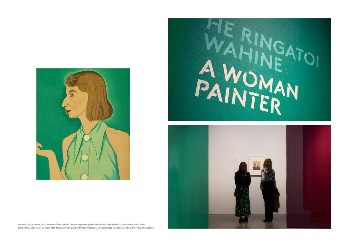
The main colour in each gallery was chosen to highlight the most important paintings in that space. Specific tones were chosen by looking at samples of fabric next to the artworks themselves. Many visitors commented on how this colour journey affected their experience of the exhibition – drawing attention to specific paintings, and making them think more widely about the importance of colour to Angus’s practice.
Rita Angus was very interested in colour theory, and the ways that colours interact with each other. The drops in the exhibition were hung in families to create dynamic combinations of different tones. The relationships between the colours, and between textiles and paintings, shifted as visitors moved through the space.
The focus on colour continued in the exhibition’s graphic treatment. Coloured drops of canvas were used for the main title treatment, and at the entry to each gallery. Quotes from the artist floated in front of these, printed on semi-transparent textile drops. The top-level text on the exhibition labels was printed in green, red and blue, to differentiate across the three main galleries. Alongside the curator’s labels, some paintings also had a response from a contemporary artist or writer. These contemporary responses were treated with a fluid wash of colour along the bottom third of the label, mimicking the spread of watercolour paint across paper.