Spatial
Marutūāhu-Ockham 7 Kōanga
-
Pou Auaha / Creative Directors
Rose Fox, Paul Majurey -
Pou Rautaki / Strategic Lead
Hannah Majurey -
Pou Taketake / Cultural Lead
Marutūāhu Iwi Collective
-
Ringatoi Matua / Design Director
Rose Fox
-
Ngā Kaimahi / Team Members
John Deely, Scott Thompson, Charlie Henderson, Zane Tiavale-Moore, William Deihl, Ben Gibbens -
Kaitautoko / Contributors
Adrienne Wong, Lisa Redgrove, Anna Bird -
Client
Marutūāhu-Ockham
Description:
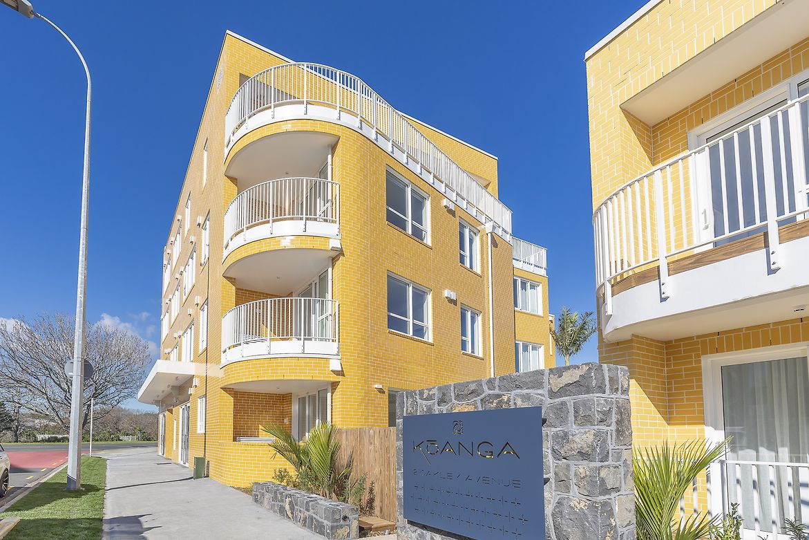
Kōanga is an exclusively Build to Rent development in Waterview, made up of 37 apartments across two carefully and beautifully designed brilliant yellow buildings.
Kōanga was conceived as a woven kete, using pingao, a coastal plant that dries to a brilliant yellow-gold, as inspiration. That golden yellow became the starting point for the entire project colour palette. Rather than the typical "new growth = green," we explored the richness of a golden colourway, symbolising new beginnings and growth, reinforcing the name Kōanga, meaning Spring - the season from which the building takes its name.
At Kōanga, colour has been used with real purpose - not just to look good, but to reflect the area, the season it’s named after, and the experience of the people who live there.
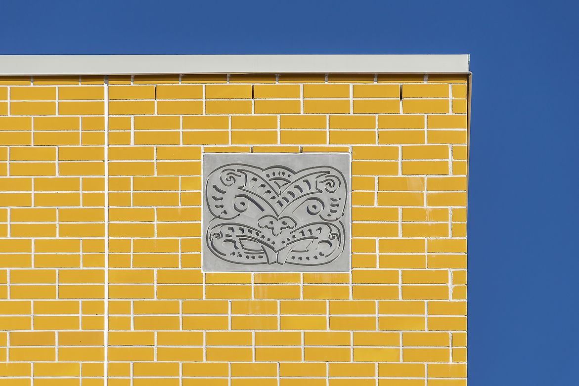
Three colours of yellow brick were used to give different parts of the building their own character. Larger curved forms use glossy brick, while smaller areas are finished in matte textures.
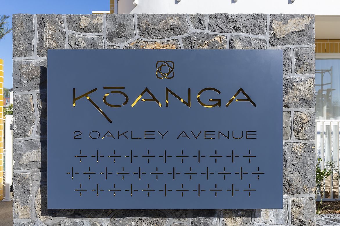
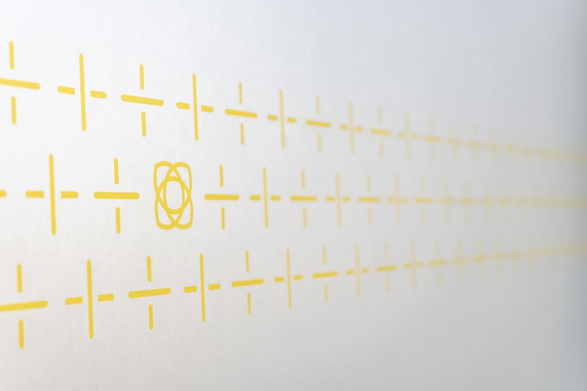
The concept of weaving is reinforced not just as a design feature, but as a symbol of holding, gathering and supporting - much like a home. The weave pattern shows up in glass panels, entry details, and signage. It connects Kōanga with its sister development Kōkihi across the road, while still having its own identity. The weave is used subtly, with variations in colour to add interest and help the building sit comfortably within its surroundings.
The flower motif - based on the kōkihi plant, our native spinach - is strong across the project. It’s a simple but effective shape that’s used in wayfinding, signage, and glass manifestations, and interspersed within the weave on glass panels and the main external entry sign.
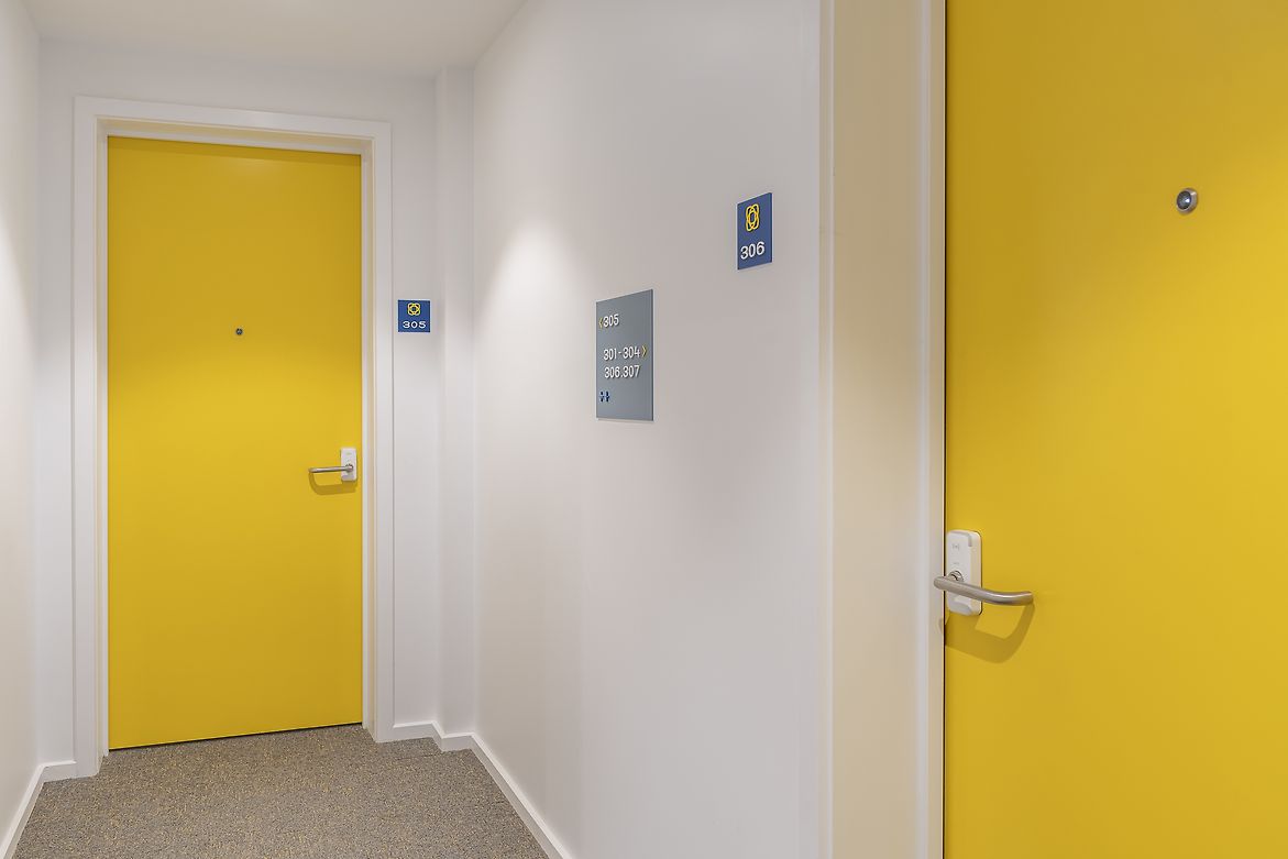
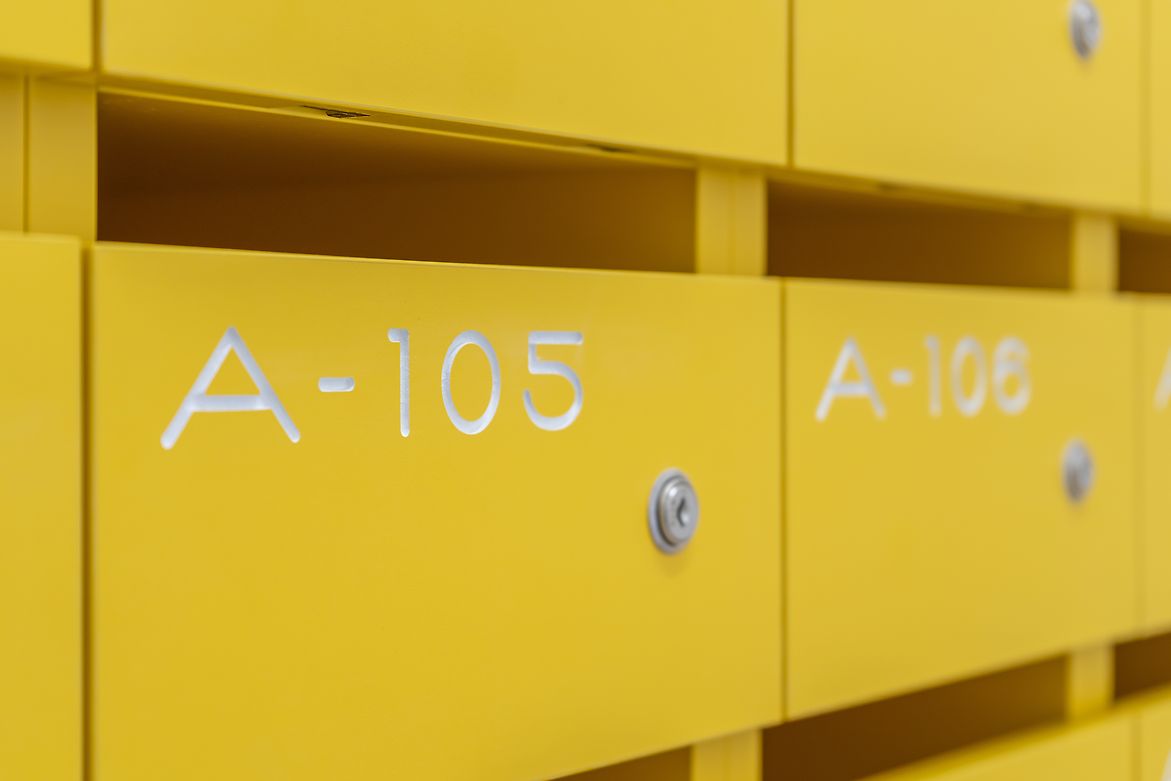
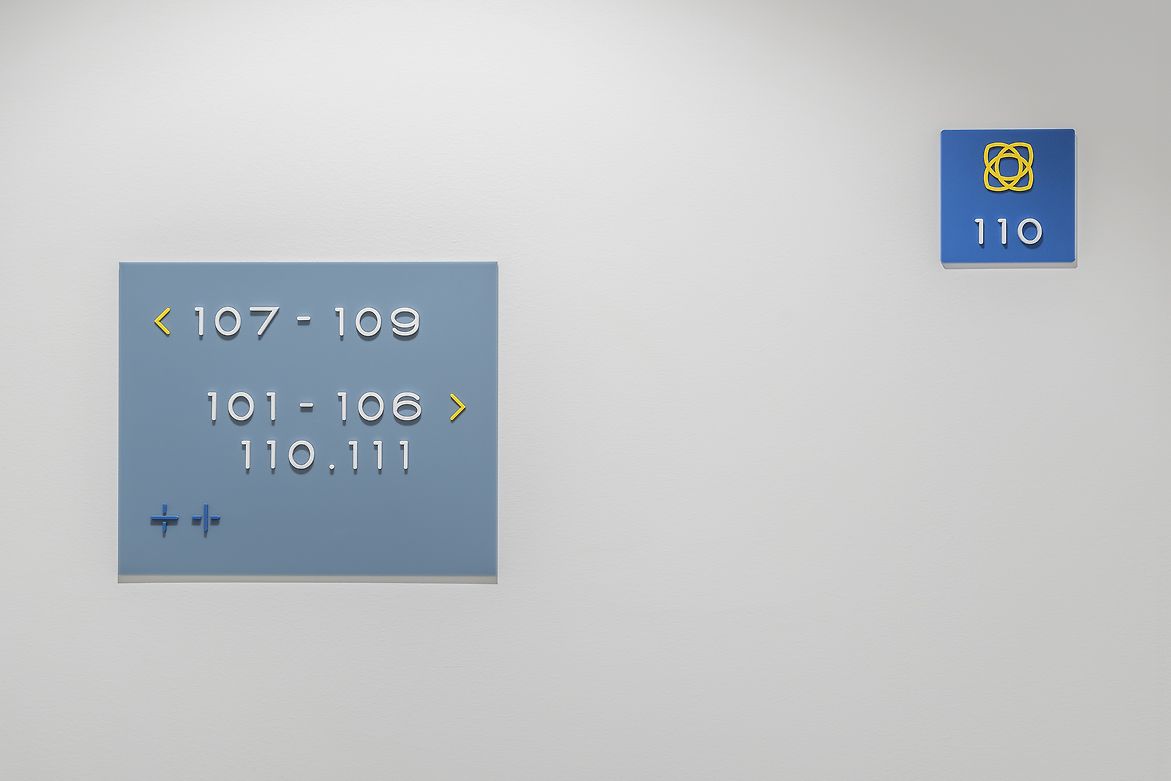
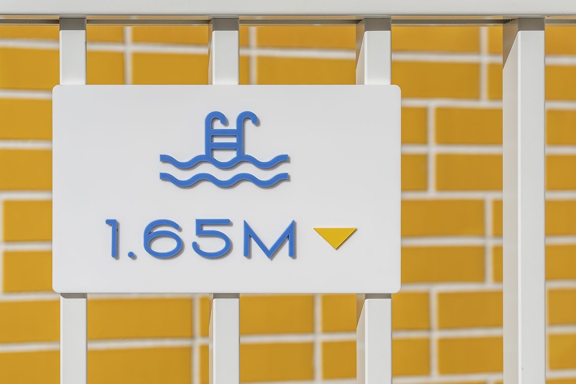
Colour is also used to help people navigate the building. Apartment doors are bright yellow, and corridor signage uses the same colours and materials to stay consistent and easy to follow. Illumination is also used to emphasise colour and form, from the entrance sign through to the lighting on the façade.
Inside, yellow is paired with a blue-grey that references the nearby waterways. The combination of warm yellow and blue creates a balanced, calm but distinctive look. This colour pairing shows up in signage, doorways, entry features and common areas — tying everything together without overwhelming the space.
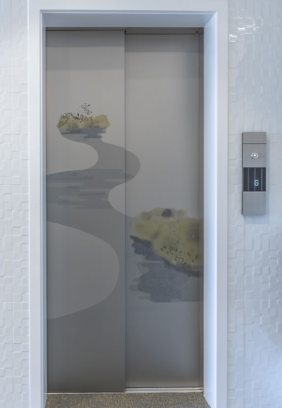
The elevator doors are a final flourish, a colour story that links Kōanga with its environment. Bespoke painterly scenes, drawn from local green mangroves, the blue-tones of waterways and golden-yellow flowers, adorn the lift doors, take residents on a journey upwards from the water to flora to sky.
Kōanga shows how thoughtful use of colour - not just as decoration but as part of the building’s identity - can lift a place and tell its story. It brings character, warmth, and a strong sense of connection to the site, the community, and the landscape it sits in.