Spatial
Smith Architects 13 Kākāpō Creek Children's Garden
-
Pou Auaha / Creative Director
Phil Smith
-
Ringatoi Matua / Design Director
Phil Smith
-
Ngā Kaimahi / Team Member
Akash Kumar -
Client
Ian & Kaye McKean
Description:
Being part of the Mairangi Bay community for many years, the owner aspired to create a village centre for children that would enhance connection and meetings across generations and different cultures.
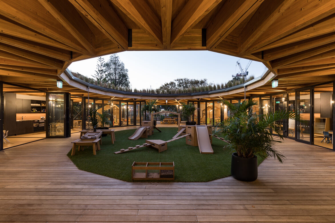
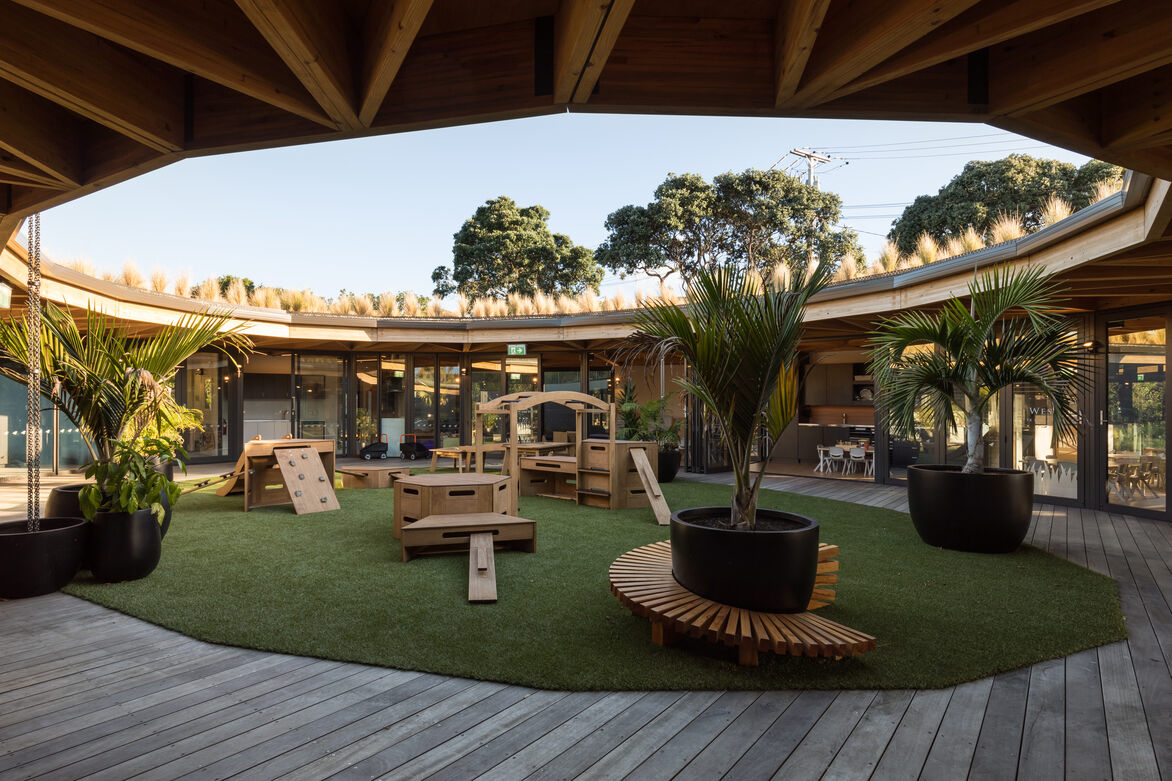
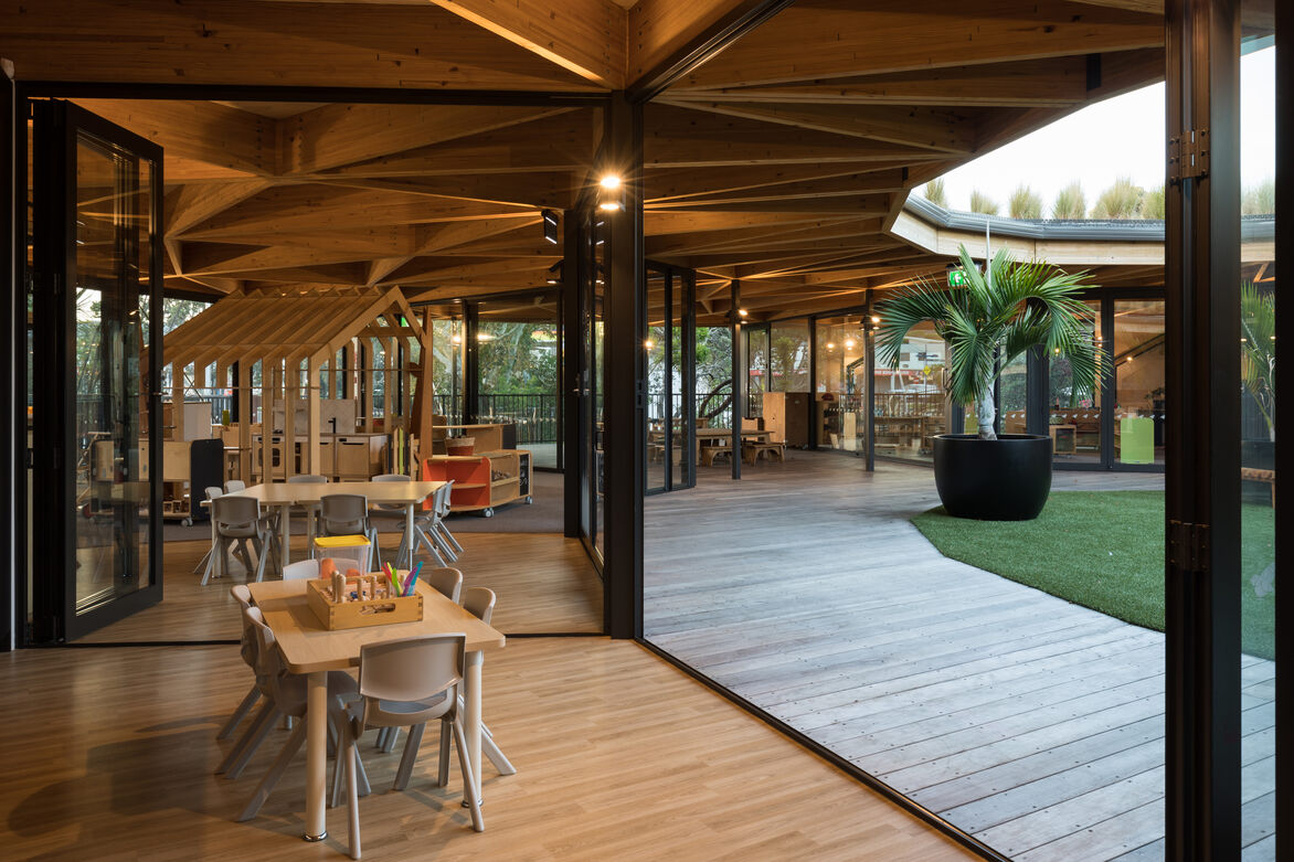
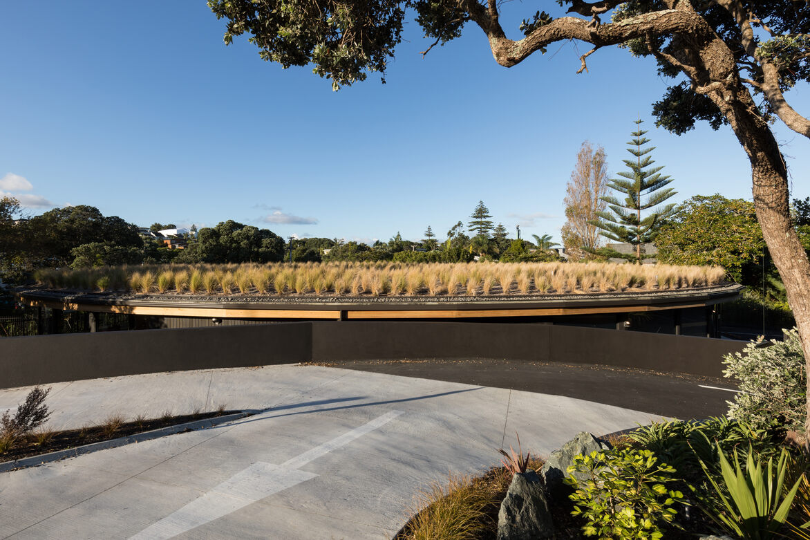
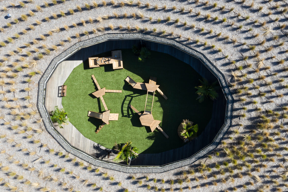
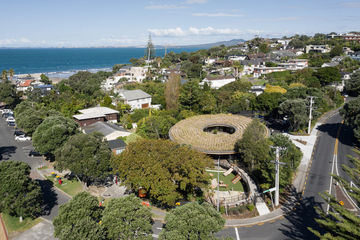
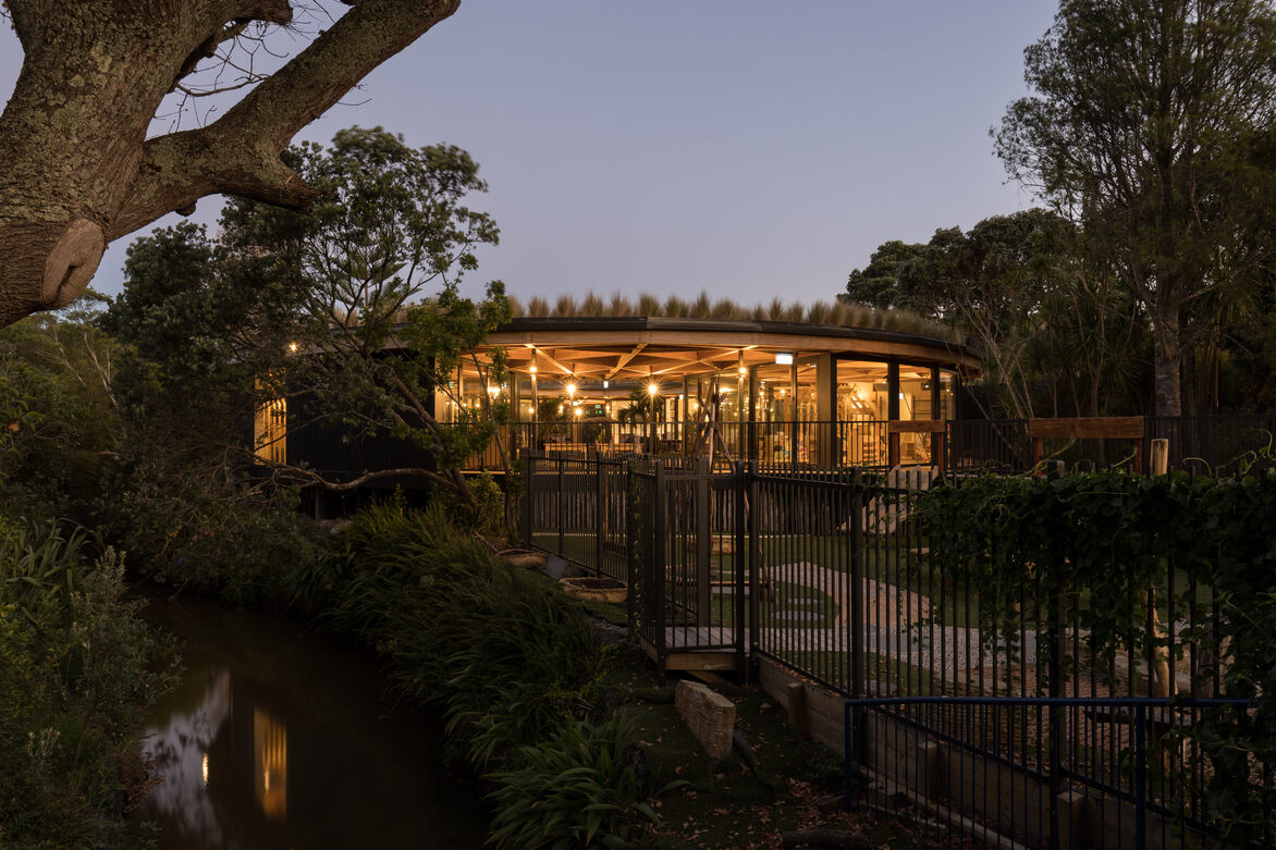
Kakapo Creek is therefore founded on the idea of Nga Hau E Wha, the four winds, being symbolic as a meeting place for people from all backgrounds. This idea is embodied in the design of the building, forming it into a circular shape to create a central meeting space, with four main classrooms arranged around it. The shape of the curve was derived from the shape of the stream which forms the site boundary on the northern side of the building and helps root the building in its place.
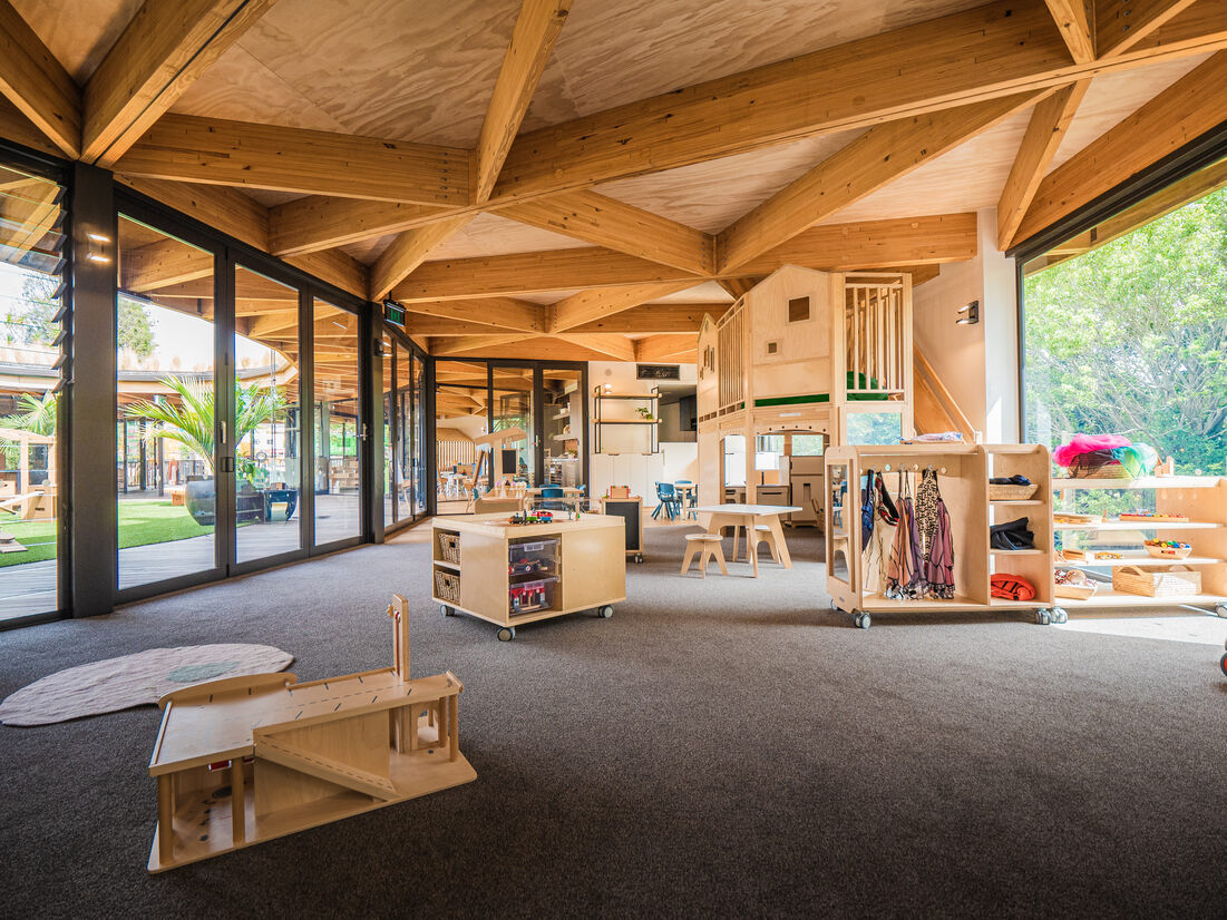
Further ideas of connection and meeting were explored throughout the design - the four classrooms are fully glazed onto the courtyard, allowing connection between inside and out and between the rooms themselves. Not only does this enhance the feeling of space and light within the building, but it enables visible and physical connection of children in different rooms, which is a vital part of tackling separation anxiety between age groups.
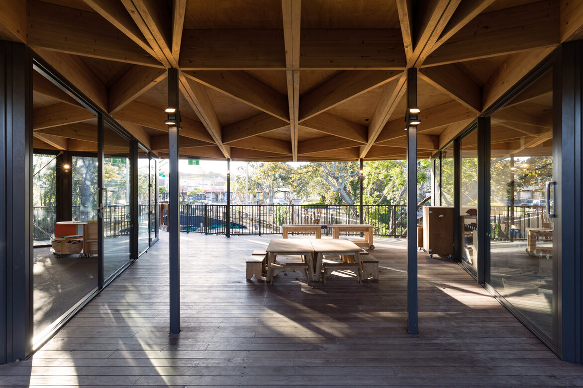
Nature is prevalent throughout the design, which also has a positive health benefit for the occupants – from circadian rhythms and vitamin D production to general lowering of stress. The site is surrounded by mature trees and shrubs and by extensively glazing the building, the wider landscape is effectively brought into the site, enhancing the feeling of space and nature throughout.
The building also harnesses the natural environment in its operational use – natural ventilation and daylighting are used throughout the building in all spaces, with simple ducted heating provided for wintertime and artificial lighting needed only outside regular hours.
Internally, the spaces are simply arranged, with the two pairs of classrooms sharing an art studio and bathroom, facing each other across the courtyard, with admin spaces and reception providing a control point at the car park end of the building. A simple palette of materials internally allows the building to keep a natural feel whilst letting the views of the natural surroundings remain the star attraction.
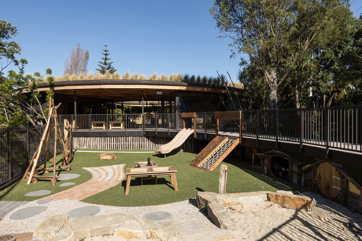
Within the rooms, the space is broken down further using furniture pieces such as the simple house-type units. These give somewhere for children to create their own space – with the simple addition of a sheet, they can create a quiet den. This is further explored in the playground with the hobbit houses hidden under the timber walkway – a beautiful little space for children to play in.
This elegantly simple design is topped off by a timber glulam/ply roof canopy and green roof, further unifying the spaces beneath and blending the building into its natural environment.
Judge's comments:
A delightful building and playground that sits lightly in the landscape. Both aesthetically and environmentally outstanding, this is somewhere I would want my child to attend.
The approach to the design for this education facility has clearly considered the surrounding environment and context with many sustainable design strategies being utilised to provide not only an engaging learning environment but one which gives lightly touches Papatuanuku.
Great vision for this project to create a space that fosters the whole community and not just children. Innovative and refreshing geometry and a commitment to a natural and authentic learning environment. Commitment to consistency and detail all the way down to custom plywood FF&E.
The name Children's Garden doesn't quite capture the essence of the whole village. It feels like the children were part of the client team and that they requested a space that their imagination could be applied to every part. Inspiring spaces inside and out.