AWARE is a youth-led magazine that centres lived experience as a way to support and destigmatise mental health conversations in Aotearoa. Its first issue, Kōanga, responds to the rising rates of distress among rangatahi (young people), offering a design-led, student-made alternative to the standard approaches of helplines and online services. Rather than present mental health through statistics or advice, AWARE starts with storytelling. It opens a space where real student voices can speak with honesty, vulnerability, and strength—inviting others to feel seen, heard, and less alone.
The concept was born from the designer’s own experience of navigating university life and the quiet pressure to “have it all figured out.” This issue, Kōanga, reflects that reality: a transitional season, full of energy, uncertainty, and change. The magazine doesn’t offer solutions—it offers solidarity. Through personal interviews with two tertiary students, Janka and Nate, AWARE explores how mental wellbeing is shaped by environment, identity, relationships, and routine. Each story is presented as an open conversation, conversational in tone, carefully crafted in structure, and deeply human in impact.
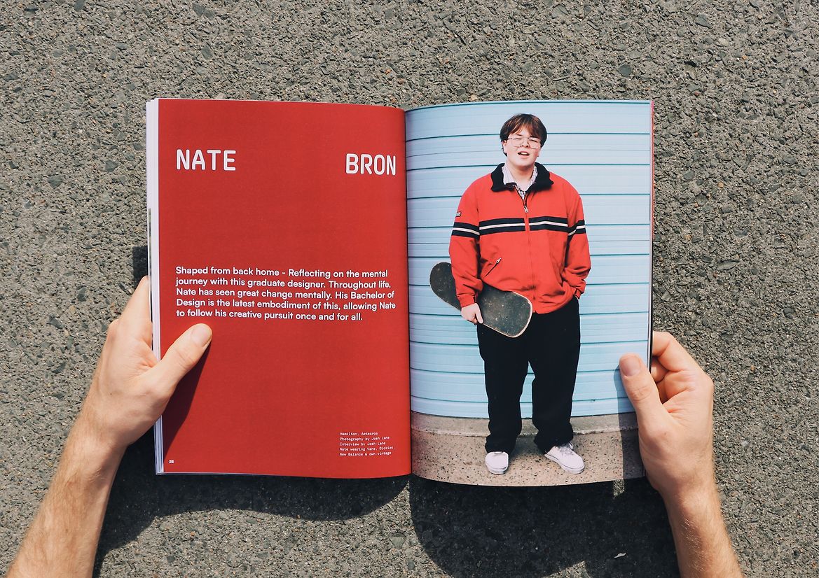
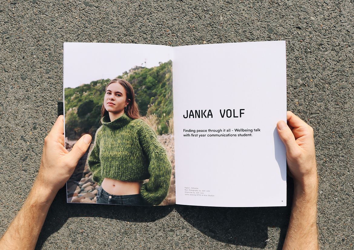
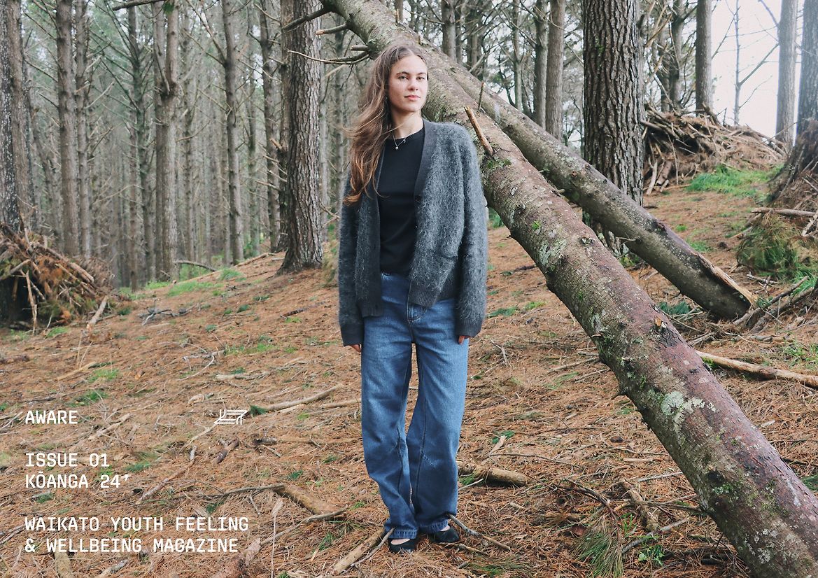
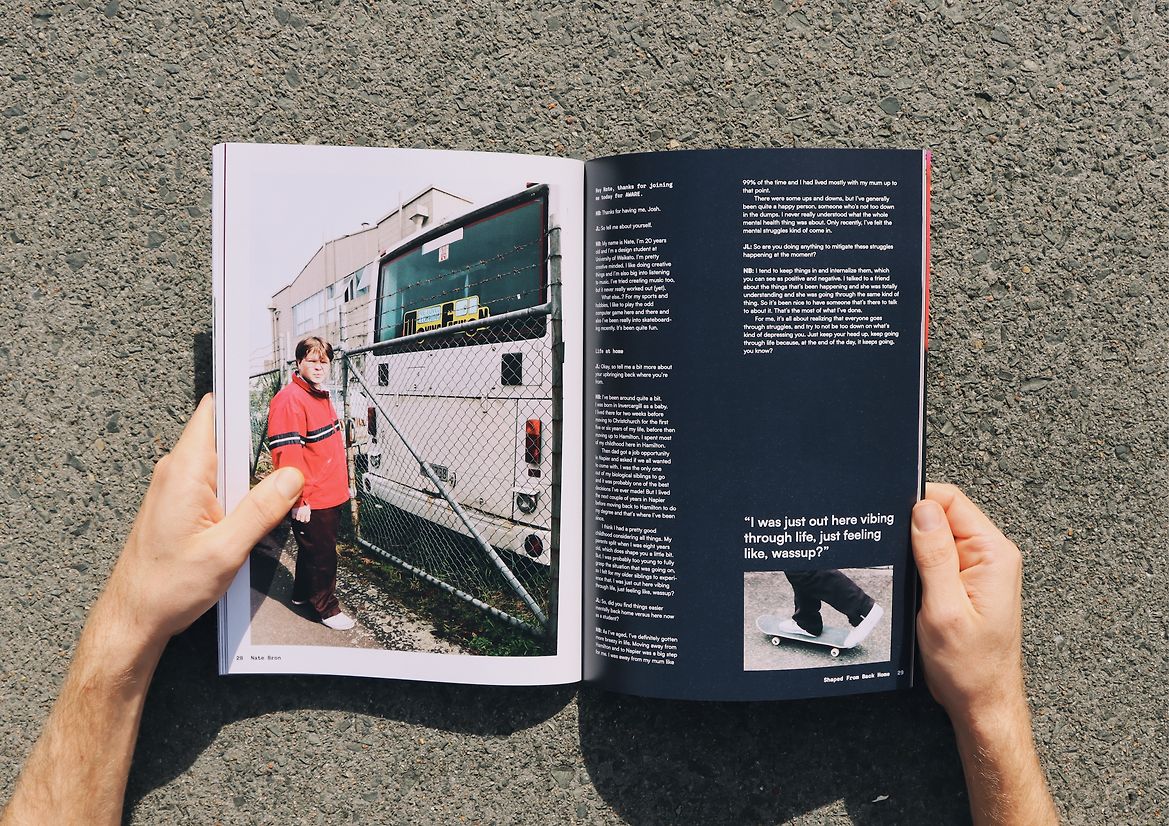
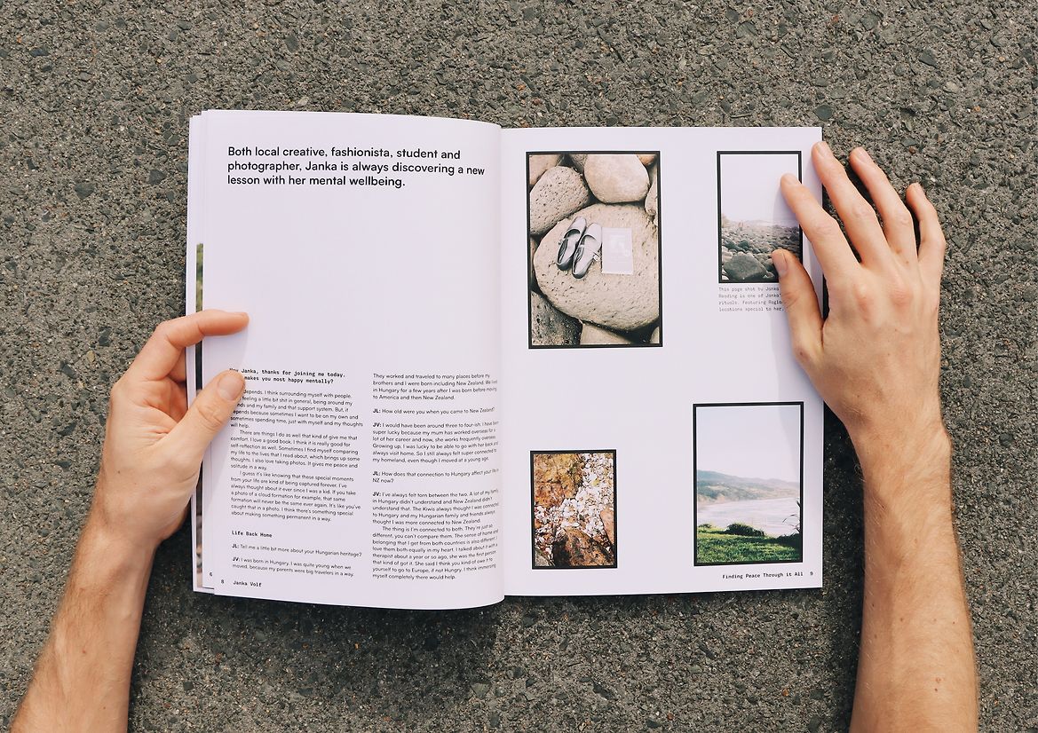
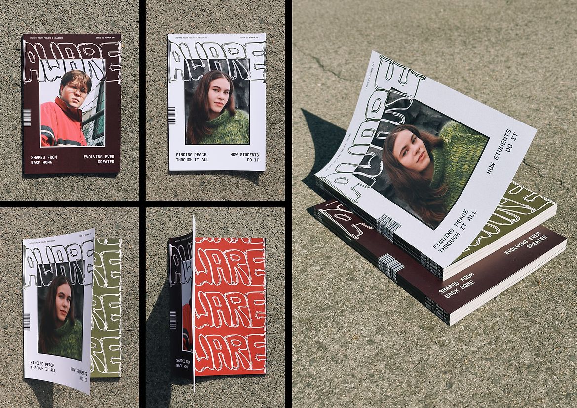
These personal stories are paired with design decisions that give them space and emotional resonance. Each feature was photographed in a location chosen by the student—a place where they feel most at ease. Janka’s story is set in Raglan, with soft, coastal light and a cool, earthy palette that reflects her connection to nature and belonging. Nate’s story unfolds in urban Hamilton, surrounded by concrete, texture, and deeper colour tones that echo his internal world. The visual language of each piece is intentionally distinct, helping each story feel grounded and personal, while still sitting within a unified magazine aesthetic.
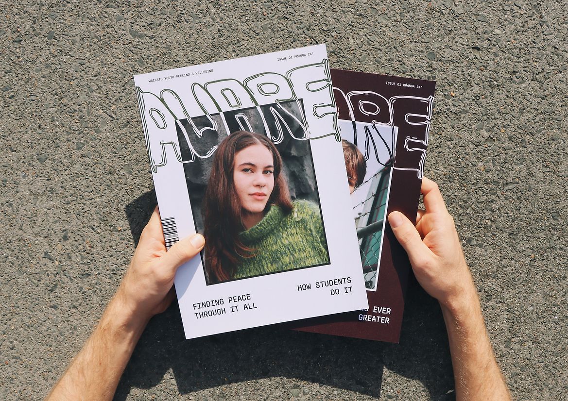
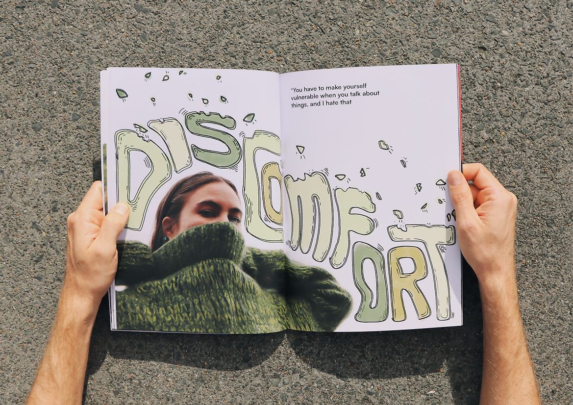
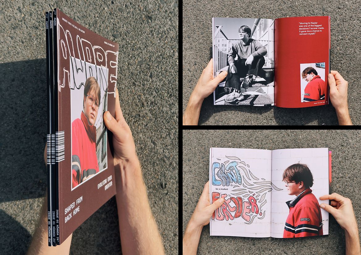
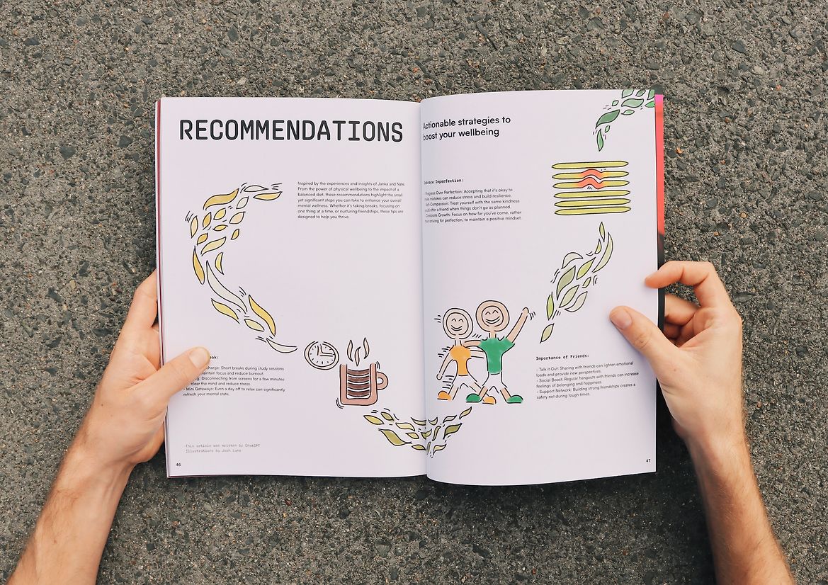
Typography, layout, and colour have been handled with care to support readability and emotional tone. The design balances a contemporary editorial feel with softness and space—giving voice and weight to each student’s experience. Two alternate covers—one for Janka and one for Nate—extend the idea that no single story defines this issue. Every voice counts.
What makes AWARE unique is its refusal to separate design from lived reality. It demonstrates that visual communication can be a form of care, and that mental health design doesn’t always need to look clinical or corporate. It can be warm, quiet, reflective—focused more on listening than on telling.
Early responses to the magazine have been overwhelmingly positive. Peers and youth readers have described it as affirming, approachable, and different from anything they’ve seen before. It gives permission to feel uncertain. It honours complexity without trying to fix it. And in doing so, it models a different way of engaging with mental health—through design that’s rooted in trust, empathy, and shared experience.
AWARE isn’t just about mental wellbeing. It’s about making space—for stories, for self-reflection, for community. It’s about reminding young people that being “in progress” is not only normal—it’s something worth celebrating.
Description:
AWARE is a youth-led magazine that centres lived experience as a way to support and destigmatise mental health conversations in Aotearoa. Its first issue, Kōanga, responds to the rising rates of distress among rangatahi (young people), offering a design-led, student-made alternative to the standard approaches of helplines and online services. Rather than present mental health through statistics or advice, AWARE starts with storytelling. It opens a space where real student voices can speak with honesty, vulnerability, and strength—inviting others to feel seen, heard, and less alone.
The concept was born from the designer’s own experience of navigating university life and the quiet pressure to “have it all figured out.” This issue, Kōanga, reflects that reality: a transitional season, full of energy, uncertainty, and change. The magazine doesn’t offer solutions—it offers solidarity. Through personal interviews with two tertiary students, Janka and Nate, AWARE explores how mental wellbeing is shaped by environment, identity, relationships, and routine. Each story is presented as an open conversation, conversational in tone, carefully crafted in structure, and deeply human in impact.
These personal stories are paired with design decisions that give them space and emotional resonance. Each feature was photographed in a location chosen by the student—a place where they feel most at ease. Janka’s story is set in Raglan, with soft, coastal light and a cool, earthy palette that reflects her connection to nature and belonging. Nate’s story unfolds in urban Hamilton, surrounded by concrete, texture, and deeper colour tones that echo his internal world. The visual language of each piece is intentionally distinct, helping each story feel grounded and personal, while still sitting within a unified magazine aesthetic.
Typography, layout, and colour have been handled with care to support readability and emotional tone. The design balances a contemporary editorial feel with softness and space—giving voice and weight to each student’s experience. Two alternate covers—one for Janka and one for Nate—extend the idea that no single story defines this issue. Every voice counts.
What makes AWARE unique is its refusal to separate design from lived reality. It demonstrates that visual communication can be a form of care, and that mental health design doesn’t always need to look clinical or corporate. It can be warm, quiet, reflective—focused more on listening than on telling.
Early responses to the magazine have been overwhelmingly positive. Peers and youth readers have described it as affirming, approachable, and different from anything they’ve seen before. It gives permission to feel uncertain. It honours complexity without trying to fix it. And in doing so, it models a different way of engaging with mental health—through design that’s rooted in trust, empathy, and shared experience.
AWARE isn’t just about mental wellbeing. It’s about making space—for stories, for self-reflection, for community. It’s about reminding young people that being “in progress” is not only normal—it’s something worth celebrating.