Social Good Award
Jessica Kwong, Ashleigh Sun, Michelle Sheng, Sonia Zhang, Jacky Jones, Anya Hill, Emily Liu Making medication information accessible
-
Tauira / Students
Jessica Kwong, Ashleigh Sun, Michelle Sheng, Sonia Zhang, Jacky Jones, Anya Hill, Emily Liu -
Kaitautoko / Contributor
Dean Croft -
Kaiako / Lecturers
Cassie Khoo, Stephen Reay, Ivana Nakarada-Kordic
-
School
AUT Art + Design 2025
Description:
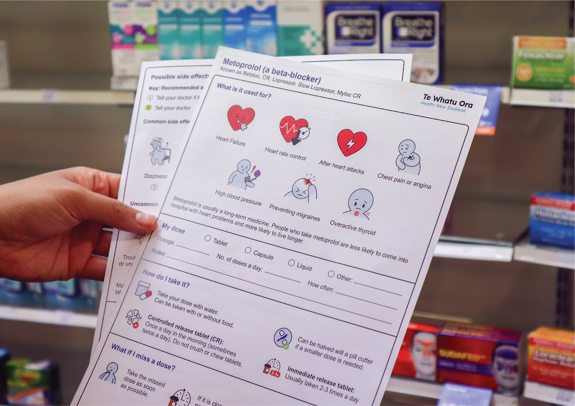
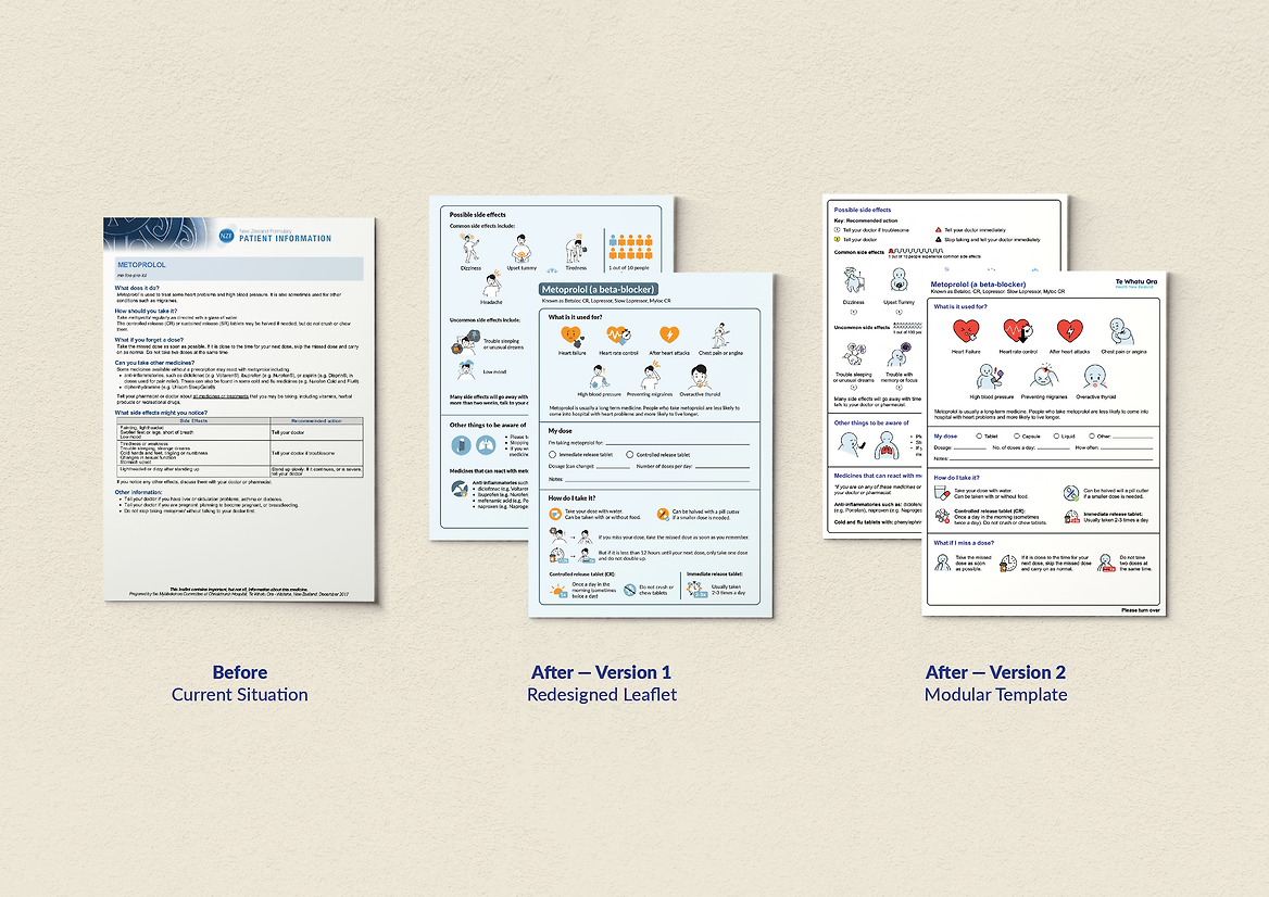
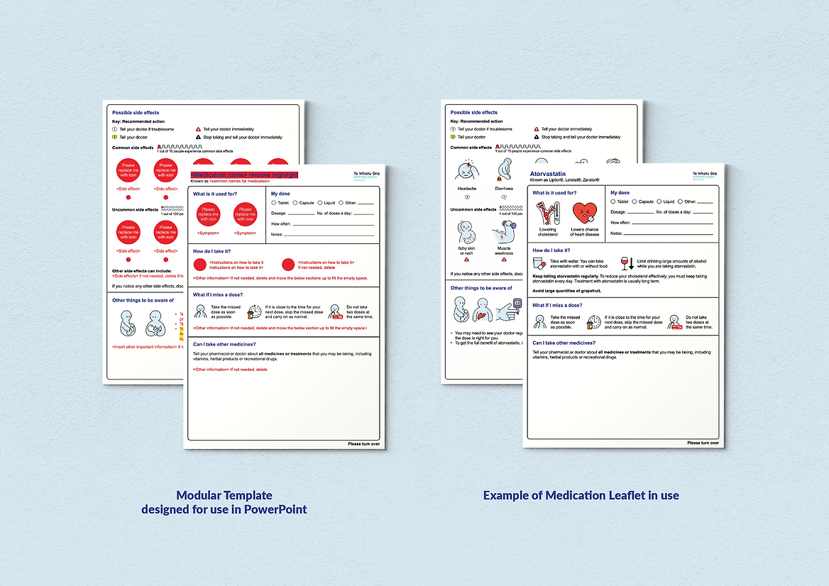
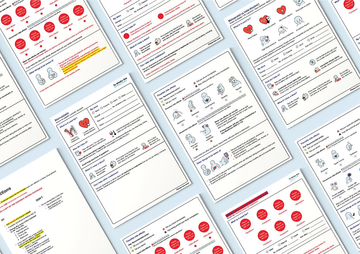
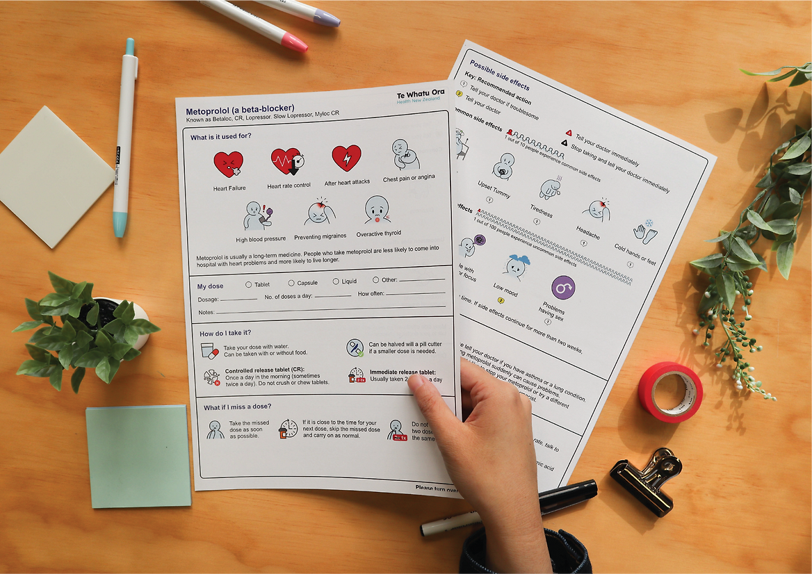
Medication information leaflets are usually text-heavy and lack engaging visuals, making them difficult for patients to comprehend. This can lead to issues with understanding and potentially medication adherence, which can have significant consequences on health outcomes. In this project we worked with a pharmacist at Te Whatu Ora Waitematā to improve patient access to and health literacy around medication information through visual communication and designing a modular leaflet template.
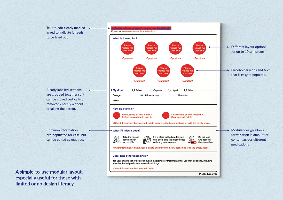
The challenge of this project was to make an easy-to-use leaflet template for non-designers that could be used with the vast number of medications available. The template needed to communicate medication information effectively to patients, but also consider the user experience of healthcare staff editing the content. This was achieved by designing the templates in PowerPoint to ensure the template was widely accessible. The template was designed using a vertically stacked modular system. This allows the content to be edited, while maintaining the overall integrity of the designed arrangement of graphic elements, layout and alignment. Sections of information are designed to be moved vertically to accommodate varying amounts of information across a wide range of medications.
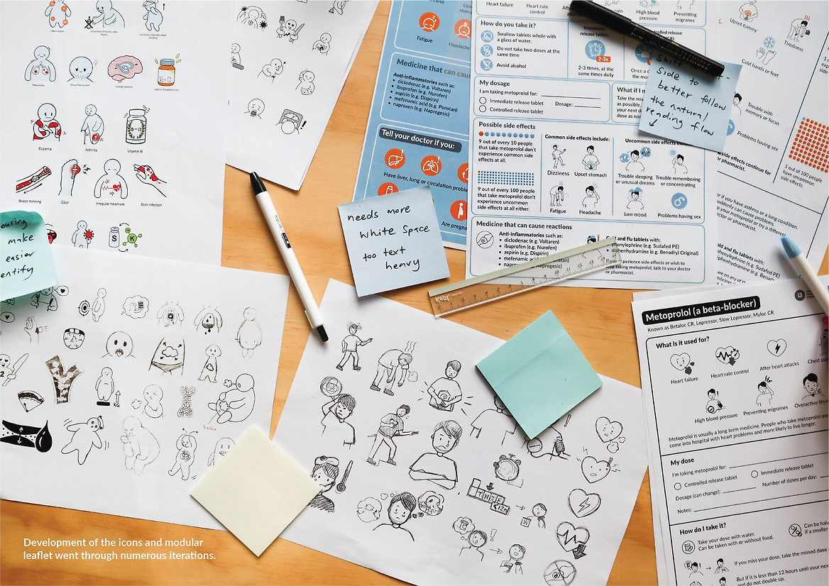
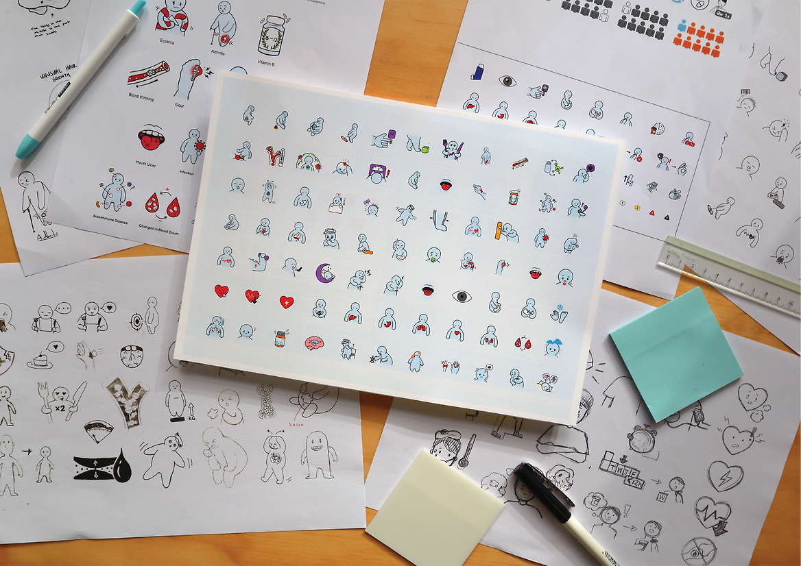
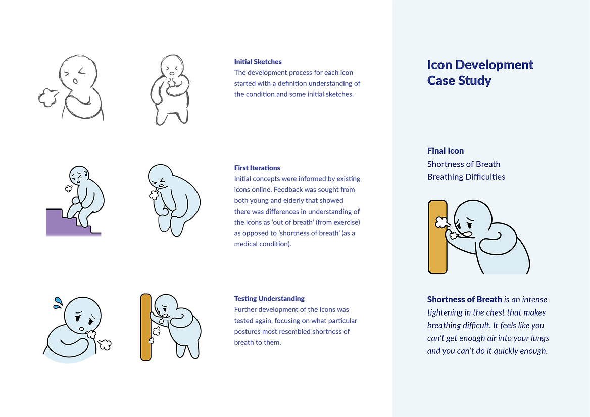
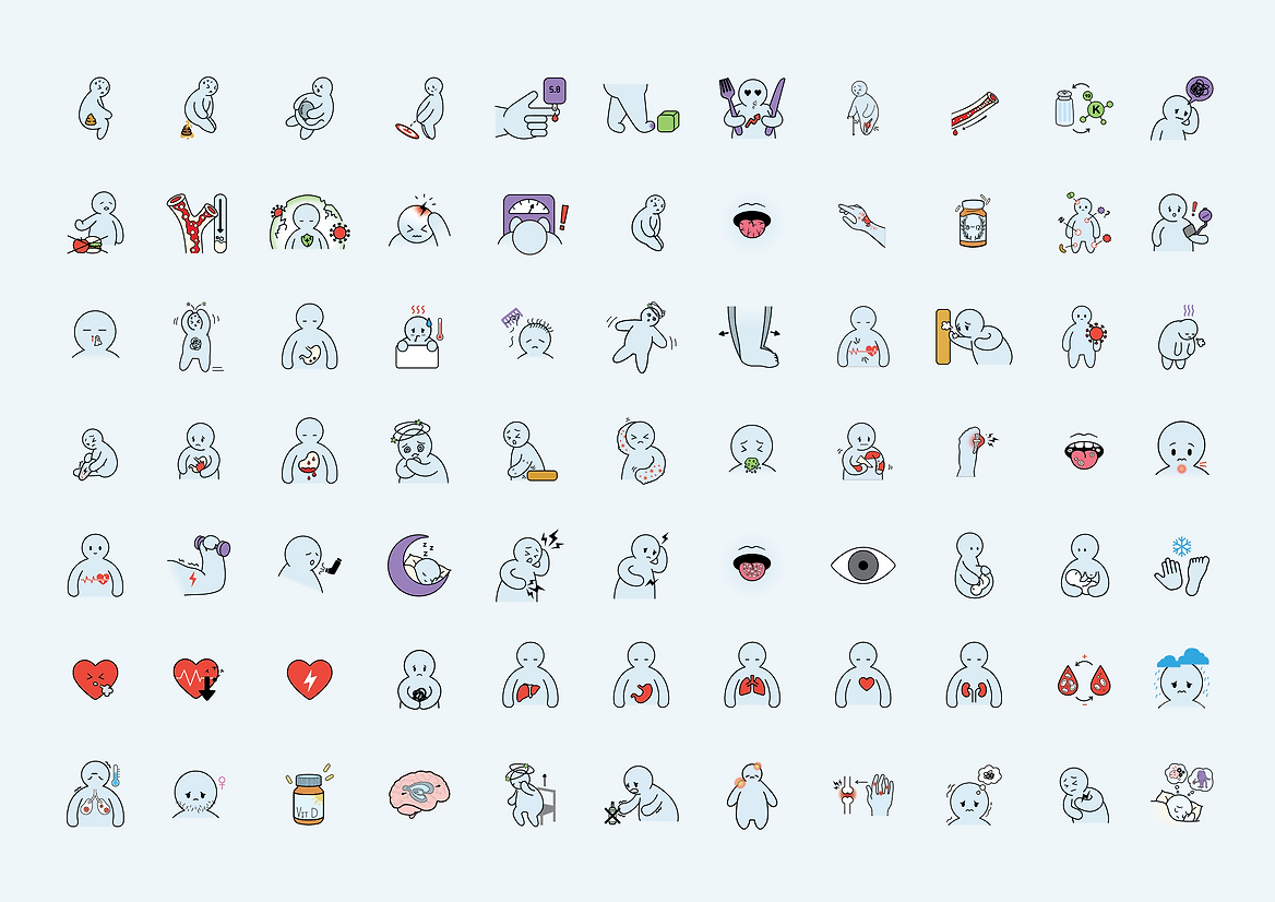
Medical terms can often be foreign or complex for patients to understand. One of the key parts of this new medication information leaflet was the design of a medication icon bank that accompanies the template. The medication icon bank supports improved health literacy by helping patients understand symptoms, potential side effects, and how to use their medication. The icons had to accurately depict specific conditions or symptoms and be inclusive and representative of a wide range of people. A gender, race, and body-size neutral character was used to achieve this. This character was designed to be endearing and relatable, to help build positive relationships between patients and their medication information. Each icon underwent several iterations drawing on an accurate understanding of the medical terms and common visual cues, and was developed with feedback from a diverse demographic.
The resulting medication leaflet template and icon bank challenge how health information can be reimagined and redesigned to better support patient understanding, so patients can be empowered to take the lead in their health and wellbeing.