Product
ZURU Edge 35 DAISE Beauty
-
Pou Auaha / Creative Director
Monique Robins -
Pou Rautaki / Strategic Lead
Kelly McAuliffe
-
Ringatoi Matua / Design Director
Nikki Ravlich
-
Ngā Kaimahi / Team Members
Alex Wong, Jevin Yan, Ethan Wilson, Sam Brock -
Kaitautoko / Contributor
Think Packaging -
Client
ZURU Edge - DAISE Beauty
Description:
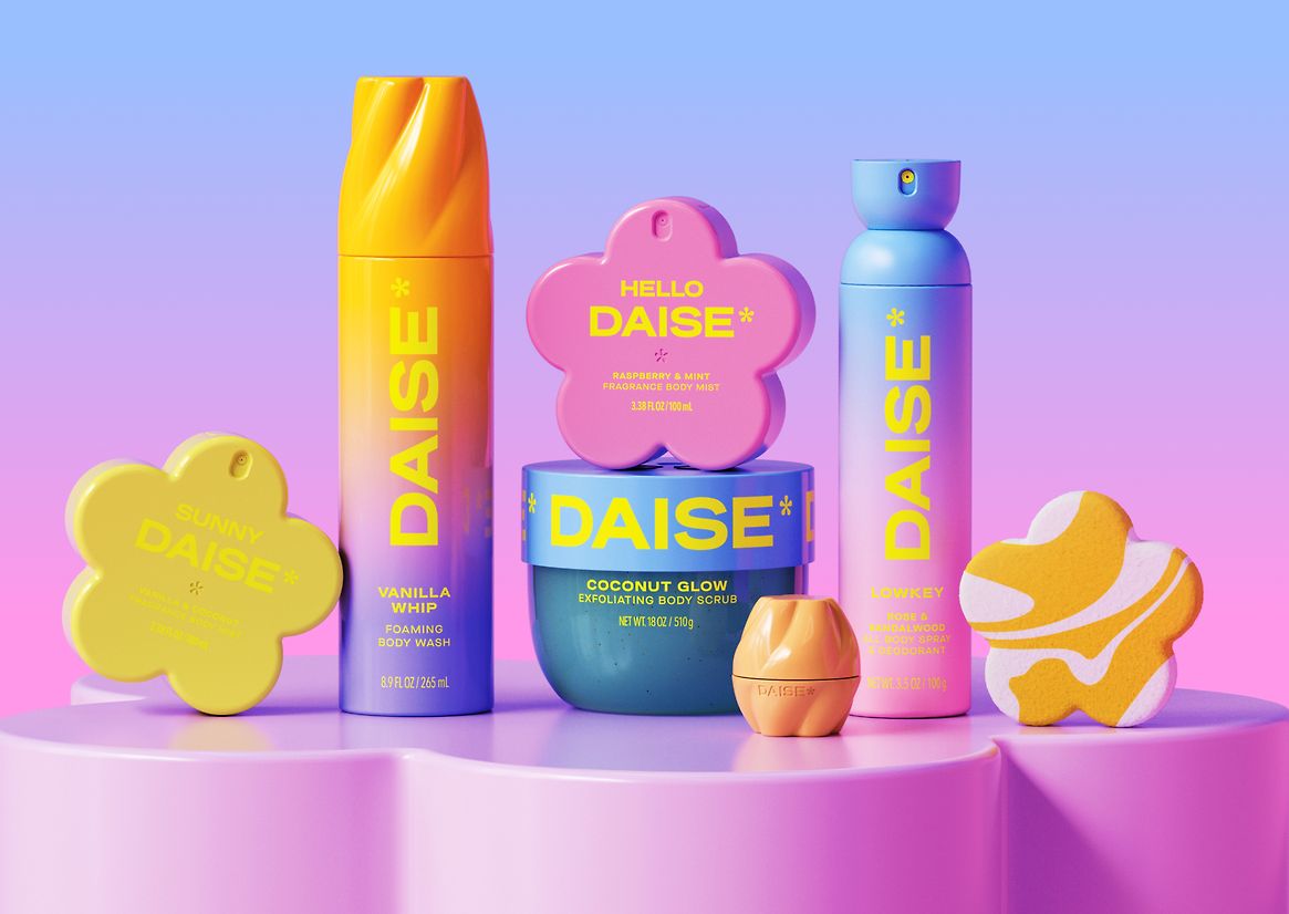
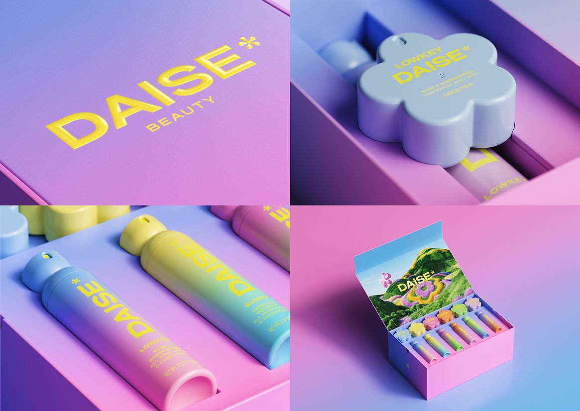
DAISE: a bold new season in beauty.
Rooted in play and elevated through form, DAISE reimagines structural design for a new generation of beauty consumers. Created for Gen Z and Gen Alpha—two highly engaged and fast-emerging audiences—DAISE delivers a world of scent and self-expression through packaging that’s as joyful as it is functional.
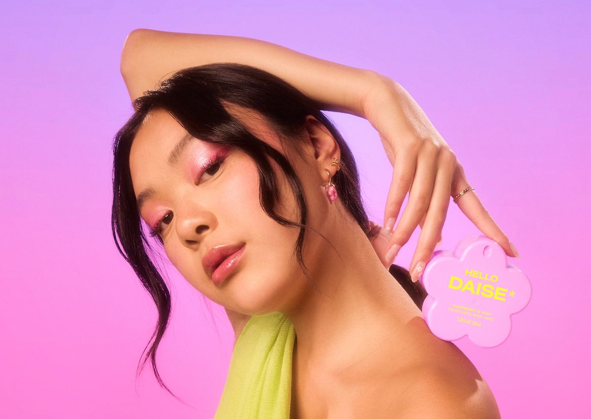
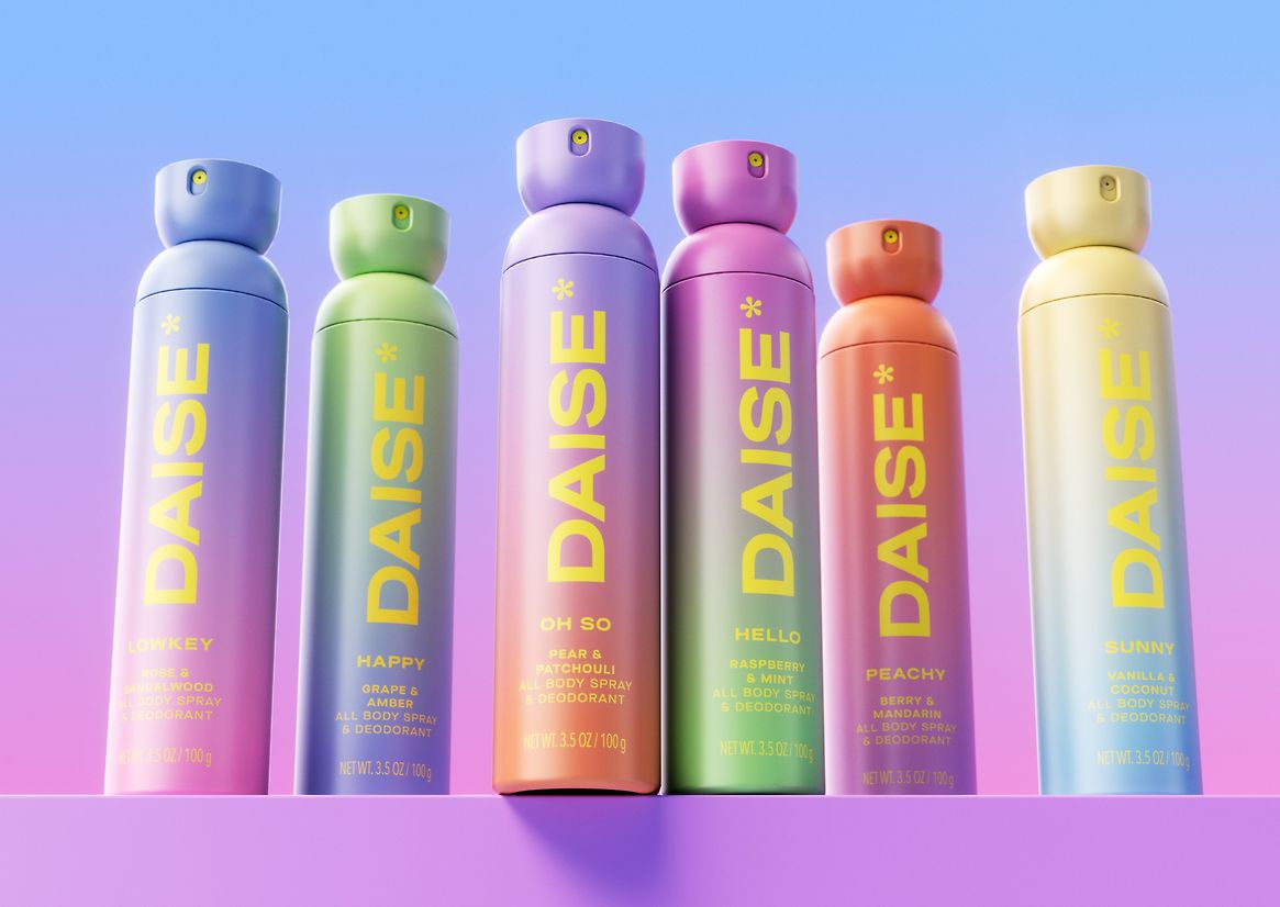
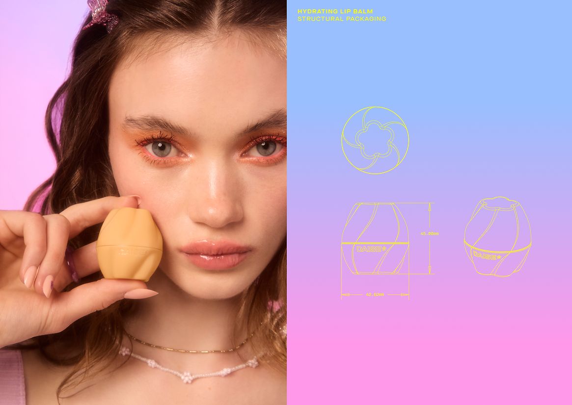
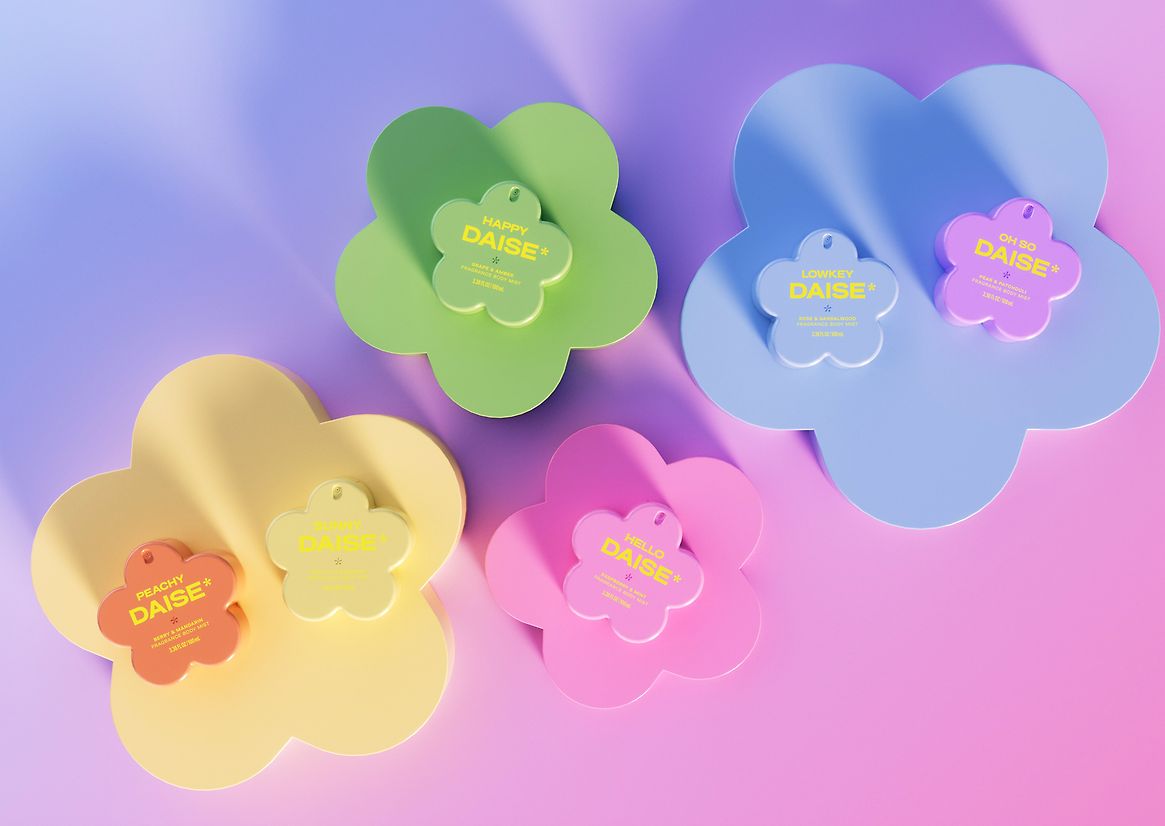
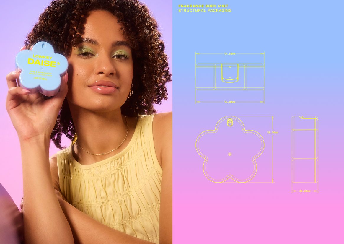
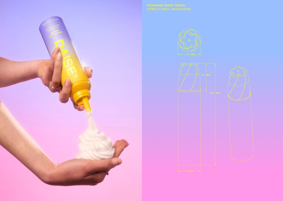
The range features five fully custom-designed structural formats, each crafted to be bold, collectible, and designed for smaller hands without losing aspirational appeal. At the heart of the range is a sculptural, flower-shaped body mist bottle: chubby, high-gloss, and display-worthy, with an integrated lock to prevent on-the-go spray mishaps. This signature form becomes the unifying memory structure across the range, building immediate brand recognition.
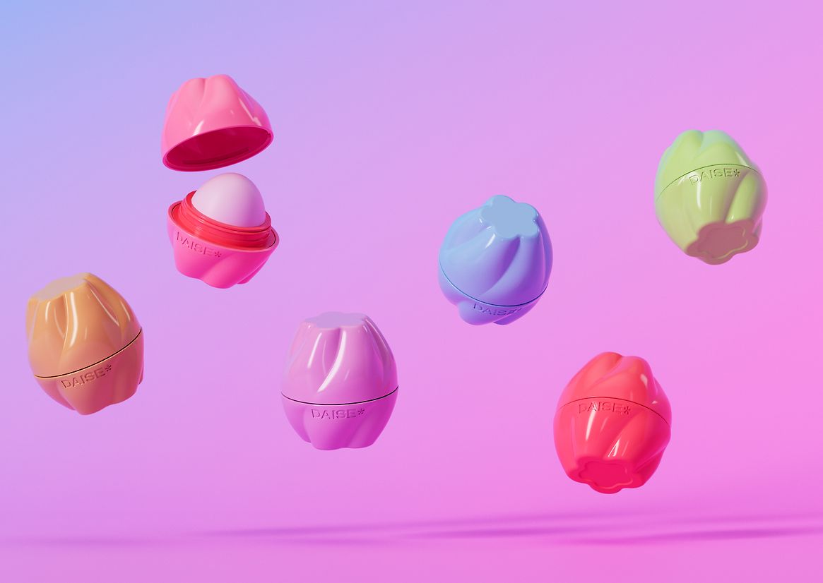
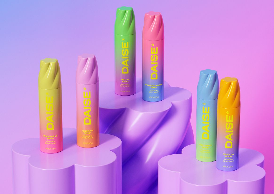
From the foaming whip, which extends into a soft sculptural swirl, to the bubble-like lip balm edged with flower motifs and surprise interior colour pops, each pack is a tactile moment waiting to be discovered. The aerosol can and scrub tub build on a bud-to-bloom visual system, while even the bath bombs mirror the flower shape—fizzing into a playful mini-pack that delivers surprise and delight.
Crucially, this system is more than visual. DAISE prioritises usability: ergonomic proportions and smart locking mechanisms ensure that the packaging is easy to use, safe, and intuitive for younger consumers. Structural finishes—ranging from glossy coatings to creamy satins—elevate the packaging’s sensory profile while maintaining a durable, retail-ready feel.
To aid product navigation, ombré colour gradients differentiate SKUs while enhancing shelf standout. Every component—from silhouette to closure—is intentionally designed to support the brand’s philosophy of “playability”: the idea that beauty should be interactive, layered, and joyful.
From sculptural packaging to immersive textures, every element of DAISE is crafted to invite playful exploration. The result is a cohesive structural system that goes beyond function—turning beauty routines into moments of creativity, curiosity, and connection.
DAISE proves that structural design can be both whimsical and technically exacting—a next-generation packaging system built to be held, loved, and remembered.