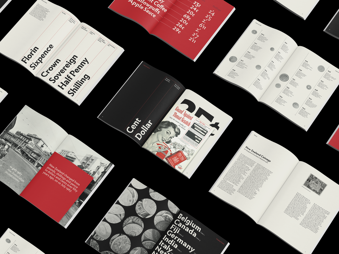
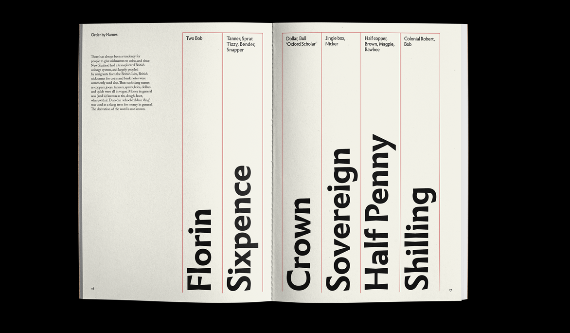
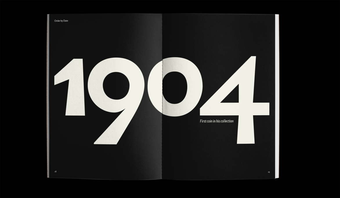
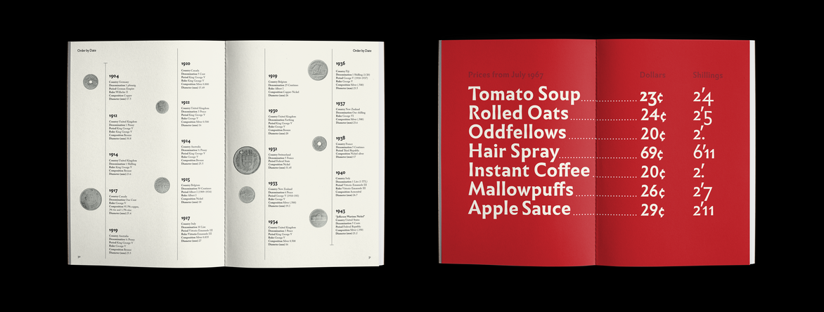
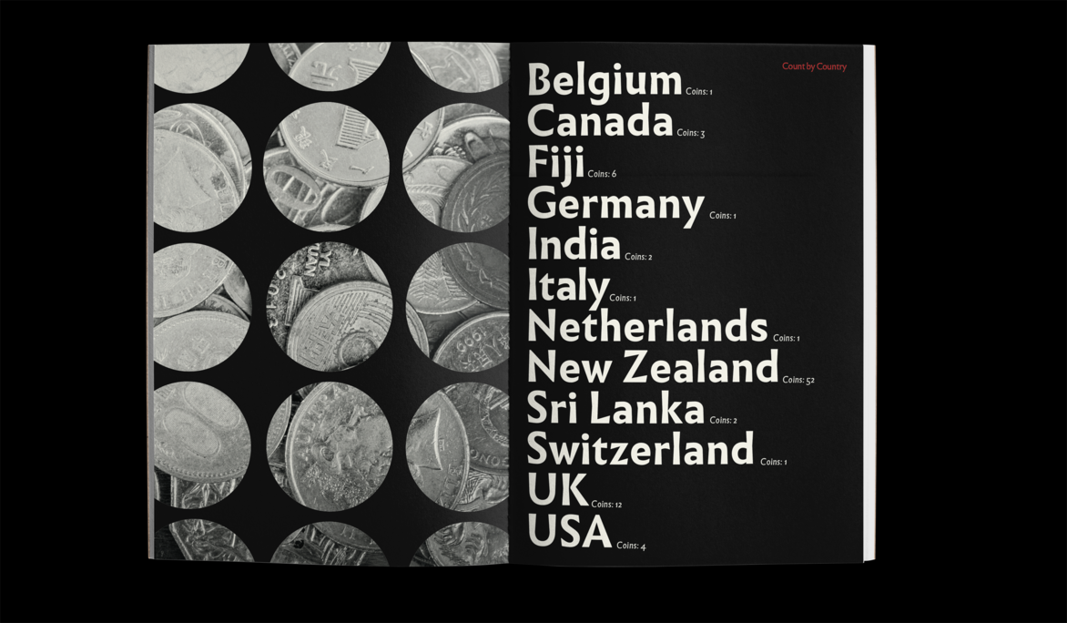
This typographic project was in response to the ISTD brief ‘Putting things in Order’, with the aim to ‘Look for lesser-known methods and obscure ways people have put things in order. This could be the things they own and the things that surround them or it could be how they categorise in a social or ideological form’. I choose to respond with unpacking my grandfather’s coin collection and with further research into numismatics (study or collection of currency) particularly in New Zealand. With this I could look deeper into his collection and how it was organised using categories such as date, country, name and mintage.
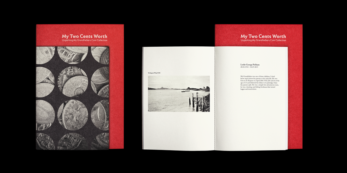
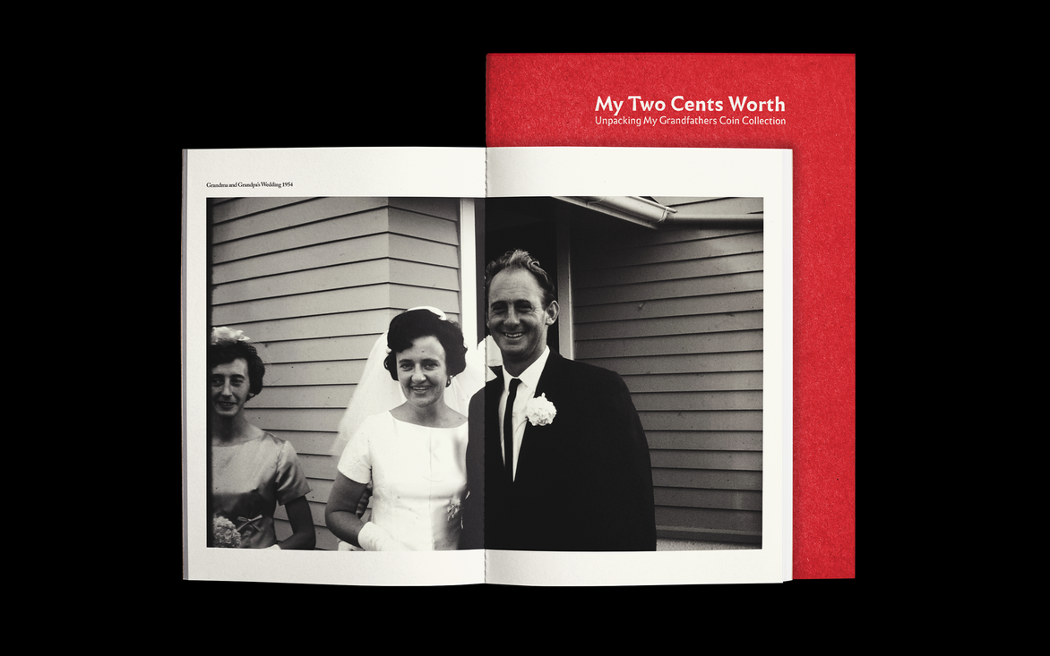
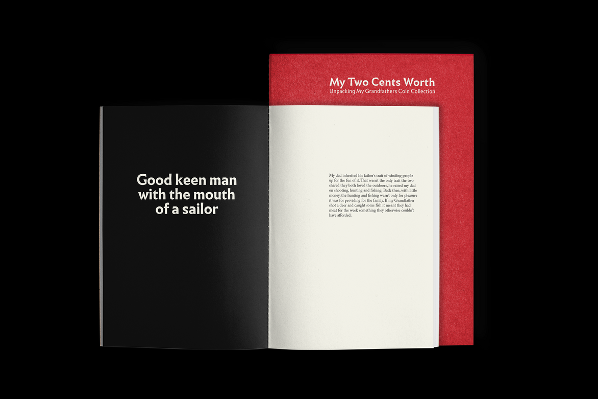
I took a personal approach to this project as I wanted to create an artifact that I could keep and show to family as we don’t have many photos or records of my grandfather. The photo I used in the external tip-in was one of the only we have, so making this book was a little memento for myself.
‘Infini’ was the display font I used throughout the book; it is a calligraphic sans-serif typeface which reads well with extreme heaviness which embodies the chiselled look of the typefaces used on coins. I paired this with Adobe Caslon for the body font as it is comfortable and inviting to read for large blocks of text.
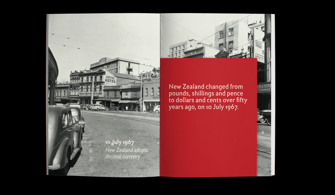
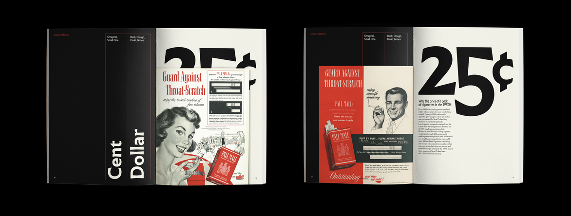
To evoke a nostalgic feeling, I used a colour pallet of cream, black and a vibrant red. 1950s New Zealand walked the line between British tradition and new US influences, so I used imagery that was inspired from both. The images used are only grey scale to reinforce that nostalgic feeling.
The external tip-in was used as small side story of the character of my grandfather to help contextualize information and references in the main book. The book also has red coptic binding which makes it look more personal and hand made.
Description:
This typographic project was in response to the ISTD brief ‘Putting things in Order’, with the aim to ‘Look for lesser-known methods and obscure ways people have put things in order. This could be the things they own and the things that surround them or it could be how they categorise in a social or ideological form’. I choose to respond with unpacking my grandfather’s coin collection and with further research into numismatics (study or collection of currency) particularly in New Zealand. With this I could look deeper into his collection and how it was organised using categories such as date, country, name and mintage.
I took a personal approach to this project as I wanted to create an artifact that I could keep and show to family as we don’t have many photos or records of my grandfather. The photo I used in the external tip-in was one of the only we have, so making this book was a little memento for myself.
‘Infini’ was the display font I used throughout the book; it is a calligraphic sans-serif typeface which reads well with extreme heaviness which embodies the chiselled look of the typefaces used on coins. I paired this with Adobe Caslon for the body font as it is comfortable and inviting to read for large blocks of text.
To evoke a nostalgic feeling, I used a colour pallet of cream, black and a vibrant red.
1950s New Zealand walked the line between British tradition and new US influences, so I used imagery that was inspired from both. The images used are only grey scale to reinforce that nostalgic feeling.
The external tip-in was used as small side story of the character of my grandfather to help contextualize information and references in the main book. The book also has red coptic binding which makes it look more personal and hand made.