My brief was to design two related publications. First a book 'Twenty Typefaces', then the ‘collectable’ twentieth typeface specimen that features and classifies one contemporary typeface family released in the last decade. I was to curate 19 typefaces out of 40 typeface choices and choose how to order/sort the typeface selections, as it was not prescriptive.
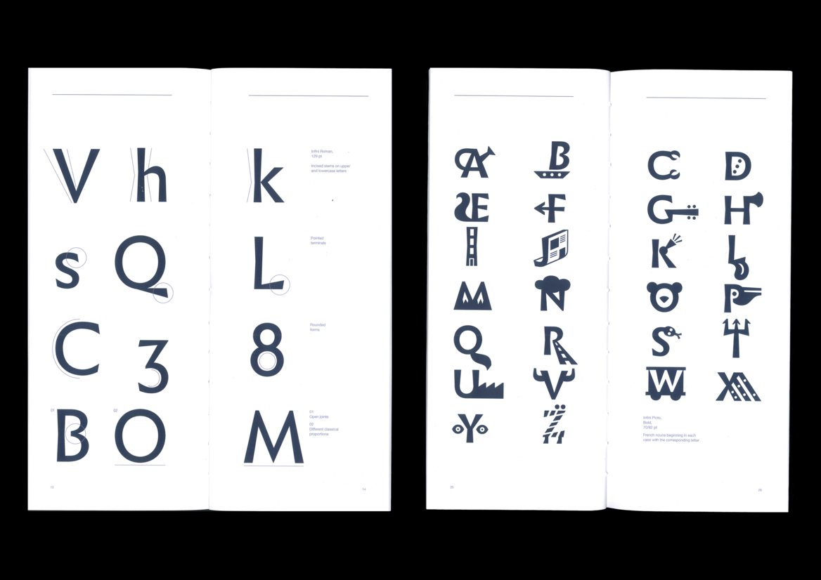
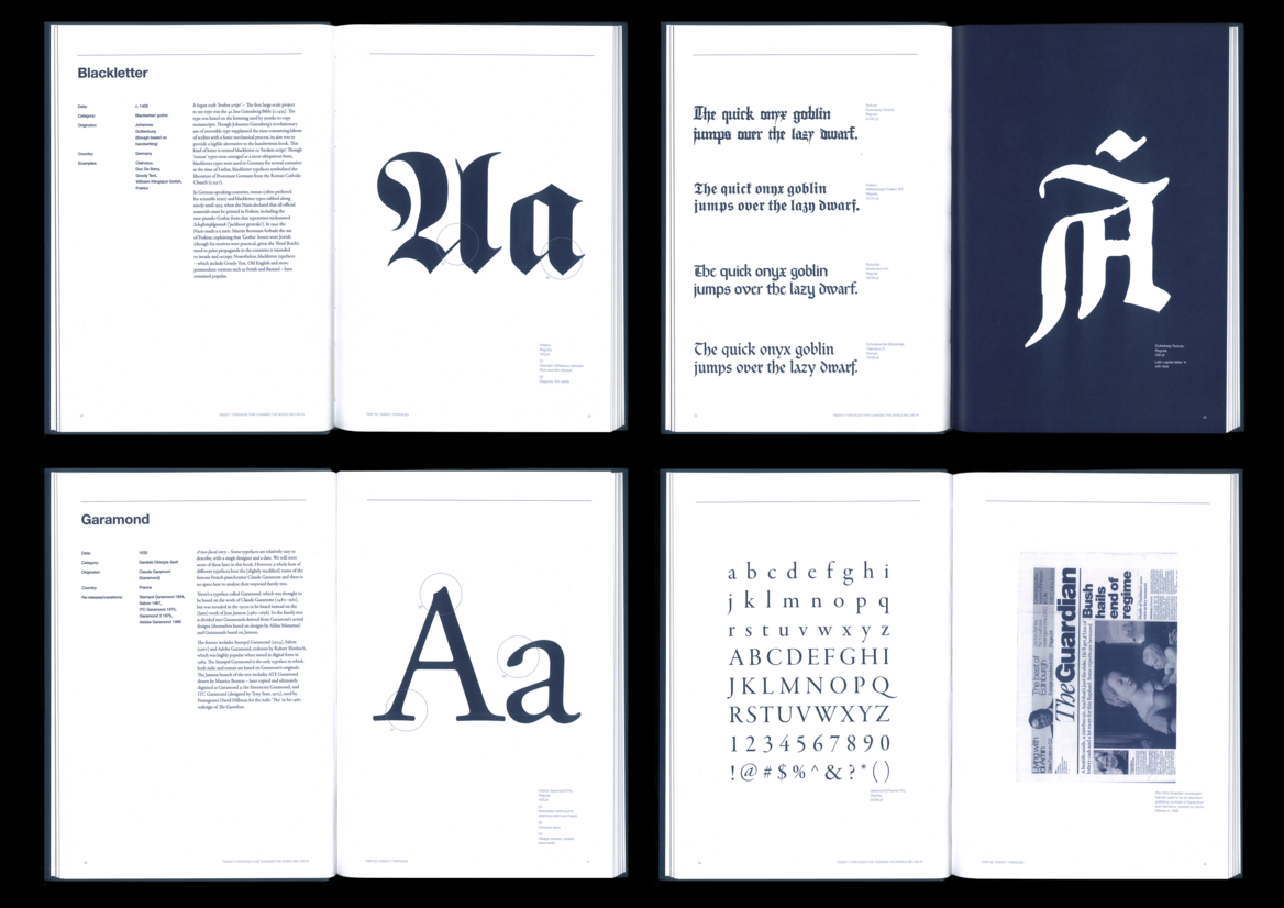
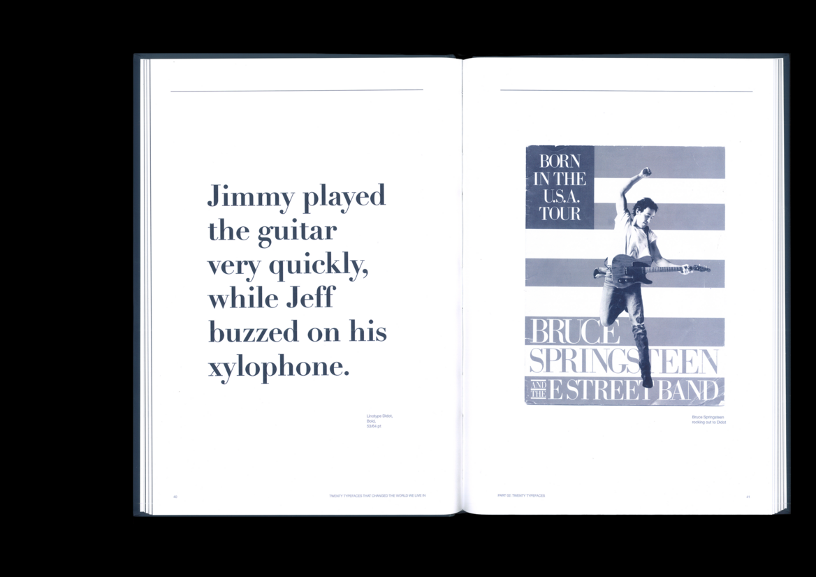
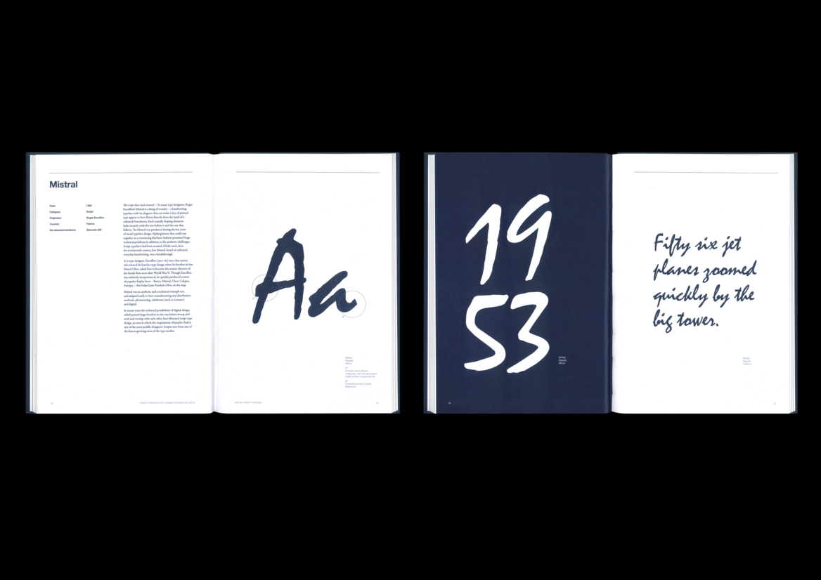
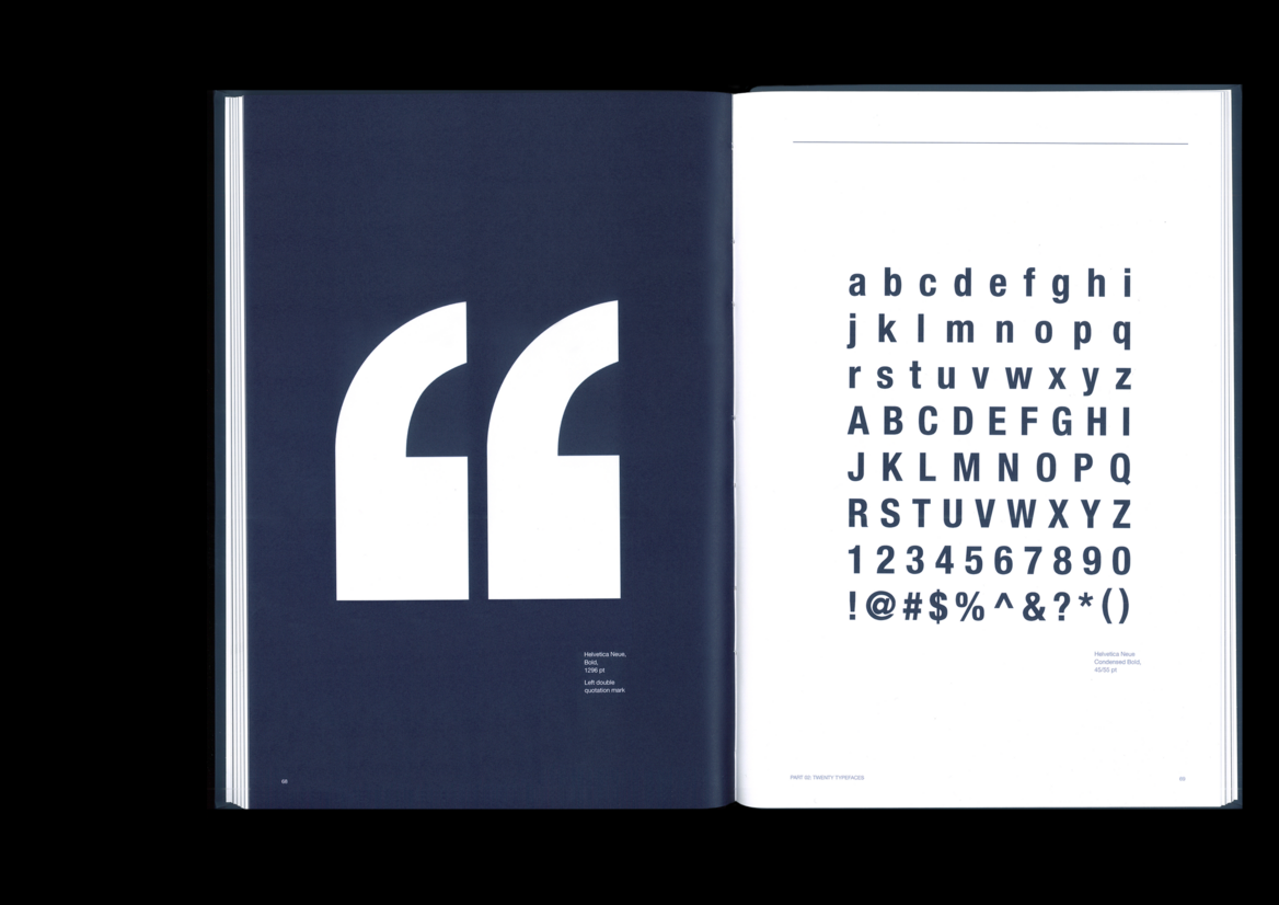
My publication’s subject matter is an exploration of typographic history, opening an original field and unveiling how typographic forms have developed in response to prevailing technology, commercial needs, and aesthetic trends. The discussion of each typeface’s historical origins are illustrated visually through meticulously chosen images, symbols, numbers and/or letterforms, to give emphasis on these responses to change or character. My publication is directed at graphic designers and students, aiding in decision making; with the plethora of typefaces, from the very first creations to revitalised versions and new initiatives (c.1455-2015), chronological arrangement and the publication’s clean and well-structured visual system ease users in electing the correct typeface with consideration to stylistic qualities, era, and historical relevance.
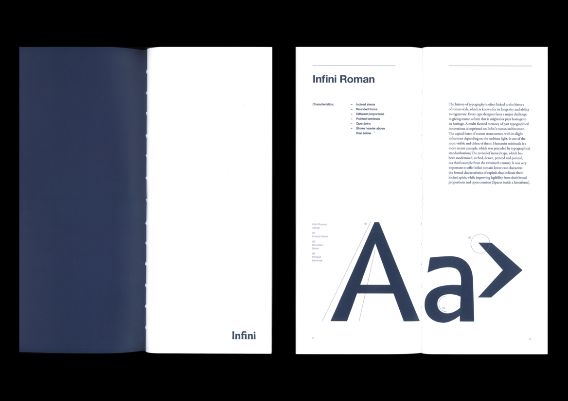
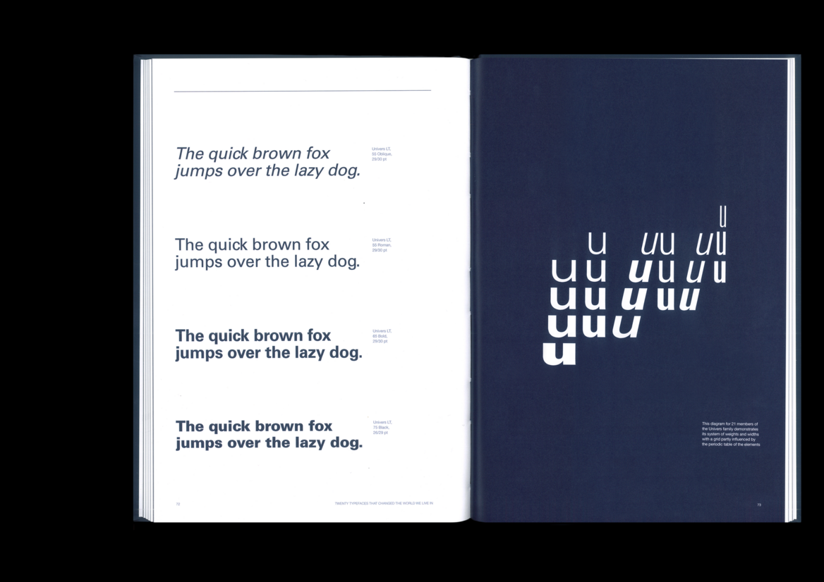
In further detail, my publication utilises a four-column grid with appropriate gutter spacing and margins, to ensure a precise and distinct system where imagery, typeface choice and text styles are simultaneous across all spreads. Hierarchy is evident and effectively files each typeface’s information in levels of priority for intuitive flow. I have utilised the colour dark blue within page backgrounds, text, and duo-toned images, as according to colour psychology, dark blue is usually associated with knowledge, depth, durability, and innovation - connoting the infinite.
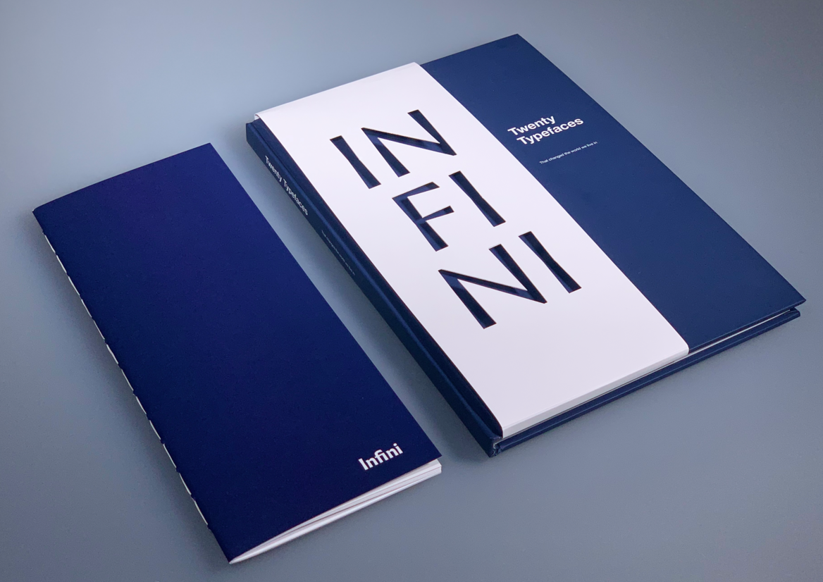
With the inclusion of my 20th typeface, Infini, created by Sandrine Nugue, my publication’s format, materials, and binding have followed Infini’s history and form; my specimen has been designed in a thin, vertical format recreating that of the rectangular tablets used as the surface for inscriptional lettering from the turn of the 2nd and 3rd century AD. I have taken influence from the incised roman capitals to create a tactile experience within my specimen’s cover text. Heavy, Arco print paper has been used to show influence of the emulation of inscriptional writing’s letterforms, through the transition to parchment from limestone, granite, or marble. To further show influence of Infini and typographic history, I have chosen the use of a hard cover with case binding which gives emphasis on the hard surfaces used for inscriptional writing as well as the incised lettering itself, also reflected in the hinge of the publication’s spine.
In regard to revitalised letterforms, I have included a tip-in within typeface Albertus’s double page spread to show comparison and restoration of Berthold Wolpe’s Albertus (1932) to Nugue’s Infini (2015) – one of Infini’s centric derivatives.
I would describe the approach to my publication as clean-cut and progressive; through layout, typeface choice, each image, each phrase, each line - the main objective is to raise public awareness of the history of typographical advances and influential character, aspired to make every voice heard in the polyphonic symphony of typography and design.
Description:
My brief was to design two related publications. First a book 'Twenty Typefaces', then the ‘collectable’ twentieth typeface specimen that features and classifies one contemporary typeface family released in the last decade. I was to curate 19 typefaces out of 40 typeface choices and choose how to order/sort the typeface selections, as it was not prescriptive.
My publication’s subject matter is an exploration of typographic history, opening an original field and unveiling how typographic forms have developed in response to prevailing technology, commercial needs, and aesthetic trends. The discussion of each typeface’s historical origins are illustrated visually through meticulously chosen images, symbols, numbers and/or letterforms, to give emphasis on these responses to change or character. My publication is directed at graphic designers and students, aiding in decision making; with the plethora of typefaces, from the very first creations to revitalised versions and new initiatives (c.1455-2015), chronological arrangement and the publication’s clean and well-structured visual system ease users in electing the correct typeface with consideration to stylistic qualities, era, and historical relevance.
In further detail, my publication utilises a four-column grid with appropriate gutter spacing and margins, to ensure a precise and distinct system where imagery, typeface choice and text styles are simultaneous across all spreads. Hierarchy is evident and effectively files each typeface’s information in levels of priority for intuitive flow. I have utilised the colour dark blue within page backgrounds, text, and duo-toned images, as according to colour psychology, dark blue is usually associated with knowledge, depth, durability, and innovation - connoting the infinite.
With the inclusion of my 20th typeface, Infini, created by Sandrine Nugue, my publication’s format, materials, and binding have followed Infini’s history and form; my specimen has been designed in a thin, vertical format recreating that of the rectangular tablets used as the surface for inscriptional lettering from the turn of the 2nd and 3rd century AD. I have taken influence from the incised roman capitals to create a tactile experience within my specimen’s cover text. Heavy, Arco print paper has been used to show influence of the emulation of inscriptional writing’s letterforms, through the transition to parchment from limestone, granite, or marble. To further show influence of Infini and typographic history, I have chosen the use of a hard cover with case binding which gives emphasis on the hard surfaces used for inscriptional writing as well as the incised lettering itself, also reflected in the hinge of the publication’s spine.
In regard to revitalised letterforms, I have included a tip-in within typeface Albertus’s double page spread to show comparison and restoration of Berthold Wolpe’s Albertus (1932) to Nugue’s Infini (2015) – one of Infini’s centric derivatives.
I would describe the approach to my publication as clean-cut and progressive; through layout, typeface choice, each image, each phrase, each line - the main objective is to raise public awareness of the history of typographical advances and influential character, aspired to make every voice heard in the polyphonic symphony of typography and design.