Graphic
Ashleigh Sun Dot Dot Dot
-
Tauira / Student
Ashleigh Sun -
Kaiako / Lecturer
Tatiana Tavares
-
School
AUT Art + Design 2025

Description:
Mental health conditions have been increasing worldwide in the last decade and with the rise of COVID-19, symptoms of anxiety and depression have since quadrupled as a result of feelings of stress, fearing the future, and craving normality. However, the fallout of the pandemic has meant that almost all countries have had their critical mental health services disrupted, making it difficult for many to seek help and support.
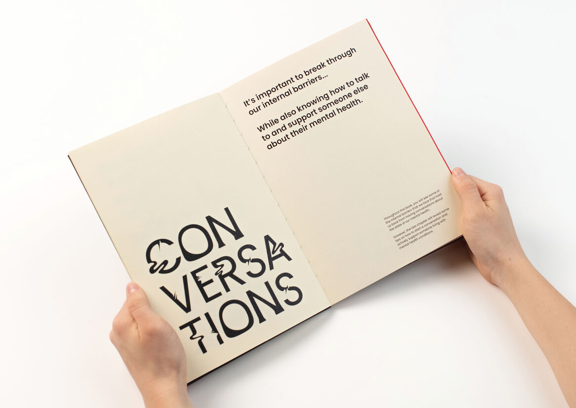
According to the World Health Organization, being mentally fit is essential to a healthy life yet less than half of people with poor psychological health seek professional treatment. While there are numerous reasons for this, social stigma has long since been a barrier that prevents people from getting help, and the pandemic has only added another barrier. Therein lies an opportunity to encourage more normalised day-to-day conversations about mental health so that people may better manage their symptoms.
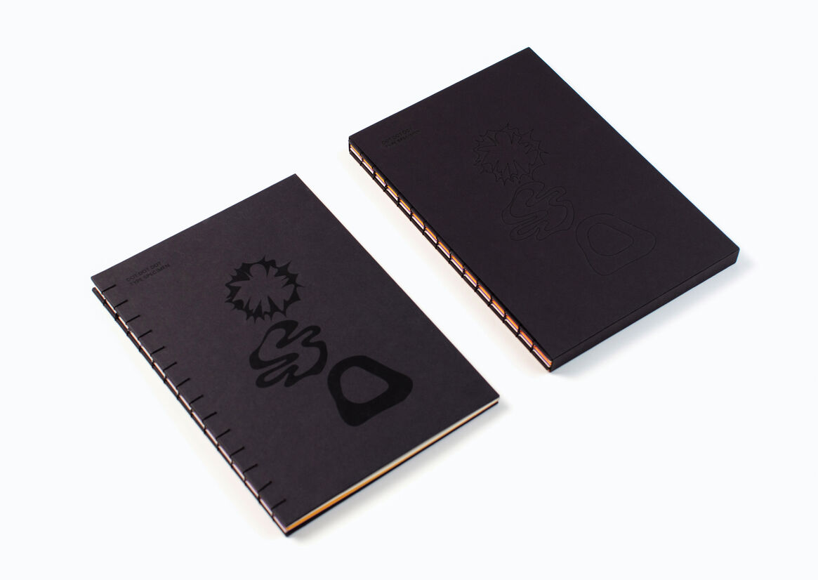
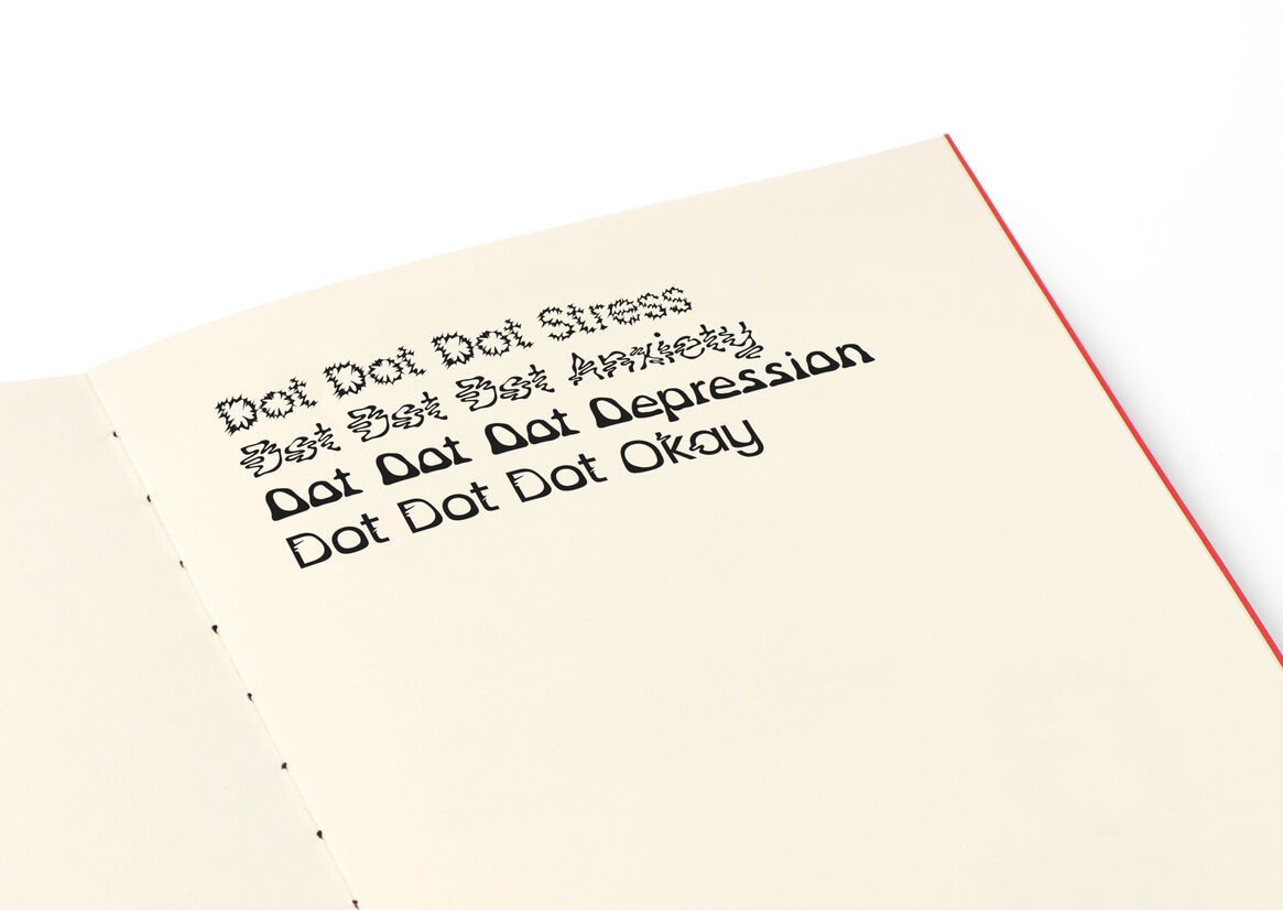
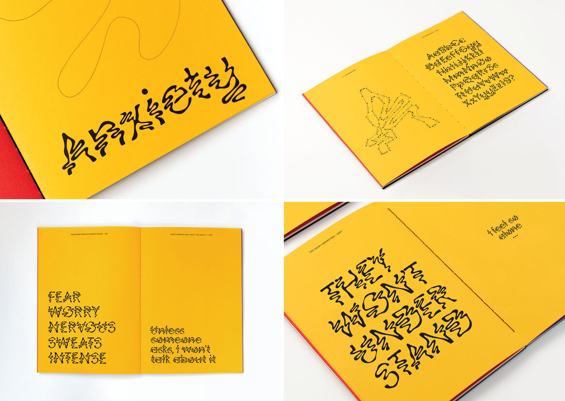
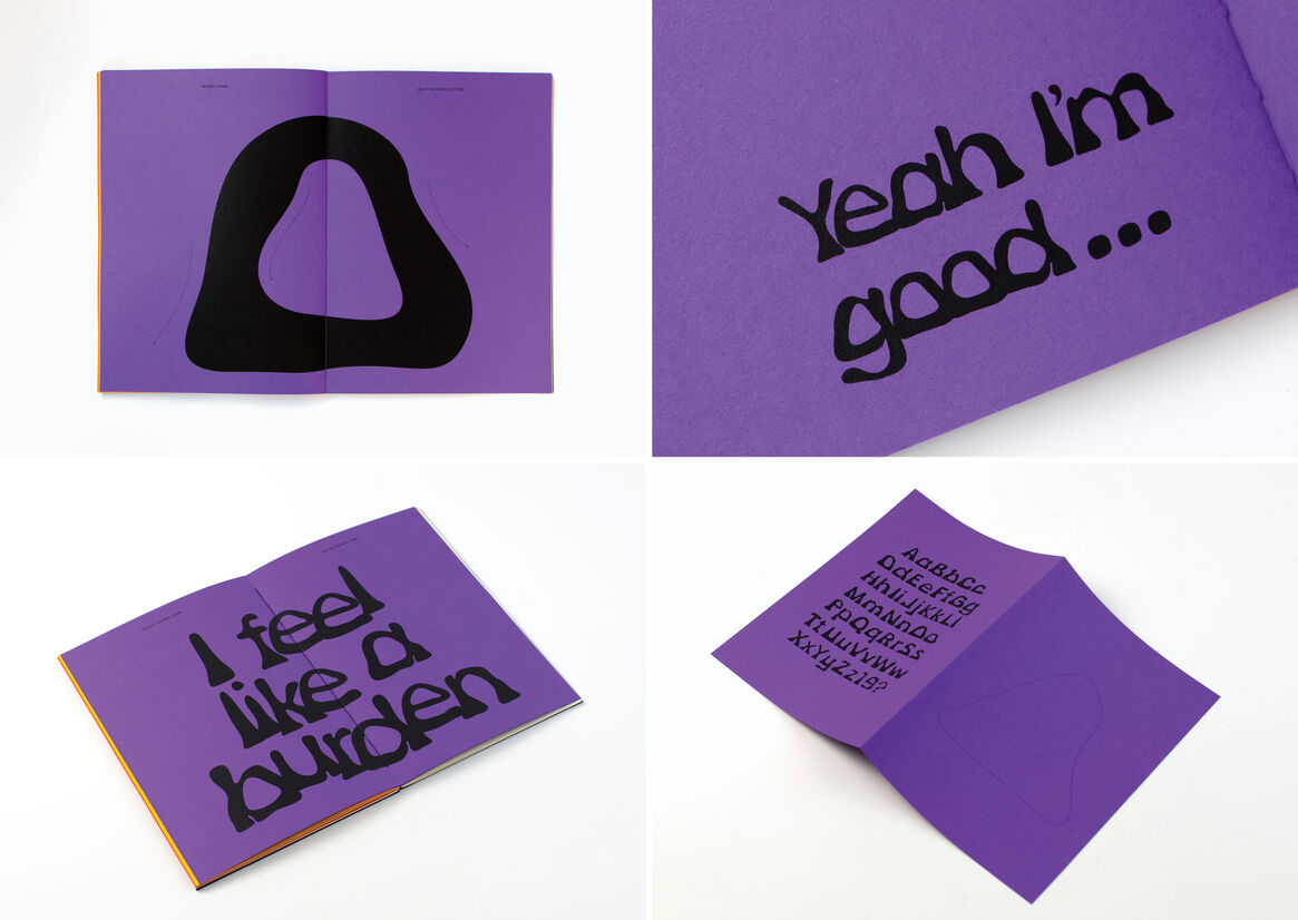
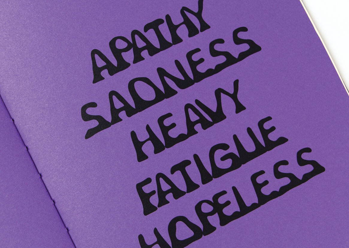
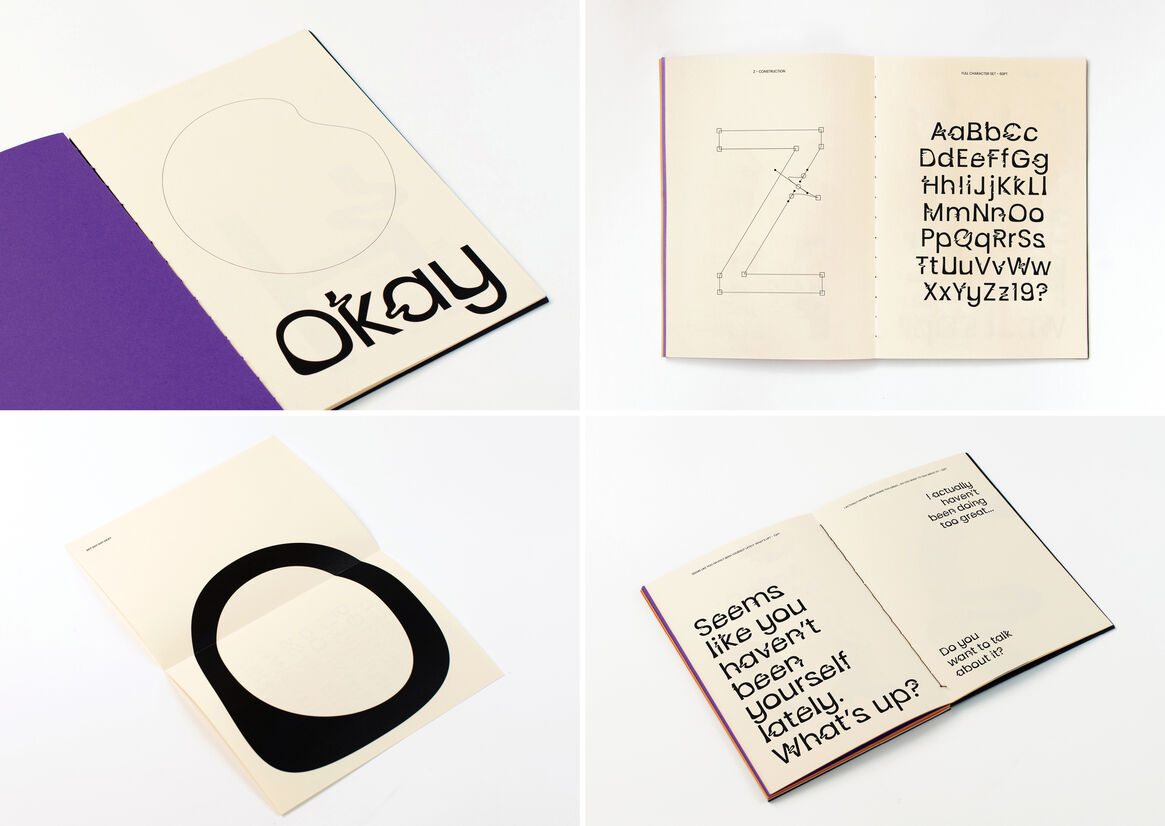
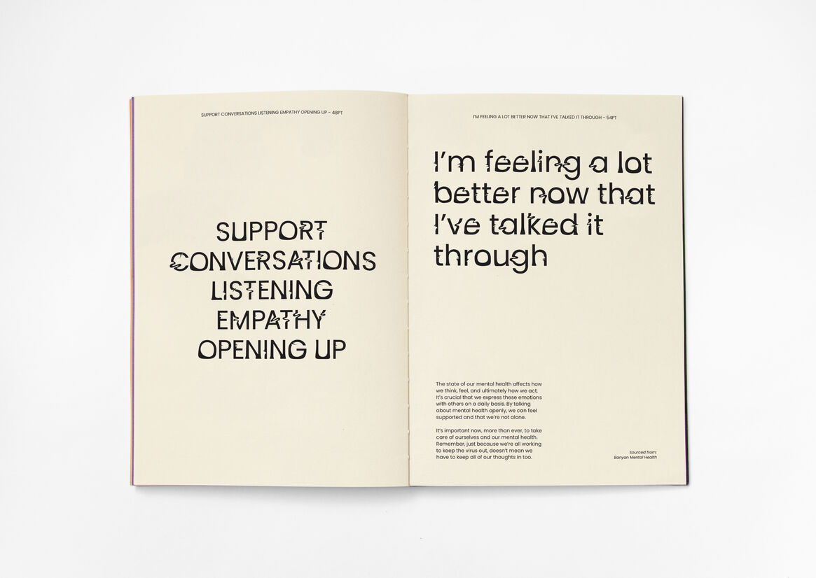
Concerning itself with the lack of conversations surrounding mental health and the awkward pauses that arise when people do have these conversations, ‘Dot Dot Dot’ is a bespoke display typeface consisting of four styles (stress, anxiety, depression, and being okay). It is presented in a type specimen book, aiming to stimulate genuine dialogue so that people may find solace during a time when there is a lack of mental health services. This is done through storytelling and revealing internal barriers, striking a sense of relatability within the viewer.
Mental health can often be addressed in media in academic or medical ways, perpetuating the stigma and making people feel disempowered. As such, ‘Dot Dot Dot’ applies a playful approach to strike balance with the serious topics being discussed and create engagement. We can see this approach within the playful, vibrant, contrasting visuals (such as colours) so mental health can be perceived as a more approachable and less stigmatising topic.
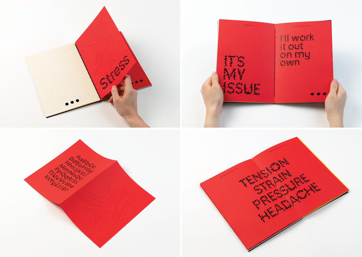
Playfulness is also adopted in the construction of the typeface itself. Expressive forms are used, creating an element of illegibility because living with mental health conditions can often feel overwhelming. While ‘Stress’, ‘Anxiety’, and ‘Depression’ are maximally distorted, ‘Okay’ is less distorted, signalling a shift towards feeling better from having open conversations. This is inspired by Leah Maldonado and Formist Foundry who often use experimental letterforms to communicate feelings and tell narratives.
Within the specimen book, real life stories and quotes are used that reveal inner voices. There is a compelling contrast between the quietness of the denotative meaning of these phrases and the loudness of the font, emphasising the importance of breaking through internal barriers. With that, the book offers helpful conversation starters and resources in the last chapter where ‘Dot Dot Dot Okay’ is showcased, creating a resolution to the story being told.
The project aims to not only help destigmatise mental health, but also to help initiate more open conversations during a time we need it most. It employs the power of typography to create a sense of solidarity and reassure people that they are not alone.
Judge's comments:
A great piece of typeface storytelling for mental health. We loved the playful approach and the execution.