The ISTD 2024 ‘The Line’ brief leads us on an exciting journey as we explore lines of reading and writing direction and the stories behind them. As designers and typographers, we are familiar with the rules of good typesetting and information hierarchy. However, have you ever wondered how these rules differ for different writing systems and languages?
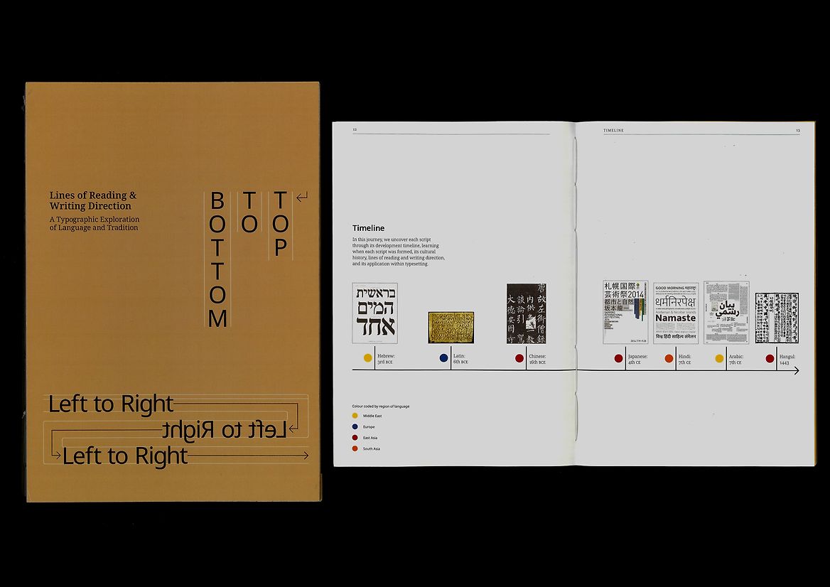
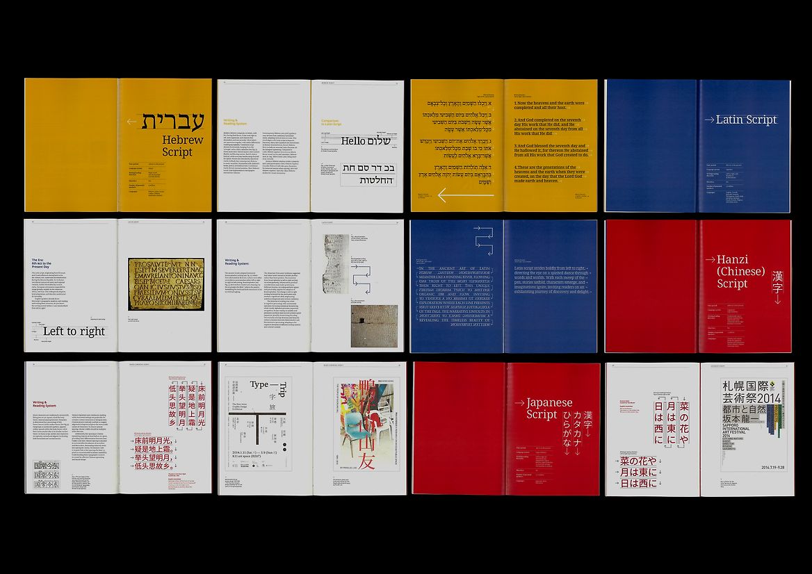
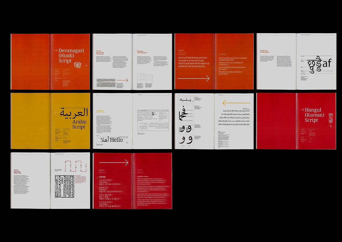
We start with the familiar left-to-right progression of English and South Asian scripts, symbolising narrative line flow. Venturing into the elegant right-to-left scripts of Arabic and Hebrew, each line is steeped in centuries of tradition. Despite their initial intimidation, these scripts are a testament to the rich cultural history of their respective regions. Delving into the Chinese, Japanese, and Korean worlds, the lines cascade from top to bottom, reflecting societal norms and heritage.
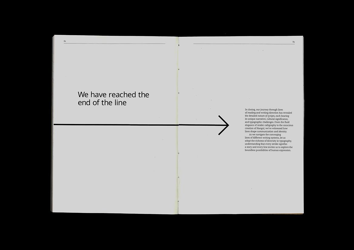
While these scripts may differ from what we are used to, they are just as beautiful and expressive. Each writing direction and script harbours the weight of history, tradition, and cultural identity, revealing the detailed nature of scripts, each bearing its unique narrative, cultural significance, and typographic challenges.
This project invites the intended audience—designers and typographers—on a journey to understand and appreciate various scripts within a typographic setting. Each language’s directionality is deeply rooted in its cultural and traditional calligraphy practices. The goal is to educate and delight the reader while encouraging them to explore the beauty of different languages in typography, understand their application, and learn their unique reading patterns and how they can incorporate these diverse practices into their design work.
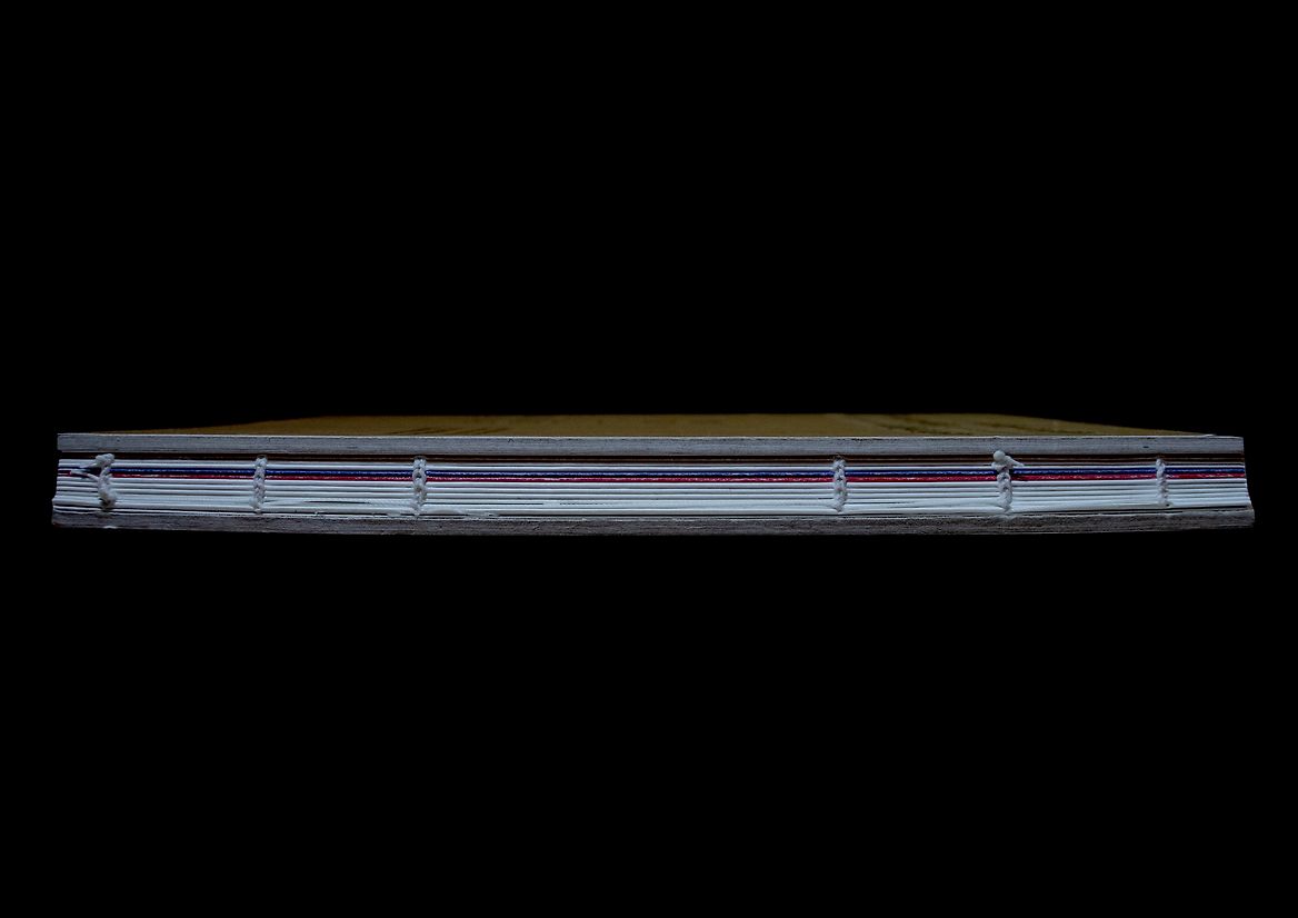
Through careful consideration of format, binding, paper, cover design, and typefaces, Lines of Reading and Writing Direction is a visually compelling and culturally rich project honouring diverse writing systems’ traditions and directionality.
Description:
The ISTD 2024 ‘The Line’ brief leads us on an exciting journey as we explore lines of reading and writing direction and the stories behind them. As designers and typographers, we are familiar with the rules of good typesetting and information hierarchy. However, have you ever wondered how these rules differ for different writing systems and languages?
We start with the familiar left-to-right progression of English and South Asian scripts, symbolising narrative line flow. Venturing into the elegant right-to-left scripts of Arabic and Hebrew, each line is steeped in centuries of tradition. Despite their initial intimidation, these scripts are a testament to the rich cultural history of their respective regions. Delving into the Chinese, Japanese, and Korean worlds, the lines cascade from top to bottom, reflecting societal norms and heritage.
While these scripts may differ from what we are used to, they are just as beautiful and expressive. Each writing direction and script harbours the weight of history, tradition, and cultural identity, revealing the detailed nature of scripts, each bearing its unique narrative, cultural significance, and typographic challenges.
This project invites the intended audience—designers and typographers—on a journey to understand and appreciate various scripts within a typographic setting. Each language’s directionality is deeply rooted in its cultural and traditional calligraphy practices. The goal is to educate and delight the reader while encouraging them to explore the beauty of different languages in typography, understand their application, and learn their unique reading patterns and how they can incorporate these diverse practices into their design work.
Through careful consideration of format, binding, paper, cover design, and typefaces, Lines of Reading and Writing Direction is a visually compelling and culturally rich project honouring diverse writing systems’ traditions and directionality.