Graphic
Soumil Hugo Arnott Elyssa Chen Tuba Karademir Megan Tran Minh Ngoc Trinh Tsui Tsz Tracy Wong RMIT School of Design Grad Shows
-
Tauira / Students
Hugo Arnott, Elyssa Chen, Tuba Karademir, Soumil, Megan Tran, Minh Ngoc Trinh, Tsui Tsz Tracy Wong -
Te Kapa Tauira / Student Team
School of Design Student Exhibition Brand Identity Team -
Kaiako / Lecturer
Jenny Grigg
-
Client
RMIT University -
School
RMIT University
Description:
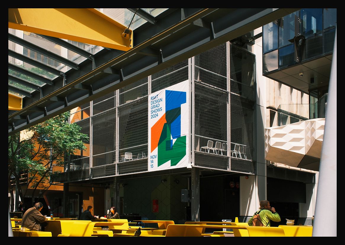
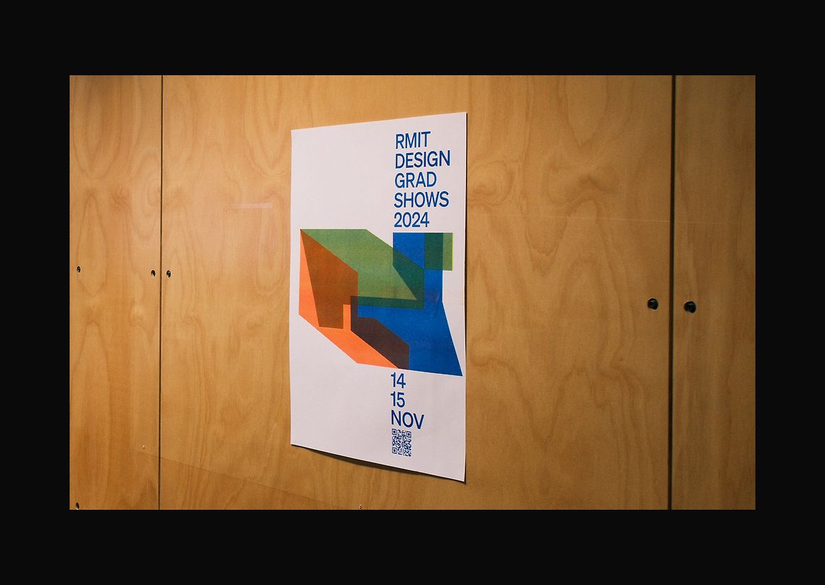
The RMIT School of Design Grad Shows is an annual event that provides graduands from its Communication Design, Digital Design and Industrial Design programmes with the platform to exhibit their design work for friends, family and industry professionals. The showcase celebrates RMIT University’s 1887 motto “Perita manus, mens exculta” — a skilled hand, a cultivated mind, and the diversity of the student cohort.
Before 2023, the three design disciplines hosted separate graduand exhibitions, and with time, the need for an integrated event to identify the school by its interdisciplinarity was realised. Our student team was selected and briefed to conceive and produce the identity for the 2024 end-of-year Grad Shows and reflect this aim. The task was to build upon the previous years’ success by positioning the three design disciplines as unique entities that work hand in hand towards optimistic futures.
In response, our team began to explore graphic elements that bridged the three distinct disciplines while also resolved the overall event branding.
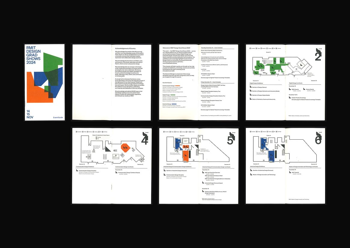
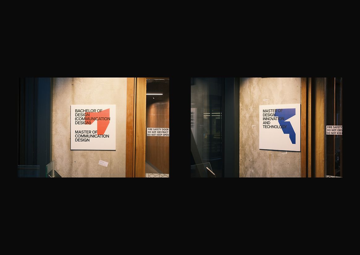
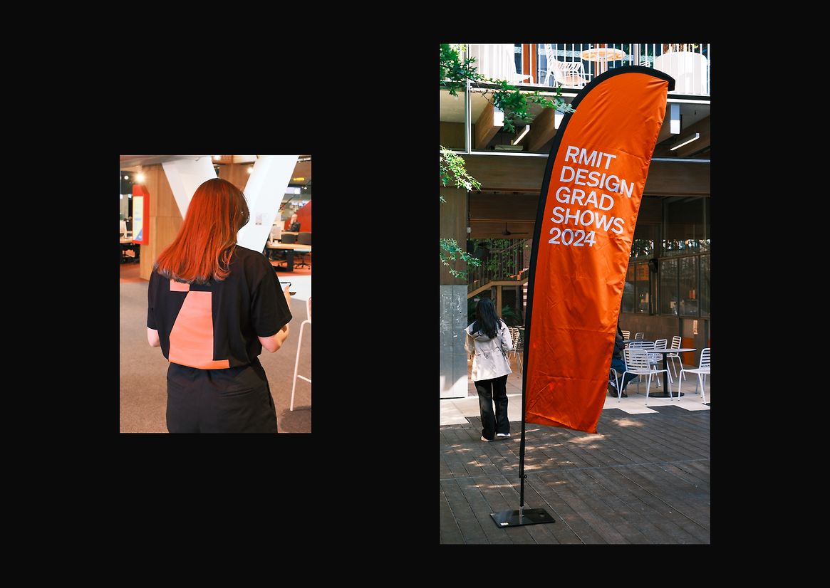
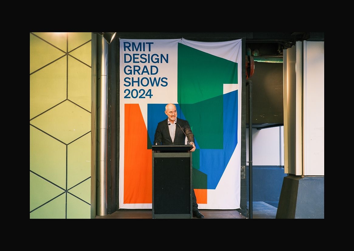
We first developed a selection of modular geometries which brought together alternating abstract shapes. This led to the idea to identify each discipline within the school by a vibrant colour, and a colour coding strategy based on the inks available through the RISO printer — an asset unique to RMIT — was devised. A language of coloured shapes and a chosen typeface was refined, with Communication Design represented by orange, Digital Design represented by green, and Industrial Design represented by blue.
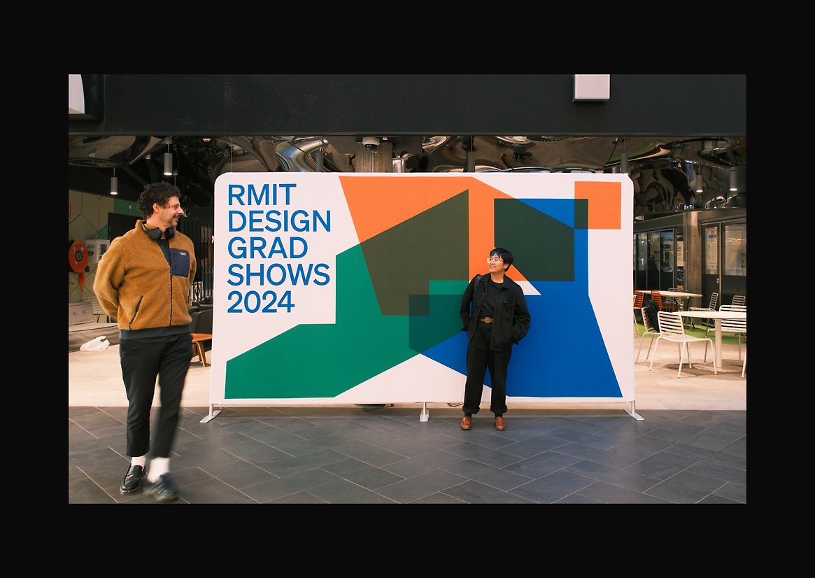
The two-day event campus campaign required the identity to be adapted to a very diverse array of large and small, printed and digital platforms, including t-shirts for wayfinding volunteers, feather flags, glass decals, a printed event guide, exhibition signage, campus banners, large format street posters, A3 RISO posters and a social media campaign.
Reconfigured shapes represent the dynamic activities of the school, our diverse community and the design industry. Intersecting shapes express the school’s disciplinary interactions, and individual shapes signify independent discipline-specific activities.
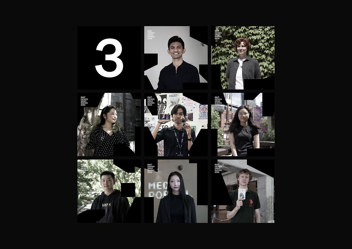
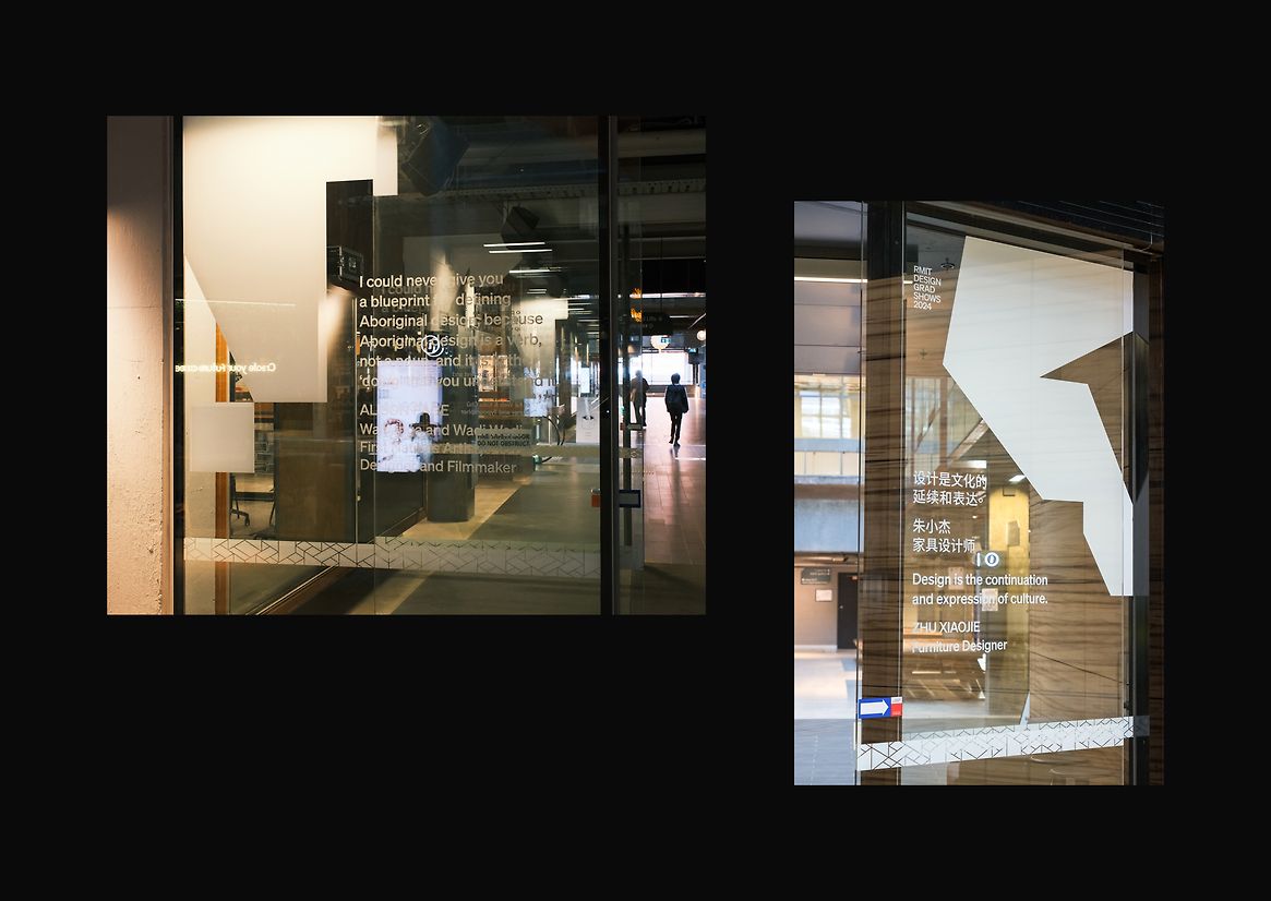
The aspects that elevate the campaign in our view are its personal features. A monochrome interpretation of the branding was used for student stories in the social media campaign, and the multi-lingual definitions of design produced on glass decals to welcome visitors, a component of the identity that hoped to demystify and decolonise design.
One of the most challenging aspects of the project was the conception of an identity that was coherent and visible to visitors in an architecturally noisy and fractured campus, and the production of its applications to an ambitious number of items. Each item produced required separate oversight by designated members of our student design team.