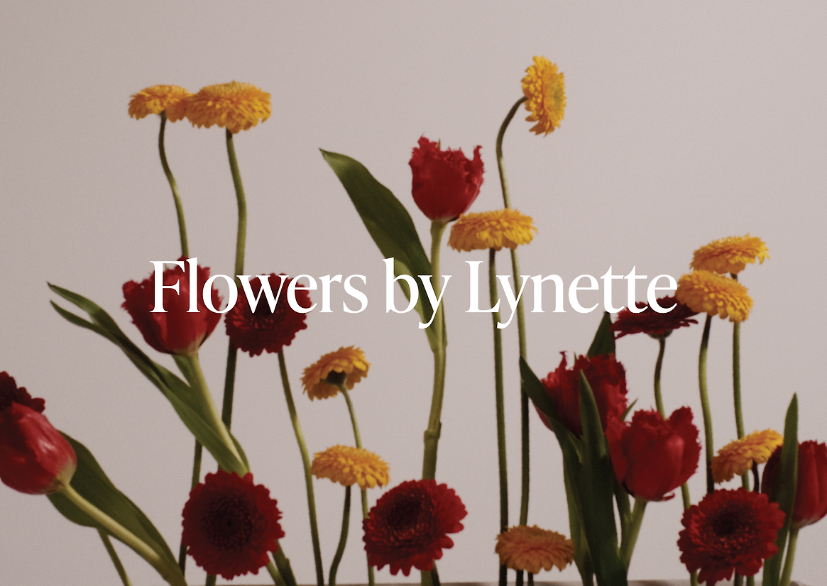
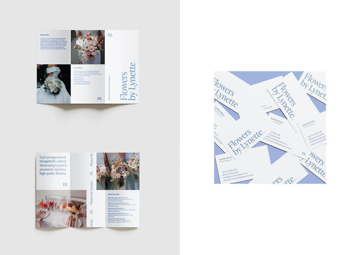
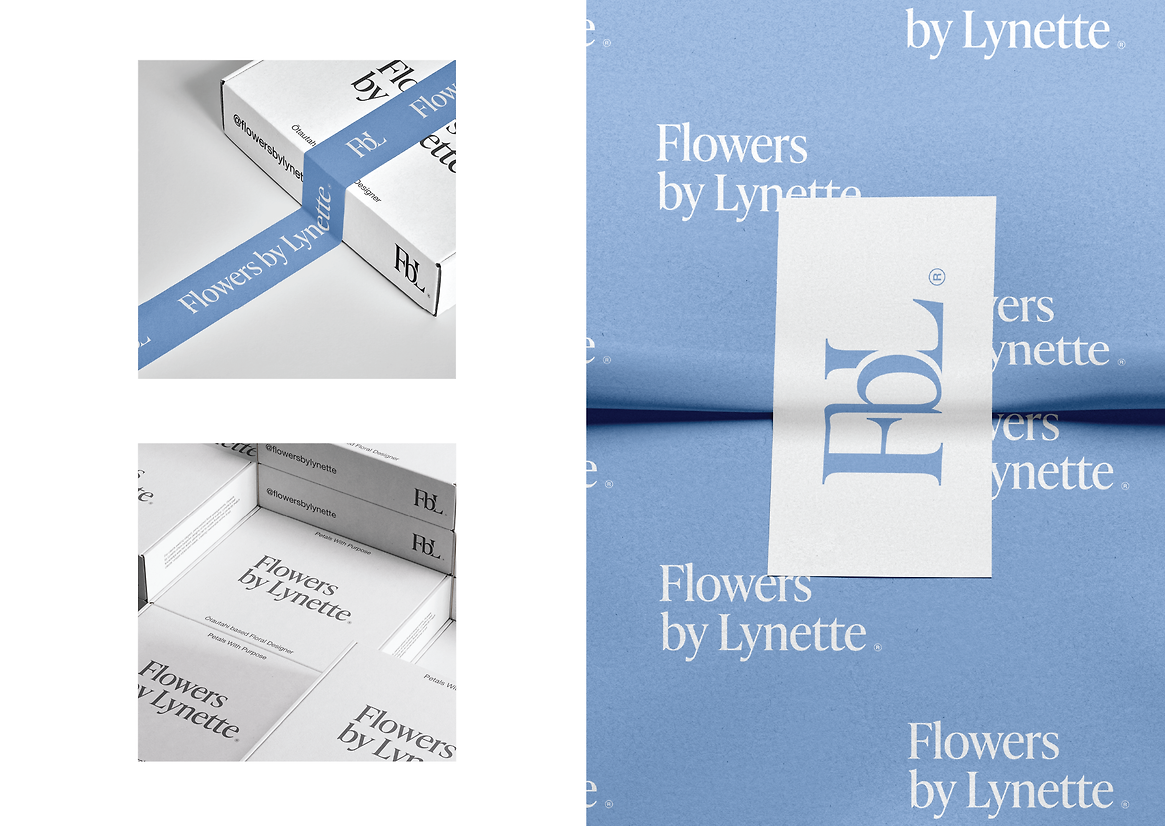
This capstone project began as a rebrand for Flowers by Lynette, a long-standing, Christchurch-based floral business operated from home by Lynette and her husband for over 25 years. The opportunity lay in modernising the visual identity to reflect Lynette’s extensive experience, her personalised service, and her ability to create arrangements in any style to suit the unique needs of her clients. The aim was to develop a brand system that felt refined yet timeless—something that could extend across all touchpoints while positioning Lynette not only as a wedding florist, but as a skilled, all-round floral designer.
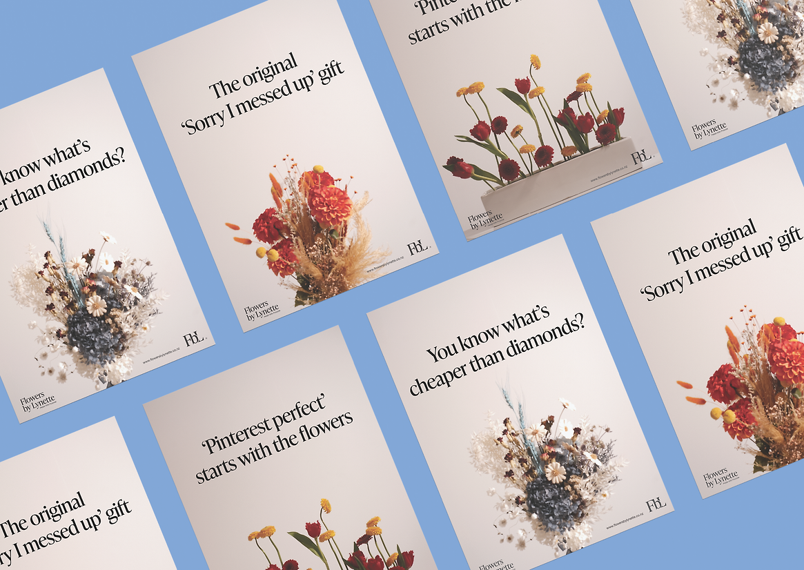
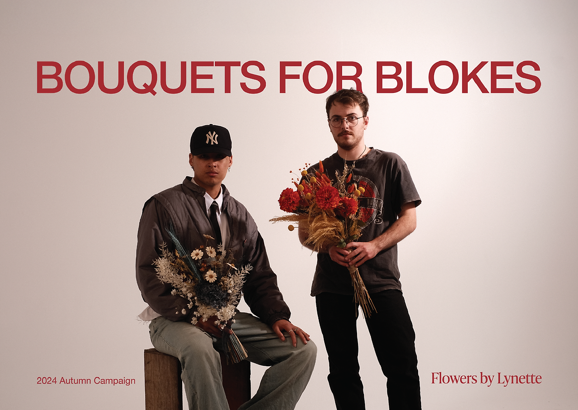
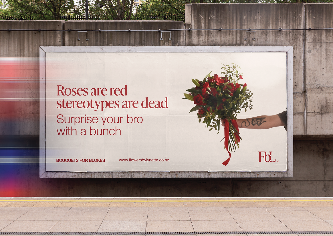
As the identity system took shape, the project evolved into a two-part brand campaign. The second phase, titled Bouquets for Blokes, was created in response to an opportunity to push social and cultural boundaries—challenging the notion that flowers are just for women, and instead reframing them as thoughtful gifts between men. Research showed that the gifting of flowers is heavily gendered, and rarely seen as something men do for other men. This opened up the potential to create a campaign that was playful, slightly provocative, and full of personality—while also expanding Lynette’s market to include a previously untapped audience.
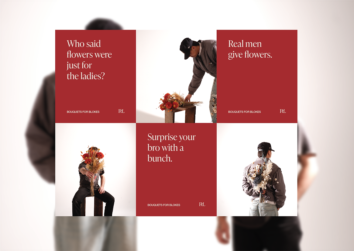
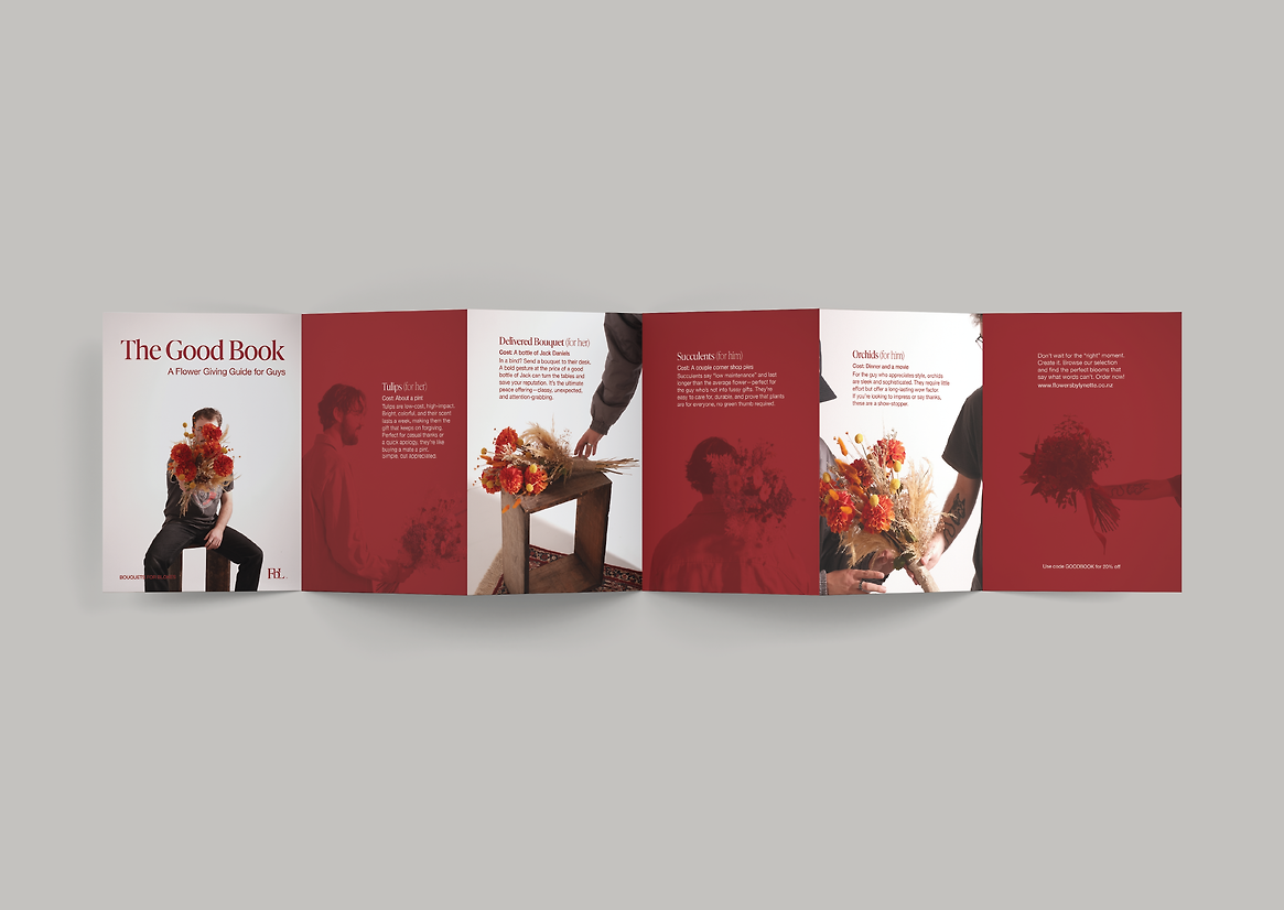
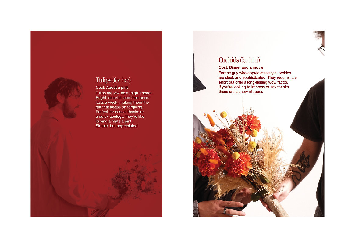
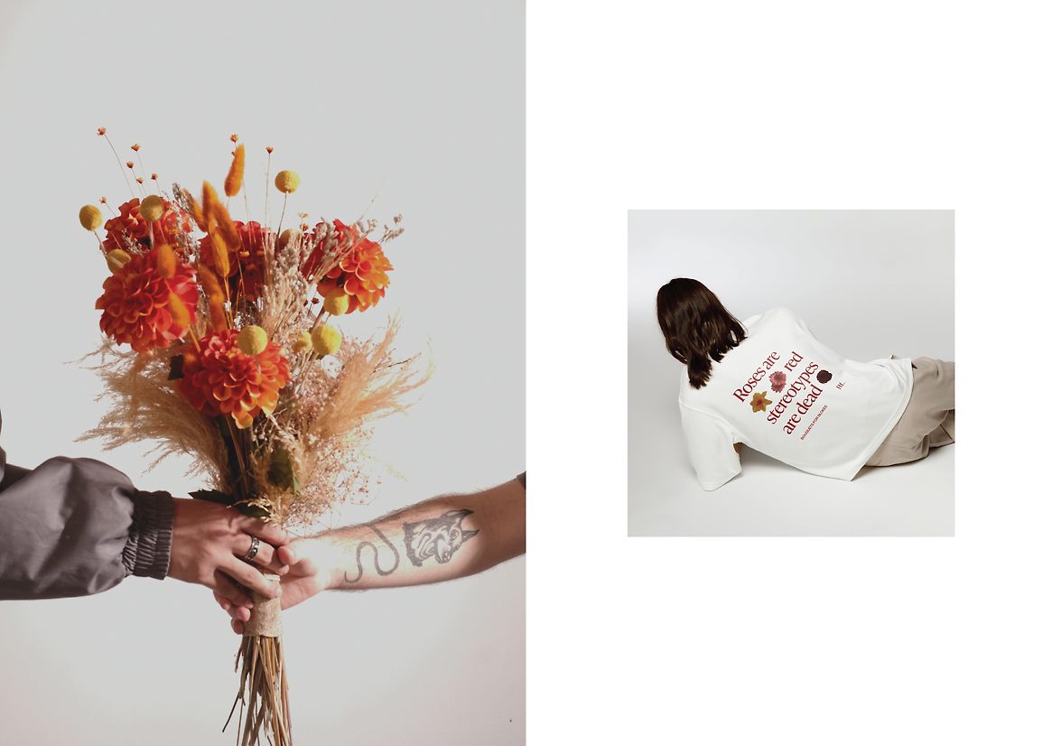
Bouquets for Blokes is expressed across a suite of campaign materials including a hero print piece, The Good Book—a tongue-in-cheek brochure designed to help men navigate the world of flower gifting. From apology bouquets to subtle bro-to-bro gestures, the guide gives flowers cultural relevance through humour and relatability. Additional campaign expressions include billboard mockups, branded apparel, and social media assets that amplify the message and position the campaign as more than a sales push—almost a movement. These executions were unified through a confident design system that combines bold sans serif typography, a limited colour palette, and striking hero photography featuring men confidently gifting or holding flowers.
This campaign stretched beyond brand building. It was an exercise in shifting perception—encouraging New Zealand men to rethink what flowers can mean, and for whom. In doing so, it gave the broader Flowers by Lynette brand a fresh cultural relevance and a wider audience, with room for further expansion.
Creatively, this project marked a significant personal challenge—pushing me into unfamiliar territory, from navigating a sensitive subject matter to directing a photoshoot for the first time. The results successfully demonstrate a cohesive identity system paired with a daring, well-considered campaign that injects new energy and purpose into an established local business.
Description:
This capstone project began as a rebrand for Flowers by Lynette, a long-standing, Christchurch-based floral business operated from home by Lynette and her husband for over 25 years. The opportunity lay in modernising the visual identity to reflect Lynette’s extensive experience, her personalised service, and her ability to create arrangements in any style to suit the unique needs of her clients. The aim was to develop a brand system that felt refined yet timeless—something that could extend across all touchpoints while positioning Lynette not only as a wedding florist, but as a skilled, all-round floral designer.
As the identity system took shape, the project evolved into a two-part brand campaign. The second phase, titled Bouquets for Blokes, was created in response to an opportunity to push social and cultural boundaries—challenging the notion that flowers are just for women, and instead reframing them as thoughtful gifts between men. Research showed that the gifting of flowers is heavily gendered, and rarely seen as something men do for other men. This opened up the potential to create a campaign that was playful, slightly provocative, and full of personality—while also expanding Lynette’s market to include a previously untapped audience.
Bouquets for Blokes is expressed across a suite of campaign materials including a hero print piece, The Good Book—a tongue-in-cheek brochure designed to help men navigate the world of flower gifting. From apology bouquets to subtle bro-to-bro gestures, the guide gives flowers cultural relevance through humour and relatability. Additional campaign expressions include billboard mockups, branded apparel, and social media assets that amplify the message and position the campaign as more than a sales push—almost a movement. These executions were unified through a confident design system that combines bold sans serif typography, a limited colour palette, and striking hero photography featuring men confidently gifting or holding flowers.
This campaign stretched beyond brand building. It was an exercise in shifting perception—encouraging New Zealand men to rethink what flowers can mean, and for whom. In doing so, it gave the broader Flowers by Lynette brand a fresh cultural relevance and a wider audience, with room for further expansion.
Creatively, this project marked a significant personal challenge—pushing me into unfamiliar territory, from navigating a sensitive subject matter to directing a photoshoot for the first time. The results successfully demonstrate a cohesive identity system paired with a daring, well-considered campaign that injects new energy and purpose into an established local business.