Graphic
Mia Murone Yunmeng Jia Ananya Saini Yew Qi Yap Li Jun Wang The Saturday Paper, Brand Refresh and Design Strategy.
-
Tauira / Students
Mia Murone, Yunmeng Jia, Ananya Saini, Yew Qi Yap, Li Jun Wang -
Kaiako / Lecturer
Žiga Testen
-
Client
The Saturday Paper -
School
RMIT University
Description:
Print media companies in 2024 are being pushed to go digital. As the demand for print newspapers is reportedly declining, the security of printing infrastructure is questioned. Schwartz Media voiced their concerns about the longevity of their printed Saturday Paper and was looking to invest in a sustainable strategy that allowed them to transition their print readership to digital platforms.
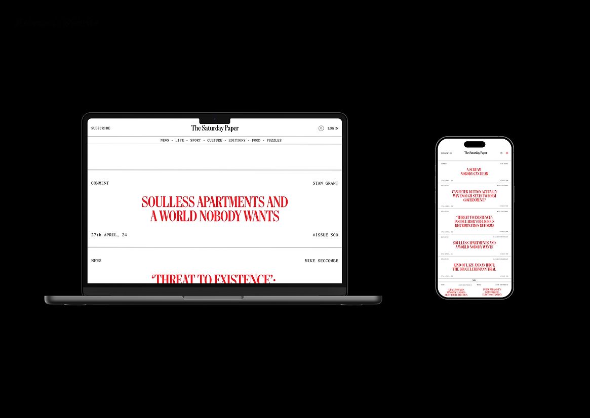
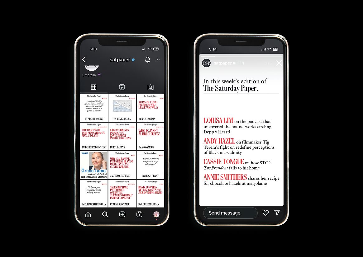
Based on our research we identified that it would not be in the best interests of Schwartz Media to cease printing of The Saturday Paper. Instead, to aid in the transition from print to digital, we proposed a gradual move away from print through the design of a b5 mini-newspaper as well as a refresh of the branding and digital offerings across their website and social media platforms. Maintaining the printed product allows the print readership to retain their current purchasing and reading habits, pushing Schwartz Media to shift their focus to improving their digital offerings, expanding their digital reach and acquiring new cross-platform readers.
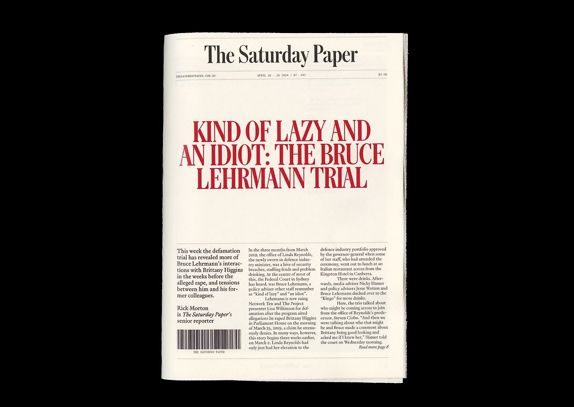
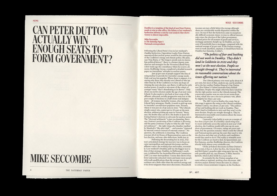
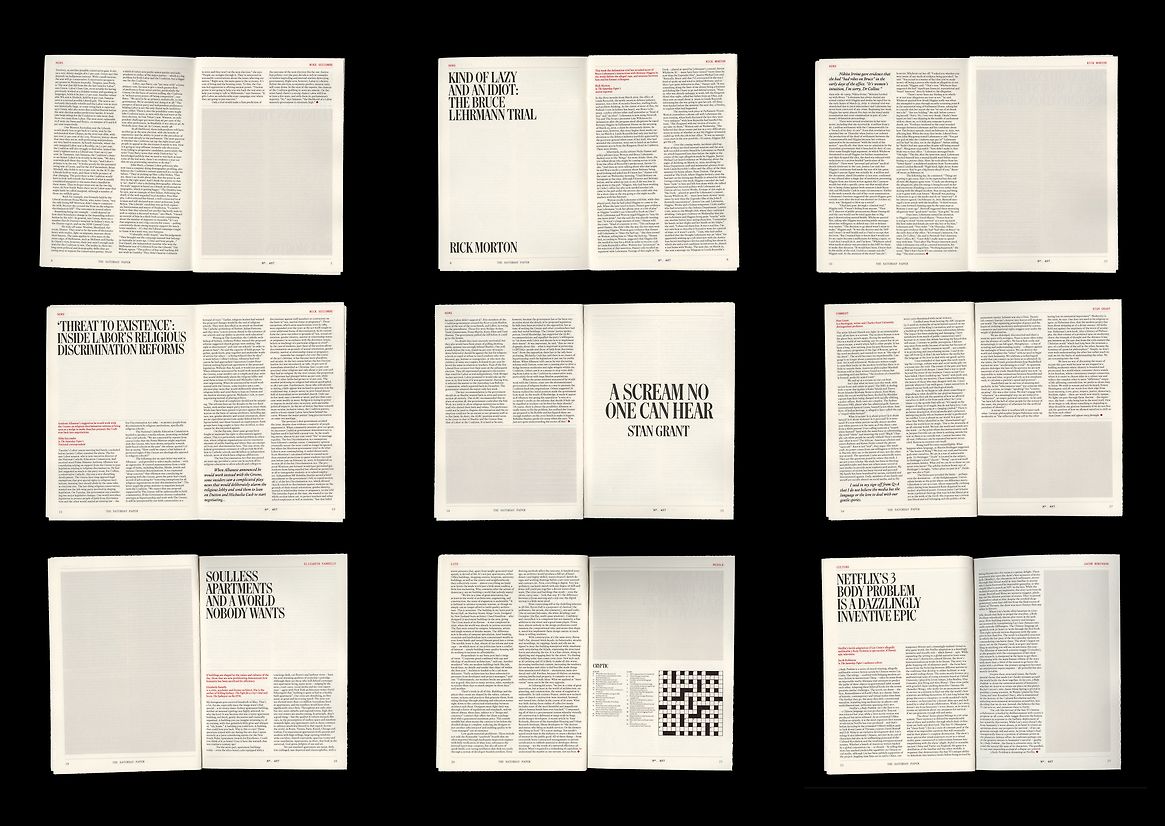
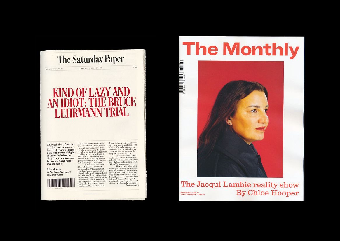
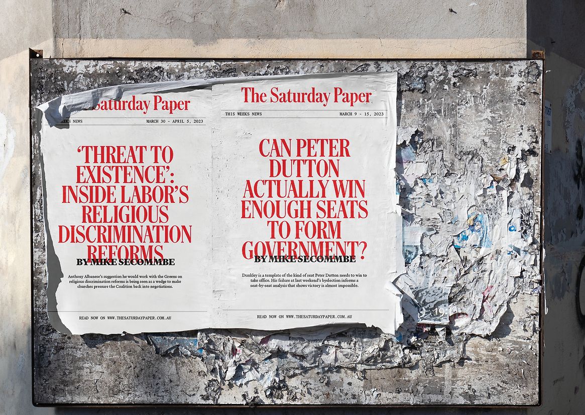
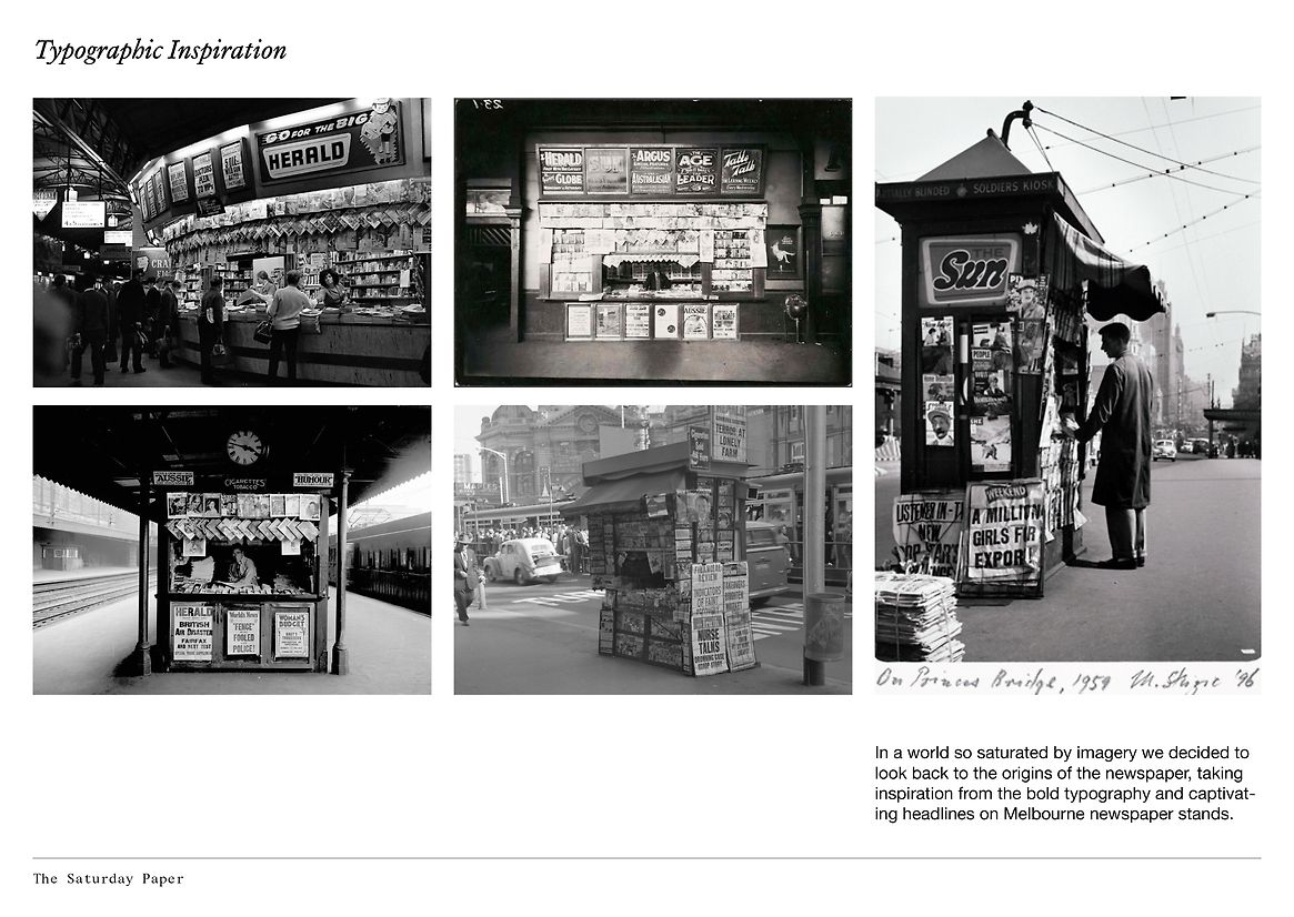
The design draws upon the strong typographic language of headlines on newsstands in Melbourne in the early to mid-20th century. The historical reference was integral to our overall design, drawing on the legacy of newspaper design systems with strong, trustworthy serifs as well as linking it to a local historical context. Bold headlines replace images emphasising the witty and eye-catching headlines and showcasing The Saturday Paper's unique tone of voice.
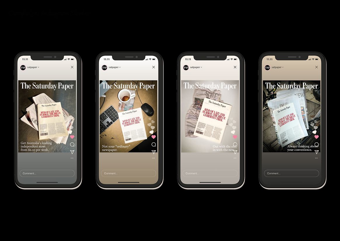
Our campaign focused on introducing the new format to its current readership whilst also attracting new readers to the print and digital offerings. Our campaign aimed to help our readership adjust to the new brand identity through the design of a poster series showcasing witty catchphrases. The art direction was inspired by the aesthetics of crime and mystery boards playing with the false assumption that print is dying.
Judge's comments:
Saturday Paper addressed a key problem in today’s society in a unique way. It successfully brought analogue to digital using digital tricks to emulate print, and vice versa. Conceptually, the topic was handled with sensitivity and care, introducing bold new moves into the space. A project with a high level of restraint