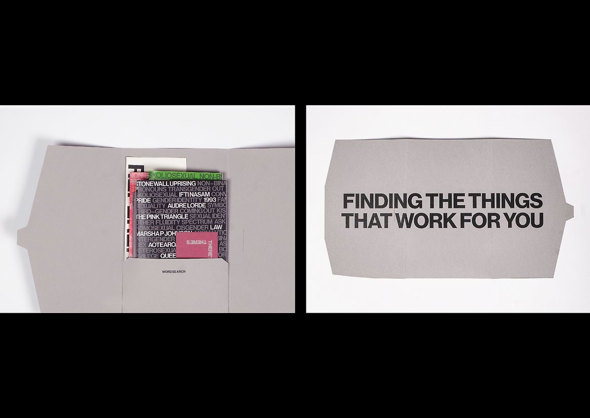
Introducing Wordsearch, an educational resource dedicated to offering queer-centric definitions and historical insights on identity. Designed to reimagine the landscape of heteronormative high school sex education in Aotearoa, Wordsearch creates an inclusive and understanding environment for adolescents.
Little has changed in the realm of inclusive sex education, despite significant societal shifts in political, cultural, and educational thinking over the past decade. Recent discussions highlight ongoing challenges faced by the LGBTQI+ community; in ‘Widespread discrimination of rainbow community in New Zealand - report’ (Stuff.co.nz) two conclusions were drawn: 1. Members of the LQBTQI+ community are more likely to be victims of crime in New Zealand. 2. A lack of information was found to be a key obstacle for the identification and resolution of issues concerning members of the rainbow community.
Wordsearch delivers information directly to the curriculum to combat the blatant lack of / misinformation. Actively supporting and building an educational environment that promotes queer safety is paramount to the flourishing of youth. Wordsearch fills a crucial void by directly addressing the informational and educational needs of queer and takatāpui adolescents. Unlike existing resources that often cater to educators or rely on academic jargon, Wordsearch speaks personally to young queer individuals, ensuring they feel seen and empowered.
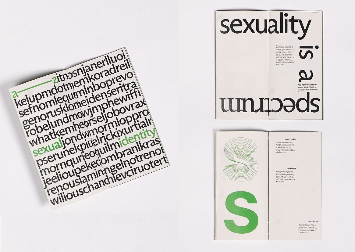
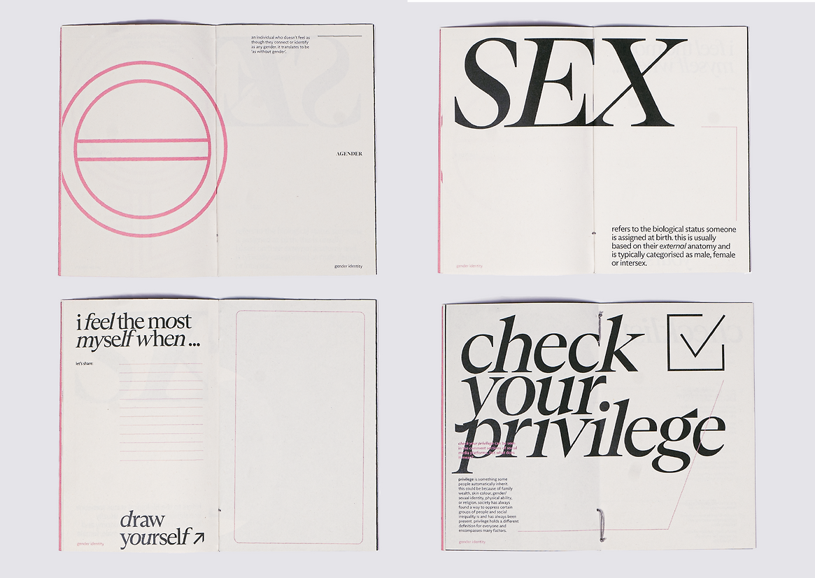
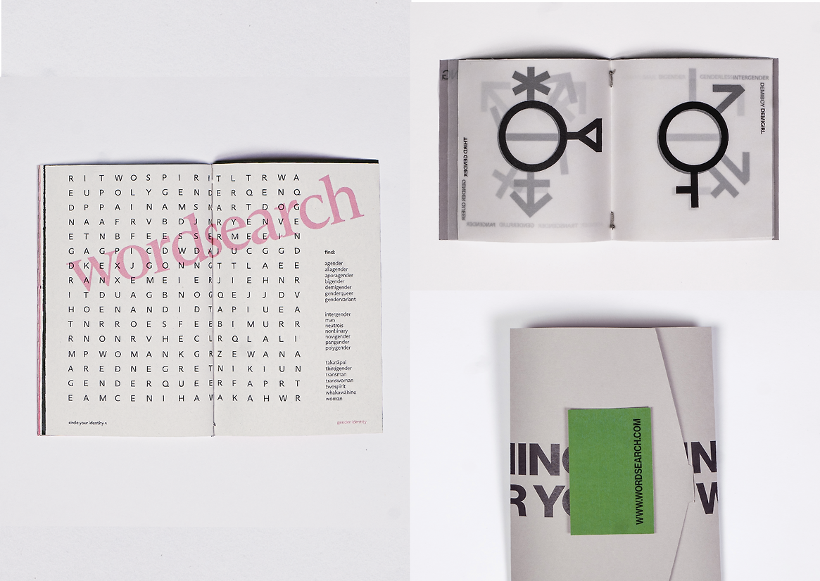
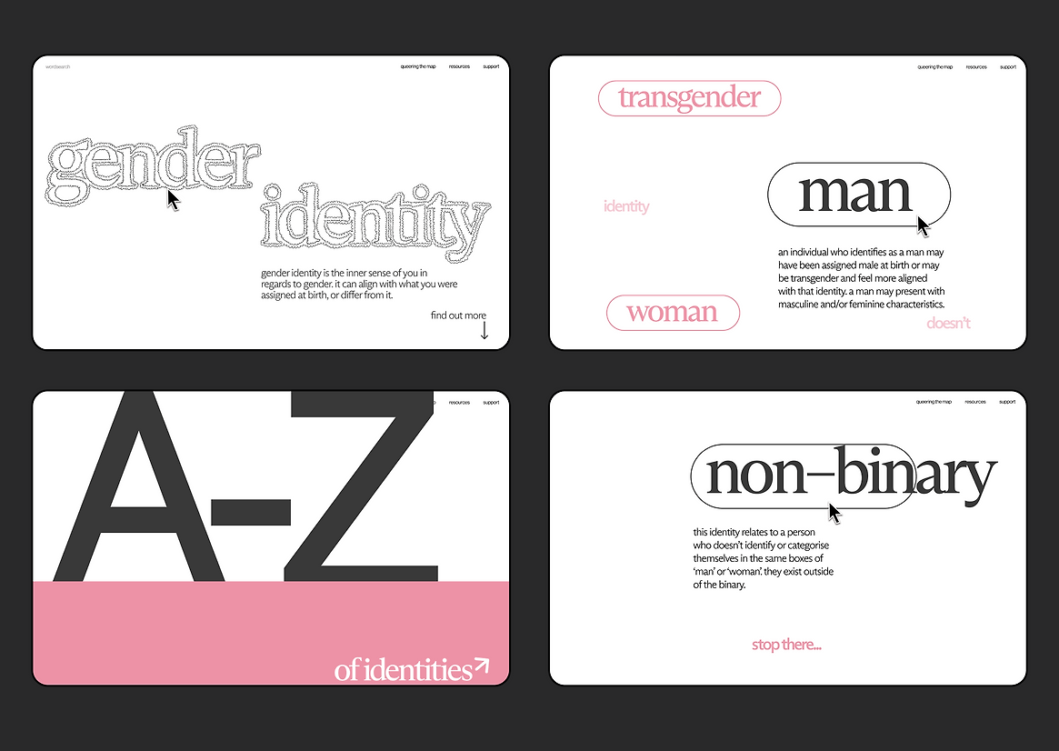
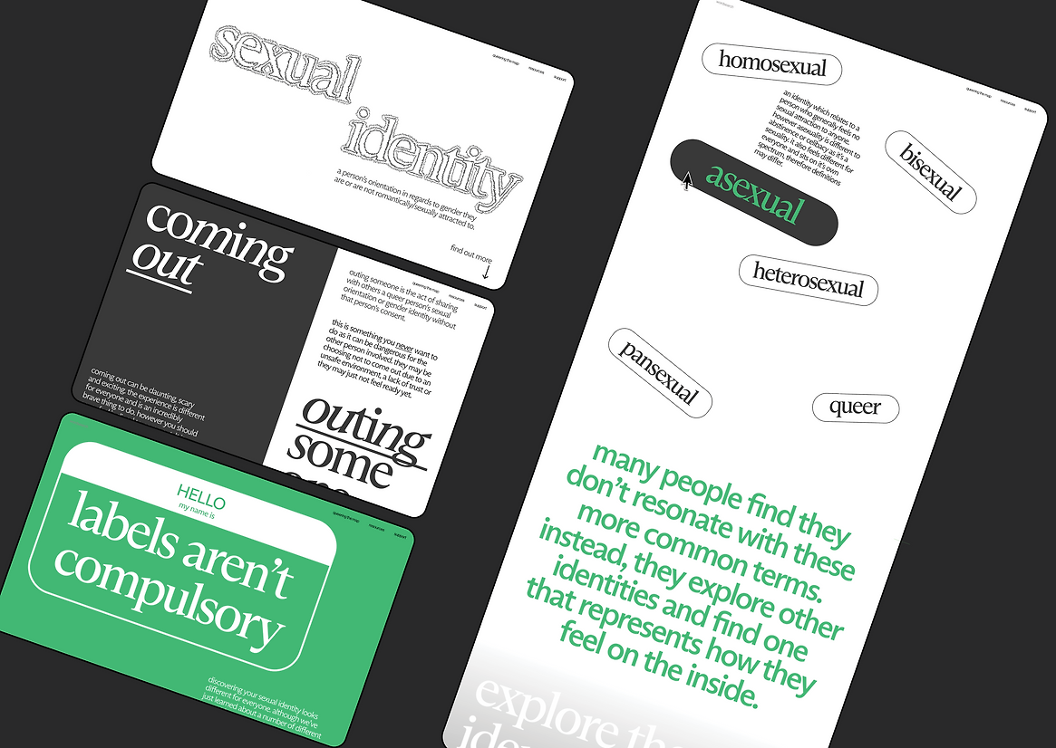
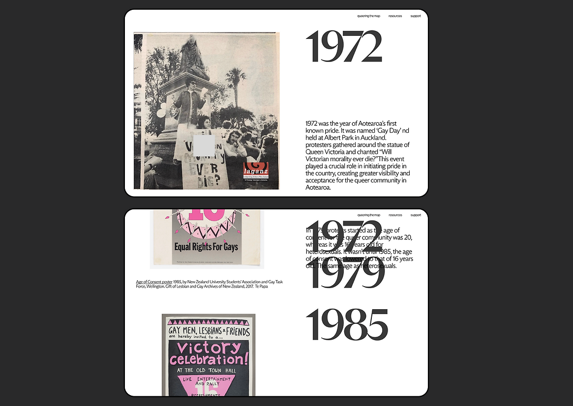
Wordsearch bridges the physical and digital realms, drawing inspiration from bold visual elements from the call-to-action design of past movements like the HIV crisis and queer liberation. Vibrant colours were chosen to highlight the queer community, but not in a way that is overt or outing for the audience. Pink references the pink triangle, a symbol that was reclaimed by the queer community and green is used in juxtaposition to create a more neutral tone.
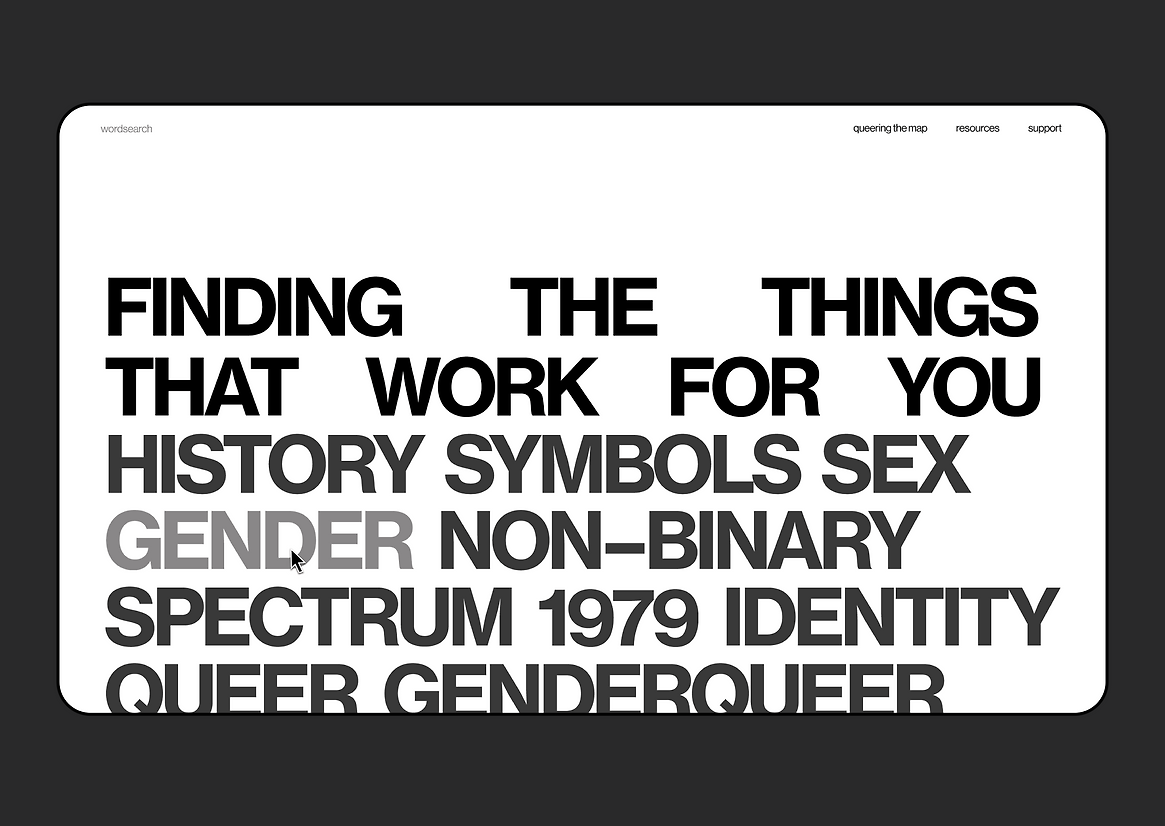
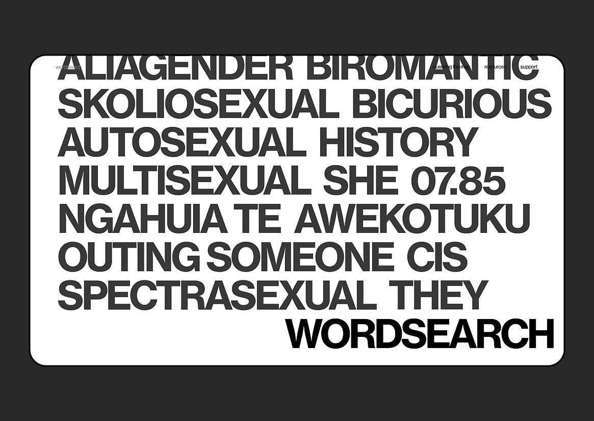
Integral to Wordsearch’s design is the Arizona variable typeface, metaphorically representing the queer community; It’s ever-changing, diverse in its shape and style but part of the same family. In the same way the typeface is fluid, the reading journey is too. Both the printed and digital versions of Wordsearch are intentionally designed to encourage personal exploration. The book format refrains from traditional structures like contents or page numbers, inviting readers to navigate their own paths. Similarly, the website features keyword-based navigation, allowing users to delve into topics that resonate with their individual experiences.
The content balances informativeness with a personable tone to maintain the warmth and sensitivity this journey possesses. A tangible resource reflects these same themes as it’s intimate – something you can experience in your own privacy. The website remains a constantly accessible resource, one that is reflective of the audience’s current digital climate.
In essence, Wordsearch is not just a resource but a call to action to rethink the way we approach queer sex education. By empowering youth to explore and understand their identities on their own terms, Wordsearch contributes to a more informed and supportive educational environment for queer adolescents and their peers.

Description:
Introducing Wordsearch, an educational resource dedicated to offering queer-centric definitions and historical insights on identity. Designed to reimagine the landscape of heteronormative high school sex education in Aotearoa, Wordsearch creates an inclusive and understanding environment for adolescents.
Little has changed in the realm of inclusive sex education, despite significant societal shifts in political, cultural, and educational thinking over the past decade. Recent discussions highlight ongoing challenges faced by the LGBTQI+ community; in ‘Widespread discrimination of rainbow community in New Zealand - report’ (Stuff.co.nz) two conclusions were drawn:
1. Members of the LQBTQI+ community are more likely to be victims of crime in New Zealand.
2. A lack of information was found to be a key obstacle for the identification and resolution of issues concerning members of the rainbow community.
Wordsearch delivers information directly to the curriculum to combat the blatant lack of / misinformation. Actively supporting and building an educational environment that promotes queer safety is paramount to the flourishing of youth. Wordsearch fills a crucial void by directly addressing the informational and educational needs of queer and takatāpui adolescents. Unlike existing resources that often cater to educators or rely on academic jargon, Wordsearch speaks personally to young queer individuals, ensuring they feel seen and empowered.
Wordsearch bridges the physical and digital realms, drawing inspiration from bold visual elements from the call-to-action design of past movements like the HIV crisis and queer liberation. Vibrant colours were chosen to highlight the queer community, but not in a way that is overt or outing for the audience. Pink references the pink triangle, a symbol that was reclaimed by the queer community and green is used in juxtaposition to create a more neutral tone.
Integral to Wordsearch’s design is the Arizona variable typeface, metaphorically representing the queer community; It’s ever-changing, diverse in its shape and style but part of the same family. In the same way the typeface is fluid, the reading journey is too. Both the printed and digital versions of Wordsearch are intentionally designed to encourage personal exploration. The book format refrains from traditional structures like contents or page numbers, inviting readers to navigate their own paths. Similarly, the website features keyword-based navigation, allowing users to delve into topics that resonate with their individual experiences.
The content balances informativeness with a personable tone to maintain the warmth and sensitivity this journey possesses. A tangible resource reflects these same themes as it’s intimate – something you can experience in your own privacy. The website remains a constantly accessible resource, one that is reflective of the audience’s current digital climate.
In essence, Wordsearch is not just a resource but a call to action to rethink the way we approach queer sex education. By empowering youth to explore and understand their identities on their own terms, Wordsearch contributes to a more informed and supportive educational environment for queer adolescents and their peers.