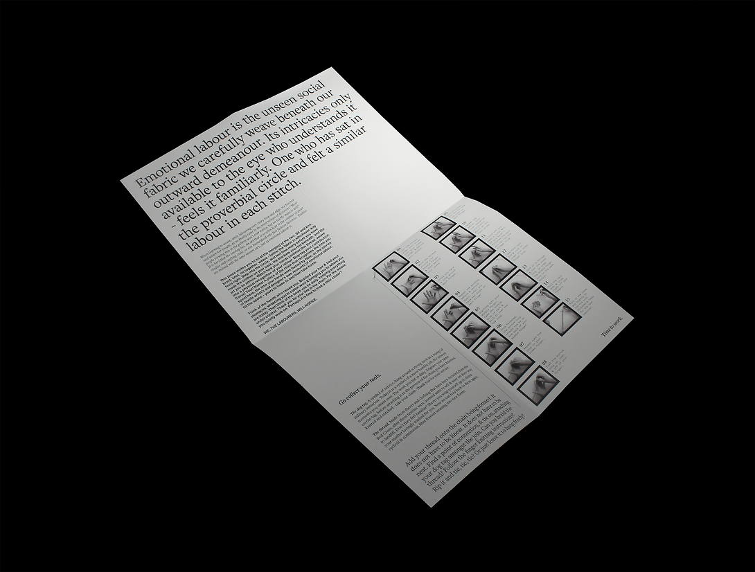
Emotional labour is the unseen social fabric we carefully weave beneath our outward demeanour. Its intricacies only available to the eye who understands it - feels it familiarly. One who has sat in the proverbial circle and felt a similar labour in each stitch.
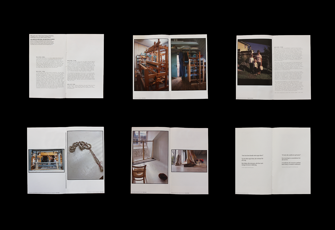
The Labour of Emotions, The Emotion of Textiles explores the relationship between emotional labour and textiles – finding their overlap through conversations with textile practitioners from Sweden and Aotearoa, as well as my own textile making. This culminating in a non-linear collection of delicate materials and intricate, sensorial conversations.
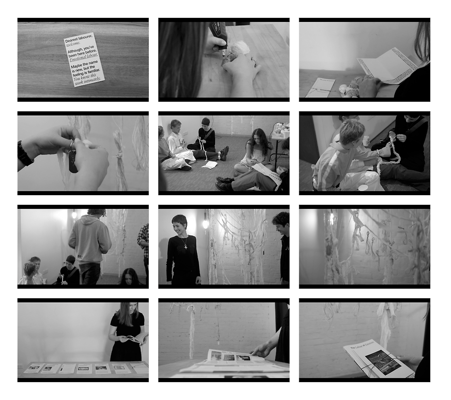
Instead of fighting this blurriness, the resulting designed response is a workshop-come-exhibition that invites its audience – through an interactive sculpture and accompanying print guides – into the world where these two topics ‘weave together’. Magnifying the unseen nature of textiles and emotional labour, making it tangible and experienceable to its audience. Aiming to invite visitors into this world rather than inform them of it. Doing so by using materiality and the subsequent stories/symbolism behind each choice as the means of subtle communication and connection to the audience. Thus hoping to instil greater value and appreciation for this quiet sphere of labour.
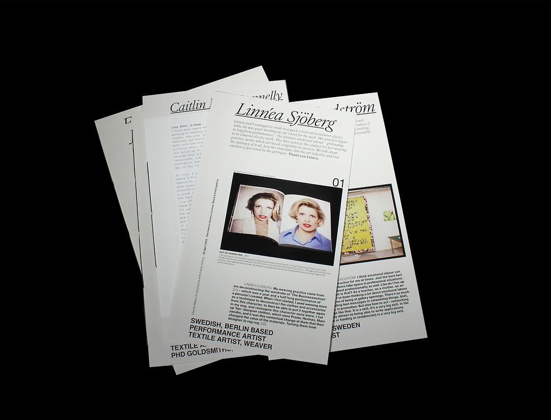
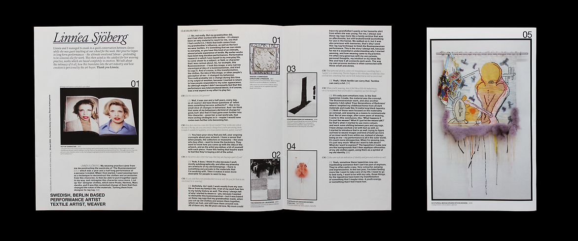
To ensure my interviewees' insight was to be widely spread and understood, the choice was made to present this text in an approachable format – small, slim and familiar to an exhibition guide. The stylistic precedents were traditional newspapers and vintage knitting pattern booklets. Both have a lo-fi feeling - you may have to flip the page or turn your head to read certain aspects… imbuing a sense of having to ‘uncover’ and work for the usually unseen answers. Not dissimilar to reading a weaving pattern or a text-dense article.
Typographically, these ideas informed the pared-back, newslike approach - sticking to iconic and familiar Helvetica, as well as a simple serif and ‘typewriter’ styles. Black and white, with colour only appearing in the artist’s images. Baseline communicatory values - but with a slight scale up/down, twist sideways, odd spacing, slight margins, tight leading and bold paragraph type to reflect where I began with this topic - balancing the conditions of communication design vs art.
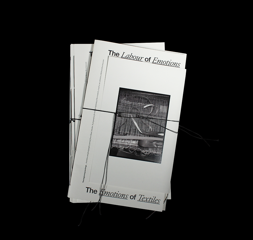
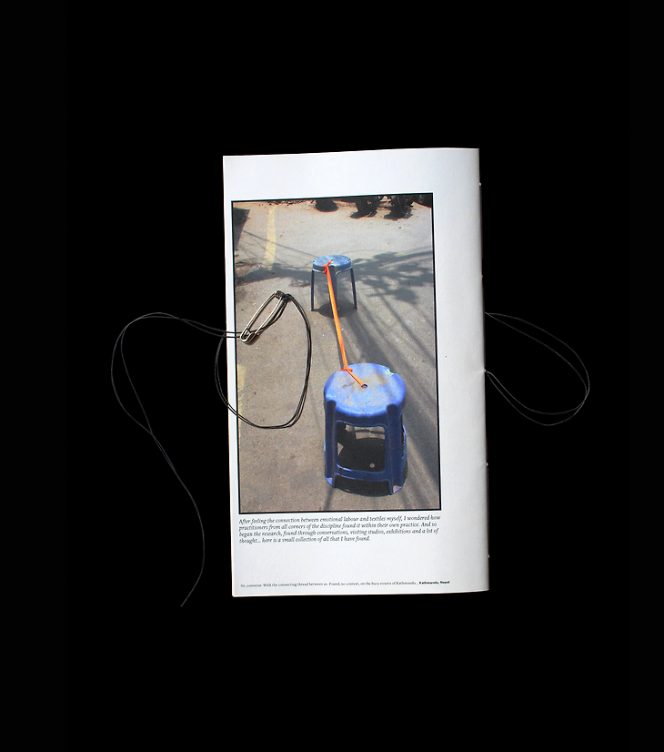
A particular design choice was made to use the introductory exhibition guide as a ‘container’ for the remaining collateral, formatting the introduction of each artist to still act as ‘read state 1’ whether contained in their ‘folder’ or free. The saddle stitch binding has been left longer than usual - a ‘loose thread’ feeling. While the photo booklet’s binding thread is especially long to act as a tie around it all, with a safety pin fastening.
These choices are subtle. The subject is subtle. An ode to the quiet tip toe around life that is discussed while our hands are busied by fibre. When learning to weave, as we finally came to the most minute decision, my teacher said under her breath, “Most people viewing this in the gallery won’t ever notice, but we – the textile makers – will.” It is here that the overlap lies.
Description:
Emotional labour is the unseen social fabric we carefully weave beneath our outward demeanour. Its intricacies only available to the eye who understands it - feels it familiarly. One who has sat in the proverbial circle and felt a similar labour in each stitch.
The Labour of Emotions, The Emotion of Textiles explores the relationship between emotional labour and textiles – finding their overlap through conversations with textile practitioners from Sweden and Aotearoa, as well as my own textile making. This culminating in a non-linear collection of delicate materials and intricate, sensorial conversations.
Instead of fighting this blurriness, the resulting designed response is a workshop-come-exhibition that invites its audience – through an interactive sculpture and accompanying print guides – into the world where these two topics ‘weave together’. Magnifying the unseen nature of textiles and emotional labour, making it tangible and experienceable to its audience. Aiming to invite visitors into this world rather than inform them of it. Doing so by using materiality and the subsequent stories/symbolism behind each choice as the means of subtle communication and connection to the audience. Thus hoping to instil greater value and appreciation for this quiet sphere of labour.
To ensure my interviewees' insight was to be widely spread and understood, the choice was made to present this text in an approachable format – small, slim and familiar to an exhibition guide. The stylistic precedents were traditional newspapers and vintage knitting pattern booklets. Both have a lo-fi feeling - you may have to flip the page or turn your head to read certain aspects… imbuing a sense of having to ‘uncover’ and work for the usually unseen answers. Not dissimilar to reading a weaving pattern or a text-dense article.
Typographically, these ideas informed the pared-back, newslike approach - sticking to iconic and familiar Helvetica, as well as a simple serif and ‘typewriter’ styles. Black and white, with colour only appearing in the artist’s images. Baseline communicatory values - but with a slight scale up/down, twist sideways, odd spacing, slight margins, tight leading and bold paragraph type to reflect where I began with this topic - balancing the conditions of communication design vs art.
A particular design choice was made to use the introductory exhibition guide as a ‘container’ for the remaining collateral, formatting the introduction of each artist to still act as ‘read state 1’ whether contained in their ‘folder’ or free. The saddle stitch binding has been left longer than usual - a ‘loose thread’ feeling. While the photo booklet’s binding thread is especially long to act as a tie around it all, with a safety pin fastening.
These choices are subtle. The subject is subtle. An ode to the quiet tip toe around life that is discussed while our hands are busied by fibre. When learning to weave, as we finally came to the most minute decision, my teacher said under her breath, “Most people viewing this in the gallery won’t ever notice, but we – the textile makers – will.” It is here that the overlap lies.