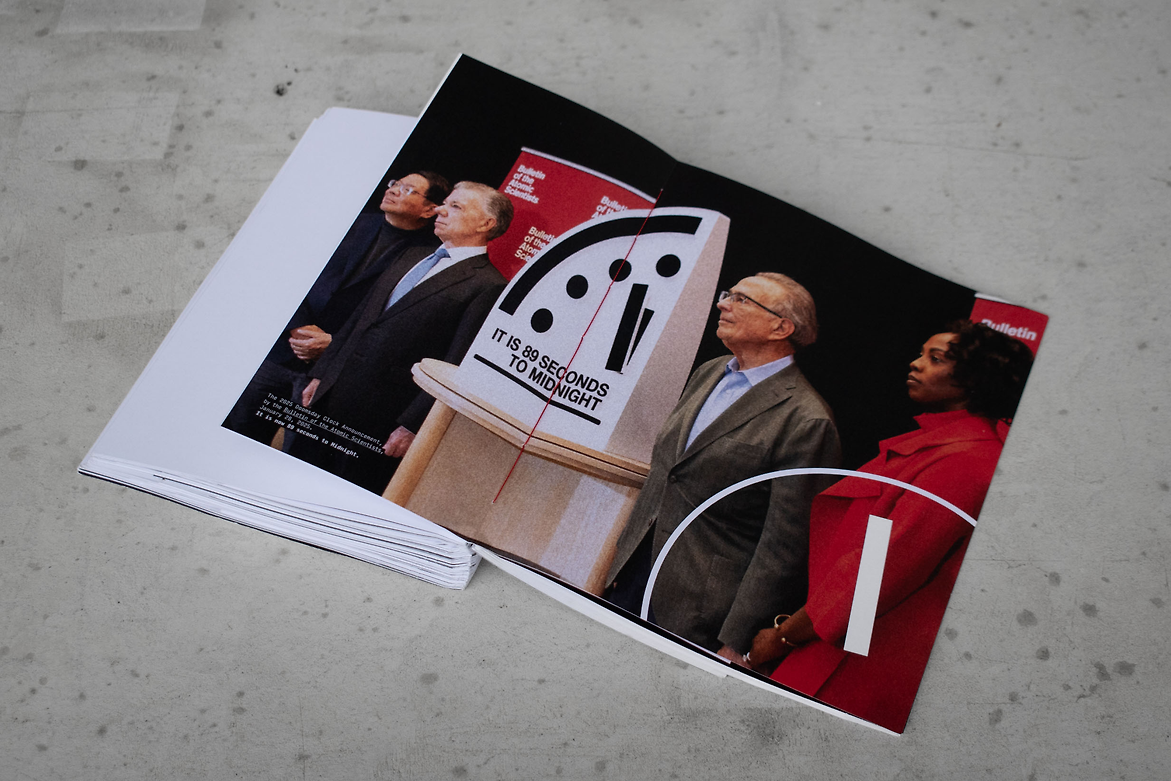
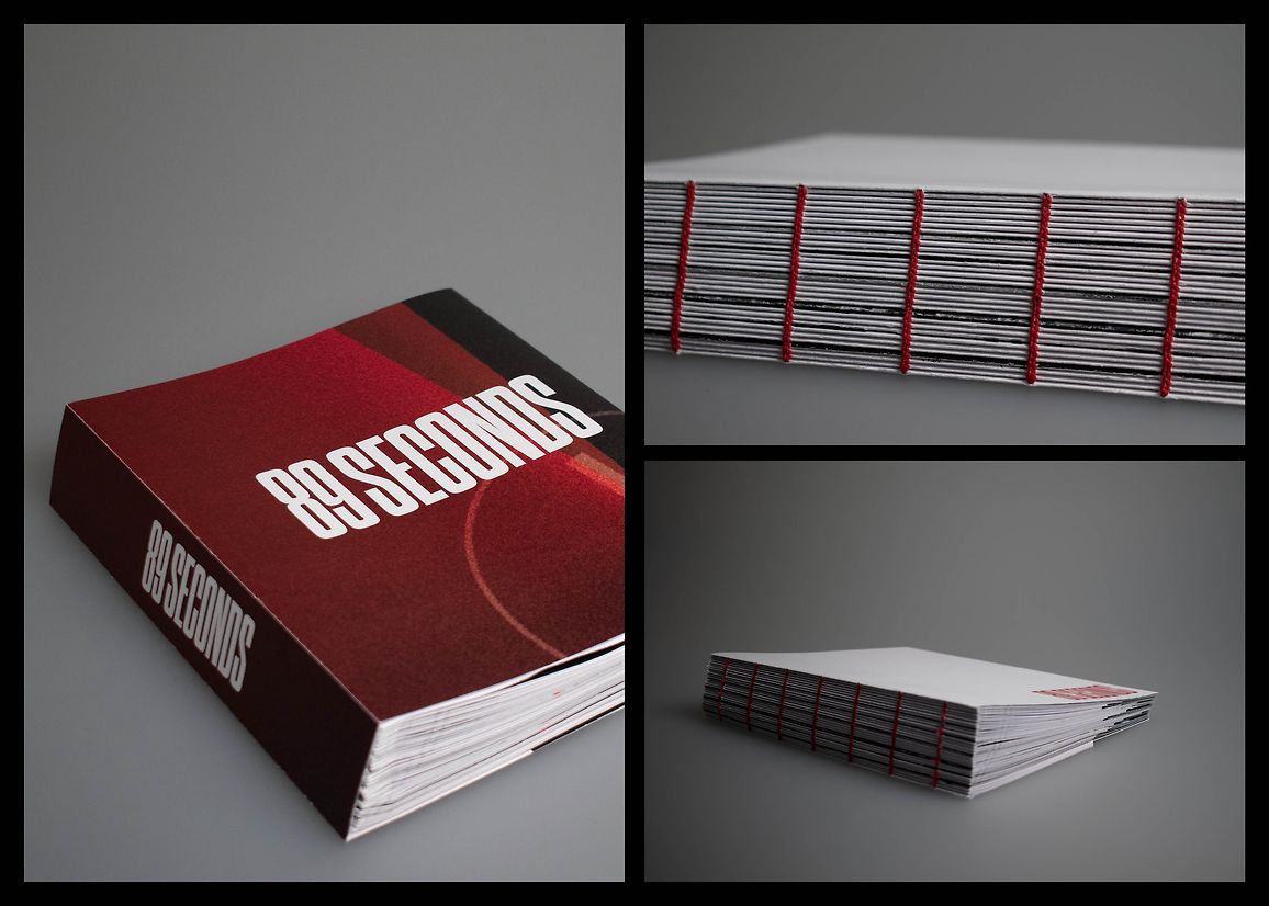
89 Seconds explores the concept of the Doomsday Clock, the metaphorical symbol for our proximity to humanity’s self-inflicted demise. It is a confronting public service announcement, warning of widespread global consequences if nuclear risk increases and our climate worsens.
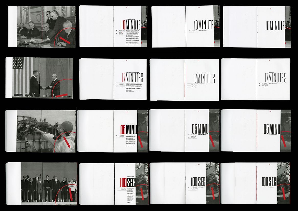
I chose to explore this by creating a publication that leads the reader through the years that the Doomsday Clock has been active. From 1947 to 2025, we experience the non-linear yet ominous progression towards Midnight — Doomsday — the end of the world as we know it. 89 Seconds guides the reader through the history of the Doomsday Clock since it was first set in 1947. Through this, the reader experiences the senses of cautious optimism, relief and then dread as the Clock moves away from or towards Midnight.
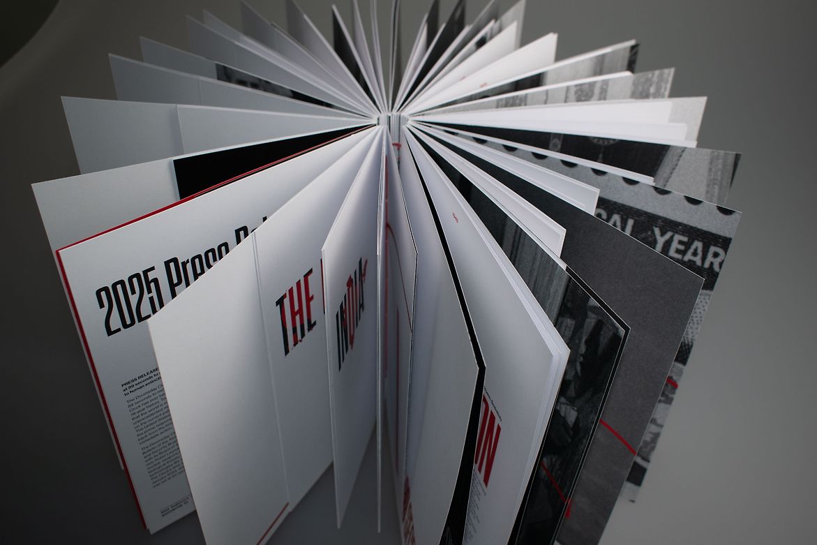
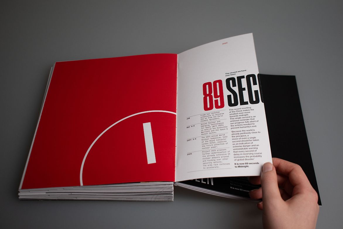
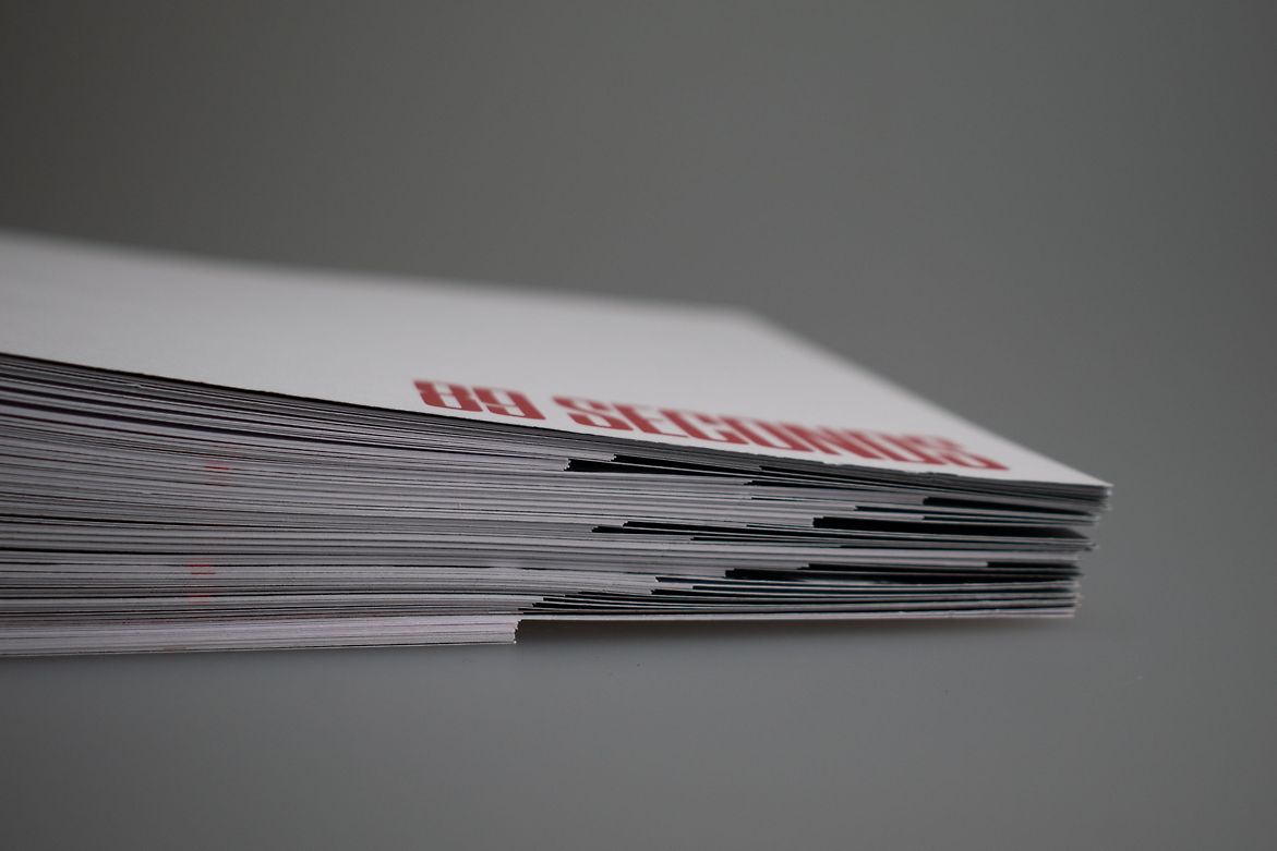
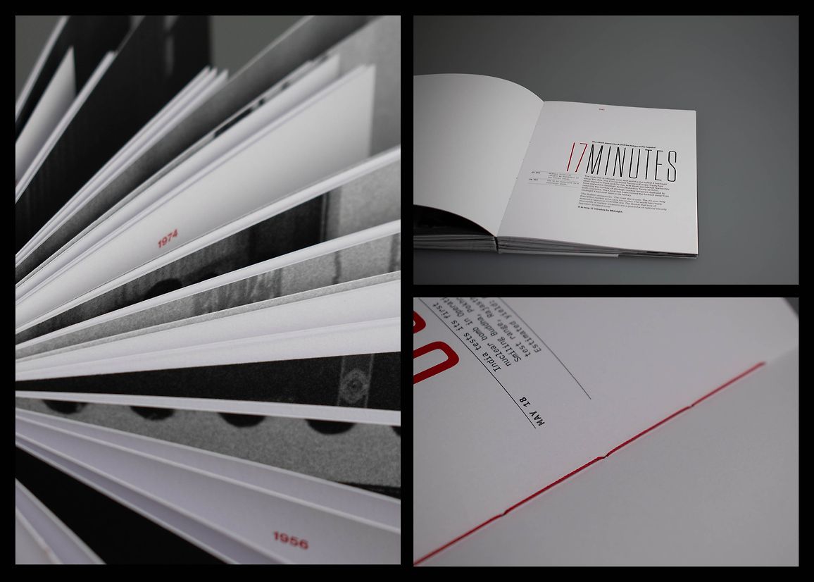
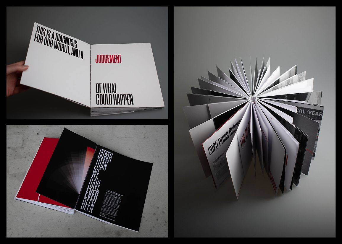
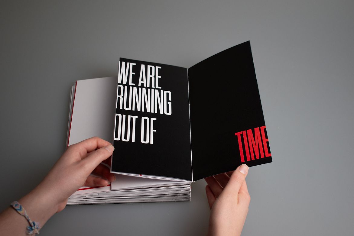
Upon reaching the current milestone, 89 seconds, the publication gives a gloomy reminder of the current state of nuclear risk in 2025 through press releases and statements, and reveals the countries that still maintain an arsenal of nuclear weapons. It closing with the warning: ‘We are running out of time.’ This book was designed to be displayed standing up with its pages flared out, harnessing the motif of a clock. The book takes form as a tangible representation of the movements of the Doomsday Clock since its conception, with the time pages widening as the ‘hand’ moves away from Midnight, and narrower, as it inches closer. The time header on each page is cut off as the body copy and page gets narrower, also reflecting movements of the Clock.
The primary typeface, ‘Dharma Gothic C’, is a condensed sans serif, evoking an existential headline from mid 20th century newspapers, warning the public of nuclear threat, and has a quality of a digital clock in its rectangular letterforms, with rounded corners. To communicate themes of urgency, this typeface increases in weight with decreased tracking as the time on the Clock moves closer to Midnight. The headline appears to increase in volume as our time runs out. This visual system confronts the reader with alarming statistics and highlights words and themes with a bold red to draw attention and shout warnings at the reader. This publication uses themes of existential newspaper headlines from the mid 20th century and government memos to convey themes of world politics and urgency. This is most prevalent on each year and time page, where the consistent type layout draws attention to the increasing weight of the header text and the narrowing of the page and body text.
89 Seconds uses typography to evoke a sense of urgency and dread as we inch closer to Doomsday. It speaks directly to the reader: Immediate action is needed, we are running out of time.
Description:
89 Seconds explores the concept of the Doomsday Clock, the metaphorical symbol for our proximity to humanity’s self-inflicted demise. It is a confronting public service announcement, warning of widespread global consequences if nuclear risk increases and our climate worsens.
I chose to explore this by creating a publication that leads the reader through the years that the Doomsday Clock has been active. From 1947 to 2025, we experience the non-linear yet ominous progression towards Midnight — Doomsday — the end of the world as we know it. 89 Seconds guides the reader through the history of the Doomsday Clock since it was first set in 1947. Through this, the reader experiences the senses of cautious optimism, relief and then dread as the Clock moves away from or towards Midnight.
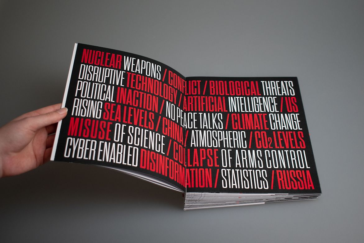
Upon reaching the current milestone, 89 seconds, the publication gives a gloomy reminder of the current state of nuclear risk in 2025 through press releases and statements, and reveals the
countries that still maintain an arsenal of nuclear weapons. It closing with the warning: ‘We are running out of time.’
This book was designed to be displayed standing up with its pages flared out, harnessing the motif of a clock. The book takes form as a tangible representation of the movements of the Doomsday Clock since its conception, with the time pages widening as the ‘hand’ moves away from Midnight, and narrower, as it inches closer. The time header on each page is cut off as the body copy and page gets narrower, also reflecting movements of the Clock.
The primary typeface, ‘Dharma Gothic C’, is a condensed sans serif, evoking an existential headline from mid 20th century newspapers, warning the public of nuclear threat, and has a quality of a digital clock in its rectangular letterforms, with rounded corners. To communicate themes of urgency, this typeface increases in weight with decreased tracking as the time on the Clock moves closer to Midnight. The headline appears to increase in volume as our time runs out.
This visual system confronts the reader with alarming statistics and highlights words and themes with a bold red to draw attention and shout warnings at the reader.
This publication uses themes of existential newspaper headlines from the mid 20th century and government memos to convey themes of world politics and urgency. This is most prevalent on each year and time page, where the consistent type layout draws attention to the increasing weight of the header text and the narrowing of the page and body text.
89 Seconds uses typography to evoke a sense of urgency and dread as we inch closer to Doomsday. It speaks directly to the reader: Immediate action is needed, we are running out of time.