The Big OE is a response to the ISTD brief, Mapping the World. This brief required rigorous investigation to allow an exploration of maps to establish unique and interesting insights.
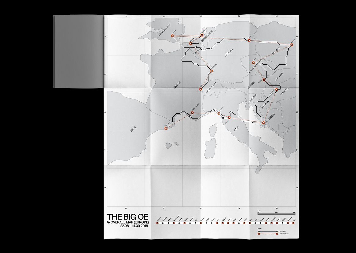
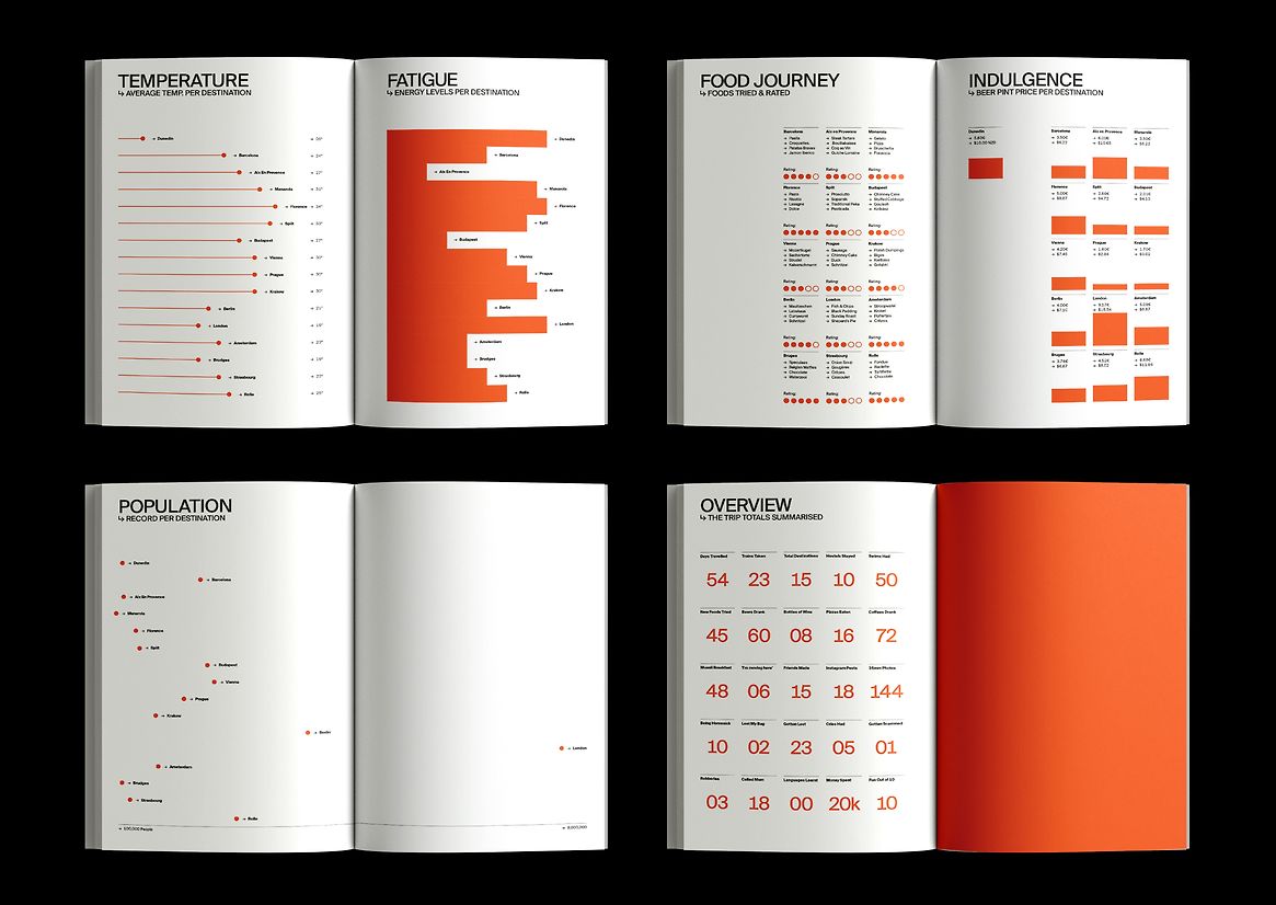
In 2018, I set off on my European overseas experience visiting 14 countries, and 23 cities by train. As I travelled, I kept track of my experiences, creating a visual and statistical representation of my journey. I collected data from all the countries I visited, including the train journeys between them. From this I have created a data-driven representation of my trip. By curating the information and ephemera I had collected, I created The Big OE as a map of my personal journey. The statistical mapping provides a lens through which to view the world, not only exploring the physicality of places, but the cultural and economic landscapes that shape them.
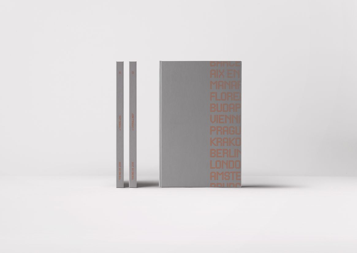
The first part of the project is Overall Map. It reveals the big picture and the journey in its entirety. It serves as a reference to the second part of the project which is the Travel Log, which combines travel ephemera with details of my experience of each city. The third part at the end of the Travel Log is informational and a summary of my overall experience.
The target audience for the project is individuals who appreciate travel, cultural exploration, and visual storytelling. This could include travel enthusiasts, other young New Zealanders, or those seeking inspiration for documenting their own journeys. The project provides a multi-dimensional perspective of my personal experience through various mapping techniques.
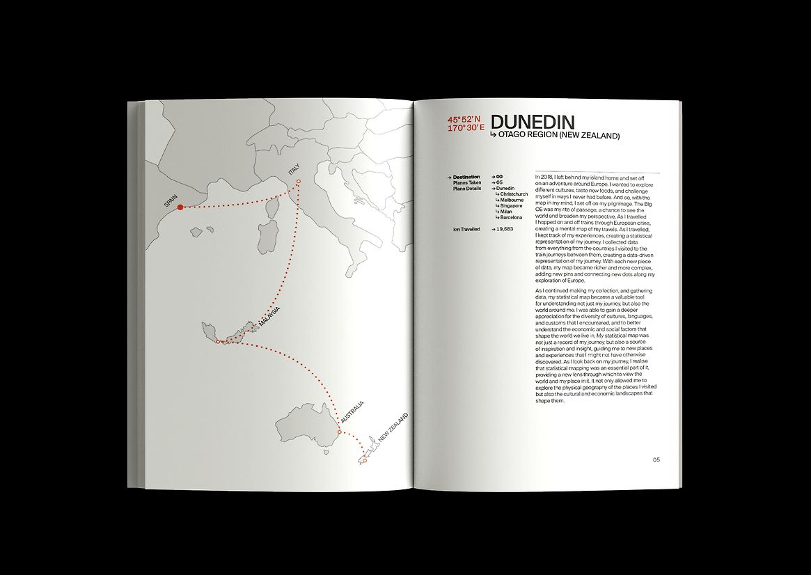
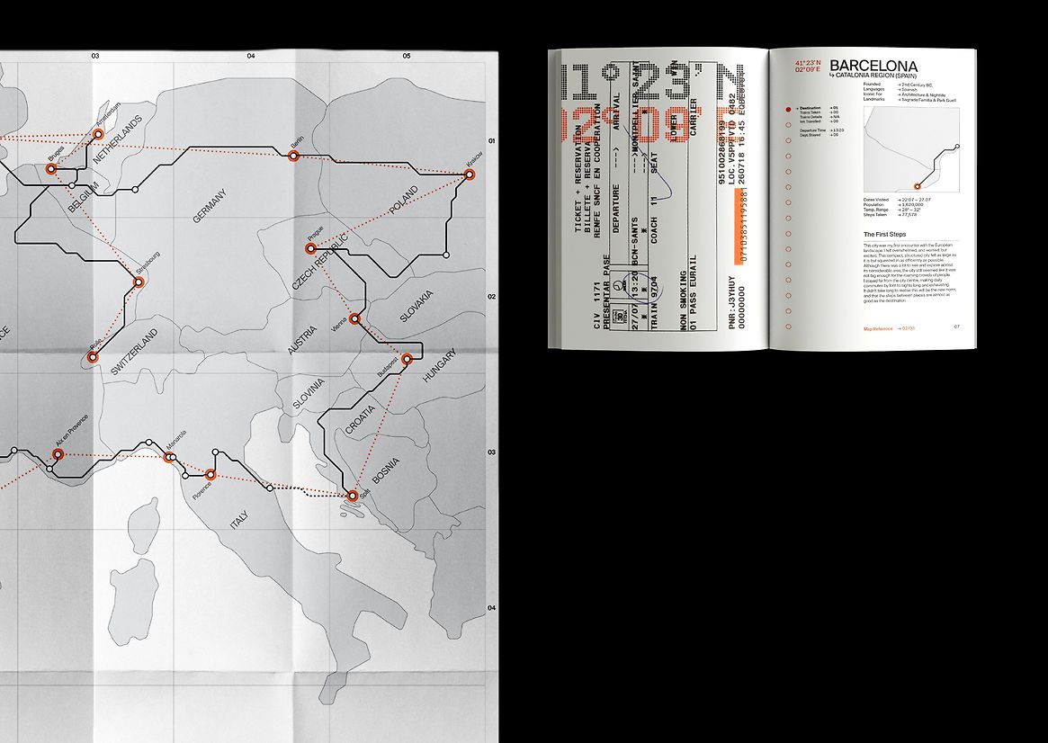
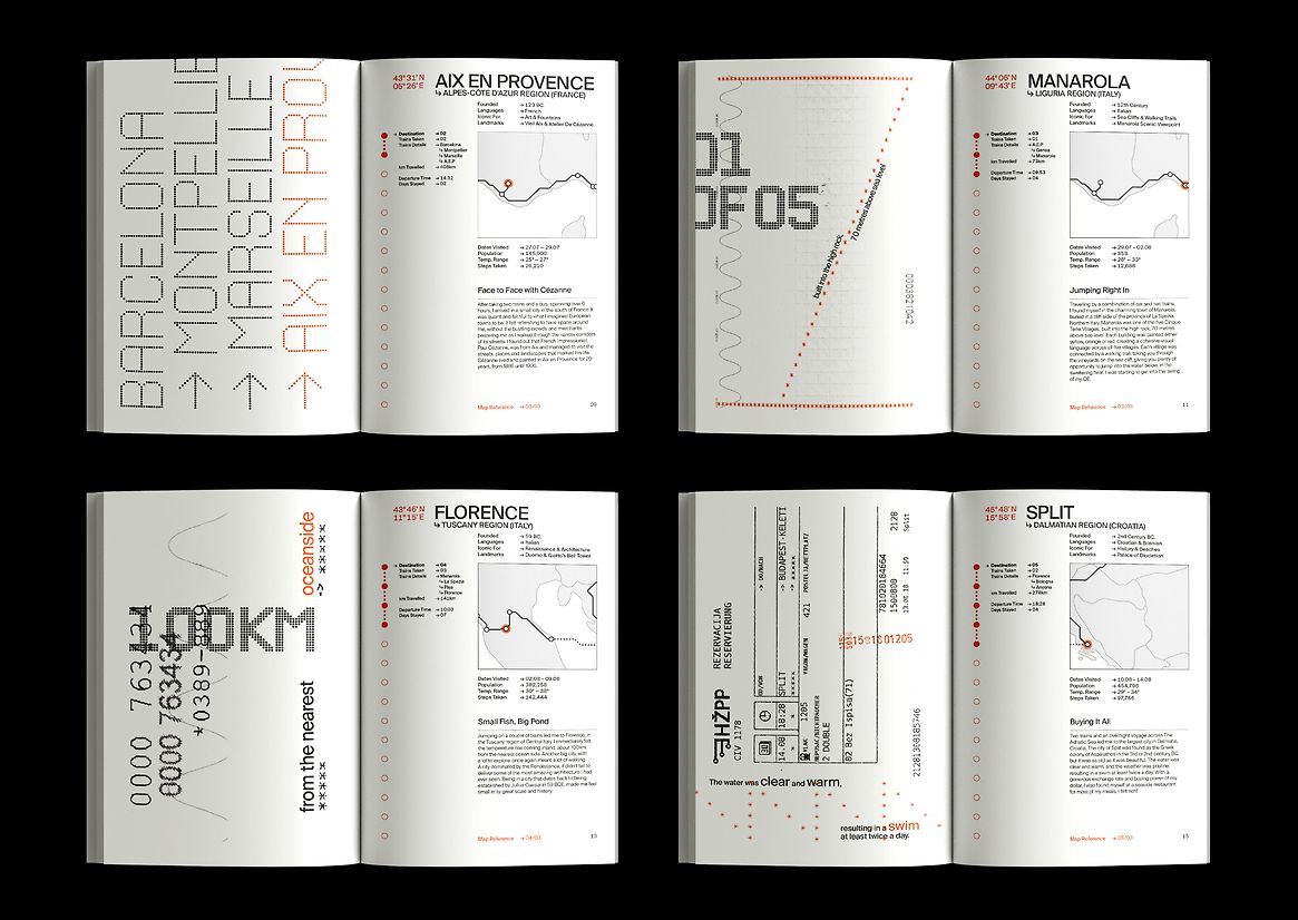
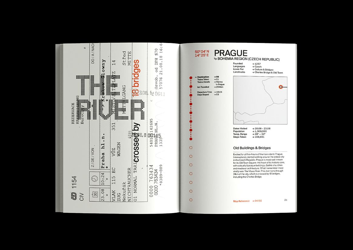
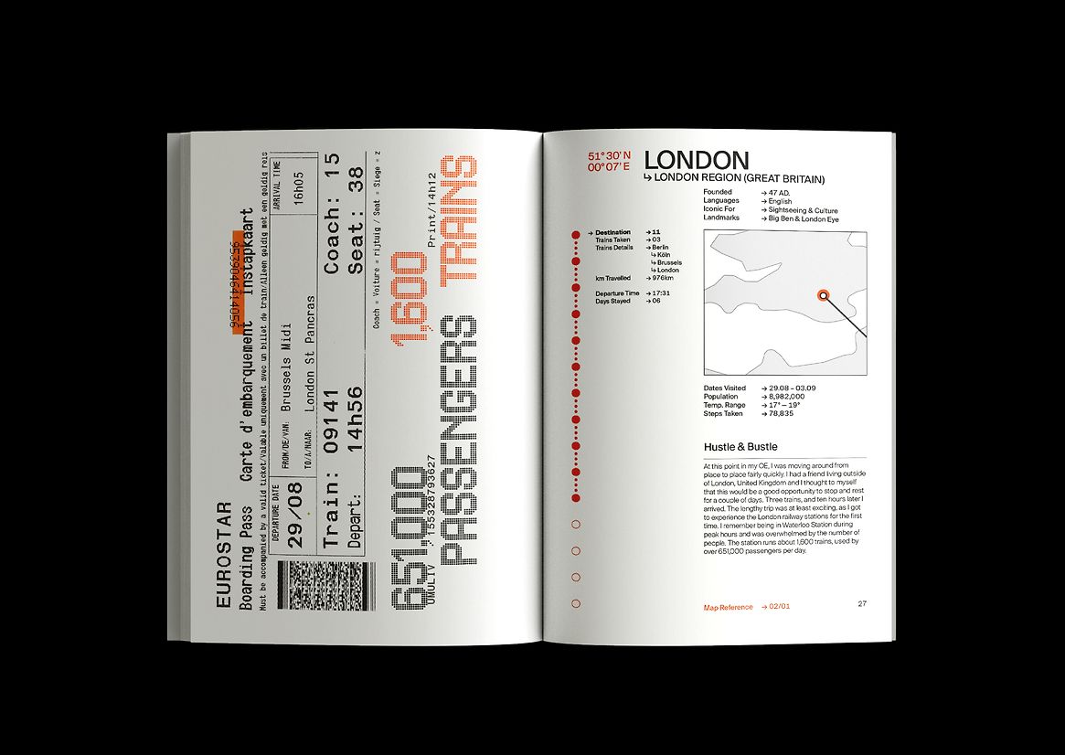
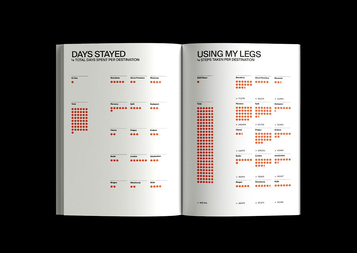
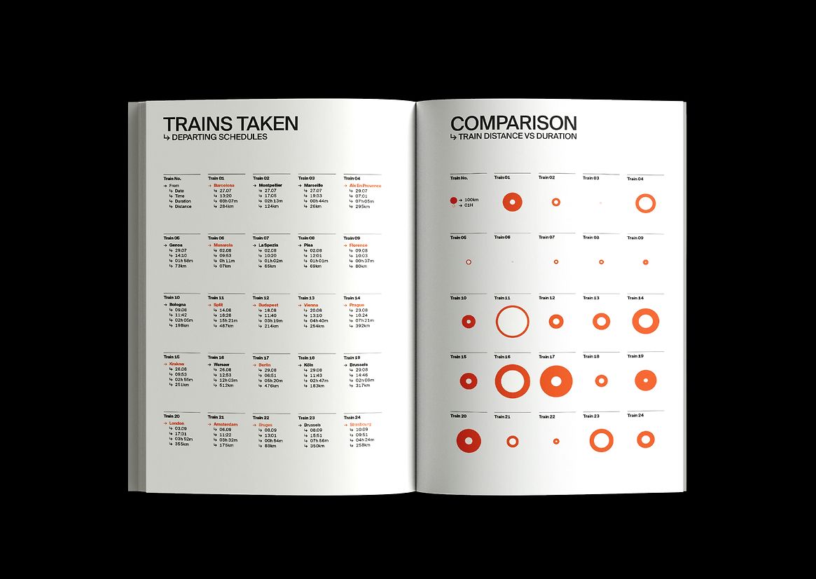
The design embraces a mix of editorial storytelling and typographic exploration. My journey is told chronologically, following the train journeys and my experiences of individual European destinations. Each location is represented by a combination of local train tickets and related typographic elements, personal reflections and statistical data. The narrative focuses on the rich experiences, observations and personal reflections I encountered during my journey. The section at the end of the book is dedicated statistical mapping of my overall experience and a summary of my impressions of each place.
The Suisse Int’ typeface has been used for its strong connection to travel as it reflects commonly seen in wayfinding at European train stations through its appearance and set of glyph arrows. Similarly, New Airport Dot, resembles the orange dot matrix displays in train stations. This and the train ticket highlights are the inspiration behind the colour palette throughout the editorial piece. These typefaces are combined with scans of my train tickets to convey the physical and emotional experience of the controlled chaotic nature of travelling by train. The pragmatic design of the destination pages is contrasted with tactile material representing my personal experience. The format and layout of the informational pages aligns with the form of train tickets.
Description:
The Big OE is a response to the ISTD brief, Mapping the World. This brief required rigorous investigation to allow an exploration of maps to establish unique and interesting insights.
In 2018, I set off on my European overseas experience visiting 14 countries, and 23 cities by train. As I travelled, I kept track of my experiences, creating a visual and statistical representation of my journey. I collected data from all the countries I visited, including the train journeys between them. From this I have created a data-driven representation of my trip. By curating the information and ephemera I had collected, I created The Big OE as a map of my personal journey. The statistical mapping provides a lens through which to view the world, not only exploring the physicality of places, but the cultural and economic landscapes that shape them.
The first part of the project is Overall Map. It reveals the big picture and the journey in its entirety. It serves as a reference to the second part of the project which is the Travel Log, which combines travel ephemera with details of my experience of each city. The third part at the end of the Travel Log is informational and a summary of my overall experience.
The target audience for the project is individuals who appreciate travel, cultural exploration, and visual storytelling. This could include travel enthusiasts, other young New Zealanders, or those seeking inspiration for documenting their own journeys. The project provides a multi-dimensional perspective of my personal experience through various mapping techniques.
The design embraces a mix of editorial storytelling and typographic exploration.
My journey is told chronologically, following the train journeys and my experiences of individual European destinations. Each location is represented by a combination of local train tickets and related typographic elements, personal reflections and statistical data. The narrative focuses on the rich experiences, observations and personal reflections I encountered during my journey. The section at the end of the book is dedicated statistical mapping of my overall experience and a summary of my impressions of each place.
The Suisse Int’ typeface has been used for its strong connection to travel as it reflects commonly seen in wayfinding at European train stations through its appearance and set of glyph arrows. Similarly, New Airport Dot, resembles the orange dot matrix displays in train stations. This and the train ticket highlights are the inspiration behind the colour palette throughout the editorial piece. These typefaces are combined with scans of my train tickets to convey the physical and emotional experience of the controlled chaotic nature of travelling by train. The pragmatic design of the destination pages is contrasted with tactile material representing my personal experience. The format and layout of the informational pages aligns with the form of train tickets.