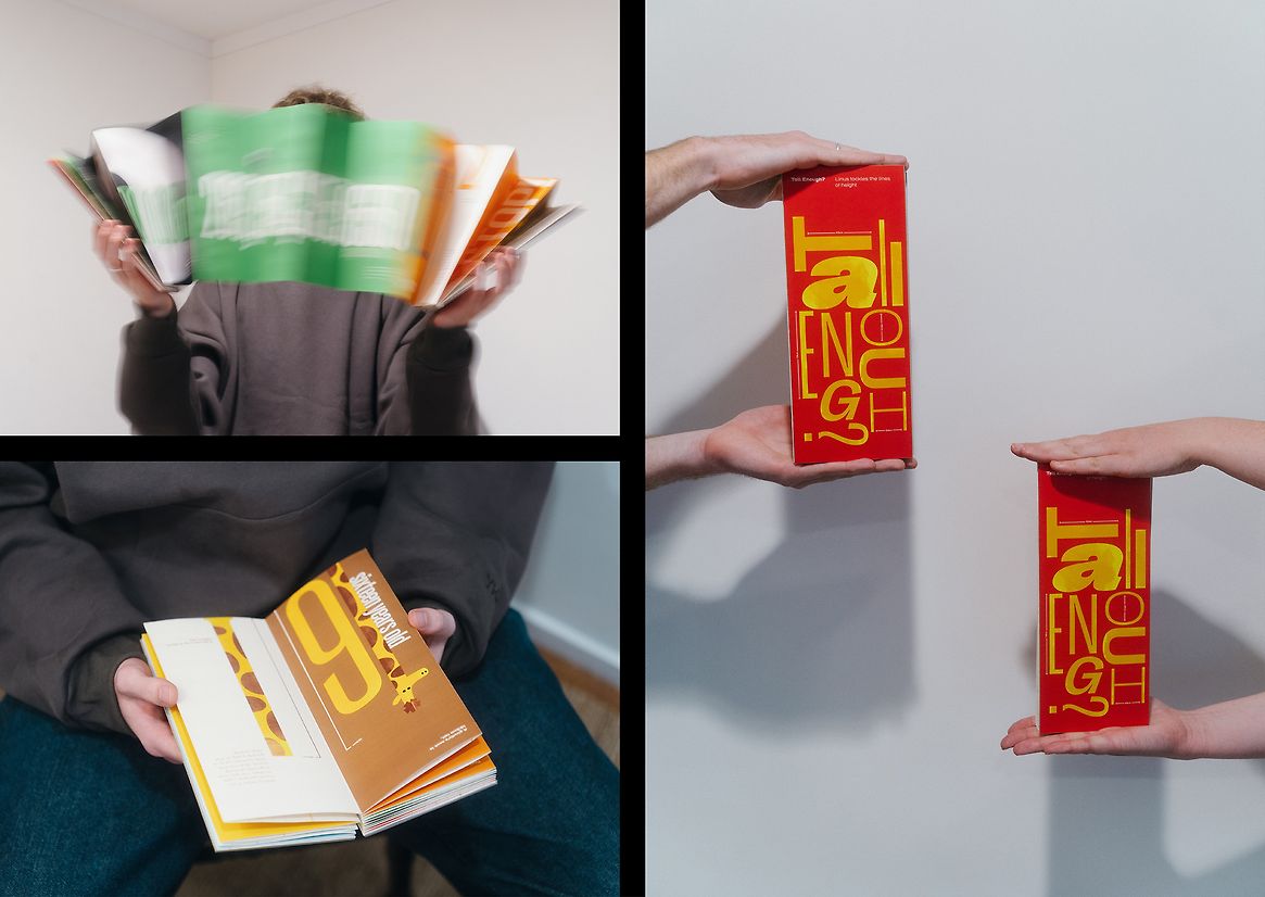
‘Tall Enough’ explores the concept of ‘The Line’. I chose to look into the lines of height and how this idea is seen through the eyes of a young boy as he grows in age and height. Both through his own personal comparisons and the pressures applied to him from outside parties due to him being taller than normal.
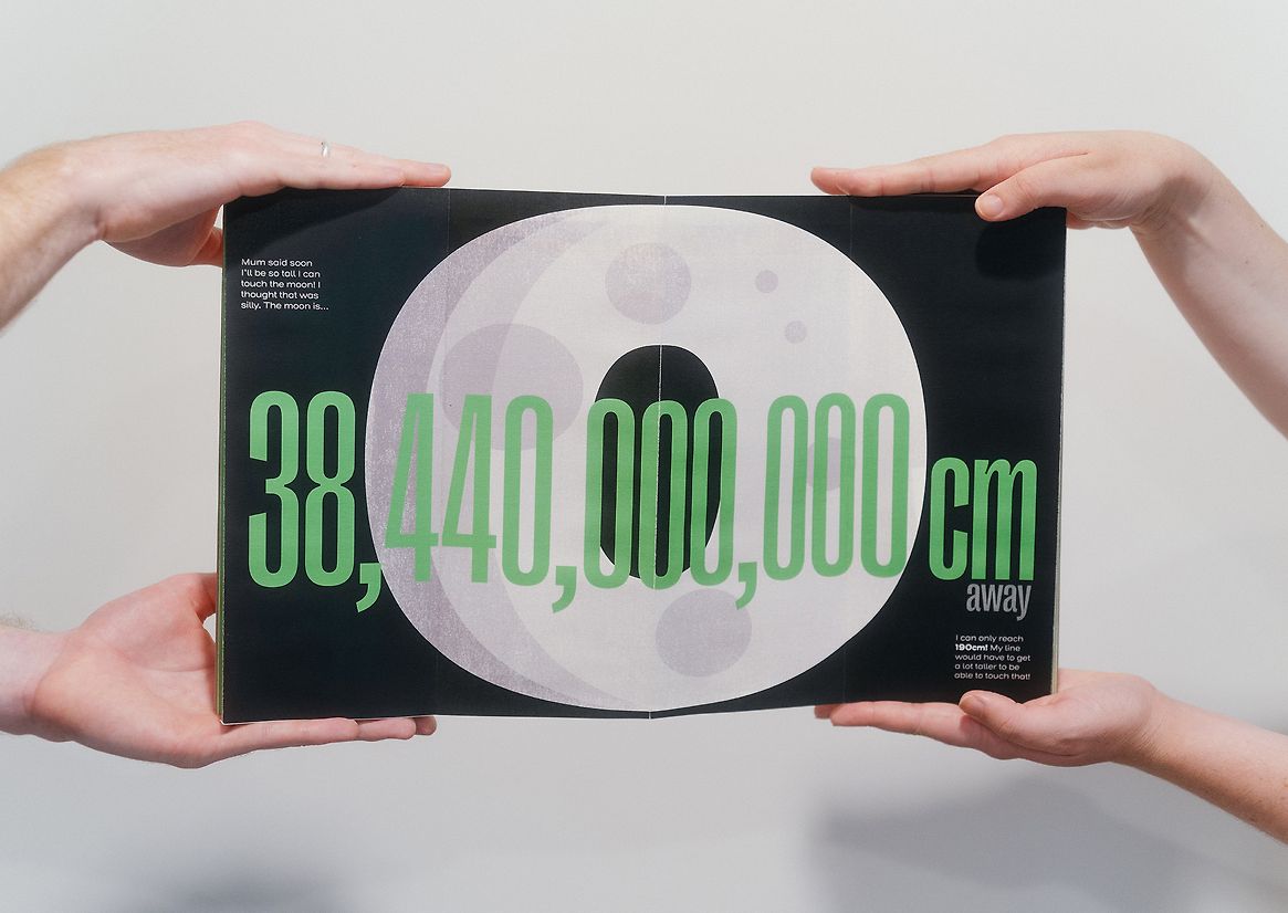
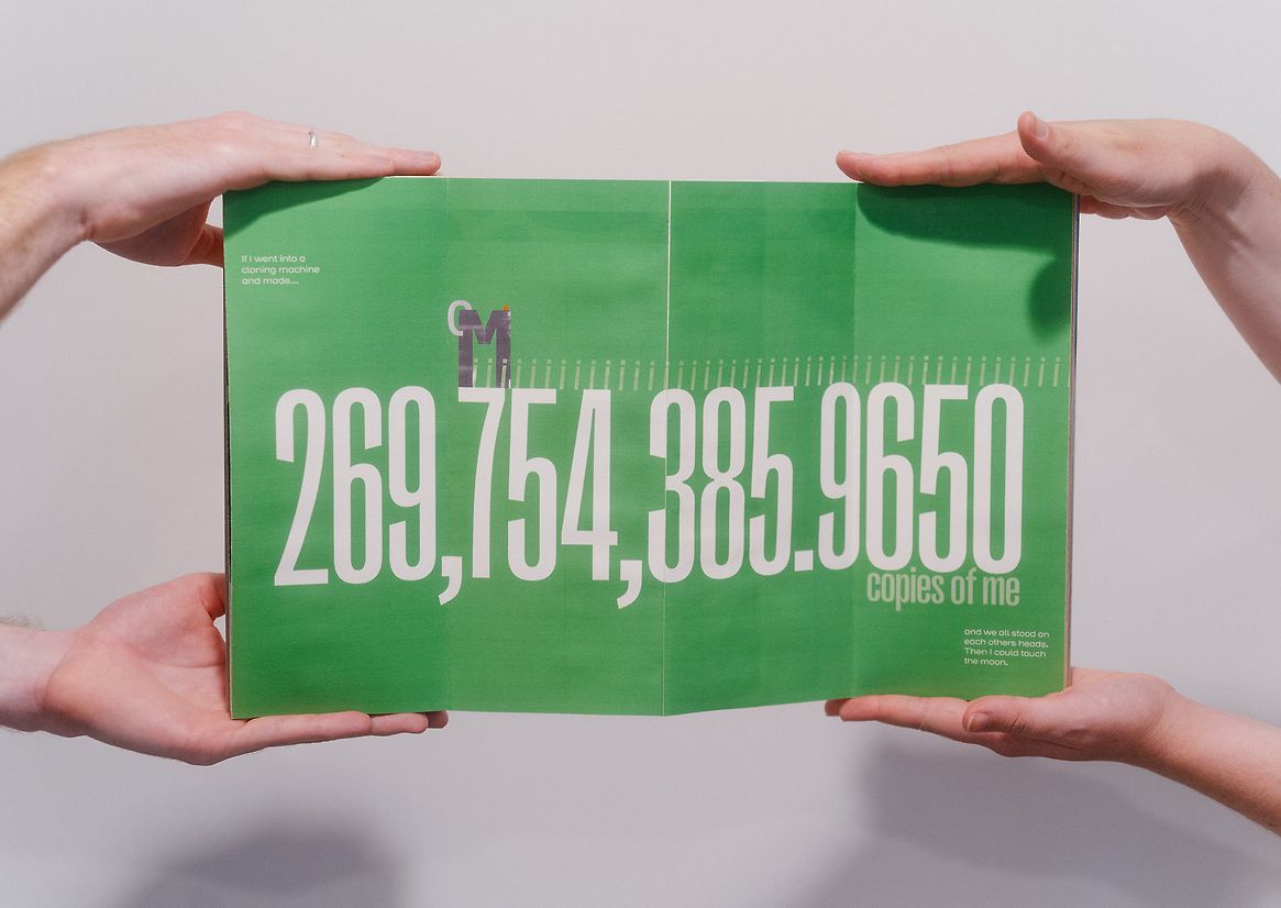
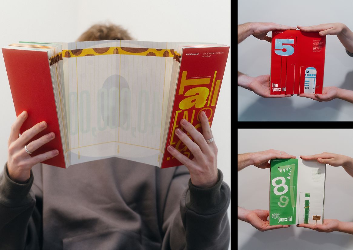
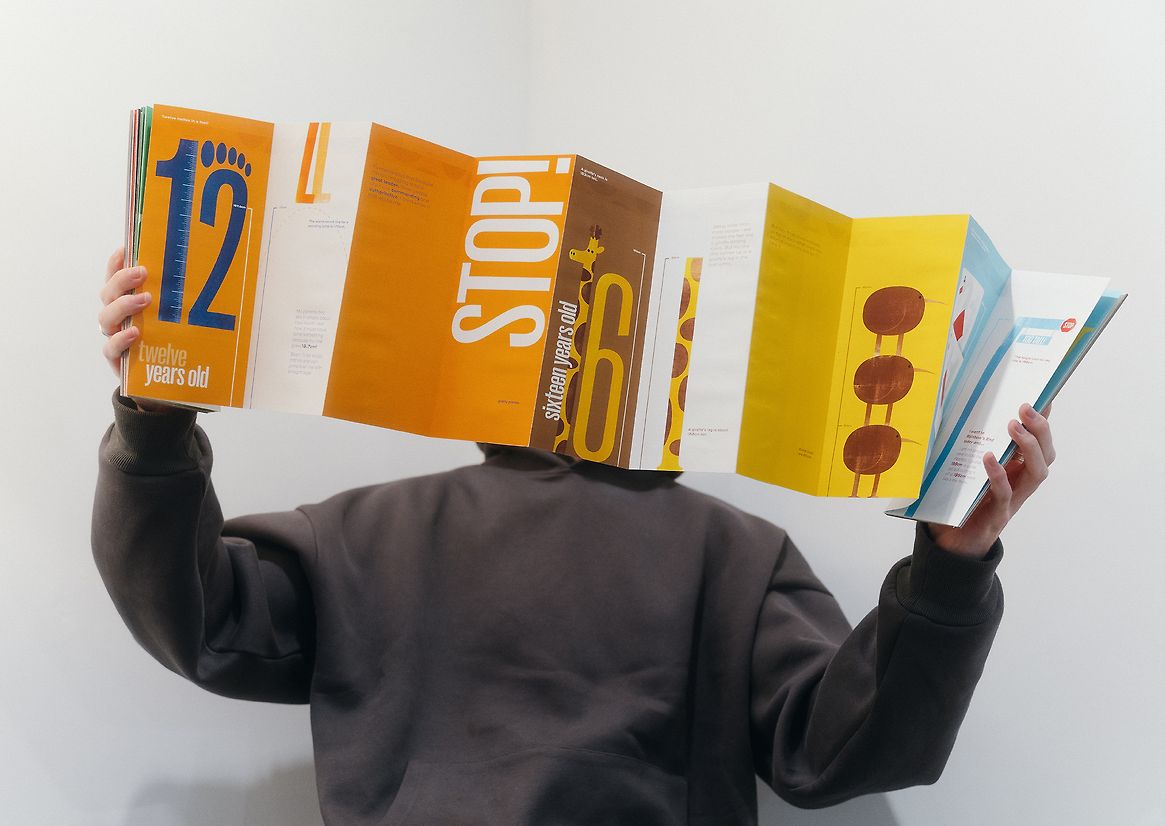
Looking through the perspective of Linus, we get to move across the timeline of his life, gaining insight into how a boy views the line of height, sourced from external research and personal experiences. Comparisons are a large part of the narrative explored in this book. Linus sees the lines of height across all things he experiences in his life, so naturally he puts himself next to them and sees how he stacks up to these. From R2D2 to a contrabass saxophone, these comparisons take all sorts of forms. The book also looks into how the world can view height and some of the pressures a tall kid like Linus would expect to feel. Ultimately we discover that although the lines of height exist, each person’s line is unique and there is no need to compare ours to anyone else's.
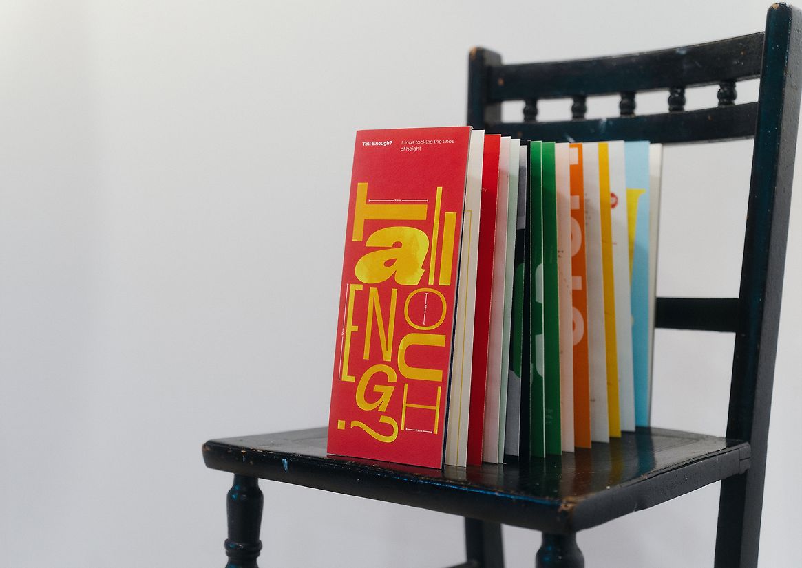
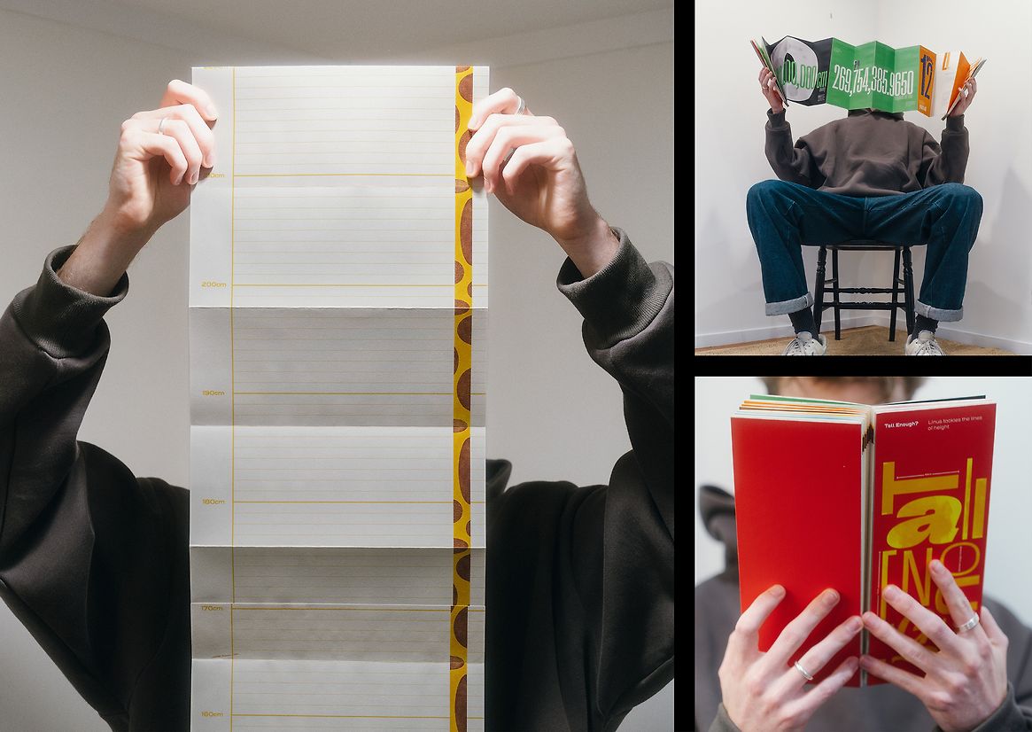
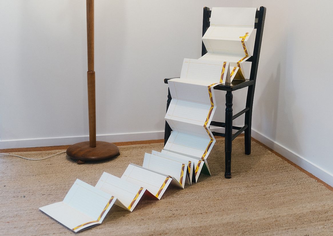
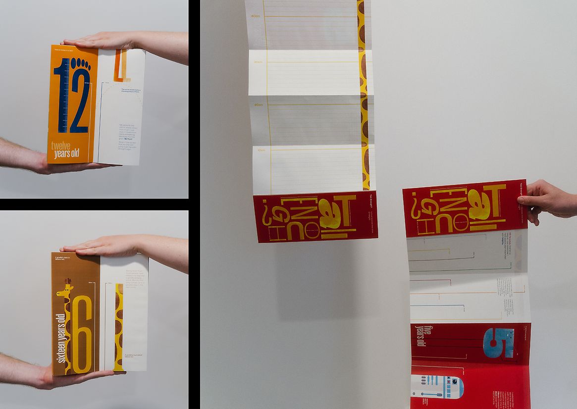
The book's form takes shape in an accordion folded, tall and narrow book. The accordion fold means the book can be viewed as a full spread. If flipped over, it can be hung up and used as a 3.2m height chart, so people of all heights can track their lines of height. The shape of the book is a nod to the nature of height. Being a taller shape it provides a unique reading experience that shows the concept of height without even having to be read. The typeface applied to the headings is Right Grotesk Tight Medium. This condensed width, paired with the tall x-height gives the typeface a stretched look. The choice came from the overall theme of heights, as the tall and narrow typeface reflects this well. Sections are broken up into ages and heights of Linus. Each section utilises a main colour to create a bold and playful aesthetic, fitting for the target audience of kids.
The project is a typographic expression of height, so each illustration within the book comes from the forms of letters. Showing how type can be playful and expressive. These illustrations also help in telling the narrative and become a short read for audiences wanting to just flick through.
Description:
‘Tall Enough’ explores the concept of ‘The Line’. I chose to look into the lines of height and how this idea is seen through the eyes of a young boy as he grows in age and height. Both through his own personal comparisons and the pressures applied to him from outside parties due to him being taller than normal.
Looking through the perspective of Linus, we get to move across the timeline of his life, gaining insight into how a boy views the line of height, sourced from external research and personal experiences. Comparisons are a large part of the narrative explored in this book. Linus sees the lines of height across all things he experiences in his life, so naturally he puts himself next to them and sees how he stacks up to these. From R2D2 to a contrabass saxophone, these comparisons take all sorts of forms. The book also looks into how the world can view height and some of the pressures a tall kid like Linus would expect to feel. Ultimately we discover that although the lines of height exist, each person’s line is unique and there is no need to compare ours to anyone else's.
The book's form takes shape in an accordion folded, tall and narrow book. The accordion fold means the book can be viewed as a full spread. If flipped over, it can be hung up and used as a 3.2m height chart, so people of all heights can track their lines of height. The shape of the book is a nod to the nature of height. Being a taller shape it provides a unique reading experience that shows the concept of height without even having to be read. The typeface applied to the headings is Right Grotesk Tight Medium. This condensed width, paired with the tall x-height gives the typeface a stretched look. The choice came from the overall theme of heights, as the tall and narrow typeface reflects this well. Sections are broken up into ages and heights of Linus. Each section utilises a main colour to create a bold and playful aesthetic, fitting for the target audience of kids.
The project is a typographic expression of height, so each illustration within the book comes from the forms of letters. Showing how type can be playful and expressive. These illustrations also help in telling the narrative and become a short read for audiences wanting to just flick through.