‘The Line’ is a brief from ISTD. Occuping a central role in graphic communication in general, and typography in particular. Lines are everywhere if you look hard enough such as the baseline, the timeline, and the underline. Barcodes are ubiquitous on products we encounter in daily life, yet we often overlook their significance. These black-and-white lines, along with the numbers they contain, help us efficiently identify products, manage inventory, and reduce industry costs.
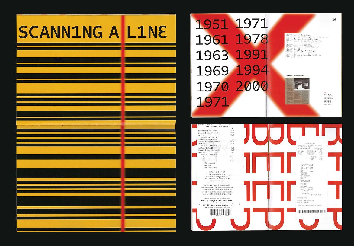
‘barcodes: scanning the lines’ targets a typographically expressive magazine style, featuring spreads that emphasize the ‘line’ theme. This is supported by barcodes displayed throughout the magazine. The use of lines in titles, subtitles, and pullout quotes, adheres to the brief and aims to invite readers, interested in the composition of barcodes and its history.
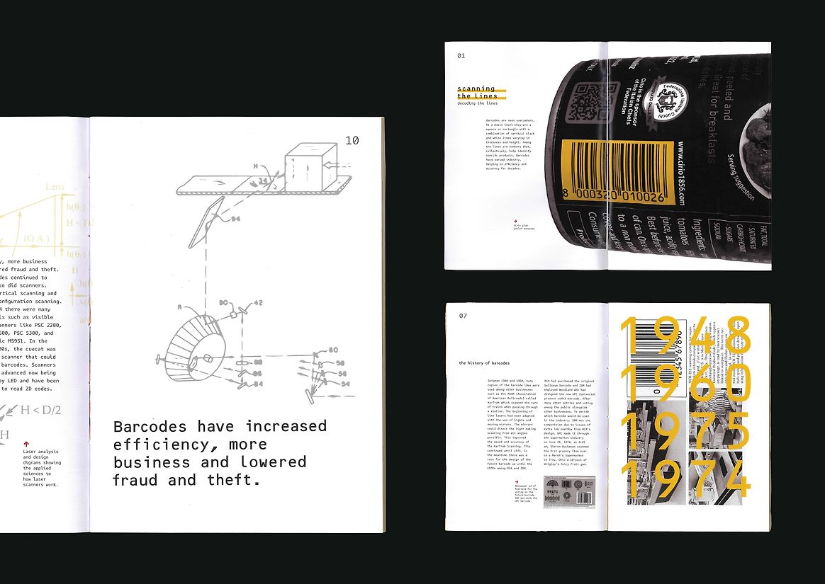
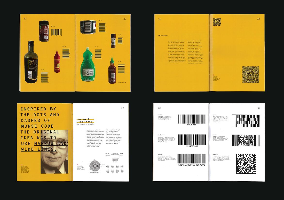
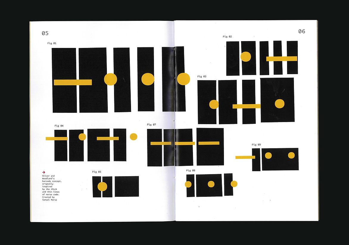
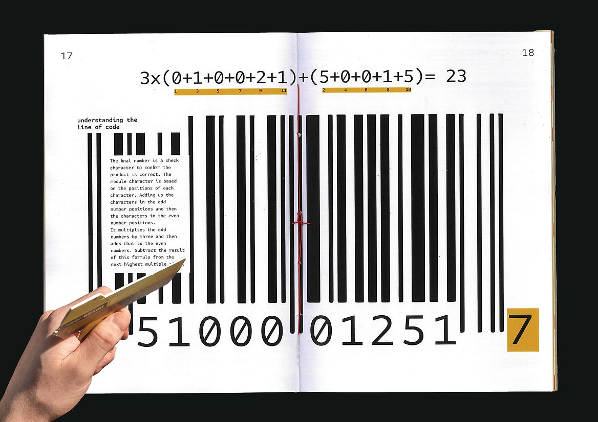
The layout begins with the history of barcodes, detailing their evolution to the present day, followed by an explanation of their structure. Exploring the impact barcodes have had on various industries and their benefits. Acknowledging Norman J Woodland and Bernard Silver's extraordinary invention. Finally, it looks ahead to the future of barcodes and what to expect. An interactive scanner is incorporated to engage readers, enabling them to scan barcodes throughout the magazine.
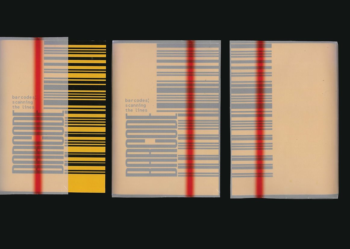
The typography style follows an expressive and visual editorial style giving viewers who indulge in this style an interesting informational read. To follow the barcode theme, Attribute Mono was used fo body text and OCR B std for titles, reflecting the monospaced type seen on barcodes and receipts. The cover design mimics a barcode, with the font ‘Barcode (5)’ used as a visual reference.
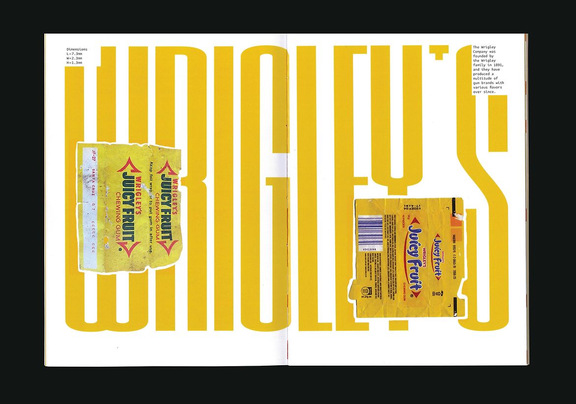
Paper is important to the structure of the magazine, using a standard art paper to delve into the feeling of a magazine and glossy paper for a pull-out instruction manual. Inspired by Ikea and Lego instruction manuals, the pull-out section breaks down the ‘code’ behind barcodes step by step alongside visual components to build the barcode. Encased in a tracing paper sleeve to add depth to the design by incorporating a scan line to read the barcode on both the front and back. The magazine is saddle-stitched with red thread to symbolize the scan line created by a scanner. Inspiring the red arrows and colour pallet throughout the magazine. Using a yellow to recognise Wrigley’s Juicy Fruit chewing gum, the first product ever scanned with a barcode.
Description:
‘The Line’ is a brief from ISTD. Occuping a central role in graphic communication in general, and typography in particular. Lines are everywhere if you look hard enough such as the baseline, the timeline, and the underline. Barcodes are ubiquitous on products we encounter in daily life, yet we often overlook their significance. These black-and-white lines, along with the numbers they contain, help us efficiently identify products, manage inventory, and reduce industry costs.
‘barcodes: scanning the lines’ targets a typographically expressive magazine style, featuring spreads that emphasize the ‘line’ theme. This is supported by barcodes displayed throughout the magazine. The use of lines in titles, subtitles, and pullout quotes, adheres to the brief and aims to invite readers, interested in the composition of barcodes and its history.
The layout begins with the history of barcodes, detailing their evolution to the present day, followed by an explanation of their structure. Exploring the impact barcodes have had on various industries and their benefits. Acknowledging Norman J Woodland and Bernard Silver's extraordinary invention. Finally, it looks ahead to the future of barcodes and what to expect. An interactive scanner is incorporated to engage readers, enabling them to scan barcodes throughout the magazine.
The typography style follows an expressive and visual editorial style giving viewers who indulge in this style an interesting informational read. To follow the barcode theme, Attribute Mono was used fo body text and OCR B std for titles, reflecting the monospaced type seen on barcodes and receipts. The cover design mimics a barcode, with the font ‘Barcode (5)’ used as a visual reference.
Paper is important to the structure of the magazine, using a standard art paper to delve into the feeling of a magazine and glossy paper for a pull-out instruction manual. Inspired by Ikea and Lego instruction manuals, the pull-out section breaks down the ‘code’ behind barcodes step by step alongside visual components to build the barcode. Encased in a tracing paper sleeve to add depth to the design by incorporating a scan line to read the barcode on both the front and back. The magazine is saddle-stitched with red thread to symbolize the scan line created by a scanner. Inspiring the red arrows and colour pallet throughout the magazine. Using a yellow to recognise Wrigley’s Juicy Fruit chewing gum, the first product ever scanned with a barcode.