Graphic
Libby Silson 2 Beyond the Book
-
Kaiako / Lecturers
Annette O'Sullivan, Fay McAlpine
-
School
Massey University College of Creative Arts
Description:
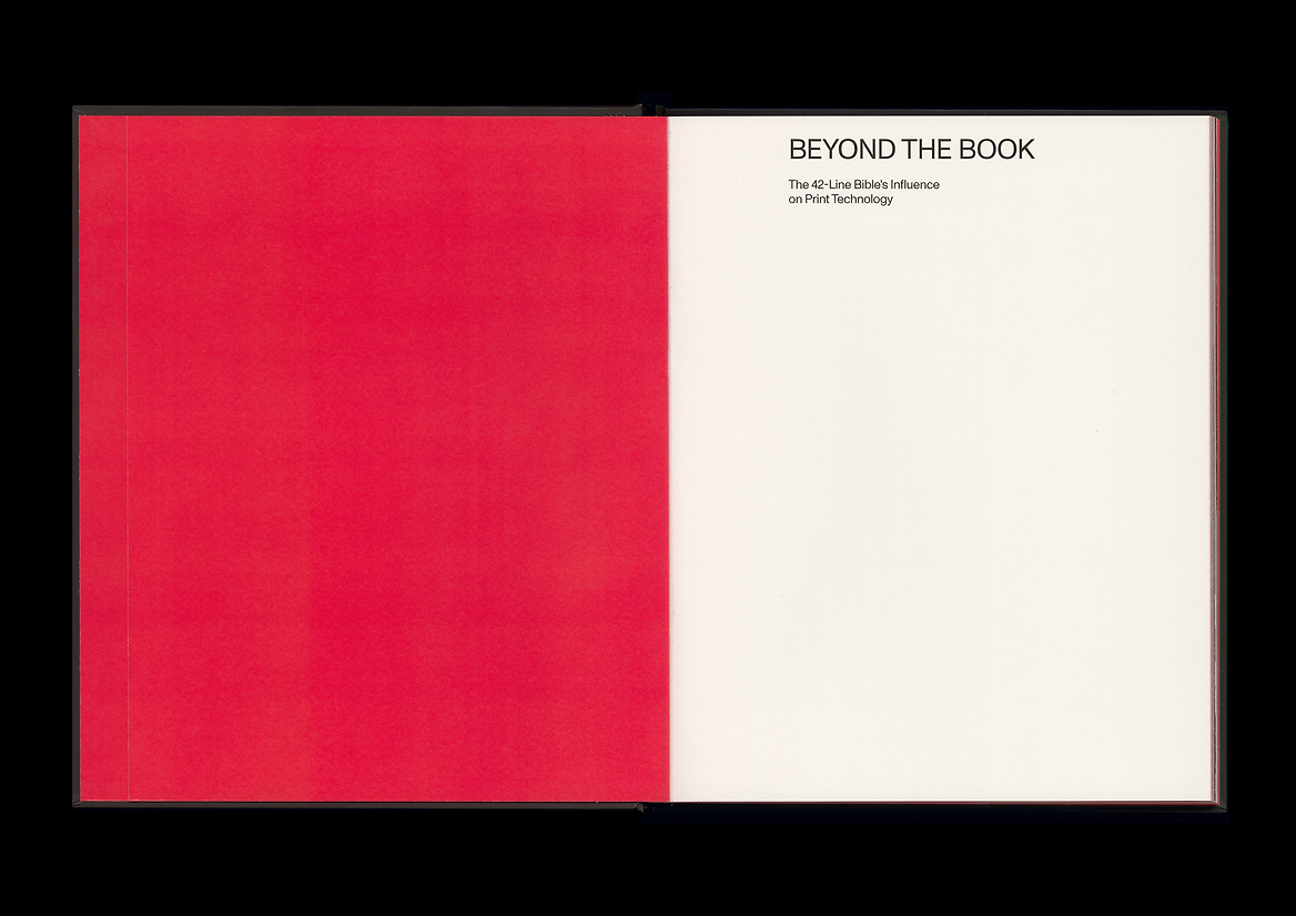
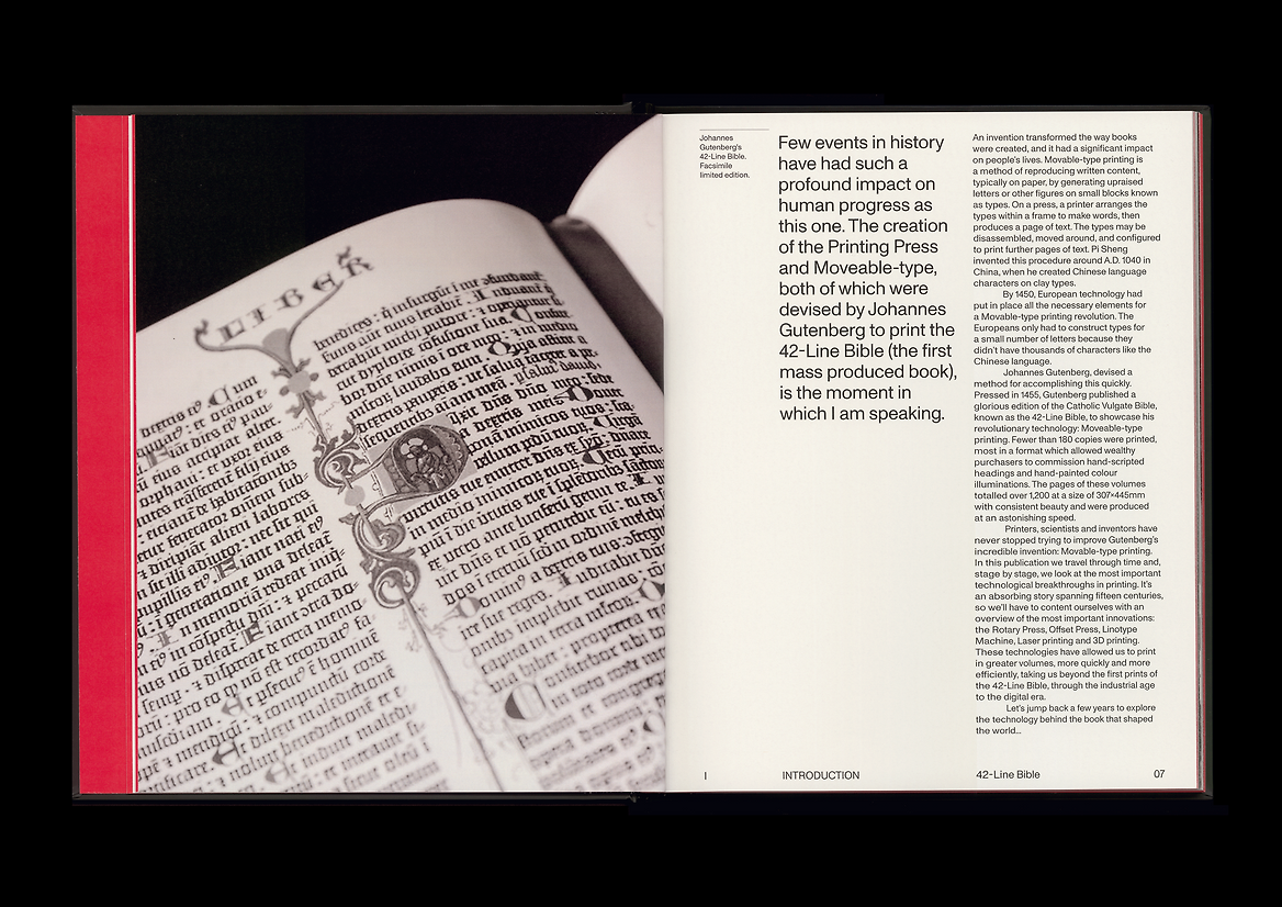
Beyond the Book, is a response to the ISTD Shaping the World brief. I have chosen the 42-Line Bible, produced in 1455 by Johannes Gutenberg, to explore the profound impact that the 42-Line Bible had on print technology.
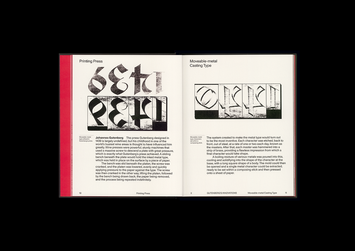
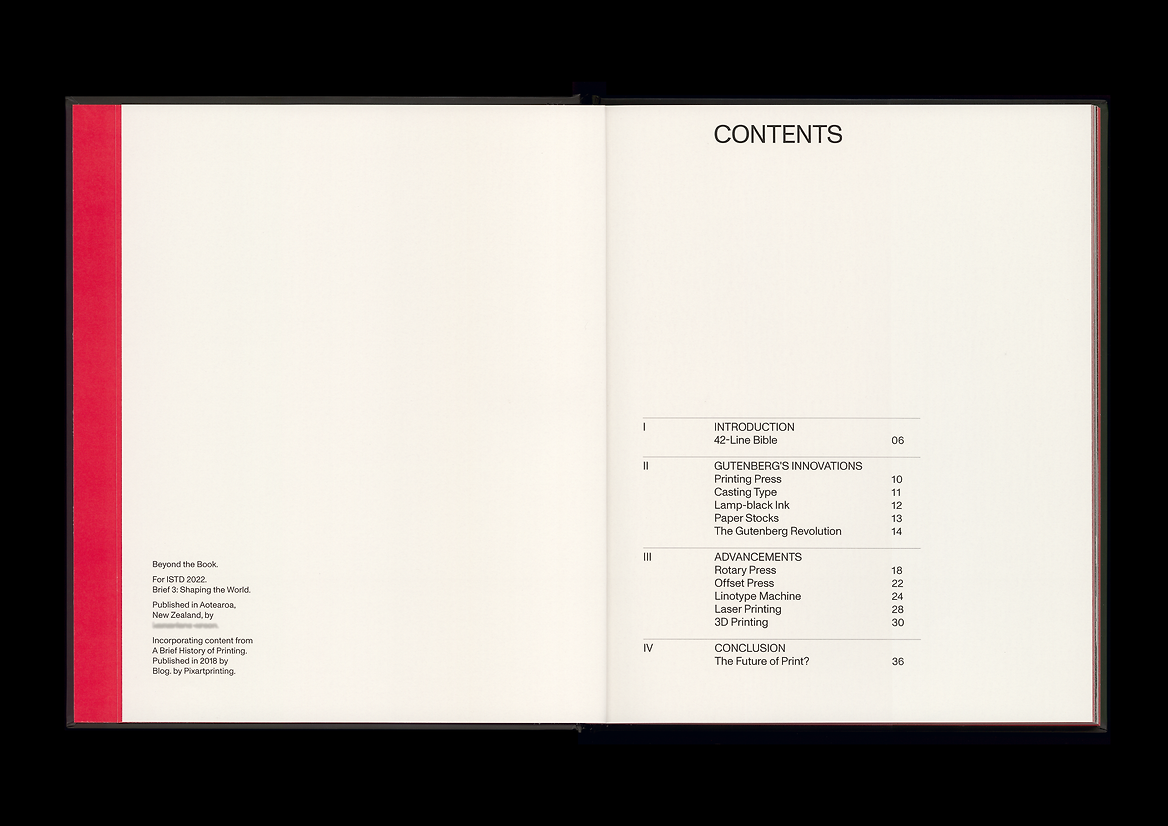
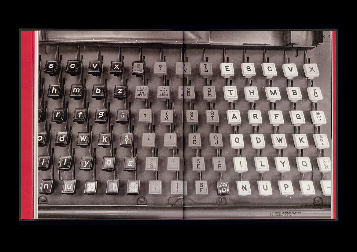
This publication is a travel through time and stage by stage, it looks at the most important technological breakthroughs in printing: Gutenberg's Innovations; the Rotary Press; Offset Press; Linotype Machine; Laser printing; and 3D printing. The aim of the publication is to create an engaging timeline of print history, allowing print lovers to understand how each technology works, and most importantly, where it came from: paying homage to Johannes Gutenberg's 42-Line Bible.
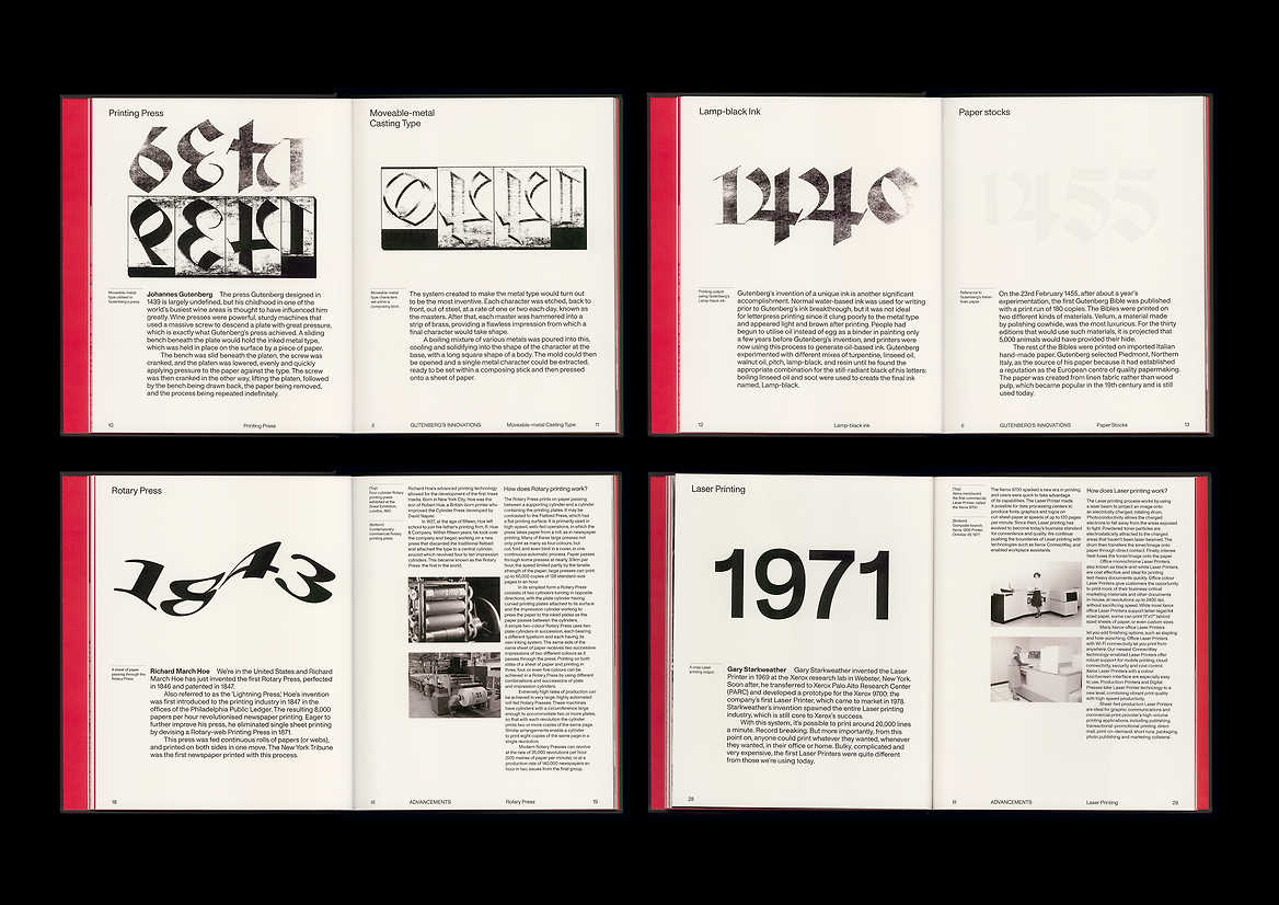
The narrative is split into three sections by way of roman numerals, referencing the numeral system that remained the usual way of writing numbers throughout Europe well into the 1500s. Section I, the Introduction, summarises the 42-Line Bible and its impact on human progress. Section II outlines Gutenberg's technologies, from ink creations, paper sampling, to his Moveable-type Printing Press. Section III, the Advancements, presents the technological breakthroughs devised by printers, scientists and inventors over time. I used a contemporary Swiss sans-serif typeface for a modern portrayal of the original publication that used solely blackletter of one weight. Indents have been used as an alternative to paragraph spacing to reference traditional writing techniques. I have displayed the dates that the print technology was invented in using contemporary interpretations of typefaces associated with these eras to create a timeline of print history. Along with typefaces that reflect the era of the technology, I drew on research into how each works in order to resemble each technology through manipulating or adding features to the dates.
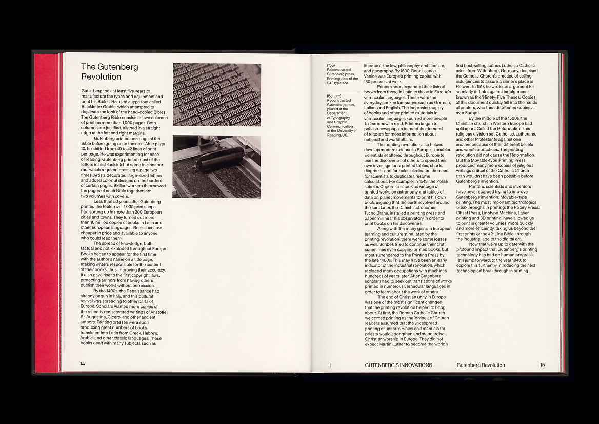
The publication’s large format is a reference to the sheer size of the 42-Line Bibles, which were printed on royal, 508x630mm. The setting of margins and gutters, express the Bible’s optimisation of negative space. The colours black and cinnabar red reference Gutenberg's Lamp-black ink innovation and decorative cinnabar red calligraphed aspects seen in the 42-Line Bible.
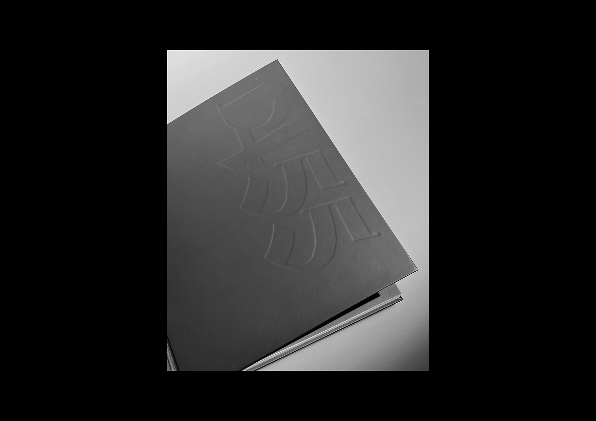
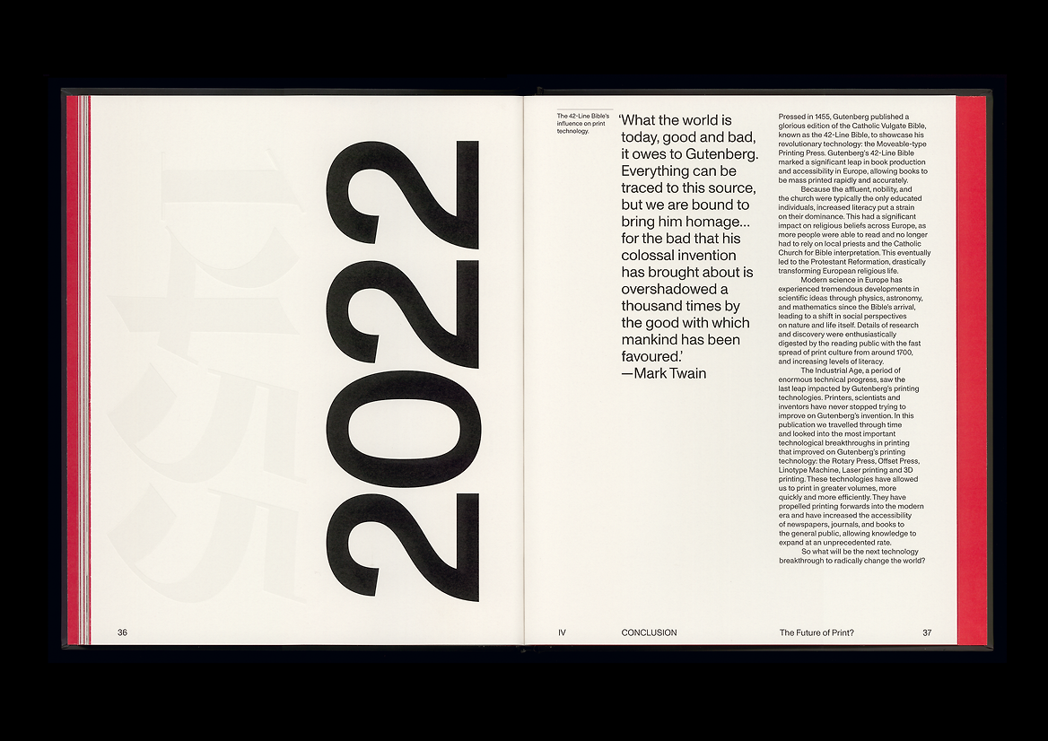
A traditional book design approach has been realised in a contemporary manner with a matte hard cover, french folds and perfect binding. The front of the cover is abstracted to a singular blackletter feature: 1455 debossed, to reference Gutenberg's Moveable Metal Casting Type molds. The back features 2022, printed in the same contemporary Swiss sans-serif typeface used throughout the publication. The cover in its entirety is an interpretation of the 42-Line Bible's influence on present day print technology.
Judge's comments:
A great showcase of the technological breakthroughs in printing.
Really nice restraint in layout & typography.