‘The Quirks of Mapmakers’ was designed in response to the 2023 ISTD brief ‘Mapping the World.’ Using this brief, I explored the hidden curiosities existing in maps from the past. There are hidden messages, ghost towns and genuine or deliberate mistakes. In some cases, the quirks demonstrate ownership of the map; in others, it appears the mapmakers are just having fun. What intrigued me the most was how the mapmakers made the maps their own.
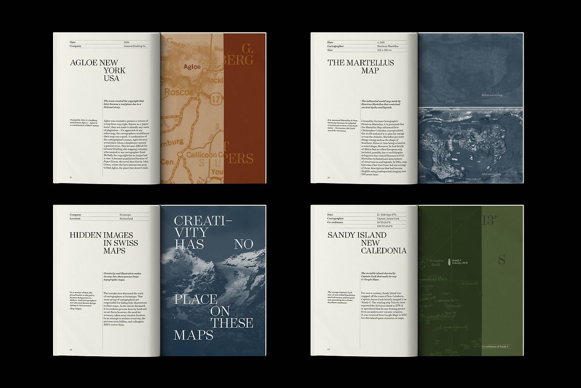
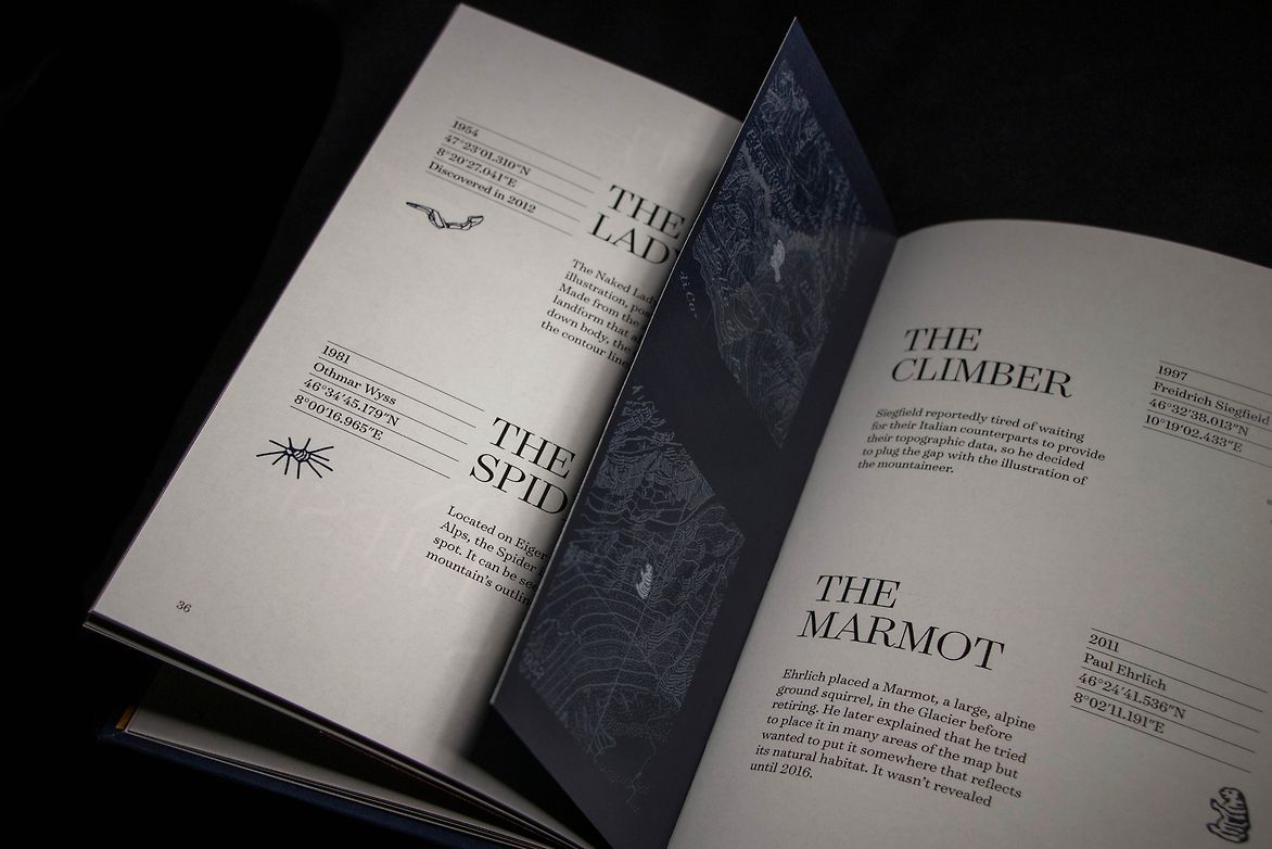
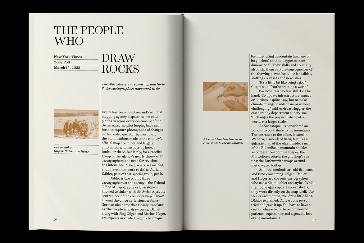
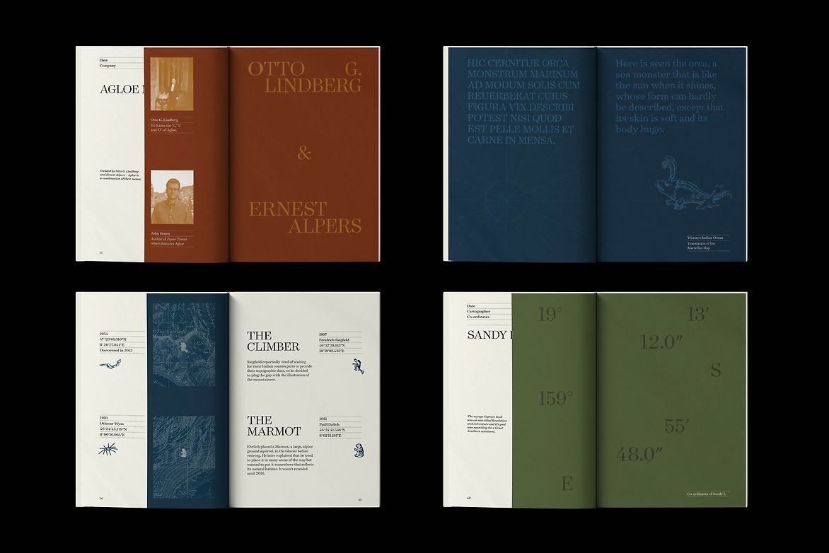
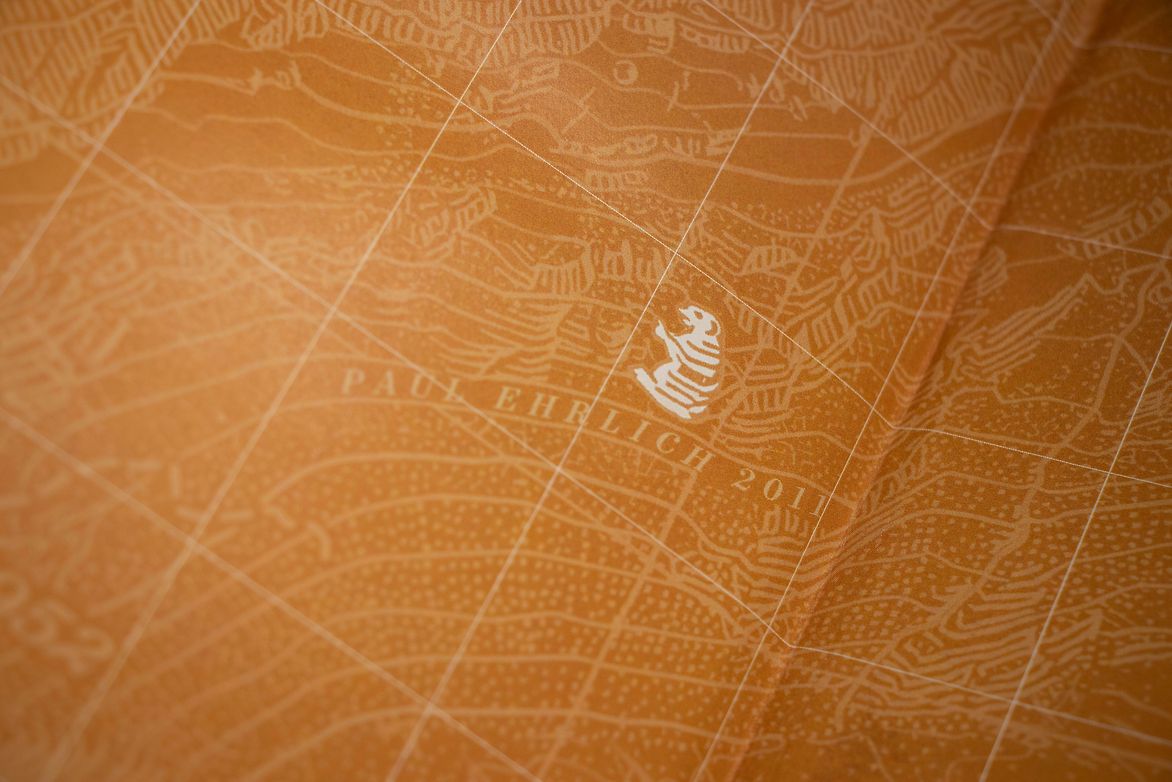
To collate the maps in the book, I selected maps from different periods, starting with an influential early map: The Martellus Map, designed by Henricus Martellus in 1491. The story ends with the more recent hidden marmot, an alpine squirrel, in the Swiss topography map designed by Swisstopo in 2011. The seven maps have been sourced from different times and locations worldwide, and represent a range of mapping techniques from hand-drawn to digital. The book is divided into three sections: Authenticity of Maps; Hidden Messages; and Mistakes. Each map has been selected as an example of one of the quirks of mapmaking. The story begins with an article from the New York Times titled The People Who Draw Rocks written in 2022. This includes an interview with cartographers at Swisstopo, a contemporary group of Swiss cartographers based in Bern responsible for hiding illustrations in their maps. The article provides an overview of the process of map making and discusses how maps could look in the future.
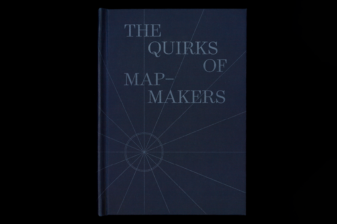
In the design, I drew on decorative elements found on old maps such as the topographical landscapes and measurement tools in the New Zealand Skippers map designed in 1979. The muted colours of brown, green and blue are typically found in landscapes and seen on topographic maps and have been used to define the different sections. The typeface is Surveyor, inspired by the characteristic style of nineteenth-century copper engravings seen on maps and charts. It is a serif typeface of the Didone style designed in 2001 by Tobias Frere-Jones.
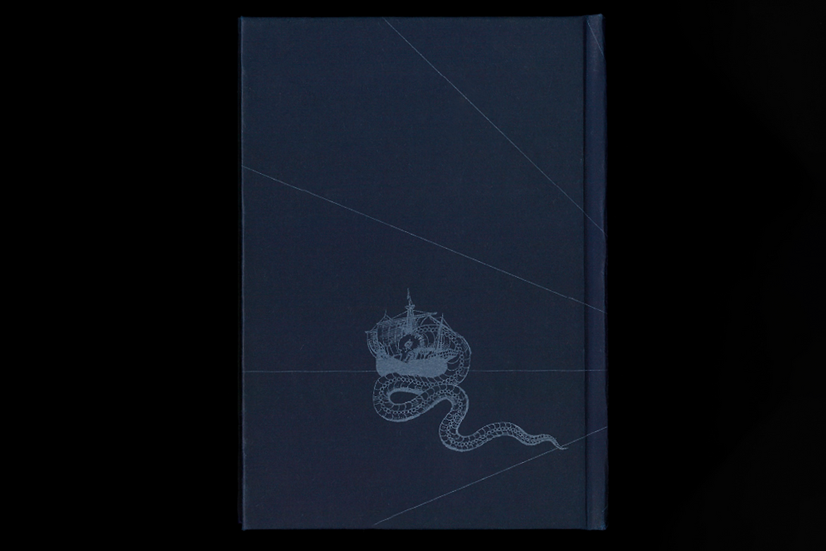
The format is similar to a field guide or a fold-up paper map. The half-page inserts allude to the idea of hiding something underneath and are similar to the way paper maps are folded. The choice of heavier weight and cream paper stock reflects the material often used in early map-making. The choice of a hardcover binding makes it an object of value like maps are made with great skill and lasting beauty.

Description:
‘The Quirks of Mapmakers’ was designed in response to the 2023 ISTD brief ‘Mapping the World.’ Using this brief, I explored the hidden curiosities existing in maps from the past. There are hidden messages, ghost towns and genuine or deliberate mistakes. In some cases, the quirks demonstrate ownership of the map; in others, it appears the mapmakers are just having fun. What intrigued me the most was how the mapmakers made the maps their own.
To collate the maps in the book, I selected maps from different periods, starting with an influential early map: The Martellus Map, designed by Henricus Martellus in 1491. The story ends with the more recent hidden marmot, an alpine squirrel, in the Swiss topography map designed by Swisstopo in 2011. The seven maps have been sourced from different times and locations worldwide, and represent a range of mapping techniques from hand-drawn to digital.
The book is divided into three sections: Authenticity of Maps; Hidden Messages; and Mistakes. Each map has been selected as an example of one of the quirks of mapmaking. The story begins with an article from the New York Times titled The People Who Draw Rocks written in 2022. This includes an interview with cartographers at Swisstopo, a contemporary group of Swiss cartographers based in Bern responsible for hiding illustrations in their maps. The article provides an overview of the process of map making and discusses how maps could look in the future.
In the design, I drew on decorative elements found on old maps such as the topographical landscapes and measurement tools in the New Zealand Skippers map designed in 1979. The muted colours of brown, green and blue are typically found in landscapes and seen on topographic maps and have been used to define the different sections. The typeface is Surveyor, inspired by the characteristic style of nineteenth-century copper engravings seen on maps and charts. It is a serif typeface of the Didone style designed in 2001 by Tobias Frere-Jones.
The format is similar to a field guide or a fold-up paper map. The half-page inserts allude to the idea of hiding something underneath and are similar to the way paper maps are folded. The choice of heavier weight and cream paper stock reflects the material often used in early map-making. The choice of a hardcover binding makes it an object of value like maps are made with great skill and lasting beauty.