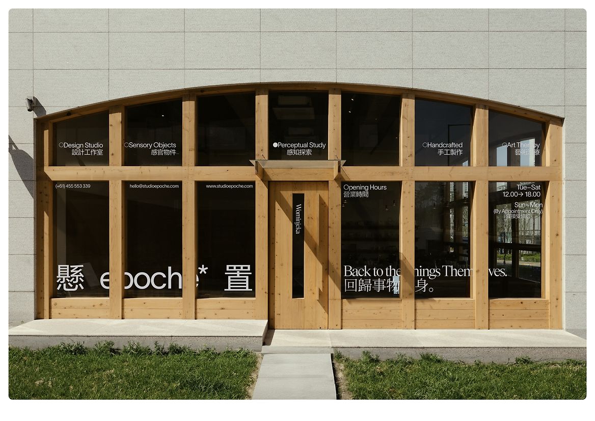
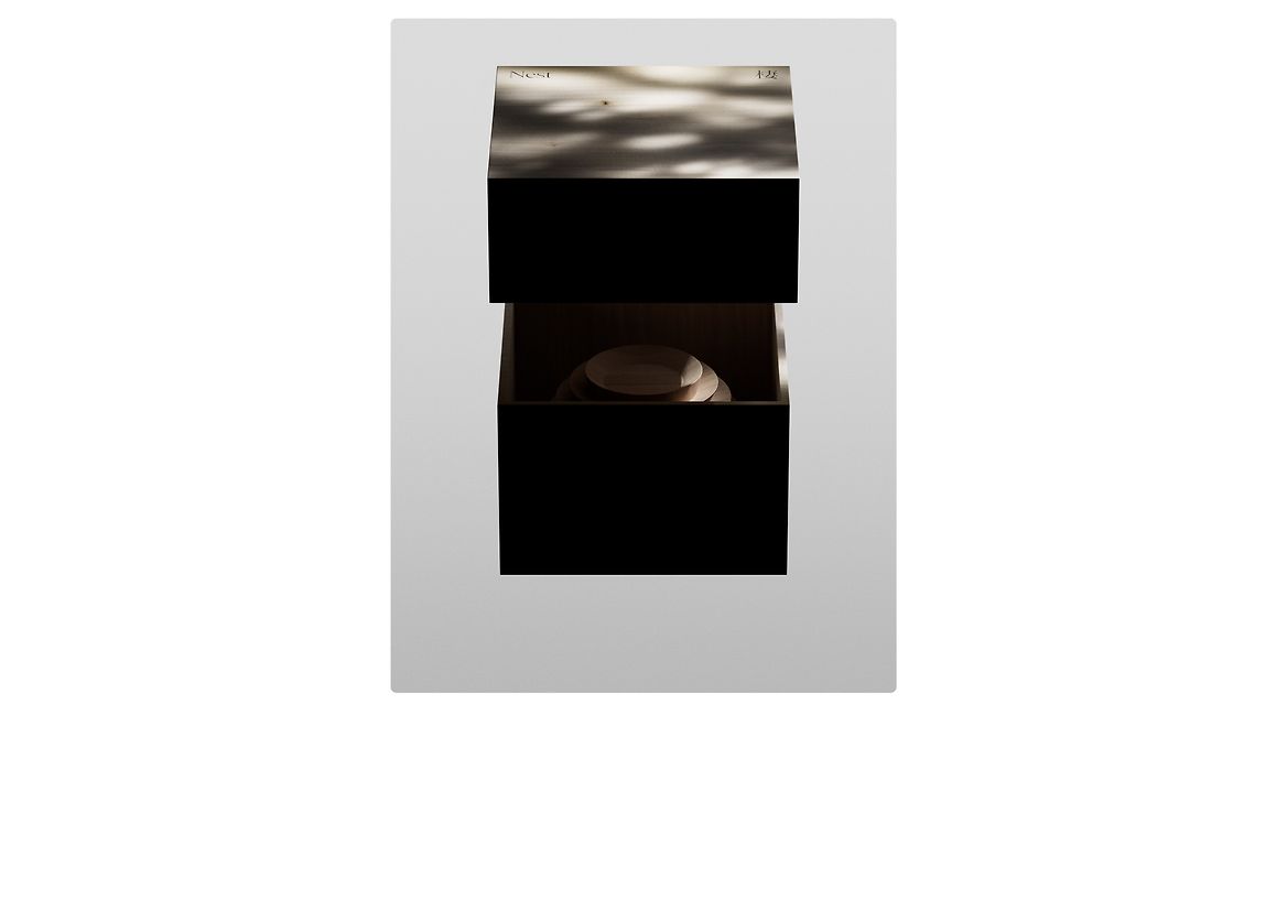
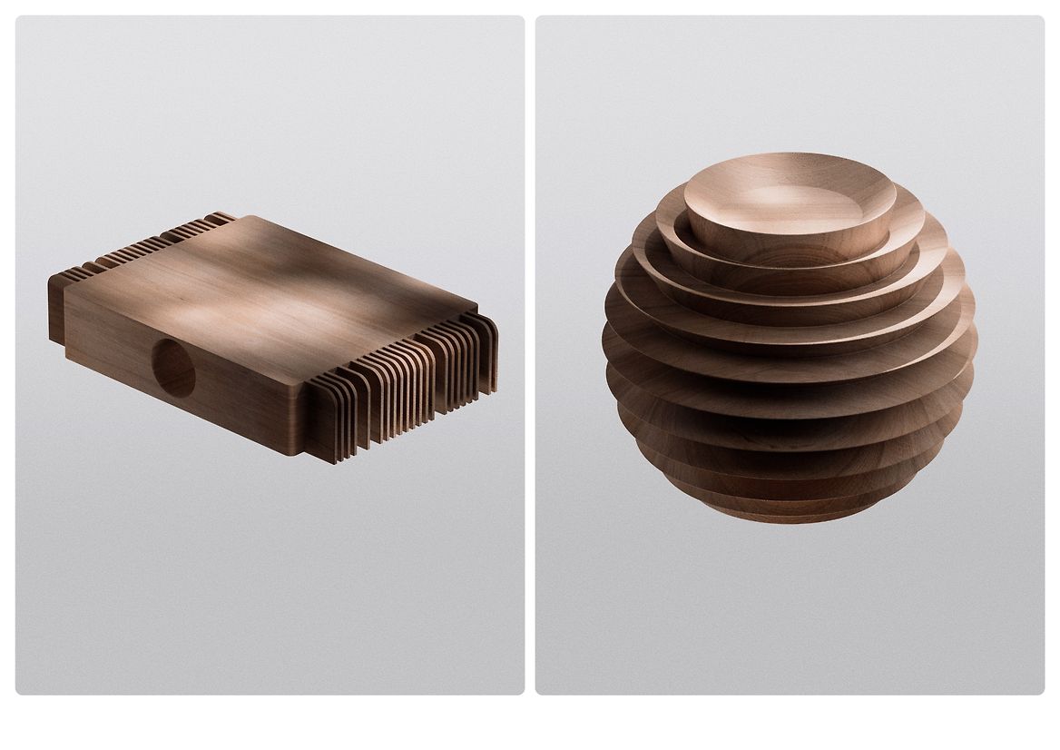
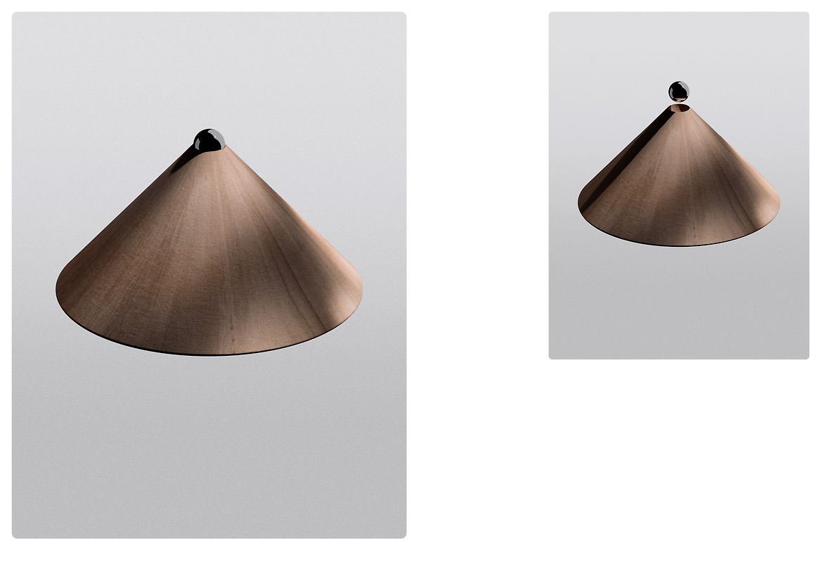
epoché* is a sensory-driven brand redefining engagement through handcrafted objects, experiential spaces, and roundtable explorations. Rooted in Husserl’s concept of "epoché," it invites users to suspend judgment, reconnect with their bodies, and cultivate a tactile way of living beyond visual dominance.
The project emerged in response to the symbolic saturation of mindfulness branding, where calm is repeatedly visualised through reductive imagery—stacked stones, cross-legged silhouettes, concentric sand circles. These familiar codes offer recognisability but little room for perceptual diversity. epoché* positions itself as a critical alternative, shifting the conversation from visual affirmation to sensory attention.
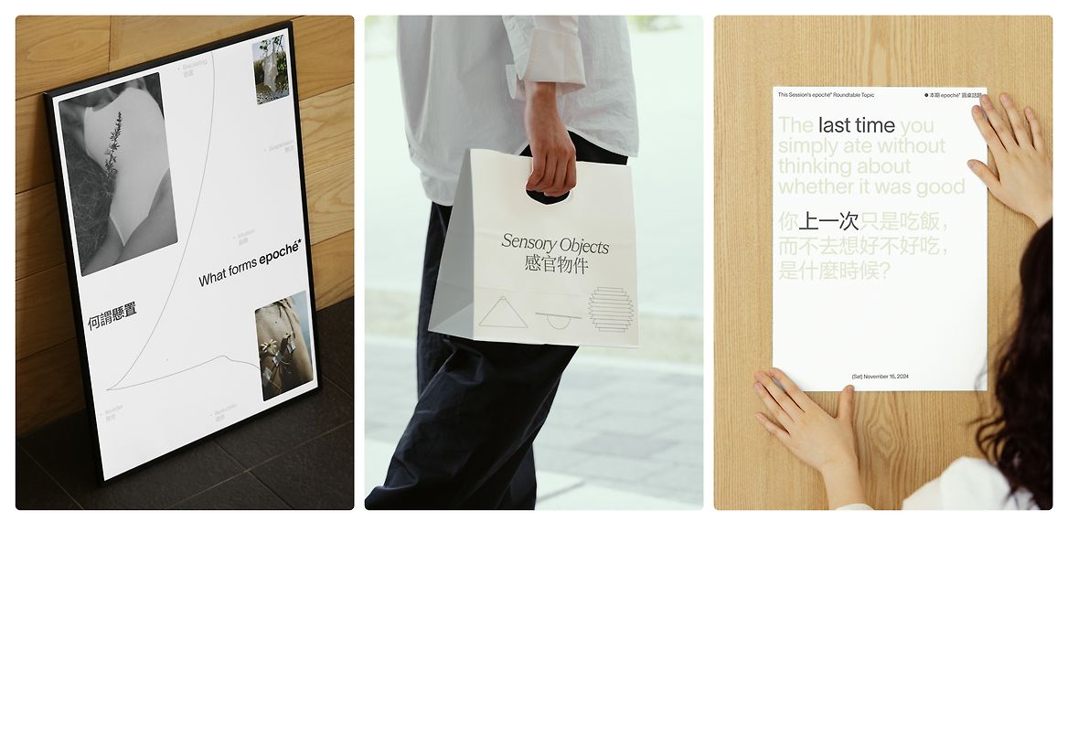
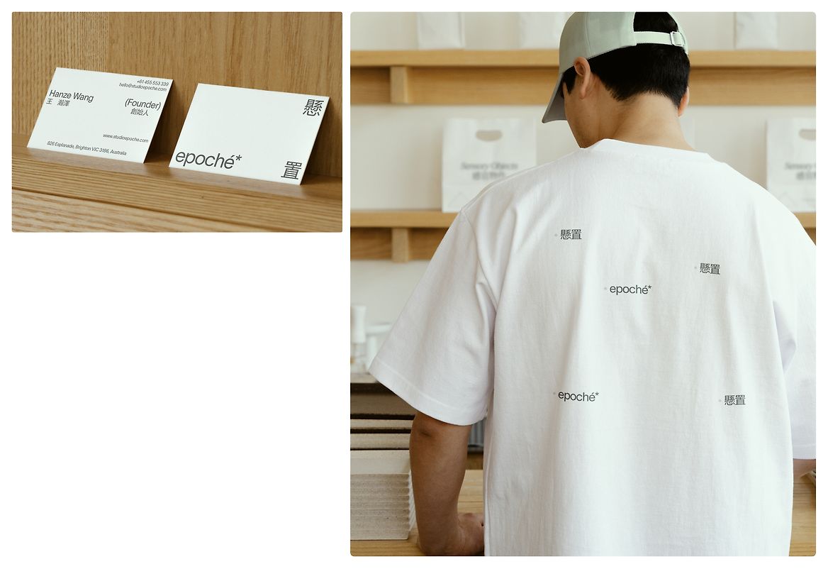
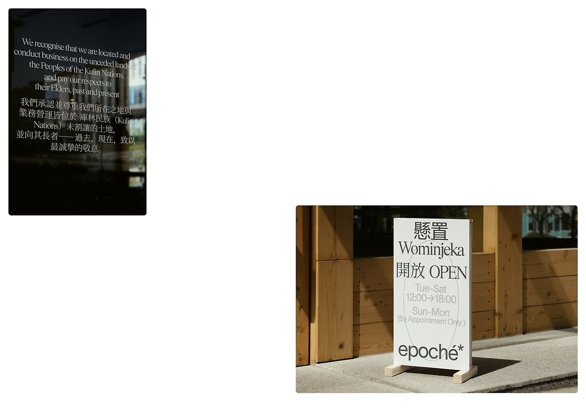
The brand’s name draws from this philosophical grounding. The accompanying asterisk symbolises a space of openness and indeterminacy, echoing epoché’s suspension of assumptions. It acts as a visual prompt, orienting attention without fixed expectation. The identity evolves from these principles, designing a system that privileges bodily perception. A lowercase wordmark suggests informality, while the typographic system blends serif and sans-serif elements across applications, balancing clarity with perceptual softness.
A bilingual structure integrating English and Traditional Chinese reflects the brand’s cross-cultural positioning. In many multilingual identities, secondary scripts are treated as decorative or secondary. This project resists that norm by calibrating stroke density, rhythm, and proportion to achieve visual balance. Typeface pairing reinforces this logic: TWK Lausanne contributes a sense of precision and refinement, while Items adds softness and rhythm. Together, they maintain composure without rigidity and expressiveness without excess.
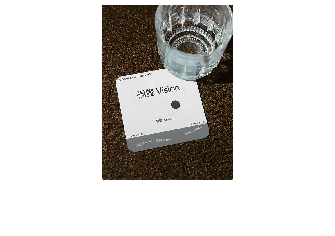
The system’s layout avoids a rigid grid in favour of relational pacing, responding to content, tone, and spatial rhythm. White space is not emptiness but a site of calibration—slowing the act of looking and creating space for embodied awareness. During development, the design process was informed by meditative practice and research into low-vision perception, which sharpened sensitivity to how presence is felt rather than merely seen.
By proposing a body-centred engagement model, epoché* challenges the visually dominated conventions typical within sensory object branding. Its formats—handcrafted, spatial, dialogic—are not outcomes in themselves but open conditions for perception to unfold. Calm is reframed not as a message to be consumed, but as a state to be inhabited.
The project contributes to social wellbeing by advocating a more sustainable, perception-led mode of attention. Culturally, it challenges typographic hierarchies embedded in multilingual design, offering a more deliberate, inclusive approach to cross-script communication. In an increasingly overstimulated visual environment, epoché* repositions care not as a fixed image, but as a form of perceptual relation.
Description:
epoché* is a sensory-driven brand redefining engagement through handcrafted objects, experiential spaces, and roundtable explorations. Rooted in Husserl’s concept of "epoché," it invites users to suspend judgment, reconnect with their bodies, and cultivate a tactile way of living beyond visual dominance.
The project emerged in response to the symbolic saturation of mindfulness branding, where calm is repeatedly visualised through reductive imagery—stacked stones, cross-legged silhouettes, concentric sand circles. These familiar codes offer recognisability but little room for perceptual diversity. epoché* positions itself as a critical alternative, shifting the conversation from visual affirmation to sensory attention.
The brand’s name draws from this philosophical grounding. The accompanying asterisk symbolises a space of openness and indeterminacy, echoing epoché’s suspension of assumptions. It acts as a visual prompt, orienting attention without fixed expectation. The identity evolves from these principles, designing a system that privileges bodily perception. A lowercase wordmark suggests informality, while the typographic system blends serif and sans-serif elements across applications, balancing clarity with perceptual softness.
A bilingual structure integrating English and Traditional Chinese reflects the brand’s cross-cultural positioning. In many multilingual identities, secondary scripts are treated as decorative or secondary. This project resists that norm by calibrating stroke density, rhythm, and proportion to achieve visual balance. Typeface pairing reinforces this logic: TWK Lausanne contributes a sense of precision and refinement, while Items adds softness and rhythm. Together, they maintain composure without rigidity and expressiveness without excess.
The system’s layout avoids a rigid grid in favour of relational pacing, responding to content, tone, and spatial rhythm. White space is not emptiness but a site of calibration—slowing the act of looking and creating space for embodied awareness. During development, the design process was informed by meditative practice and research into low-vision perception, which sharpened sensitivity to how presence is felt rather than merely seen.
By proposing a body-centred engagement model, epoché* challenges the visually dominated conventions typical within sensory object branding. Its formats—handcrafted, spatial, dialogic—are not outcomes in themselves but open conditions for perception to unfold. Calm is reframed not as a message to be consumed, but as a state to be inhabited.
The project contributes to social wellbeing by advocating a more sustainable, perception-led mode of attention. Culturally, it challenges typographic hierarchies embedded in multilingual design, offering a more deliberate, inclusive approach to cross-script communication. In an increasingly overstimulated visual environment, epoché* repositions care not as a fixed image, but as a form of perceptual relation.