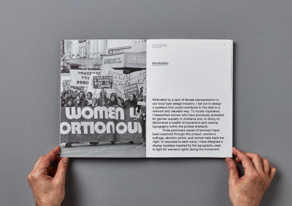
Motivated by a lack of female representation in our local type design industry, I set out to design a typeface that could contribute to this field in a relevant and valuable way. To locate inspiration, I researched women who have previously protested for gender equality in Aotearoa and, in doing so, discovered a wealth of expressive and unsung typography within the protest artefacts. ‘Whakatū Wāhine is a collective of display typefaces inspired by this typography. While exploring starting points for the typefaces, the project resolved into three prominent moments in feminist activism in Aotearoa, leading into three distinct typefaces. The ‘Suffrage Petition’ typeface referencing the Latin-style typeface used in the celebrated 1893 suffrage petition. The ‘Pregnant Muldoon’ typeface inspired by one of the more contentious posters used to fight for women’s right to freely access abortion care in the women’s liberation movement, and the ‘Women Reclaim the Night’ typeface inspired by a poster advertising a ‘Take Back The Night’ march in Wellington during the 70s. The analogue nature and commanding presence of these protest posters were crucial influences on the design of the type specimen books. To embody their voice and energy, the work took a bold approach towards scale and typographic compositions to evoke the passionate breakthrough moments of NZ feminist activism. I also used plain cards for the covers and an exposed binding to bring a homegrown and hand-crafted quality to the work. For the primary supporting typeface, I chose to use the adaptation of Helvetica, Alte Haas Grotesk, as it features softened terminals and intersections, emulating the essence of old print material. Its neutrality also allows the display typefaces to take centre stage. I used the mono-spaced typeface Fraktion Mono by Pangram Pangram as a secondary typeface, reinforcing the sentiment of analogue printing. Using hand-drawn underlines and scanned paper to emphasise headings helped to add another layer of tactility to the book.

Description:
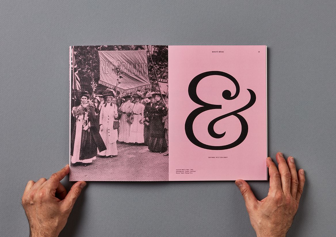
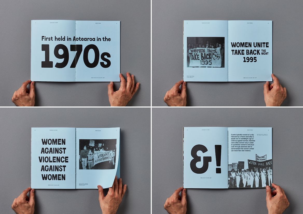
Motivated by a lack of female representation in our local type design industry, I set out to design a typeface that could contribute to this field in a relevant and valuable way. To locate inspiration, I researched women who have previously protested for gender equality in Aotearoa and, in doing so, discovered a wealth of expressive and unsung typography within the protest artefacts. ‘Whakatū Wāhine is a collective of display typefaces inspired by this typography.
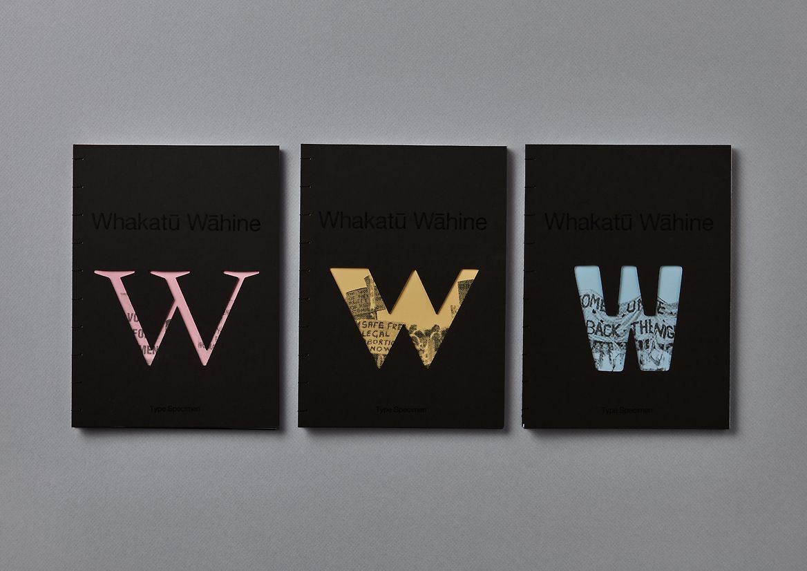
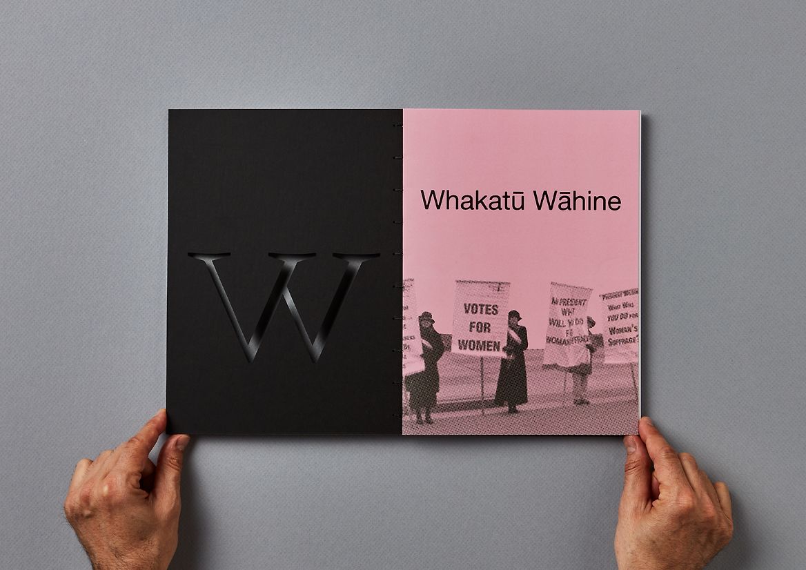
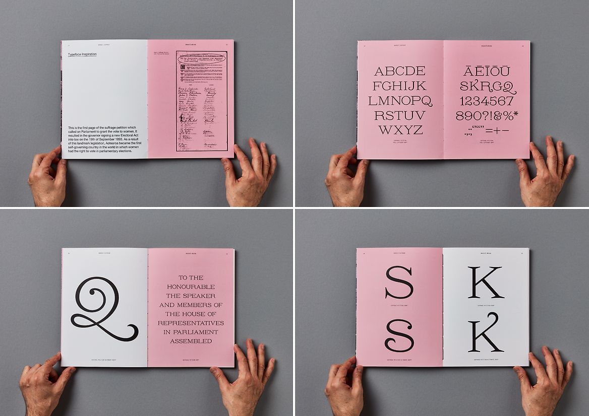
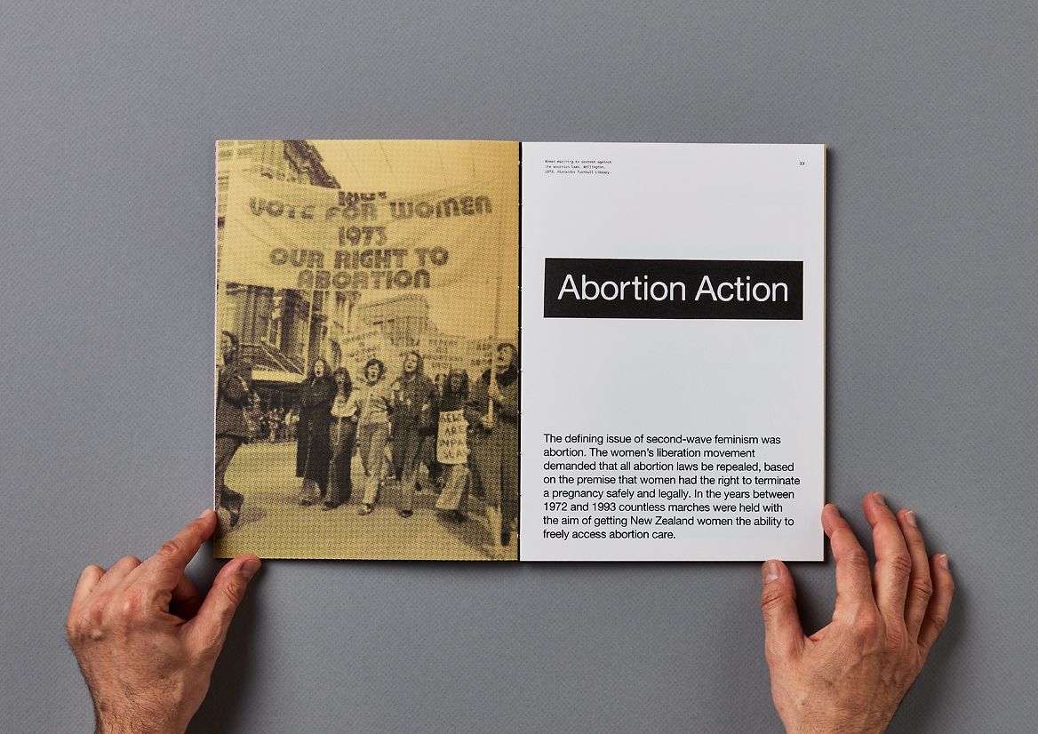
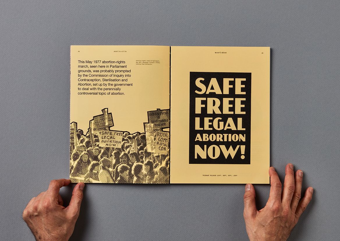
While exploring starting points for the typefaces, the project resolved into three prominent moments in feminist activism in Aotearoa, leading into three distinct typefaces. The ‘Suffrage Petition’ typeface referencing the Latin-style typeface used in the celebrated 1893 suffrage petition. The ‘Pregnant Muldoon’ typeface inspired by one of the more contentious posters used to fight for women’s right to freely access abortion care in the women’s liberation movement, and the ‘Women Reclaim the Night’ typeface inspired by a poster advertising a ‘Take Back The Night’ march in Wellington during the 70s.
The analogue nature and commanding presence of these protest posters were crucial influences on the design of the type specimen books. To embody their voice and energy, the work took a bold approach towards scale and typographic compositions to evoke the passionate breakthrough moments of NZ feminist activism. I also used plain cards for the covers and an exposed binding to bring a homegrown and hand-crafted quality to the work.
For the primary supporting typeface, I chose to use the adaptation of Helvetica, Alte Haas Grotesk, as it features softened terminals and intersections, emulating the essence of old print material. Its neutrality also allows the display typefaces to take centre stage. I used the mono-spaced typeface Fraktion Mono by Pangram Pangram as a secondary typeface, reinforcing the sentiment of analogue printing. Using hand-drawn underlines and scanned paper to emphasise headings helped to add another layer of tactility to the book.