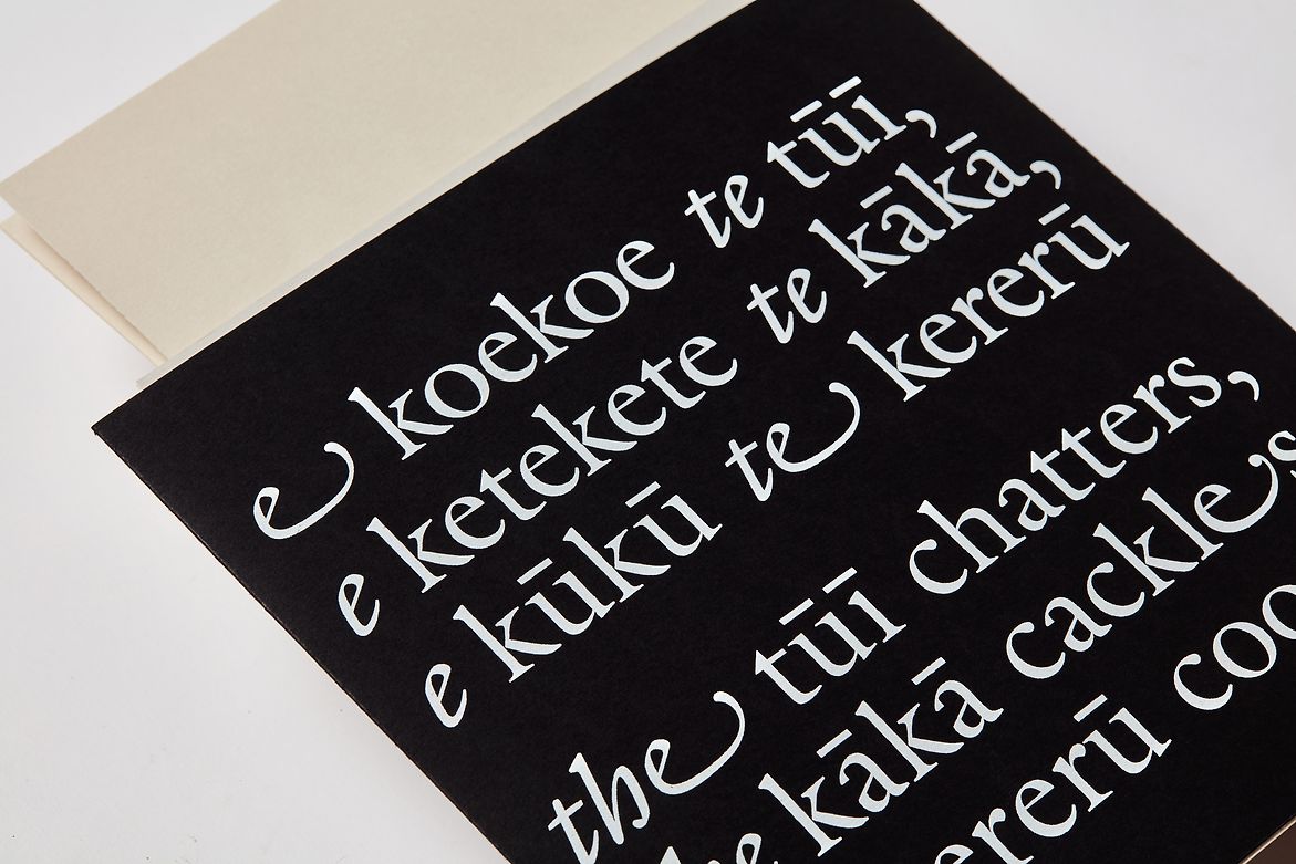
“E koekoe te tūī, e ketekete te kākā, e kūkū te kereru” (the tūī chatters, the kākā cackles, the kererū coos) is a whakataukī that speaks to the idea that everyone has their own distinct voice and deserves to be heard and appreciated. This whakataukī served as an initial kupu whakarite (metaphor) for this first year Uni project, exploring typographic voice through publication design.
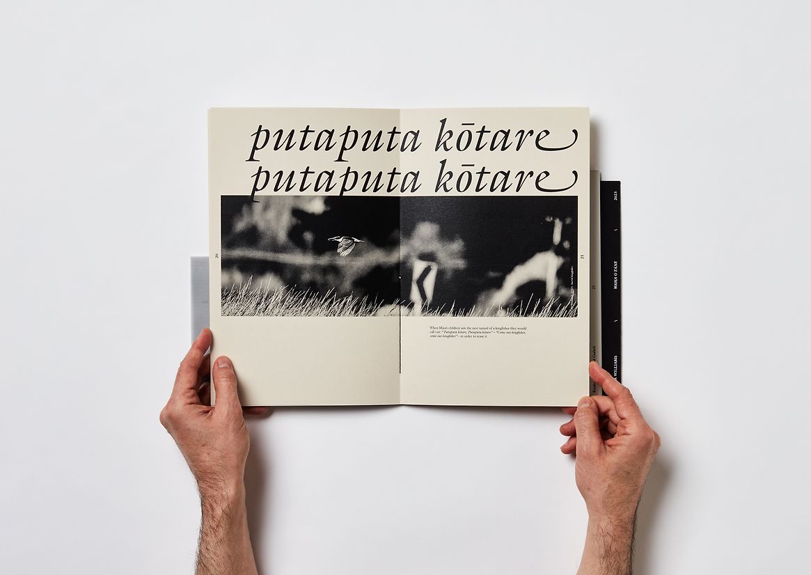
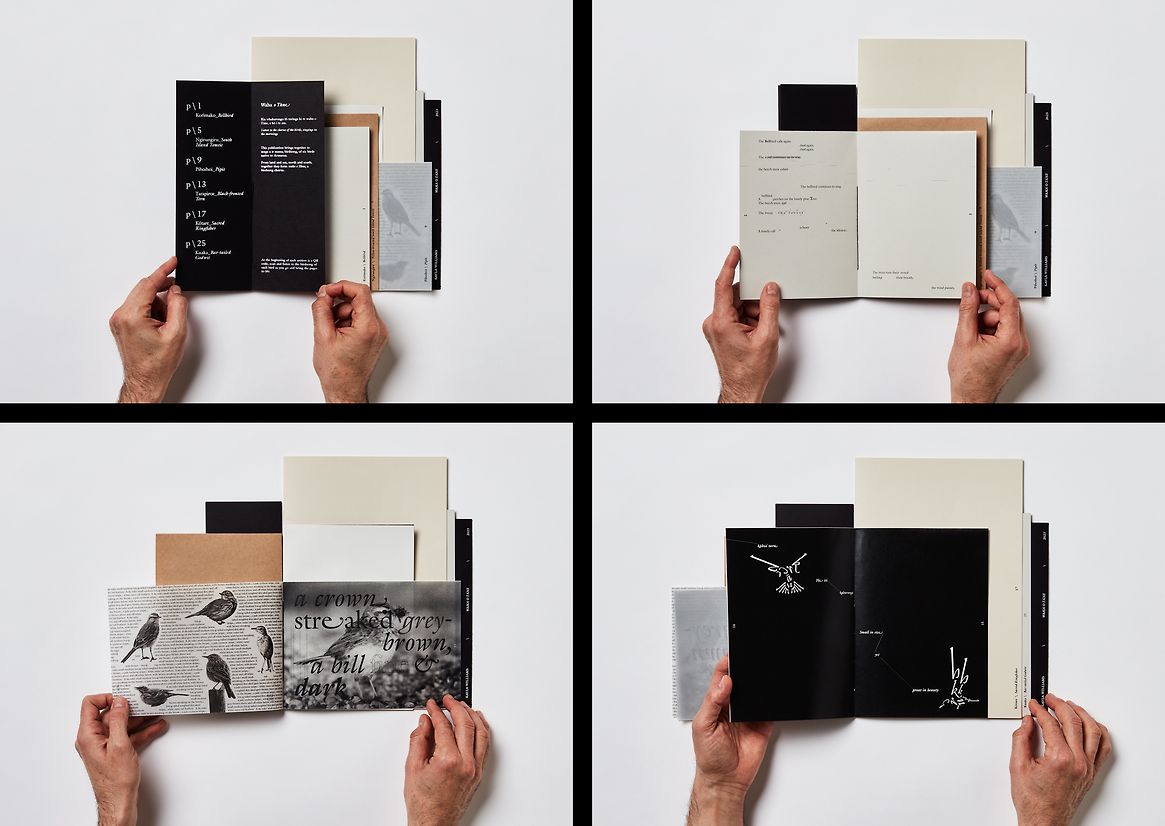
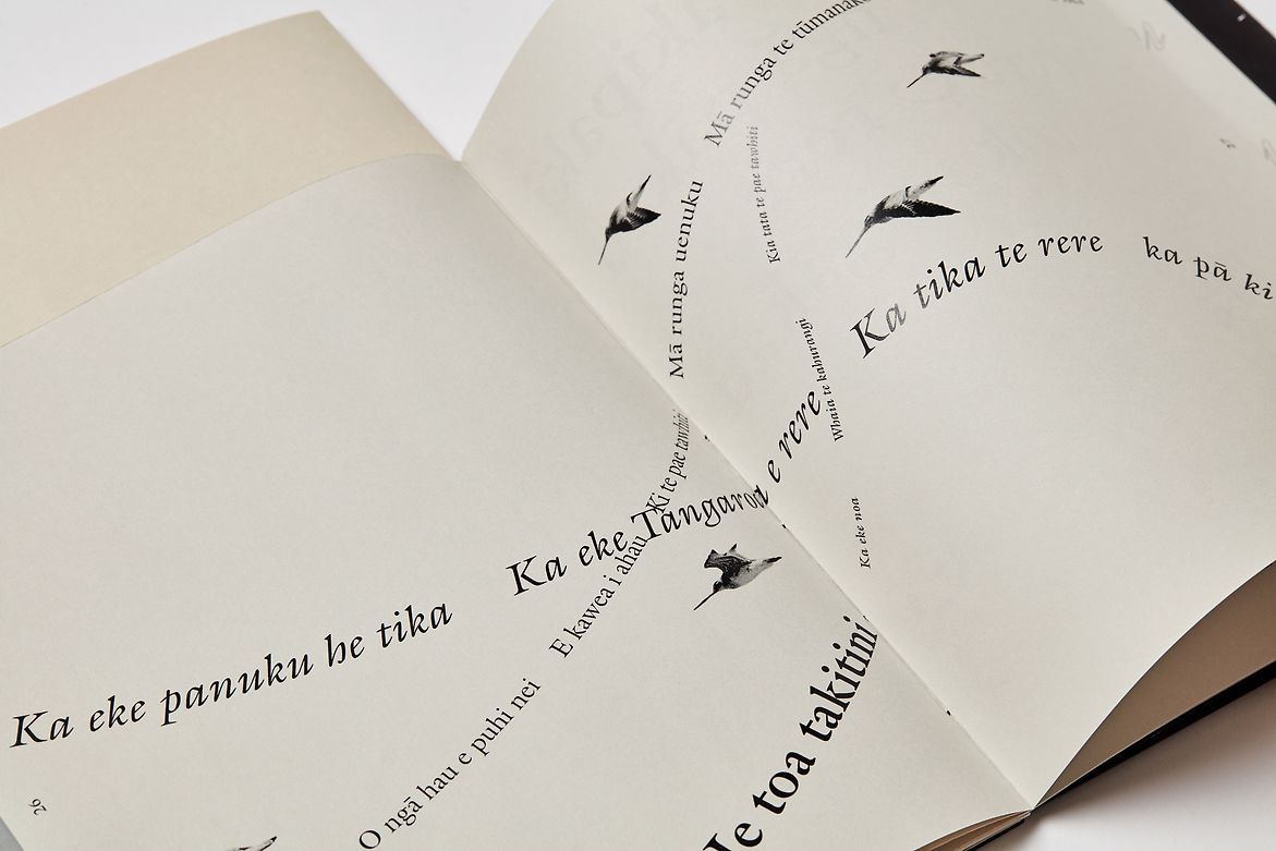
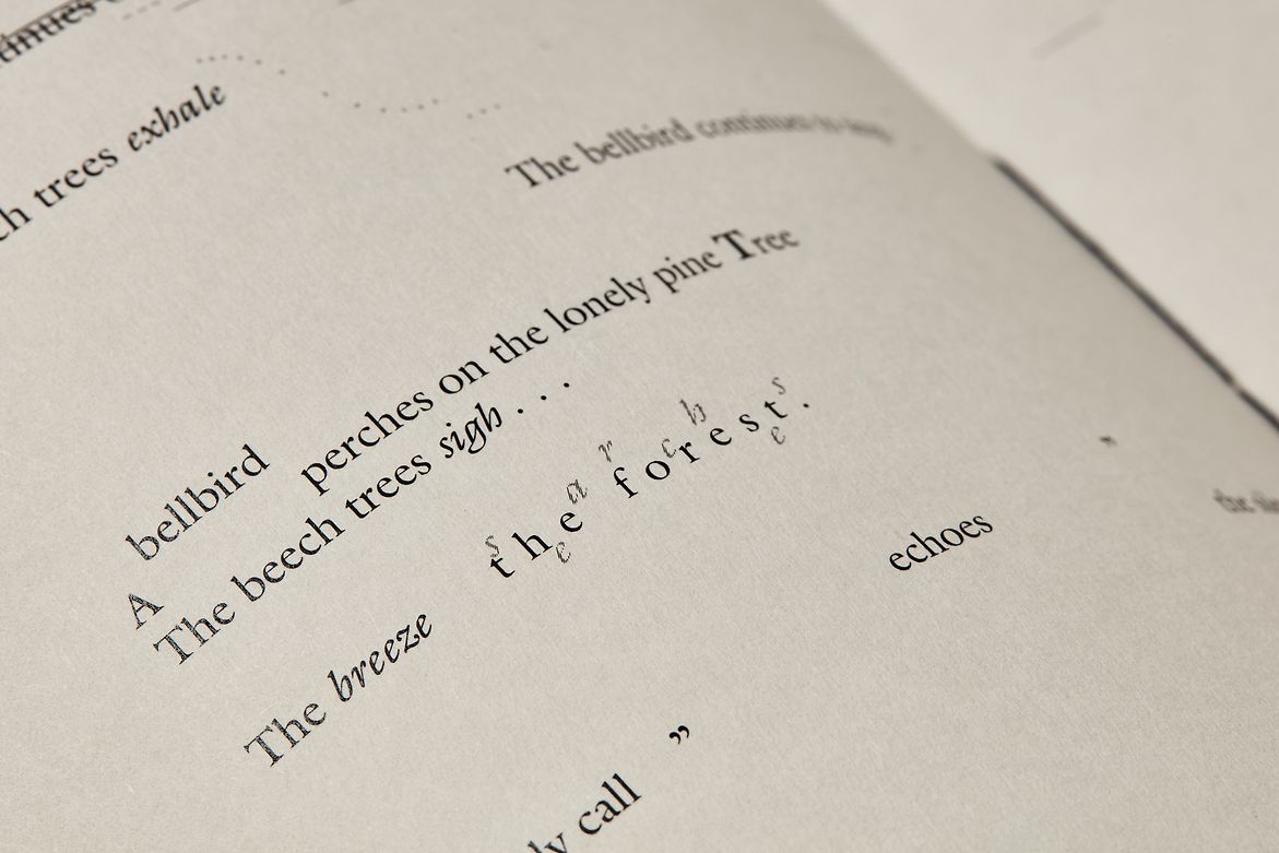
The aim of my publication was to represent the characteristics of endemic birdlife in Aotearoa—to celebrate their individuality while also valuing their collective voice. I researched six birds from different environments and created a section for each. I aligned each bird with the content format and typographic expression that best suited its distinct nature. Section one explored text and form, composing a poem that speaks of a lonely Korimako (Bellbird) in its forest home. Section two: text as pattern to represent the call of a Ngirungiru (South Island Tomtit). Section three combined image and text to describe the appearance and movement of Pihoihoi and Section four’s (expressive text) looked into indigenous connections with Tarapiroe (Black-fronted Tern). Section five provided factual information about the Kōtare, and Section six utilised typographic rhythm to reflect a song about the Kuaka (Bar-tailed Godwit).
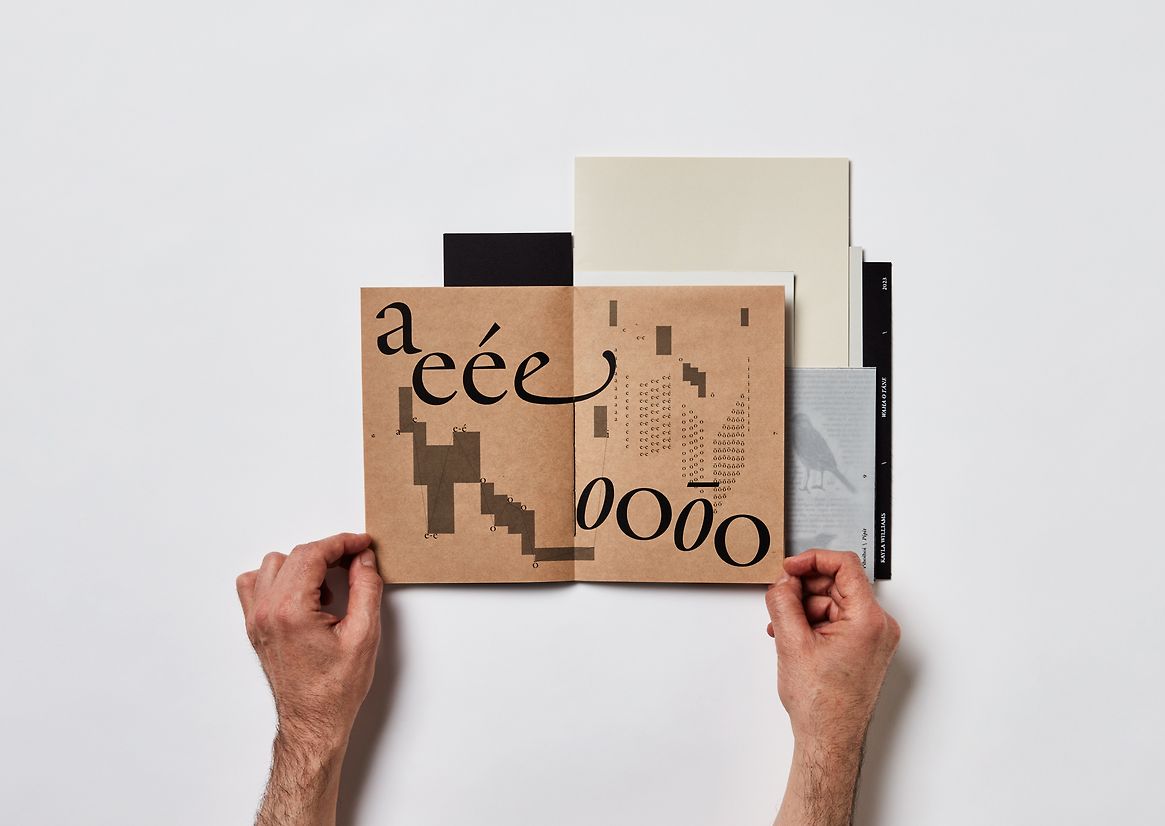
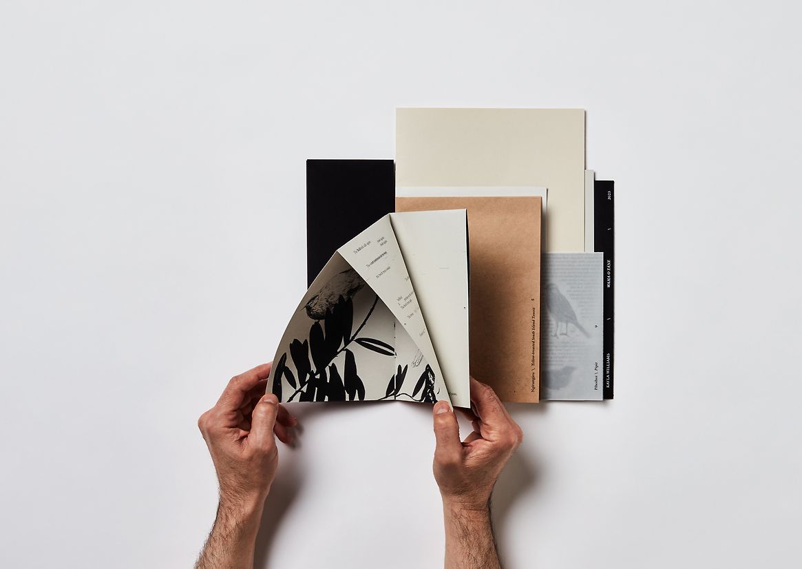
The design was restricted to black and white—this helped focus my attention on the core elements of typographic composition, rather than colour. I experimented with these limitations using only one typeface (ITC Gaillard by Matthew Carter) which extended my typographic learning.
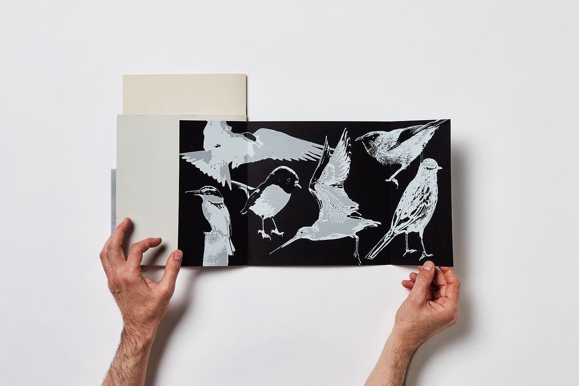
I created visual content in varying styles— photography, cyanotypes, pen and gestural ink elements which were tucked into the inner folds of several sections. These offer a visual contrast to the typographic double-page spreads, enhancing at the same time the expression of each bird's individual character.
I also wanted to engage the reader through an auditory experience. On the ‘cover’ of each section I embedded a QR code that links to an audio file of the voice/song of the relevant bird. This brought the pages to life and enabled the reader to experience birdsong that they may not have heard before.
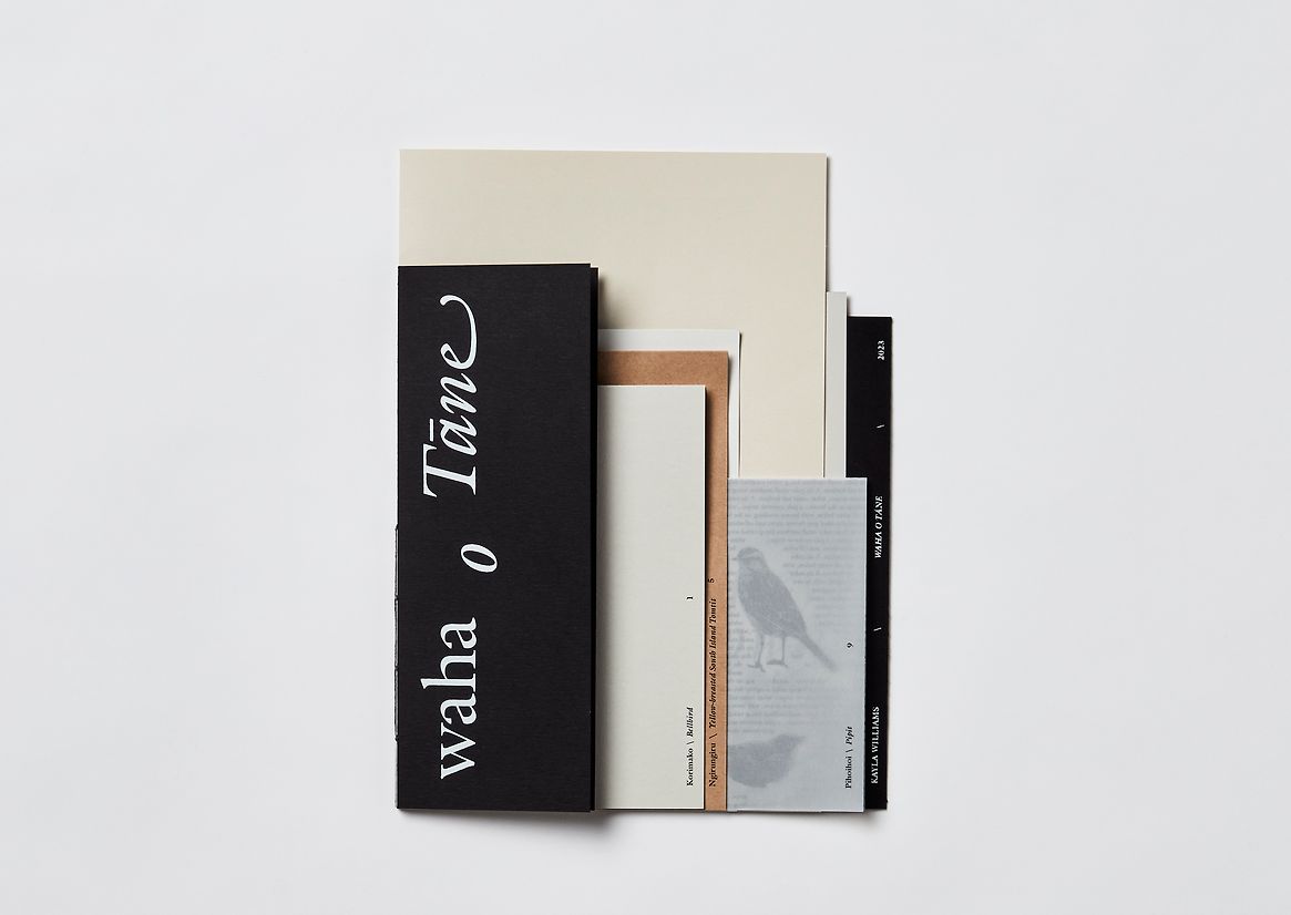
When choosing the paper stock I tried to balance variety in order to symbolise the bird's individuality with cohesion, and to represent that the birds are all native to one country. I also screen-printed the front and back covers to add a layer of tactility.
My publication is titled ‘waha o Tāne’ (a chorus of birdsong). The meaning is twofold—the multi-faceted design brings together the individual voices of many birds, while also pulling together typography, imagery, audio and materials into a cohesive whole. Each section expresses a distinct characteristic of each bird, highlighting the unique nature of the endemic birdlife in Aotearoa.
The publication embodies the value of the whakataukī through the design—reflecting the importance of both individual and collective voice. ‘waha o Tāne’ is also an expression of my voice as a designer, here in Aotearoa.
Description:
“E koekoe te tūī, e ketekete te kākā, e kūkū te kereru” (the tūī chatters, the kākā cackles, the kererū coos) is a whakataukī that speaks to the idea that everyone has their own distinct voice and deserves to be heard and appreciated. This whakataukī served as an initial kupu whakarite (metaphor) for this first year Uni project, exploring typographic voice through publication design.
The aim of my publication was to represent the characteristics of endemic birdlife in Aotearoa—to celebrate their individuality while also valuing their collective voice. I researched six birds from different environments and created a section for each. I aligned each bird with the content format and typographic expression that best suited its distinct nature. Section one explored text and form, composing a poem that speaks of a lonely Korimako (Bellbird) in its forest home. Section two: text as pattern to represent the call of a Ngirungiru (South Island Tomtit). Section three combined image and text to describe the appearance and movement of Pihoihoi and Section four’s (expressive text) looked into indigenous connections with Tarapiroe (Black-fronted Tern). Section five provided factual information about the Kōtare, and Section six utilised typographic rhythm to reflect a song about the Kuaka (Bar-tailed Godwit).
The design was restricted to black and white—this helped focus my attention on the core elements of typographic composition, rather than colour. I experimented with these limitations using only one typeface (ITC Gaillard by Matthew Carter) which extended my typographic learning.
I created visual content in varying styles— photography, cyanotypes, pen and gestural ink elements which were tucked into the inner folds of several sections. These offer a visual contrast to the typographic double-page spreads, enhancing at the same time the expression of each bird's individual character.
I also wanted to engage the reader through an auditory experience. On the ‘cover’ of each section I embedded a QR code that links to an audio file of the voice/song of the relevant bird. This brought the pages to life and enabled the reader to experience birdsong that they may not have heard before.
When choosing the paper stock I tried to balance variety in order to symbolise the bird's individuality with cohesion, and to represent that the birds are all native to one country. I also screen-printed the front and back covers to add a layer of tactility.
My publication is titled ‘waha o Tāne’ (a chorus of birdsong). The meaning is twofold—the multi-faceted design brings together the individual voices of many birds, while also pulling together typography, imagery, audio and materials into a cohesive whole. Each section expresses a distinct characteristic of each bird, highlighting the unique nature of the endemic birdlife in Aotearoa.
The publication embodies the value of the whakataukī through the design—reflecting the importance of both individual and collective voice. ‘waha o Tāne’ is also an expression of my voice as a designer, here in Aotearoa.