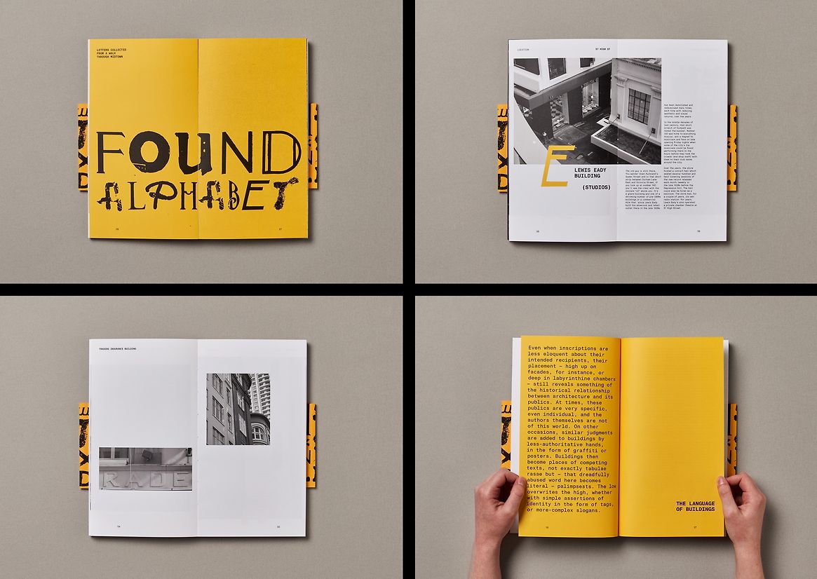
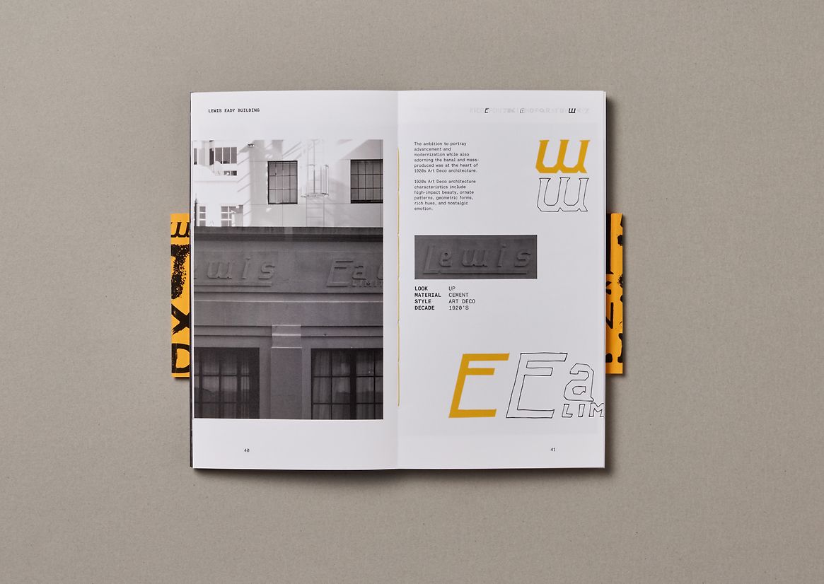
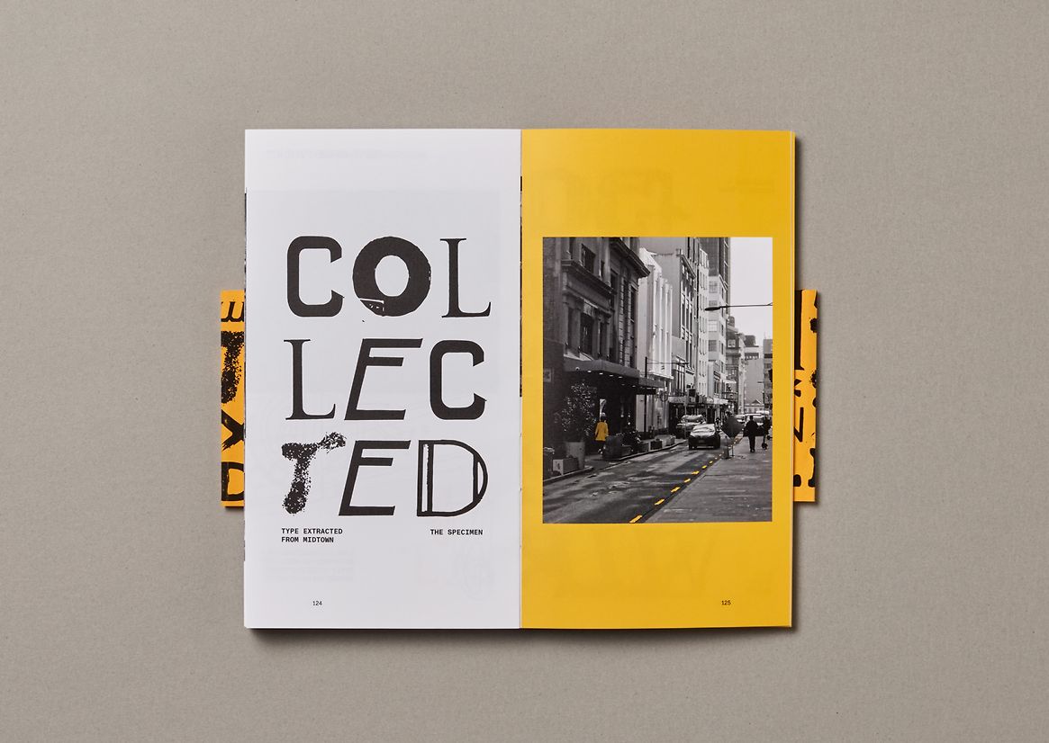
Midtown Type represents a personal collection and documentation of typography within our immediate environment. Through a combination of lens and pen, this exploration delves into the intriguing shapes and captivating histories of the letterforms that contribute significantly to the cultural identity of our local. This book has been intentionally designed to provide the reader with both a physical and figurative journey.
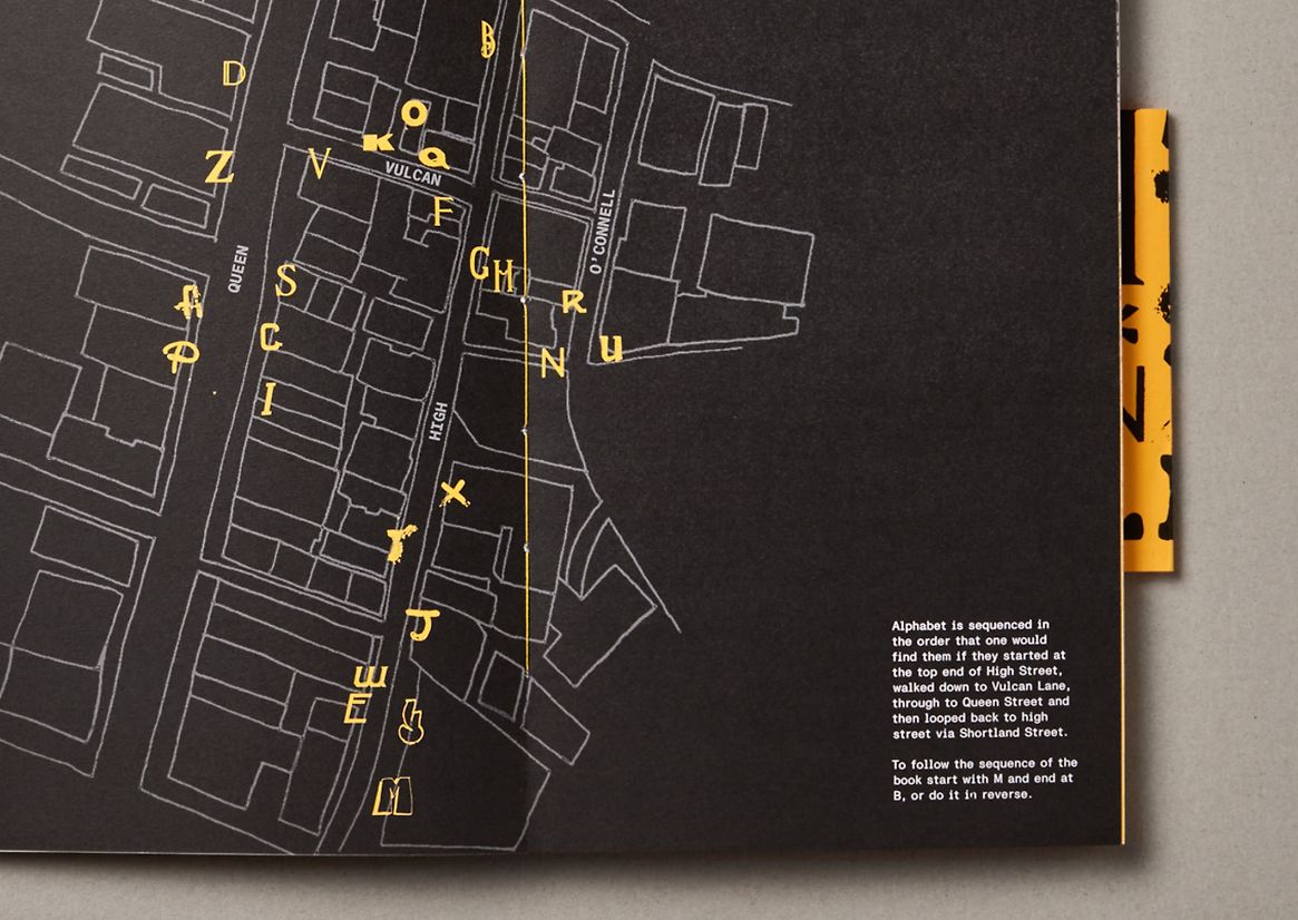
The arrangement of the alphabet within these pages mirrors the order in which you would encounter these letterforms along the route outlined in the book. This deliberate arrangement not only creates a better understanding of the diverse letterforms but also gives a sense of the historical and cultural contexts they embody, encouraging and developing appreciation of the area’s identity.
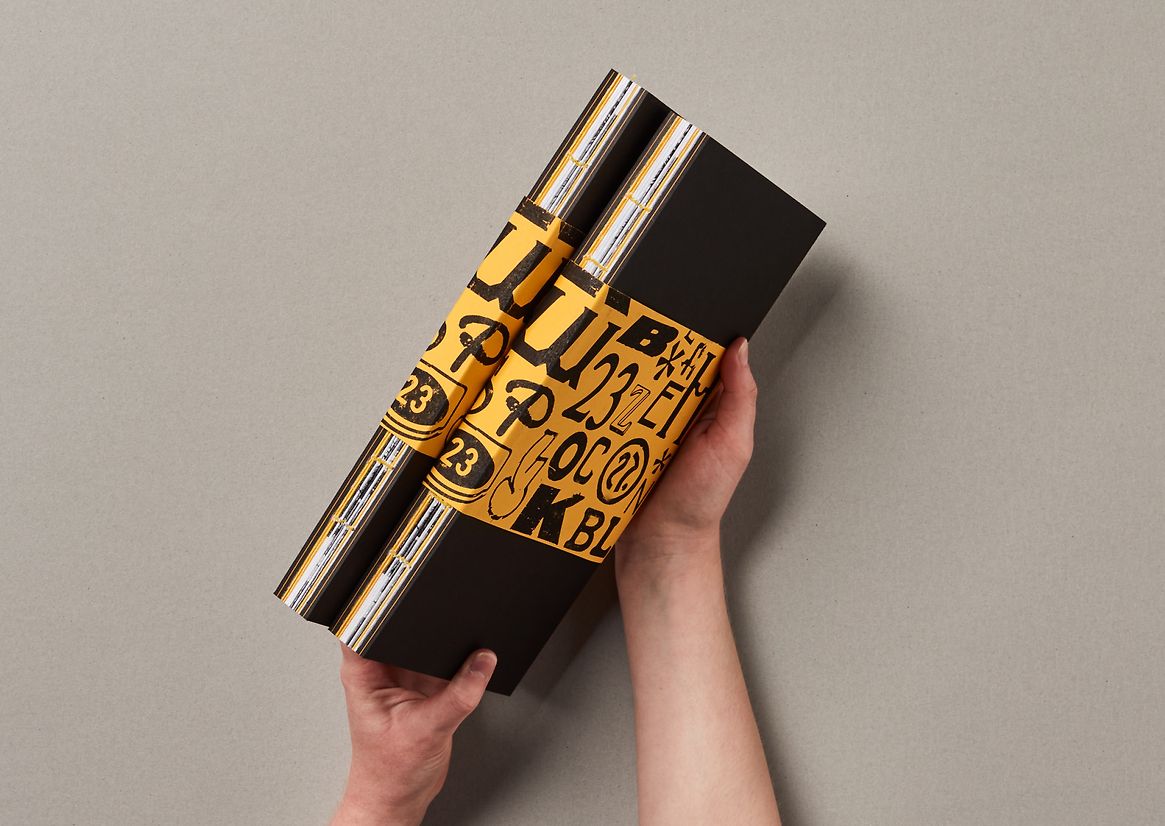
The work saw an extensive prototyping process as multiple iterations were made using different techniques to ensure that the physical outcome felt permanent and considered. The book is hand-stitched using a traditional Coptic binding technique with hand-laminated covers on the outside. The physical outcome was designed to feel permanent and valuable.
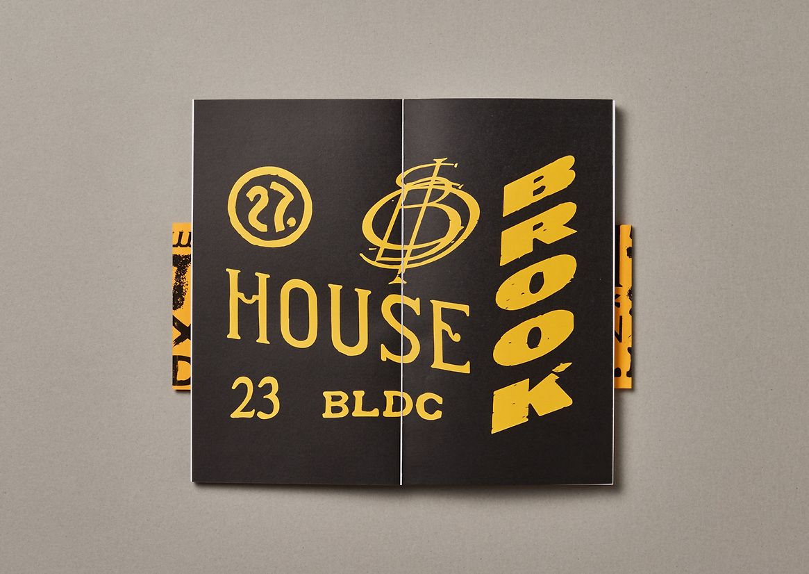
Aspects such as the colour scheme were designed to mimic the area. The colour most representative of the area is the yellow of the road markings so this was used as a visual device in the spreads, cover and stitching of the book. The yellow stripe laminated into the sides of the cover was designed to mimic the yellow lines found on the streets.
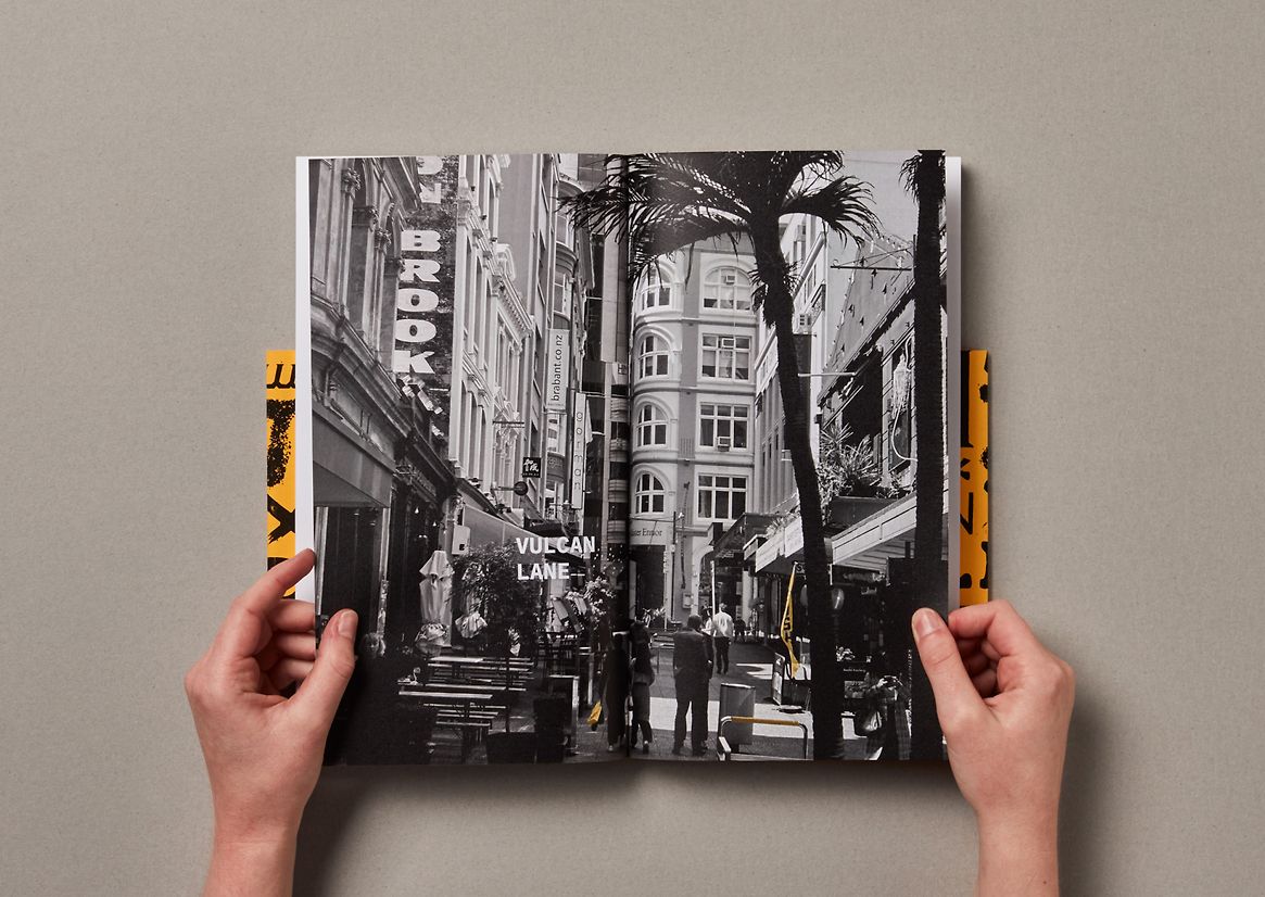
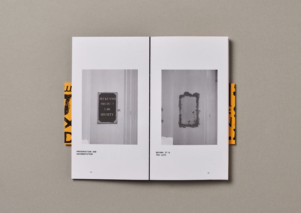
Every design decision was made to ensure it aided or represented the storytelling and influence of the area. The viewer also gets the opportunity to physically involve themselves in the journey. As the viewer follows the progression of the book, the information reveals as if they were making the walk themselves. This means that the viewer could physically follow the map and see these letterforms in real life. By placing the viewer physically within the context of the work, they can educate themselves, in turn creating awareness around the protection and preservation of our local design/architectural history.
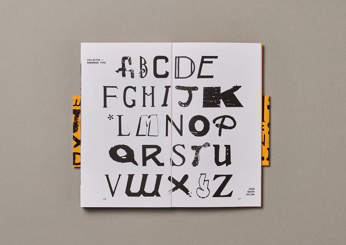
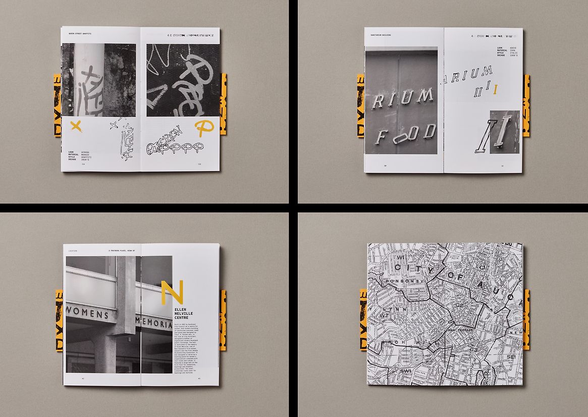
The book and research also resulted in a display typeface which is seen in titles and headers throughout the book. Taking the letterforms and making them functional. The typeface acts as another way the viewer can see and interact with the documented typography.
Description:
Midtown Type represents a personal collection and documentation of typography within our immediate environment. Through a combination of lens and pen, this exploration delves into the intriguing shapes and captivating histories of the letterforms that contribute significantly to the cultural identity of our local. This book has been intentionally designed to provide the reader with both a physical and figurative journey.
The arrangement of the alphabet within these pages mirrors the order in which you would encounter these letterforms along the route outlined in the book. This deliberate arrangement not only creates a better understanding of the diverse letterforms but also gives a sense of the historical and cultural contexts they embody, encouraging and developing appreciation of the area’s identity.
The work saw an extensive prototyping process as multiple iterations were made using different techniques to ensure that the physical outcome felt permanent and considered. The book is hand-stitched using a traditional Coptic binding technique with hand-laminated covers on the outside. The physical outcome was designed to feel permanent and valuable.
Aspects such as the colour scheme were designed to mimic the area. The colour most representative of the area is the yellow of the road markings so this was used as a visual device in the spreads, cover and stitching of the book. The yellow stripe laminated into the sides of the cover was designed to mimic the yellow lines found on the streets.
Every design decision was made to ensure it aided or represented the storytelling and influence of the area. The viewer also gets the opportunity to physically involve themselves in the journey. As the viewer follows the progression of the book, the information reveals as if they were making the walk themselves. This means that the viewer could physically follow the map and see these letterforms in real life. By placing the viewer physically within the context of the work, they can educate themselves, in turn creating awareness around the protection and preservation of our local design/architectural history.
The book and research also resulted in a display typeface which is seen in titles and headers throughout the book. Taking the letterforms and making them functional. The typeface acts as another way the viewer can see and interact with the documented typography.