Graphic
Jacob Davies Expression as Type
-
Tauira / Student
Jacob Davies -
Kaiako / Lecturers
George Hajian, Meighan Ellis
-
School
AUT Art + Design 2025
Description:
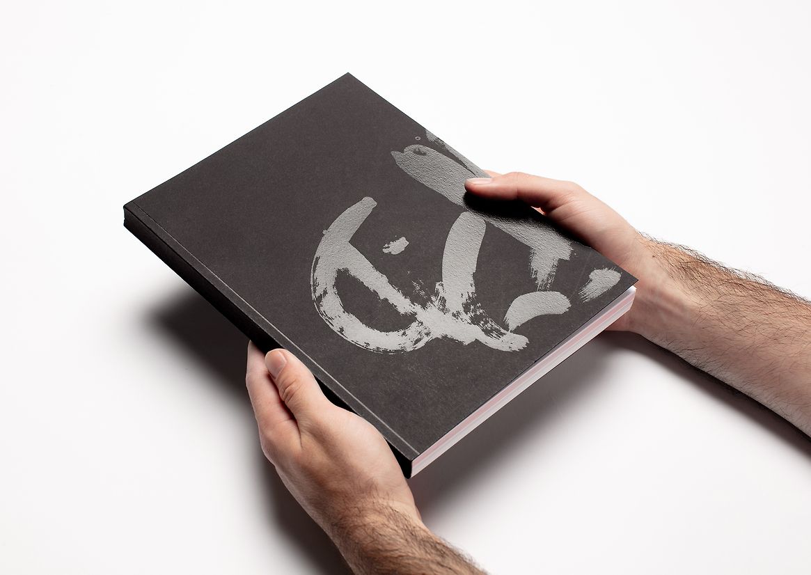
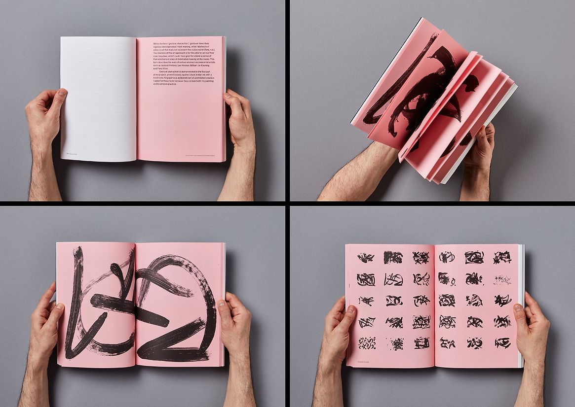
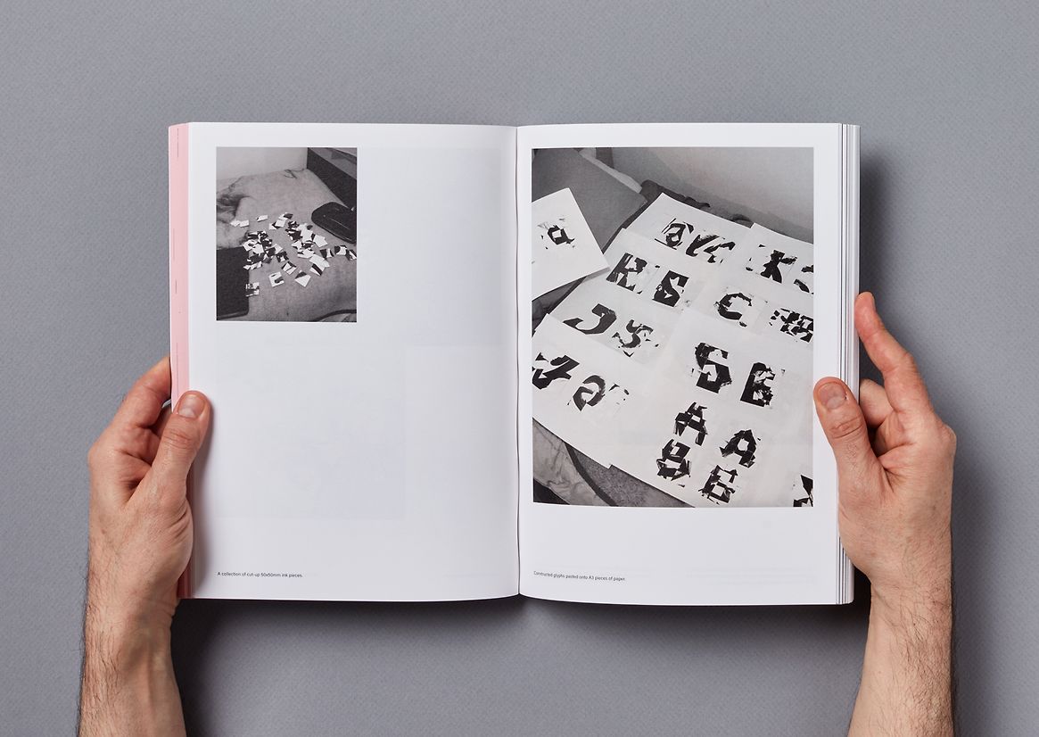
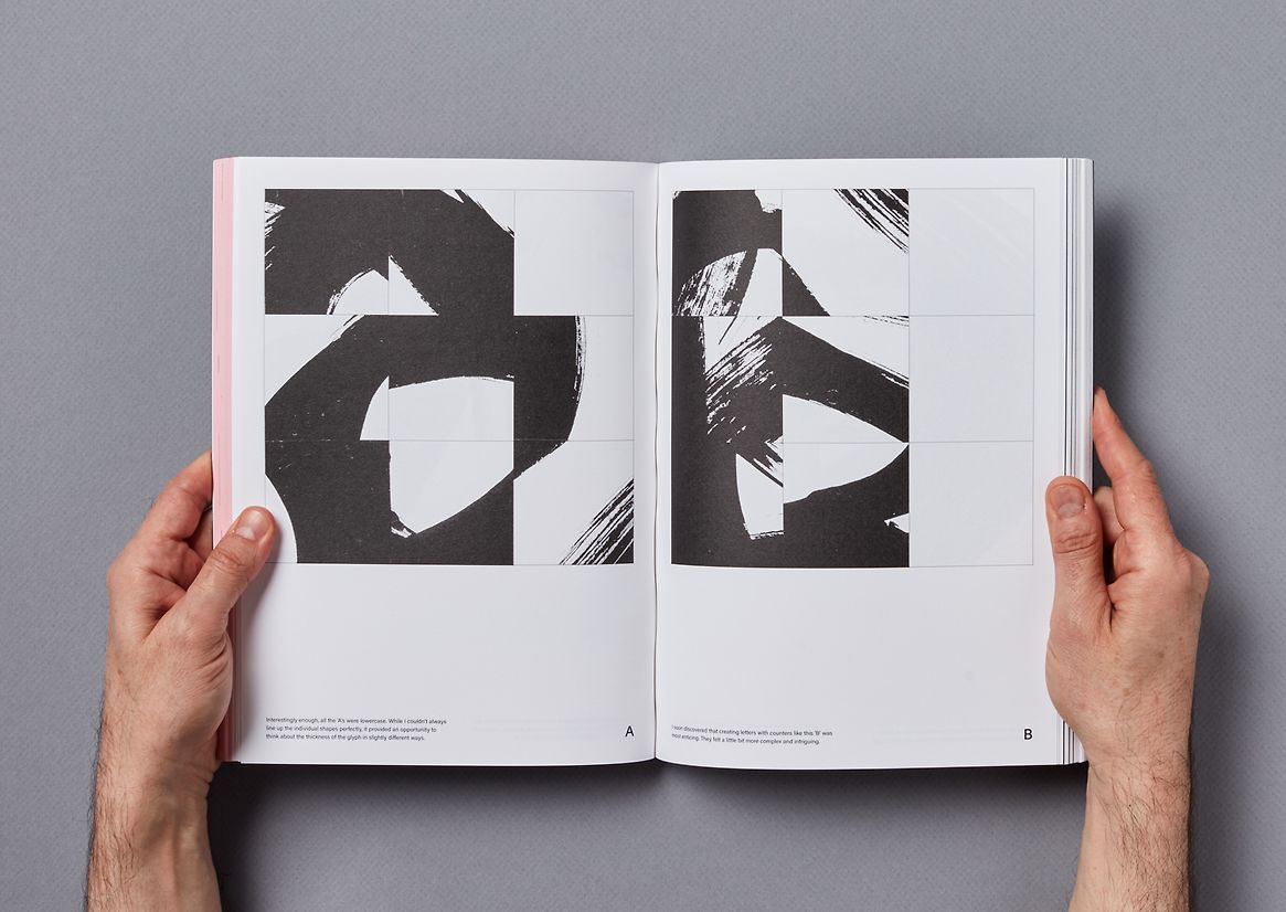
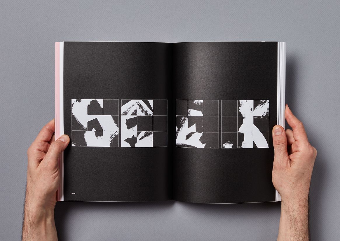
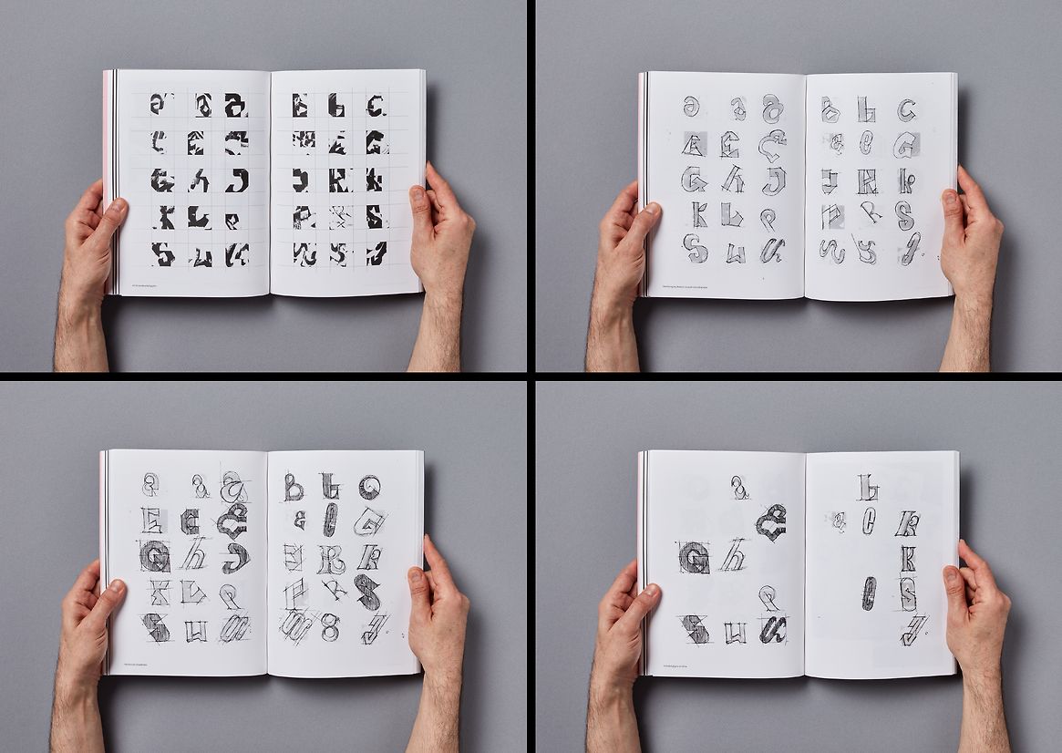
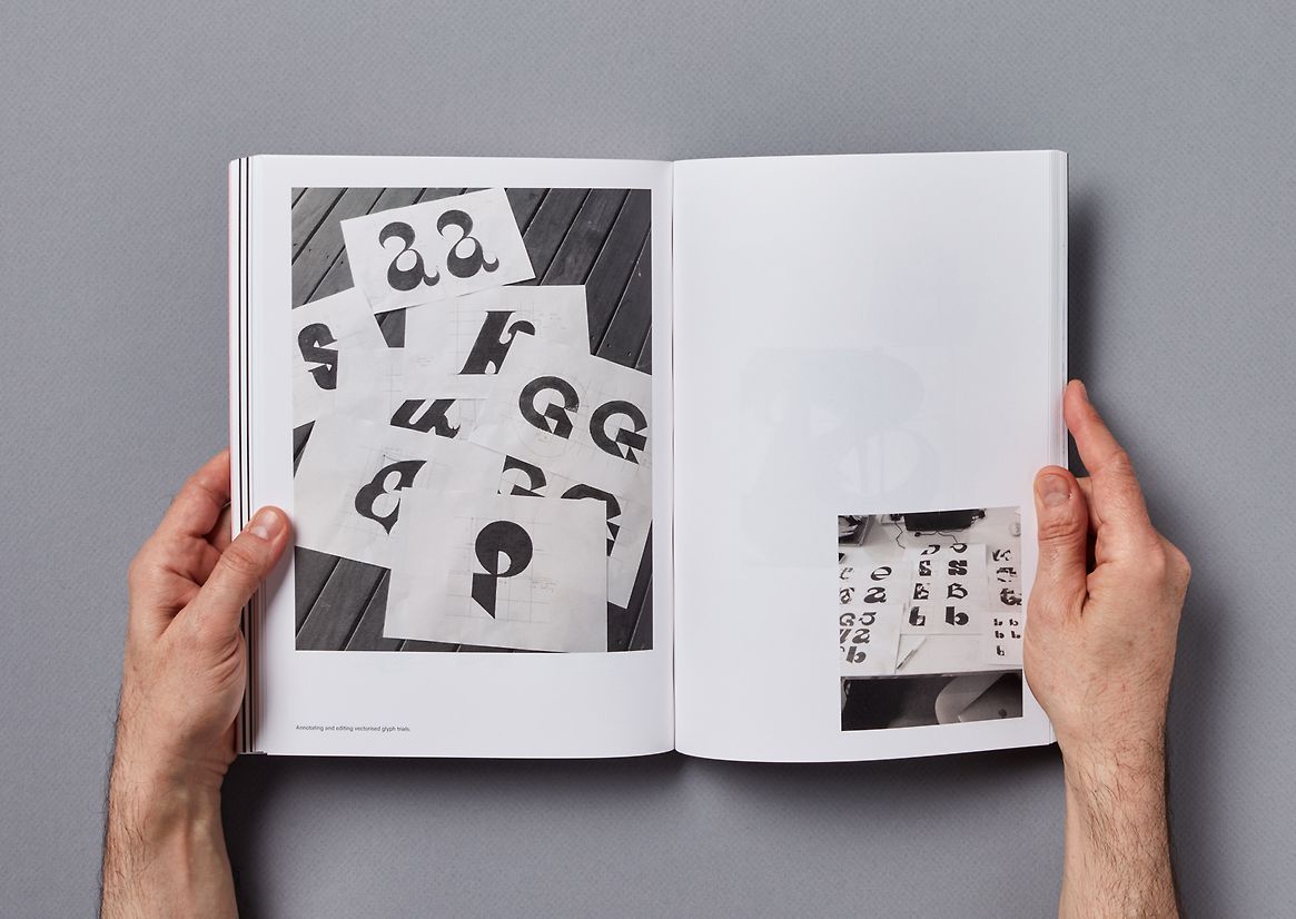
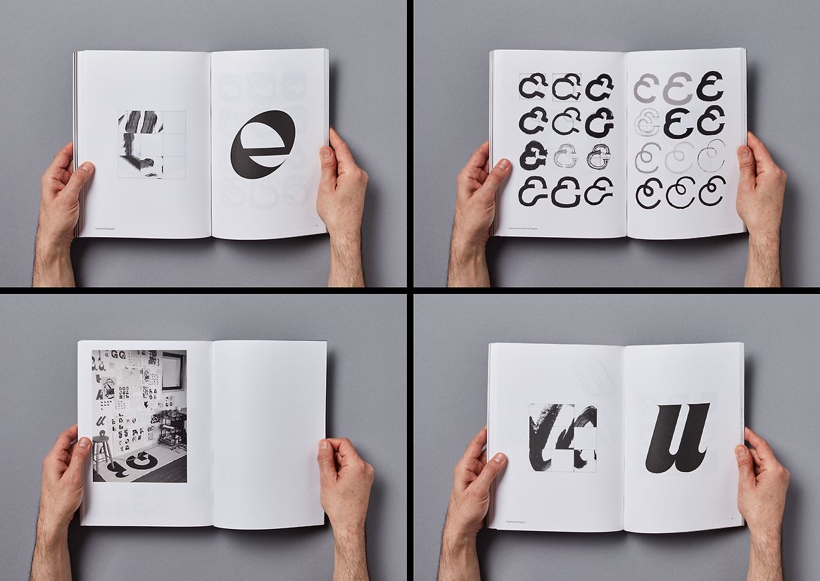
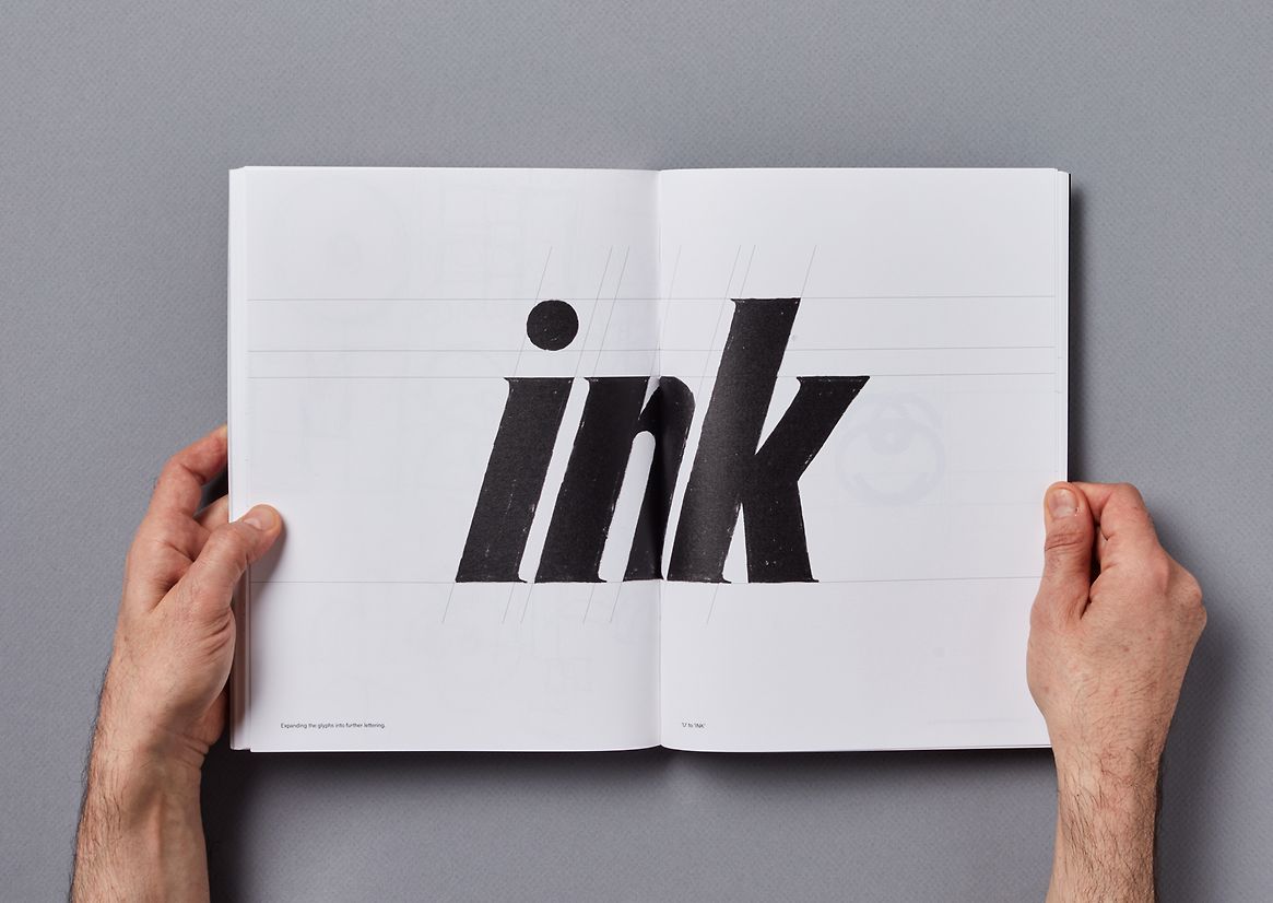
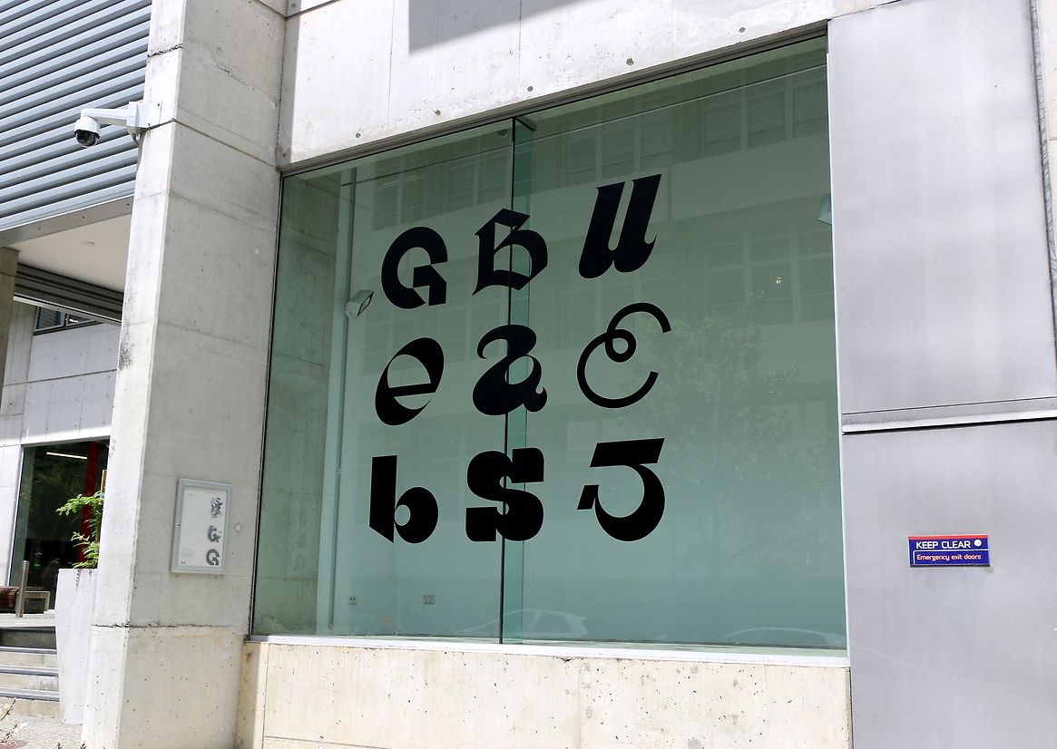
'Expression as Type' documents an unconventional approach to type design that combines analogue and digital processes. I loosely applied thirty iterations of black ink brushstrokes on paper, deliberately engaging in gestural abstraction and uninhibited creation. I divided these marks with a three-by-three square grid and physically rearranged them into type, adhering to the same grid constraint. The process of rearranging the pieces was intuitive and resulted in a varied and unexpected assortment of glyphs. These outcomes, each unique in appearance, began to reveal the characteristics of type I am most drawn to. I selected nine glyphs for digital refinement and expanded them into words as if they were to be developed into full-functioning typefaces. The brushwork emerged from a desire to integrate painting and type design; two key areas of my creative practice. The execution of this was influenced by Luke Wood's 2008 'McCahon' typeface, which comprised the painted lettering style created by New Zealand artist Colin McCahon. To maintain a focus on form, I excluded colour, except for a pink paper stock in the book's ink 'inputs' section. This emphasises the significance of this area as the essential starting point for the glyphs, while also symbolising playfulness and visibility. The hand-bound publication details a shift from gestural and expressive brush marks into refined forms, encompassing an authentic process from start to finish, highlighting the value of human individuality.
Judge's comments:
As a book, this project took you on a journey from start to finish through to a real gift at the end. Through trusting the process, the designer was able to attribute and resolve a clear structure captured in a beautiful finished object. Finally, the finished digital glyphs still retained the expression and energy of the organic workings.